https://github.com/dprischak/foundry-card
A collection of custom dashboard cards for Home Assistant, designed with industrial and vintage aesthetics.
https://github.com/dprischak/foundry-card
hacs home-assistant home-assistant-card industrial iot lovelace vintage
Last synced: 4 months ago
JSON representation
A collection of custom dashboard cards for Home Assistant, designed with industrial and vintage aesthetics.
- Host: GitHub
- URL: https://github.com/dprischak/foundry-card
- Owner: dprischak
- License: mit
- Created: 2026-01-15T01:20:44.000Z (6 months ago)
- Default Branch: main
- Last Pushed: 2026-01-22T05:53:57.000Z (5 months ago)
- Last Synced: 2026-01-22T09:49:31.210Z (5 months ago)
- Topics: hacs, home-assistant, home-assistant-card, industrial, iot, lovelace, vintage
- Language: JavaScript
- Homepage:
- Size: 1.65 MB
- Stars: 2
- Watchers: 1
- Forks: 0
- Open Issues: 0
-
Metadata Files:
- Readme: README.md
- Changelog: CHANGELOG.md
- License: LICENSE
Awesome Lists containing this project
README
[![hacs][hacs-default]][hacs-default-link]
![Downloads][downloads]
[![forum][forum-badge]][forum-url]
[![Stable][releases-shield]][releases]
[![License][license-shield]](LICENSE)


[downloads]: https://img.shields.io/github/downloads/dprischak/Foundry-Card/total
[hacs-badge]: https://img.shields.io/badge/HACS-Default-41BDF5.svg
[hacs-link]: https://hacs.xyz/
[hacs-default]: https://img.shields.io/badge/HACS-Default-blue?style=flat&logo=homeassistantcommunitystore&logoSize=auto
[hacs-default-link]: https://my.home-assistant.io/redirect/hacs_repository/?owner=dprischak&repository=Foundry-Card&category=plugin
[releases]: https://github.com/dprischak/foundry-card/releases/latest
[forum-url]: https://community.home-assistant.io/
[forum-badge]: https://img.shields.io/badge/forum-community?style=flat&logo=homeassistant&label=community&color=blue
[releases-shield]: https://img.shields.io/github/release/dprischak/Foundry-Card.svg
[license-shield]: https://img.shields.io/github/license/dprischak/Foundry-Card.svg
# 🏭Foundry Card
A collection of custom dashboard cards for Home Assistant that are designed with industrial and vintage aesthetics.
## Table of Contents
1. [Cards Included](#cards-included)
2. [Installation](#installation)
3. [Usage](#usage)
- [Foundry Gauge Card](#foundry-gauge-card)
- [Foundry Analog Clock](#foundry-analog-clock)
- [Foundry Digital Clock](#foundry-digital-clock)
- [Foundry Button Card](#foundry-button-card)
- [Foundry Thermometer](#foundry-thermometer)
- [Foundry Entities Card](#foundry-entities-card)
- [Foundry Uptime Card](#foundry-uptime-card)
- [Foundry Chart Card](#foundry-chart-card)
- [Foundry Bar Chart Card](#foundry-bar-chart-card)
- [Foundry Home Thermostat](#foundry-home-thermostat)
- [Foundry Slider Card](#foundry-slider-card)
- [Foundry Title Card](#foundry-title-card)
- [Foundry Analog Meter Card](#foundry-analog-meter-card)
- [Foundry Digital Meter Card](#foundry-digital-meter-card)
4. [Dynamic Entity Themes](#dynamic-entity-themes)
5. [Custom Themes](#custom-themes)
6. [Development](#development)
7. [Roadmap](#roadmap)
8. [Support](#support)
9. [License](#license)
10. [Credits](#credits)
## Cards Included
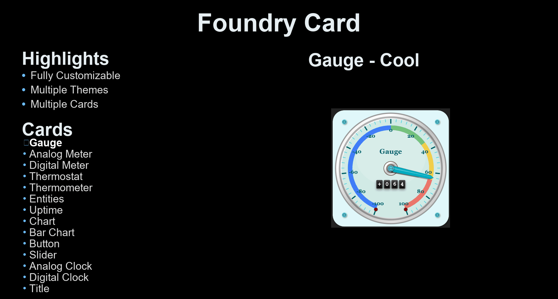
### ⏱️ Foundry Gauge Card
Display your sensor data with a beautiful foundry gauge visualization featuring:
- Customizable min/max values
- Smooth needle animation
- Theme-aware colors
- Responsive design
### 🕰️ Foundry Analog Clock
A skeuomorphic analog clock with:
- Realistic hand movements
- Multiple ring styles (Brass, Silver, Copper, etc.)
- Time zone support
- Second hand toggling
### 📟 Foundry Digital Clock
A vintage industrial digital display featuring:
- Retro LCD/LED aesthetics
- 12h/24h formats
- Custom backlight and digit colors
- Wear and age effects
### 🔘 Foundry Button Card
A tactile industrial push-button:
- Realistic press animation
- Configurable indicator light
- Everything Customizable
- Jinja2 templating support
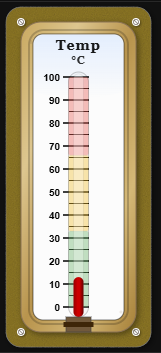
### 🌡️ Foundry Thermometer
An industrial liquid thermometer card:
- Realistic liquid column animation
- Color-coded temperature segments
- Vintage glass tube effects
- Customizable range and units
### 📋 Foundry Entities Card
A digital list display for multiple entities:
- Supports secondary info (last-updated, last-changed, etc.)
- Configurable decimal places for numeric entities
- `time_since` / `time_since_verbose` display for timestamp entities
- Configurable 12-hour / 24-hour clock display for timestamp entities
- Vintage digital VFD/LCD aesthetic
- Customizable fonts and colors
- Same industrial casing options
### ⚡ Foundry Uptime Card
A vintage uptime monitor:
- Industrial tube visualization
- Metallic dividers and bezels
- Color-coded status thresholds
- Detailed history tracking
### 📈 Foundry Chart Card
A steampunk-styled line chart for entity history:
- Configurable time range and per-hour data-point density
- Optional min/max scale and filled area
- Theme-aware styling with grid overlays
- Footer start/end labels
### 📊 Foundry Bar Chart Card
A steampunk-styled bar chart for entity history:
- Configurable time range and per-hour data-point density
- Segment-based bar coloring with optional gradient blending
- Theme-aware styling with grid overlays
- Inspectable values and optional axis min/max labels
### 🌡️ Foundry Home Thermostat
A vintage-style thermostat controller featuring:
- Odometer-style displays for modes and values
- Interactive controls for temperature, fan, and presets
- Dual setpoint support for Heat/Cool mode
- Rich industrial design with wear and glass effects
### 🎚️ Foundry Slider Card
A vertical retro-style slider control:
- Industrial knob with metallic finish
- Adjustable track with tick marks
- LED-style digital display
- Customizable knob shapes and sizes
- Multiple ring styles and themes
### 🏷️ Foundry Title Card
A decorative metallic title plate for grouping dashboard sections:
- Clean minimal design: plate, title, and 2 rivets only
- No ring, no screen, no entity data
- Full theme support with aged texture effects
- Transparent plate mode supported
### 📊 Foundry Analog Meter Card
A vintage VU-style analog meter:
- Landscape Design: Wide rectangular form factor with a rectangular rim, matching the entities card style.
- VU Meter Arc: Numbers displayed below tick marks with thin connecting lines, like a classic VU meter.
- PEAK LED: Indicator that lights up with the highest color segment when the value meets its threshold.
- Shake Action: Custom tap/hold/double-tap action for a fun meter shake animation.
- Full Theming: Supports all standard Foundry ring styles, plate colors, aged textures, and custom themes.
### 🎚️ Foundry Digital Meter Card
A vintage digital LED bar meter in a landscape rectangular chassis.
- Dual Entity Support: Can display two separate entities (e.g., L and R audio channels) simultaneously on top and bottom LED bars.
- Dynamic Scale: A detailed dual-line scale with numbers automatically calculates major/minor ticks between the bars.
- Custom Segments: Map value ranges to custom LED colors.
- Full Theming: Matches analog meter face and plate styling perfectly, along with all standard Foundry ring styles and aged textures.
## Installation
### [HACS](https://hacs.xyz) (Home Assistant Community Store)
Foundry card is available in HACS.
Use this link to directly go to the repository in HACS
[](https://my.home-assistant.io/redirect/hacs_repository/?owner=dprischak&repository=Foundry-Card&category=plugin)
or
1. If HACS is not installed yet, download it following the instructions on [https://hacs.xyz/docs/use/#getting-started-with-hacs](https://hacs.xyz/docs/use/#getting-started-with-hacs)
2. Open HACS in Home Assistant
3. Search for `Foundry Card`
4. Click the download button. ⬇️
5. Force refresh the Home Assistant page `Ctrl` + `F5` / `Shift` + `⌘` + `R`
6. Add any foundry card to your dashboard
### Manual Installation
1. Download `foundry-card.js` and `themes.yaml` from the [latest release](https://github.com/dprischak/Foundry-Card/releases)
2. Copy `foundry-card.js` to `/www/` directory (create the `www` folder if it doesn't exist)
3. Copy `themes.yaml` to `/www/` directory (same location as the .js file)
4. Add the resource to your Lovelace dashboard:
- Go to Settings → Dashboards → Resources
- Click "Add Resource"
- URL: `/local/foundry-card.js`
- Resource type: JavaScript Module
5. Refresh your browser
## Usage
### Foundry Gauge Card
Add the card to your dashboard:
```yaml
type: custom:foundry-gauge-card
entity: sensor.temperature
name: 'Temperature'
min: 0
max: 100
unit: '°C'
```
### Design Features
- **Vintage Aesthetic**: Aged beige/cream background with subtle texture
- **Aged Texture System**: Procedural noise-based texture that can be applied to gauge face only or everywhere
- Three modes: none, glass_only (default), or everywhere
- Adjustable intensity (0-100) for fine control over the vintage appearance
- High-quality filtering prevents washed-out colors
- **Brass Rim**: Gradient brass border with realistic metallic sheen
- **Rivets**: Decorative corner rivets for industrial look
- **Wear Marks**: Configurable age spots and wear marks (0-100 wear level) for authenticity
- **Glass Effect**: Optional subtle highlight overlay simulating glass cover
- **Transparent Plate Option**: Can make the background transparent to show dashboard background
- **Red Needle**: Bold red needle with shadow and highlight
- **Flip Display**: Digital odometer-style display with smooth rolling animation
- **Configurable Odometer**: Adjustable size (25-200) and vertical position (50-150px)
- **Smooth Animation**: Configurable animation duration (default 1.2s) with ease-out transition
- **High Needle Tracking**: Optional high value needle that tracks peak values for a configurable duration
- **Multi-line Titles**: Support for up to 3 lines of text in title using `\n`
- **Decorative Rings**: Choice of brass (default), silver, or no ring styles
- **Customizable Plate**: Adjustable plate color for the gauge face
#### Configuration Options
| Option | Type | Required | Default | Description |
| ---------------------------- | ------- | -------- | ----------------------- | --------------------------------------------------------------- |
| `entity` | string | **Yes** | - | Entity ID to display |
| `title` | string | No | - | Card title (supports multi-line with `\n`) |
| `min` | number | No | 0 | Minimum gauge value |
| `max` | number | No | 100 | Maximum gauge value |
| `unit` | string | No | '' | Unit of measurement |
| `decimals` | number | No | 0 | Number of decimal places to display |
| `segments` | array | No | See below | Color segments configuration |
| `start_angle` | number | No | 200 | Start angle of gauge arc (0 = top, clockwise) |
| `end_angle` | number | No | 160 | End angle of gauge arc (0 = top, clockwise) |
| `animation_duration` | number | No | 1.2 | Animation duration in seconds |
| `title_font_size` | number | No | 12 | Font size for the title text |
| `odometer_font_size` | number | No | 60 | Size of the odometer display (25-200) |
| `odometer_vertical_position` | number | No | 120 | Vertical position of odometer in pixels (50-150) |
| `ring_style` | string | No | 'brass' | Decorative ring style: 'none', 'brass', or 'silver' |
| `rivet_color` | string | No | '#6a5816' | Color of the decorative rivets (hex color code) |
| `plate_color` | string | No | '#8c7626' | Color of the gauge face plate (hex color code) |
| `high_needle_enabled` | boolean | No | false | Enable the high value tracking needle |
| `high_needle_color` | string | No | '#FF9800' | Color of the high needle (hex color code) |
| `high_needle_duration` | number | No | 60 | Duration in seconds to track the high value |
| `high_needle_length` | number | No | 75 | Length of the high needle as percentage (25-150) |
| `plate_transparent` | boolean | No | false | Make the plate transparent (shows background) |
| `wear_level` | number | No | 50 | Amount of wear marks and age spots (0-100) |
| `glass_effect_enabled` | boolean | No | true | Enable glass effect overlay |
| `aged_texture` | string | No | 'everywhere' | Aged texture mode: 'none', 'glass_only', or 'everywhere' |
| `aged_texture_intensity` | number | No | 50 | Intensity of aged texture effect (0-100, higher = more visible) |
| `background_style` | string | No | 'gradient' | Background style: 'gradient' (default) or 'solid' |
| `face_color` | string | No | '#f8f8f0' | Color of the gauge face (if solid) or base for gradient |
| `number_color` | string | No | '#3e2723' | Color of value numbers |
| `primary_tick_color` | string | No | '#3e2723' | Color of major hash marks |
| `secondary_tick_color` | string | No | '#5d4e37' | Color of minor hash marks |
| `needle_color` | string | No | '#C41E3A' | Color of the main needle |
| `tap_action` | object | No | `{action: 'more-info'}` | Action to perform on tap (see Actions below) |
| `hold_action` | object | No | `{action: 'more-info'}` | Action to perform on hold (see Actions below) |
| `double_tap_action` | object | No | `{action: 'more-info'}` | Action to perform on double tap (see Actions below) |
#### Example Configurations
Click to see examples
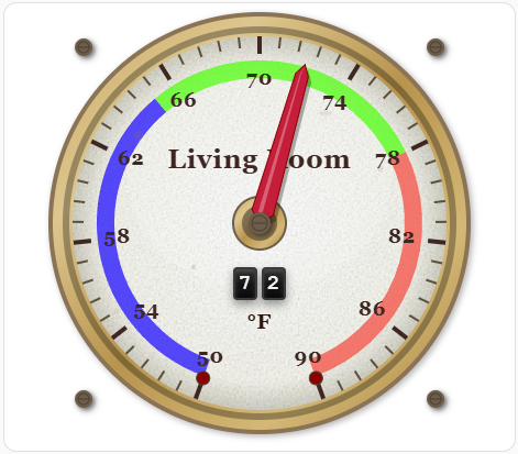
**Temperature Sensor:**
Using the gauge as a temperature sensor
```yaml
type: custom:foundry-gauge-card
entity: sensor.living_room_temperature
title: Living Room
min: 50
max: 90
unit: °F
segments:
- from: 50
to: 68
color: '#1100ff'
- from: 68
to: 78
color: '#44ff00'
- from: 78
to: 90
color: '#F44336'
```
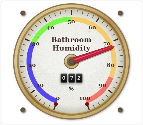
**Humidity Sensor:**
```yaml
type: custom:foundry-gauge-card
entity: sensor.bathroom_humidity
title: Bathroom\nHumidity
min: 0
max: 100
unit: '%'
segments:
- from: 0
to: 30
color: '#1100ff'
- from: 30
to: 50
color: '#44ff00'
- from: 50
to: 85
color: '#f9bc39'
- from: 85
to: 100
color: '#F44336'
```
**Heavily weathered industrial gauge**
```yaml
type: custom:Foundry-Card
entity: sensor.sumppump_fill_rate
title: Sump Pump\nFill Rate
aged_texture: everywhere
aged_texture_intensity: 80
plate_transparent: false
plate_color: '#d4d4c8'
unit: cm/min
decimals: 1
min: -3
max: 3
rivet_color: '#6a5816'
high_needle_color: '#0040ff'
high_needle_enabled: true
high_needle_length: 75
high_needle_duration: 720
segments:
- from: -3
to: 1.3
color: '#00ff11'
- from: 1.3
to: 2
color: '#fff700'
- from: 2
to: 2.5
color: '#f9bc39'
- from: 2.5
to: 3
color: '#F44336'
```
### Segment Options
Each segment in the `segments` array can have:
| Option | Type | Required | Description |
| ------- | ------ | -------- | ------------------------------ |
| `from` | number | **Yes** | Start value of the segment |
| `to` | number | **Yes** | End value of the segment |
| `color` | string | **Yes** | Hex color code for the segment |
### Angle Configuration
The gauge arc can be customized using `start_angle` and `end_angle`:
- **Angle System**: 0° = top of gauge, angles increase clockwise
- **start_angle**: Where the gauge arc begins (default: 200°)
- **end_angle**: Where the gauge arc ends (default: 160°)
- The gauge automatically handles wrapping around 360°
- The needle will always travel along the shortest arc and never cross the "dead zone"
**Common angle configurations:**
- Default (200° to 160°): Classic lower 3/4 arc
- Full semicircle (270° to 90°): Bottom half
- Upper arc (180° to 0°): Top half
- Custom ranges for specific aesthetic needs
### Actions
The card supports tap, hold, and double-tap actions like standard Home Assistant cards. Actions can be configured using `tap_action`, `hold_action`, and `double_tap_action`.
**Available action types:**
- `more-info`: Show entity more-info dialog (default)
- `navigate`: Navigate to a different view
- `call-service`: Call a Home Assistant service
- `toggle`: Toggle the entity
- `shake`: Custom shake animation (needle moves away and returns)
- `none`: No action
**Shake Action Example:**
Click to see examples
```yaml
type: custom:steam-gauge-card
entity: sensor.temperature
title: Temperature
tap_action:
action: shake # Tap to shake the gauge
```
The shake action creates a fun visual effect where the needle moves 10-50% away from the current value and then smoothly returns to the actual value over 3 seconds.
**Standard Action Examples:**
Click to see examples
```yaml
# Navigate to another view
tap_action:
action: navigate
navigation_path: /lovelace/energy
# Call a service
tap_action:
action: call-service
service: light.turn_on
service_data:
entity_id: light.living_room
# Toggle an entity
tap_action:
action: toggle
# No action on tap
tap_action:
action: none
```
### High Needle Tracking
The high needle feature tracks the highest (peak) value reached over a configurable time period. This is useful for monitoring maximum temperatures, peak power usage, or any metric where you want to see how high the value has climbed.
**Features:**
- High value tracking needle (customizable color) that marks the highest value
- Automatically resets after the configured duration (default 60 seconds)
- Adjustable needle length (25-150% of standard needle)
- Smooth animations synchronized with main needle
### Aged Texture Effects
The gauge features a realistic aged texture system that adds vintage character to the display. The texture uses procedural noise to simulate the appearance of aged, weathered gauges from the steam era.
**Configuration Options:**
- **`aged_texture`**: Controls where the texture is applied
- `'none'`: No aged texture effect
- `'glass_only'`: Applies texture only to the gauge face (default) - creates a subtle aged glass appearance
- `'everywhere'`: Applies texture to both the background plate and gauge face - creates a fully weathered vintage look
- **`aged_texture_intensity`**: Controls the strength of the texture effect (0-100)
- `0`: No visible texture (clean, modern look)
- `50`: Moderate texture (default) - balanced vintage appearance
- `100`: Maximum texture - heavily aged, weathered appearance
- Higher values make the texture more prominent and visible
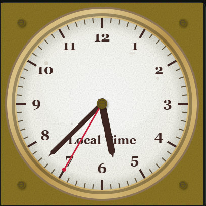
### Foundry Analog Clock
Add a vintage analog clock to your dashboard:
#### Configuration Options
| Option | Type | Required | Default | Description |
| ------------------------ | ------- | -------- | ----------------------- | --------------------------------------------------------------------------------------------------- |
| `entity` | string | No | - | Entity ID (optional, for tap action context) |
| `title` | string | No | "Local Time" | Card title (supports multi-line with `\n`) |
| `title_font_size` | number | No | 12 | Font size for the title text |
| `time_zone` | string | No | Local | Time zone (e.g., "America/New_York") |
| `ring_style` | string | No | 'brass' | Ring style: 'brass', 'silver', 'chrome', 'copper', 'black', 'white', 'blue', 'green', 'red', 'none' |
| `rivet_color` | string | No | '#6d5d4b' | Color of rivets |
| `plate_color` | string | No | '#f5f5f5' | Background plate color |
| `plate_transparent` | boolean | No | false | Make the plate transparent |
| `wear_level` | number | No | 50 | Intensity of wear marks (0-100) |
| `glass_effect_enabled` | boolean | No | true | Enable glass effect overlay |
| `aged_texture` | string | No | 'everywhere' | Aged texture mode: 'none', 'glass_only', 'everywhere' |
| `aged_texture_intensity` | number | No | 50 | Intensity of aged texture effect (0-100) |
| `second_hand_enabled` | boolean | No | true | Show/hide the second hand |
| `tap_action` | object | No | `{action: 'more-info'}` | Action to perform on tap |
| `hold_action` | object | No | `{action: 'more-info'}` | Action to perform on hold |
| `background_style` | string | No | 'gradient' | Background style: 'gradient' (default) or 'solid' |
| `face_color` | string | No | '#f8f8f0' | Color of clock face (if solid) or base for gradient |
| `number_color` | string | No | '#3e2723' | Color of numbers |
| `primary_tick_color` | string | No | '#3e2723' | Color of major hash marks |
| `secondary_tick_color` | string | No | '#5d4e37' | Color of minor hash marks |
| `hour_hand_color` | string | No | '#3e2723' | Color of hour hand |
| `minute_hand_color` | string | No | '#3e2723' | Color of minute hand |
| `second_hand_color` | string | No | '#C41E3A' | Color of second hand |
| `double_tap_action` | object | No | `{action: 'more-info'}` | Action to perform on double tap |
Click to see examples
```yaml
type: custom:foundry-analog-clock-card
entity: sun.sun
title: Local Time
title_font_size: 12
ring_style: brass
rivet_color: '#6a5816'
plate_color: '#8c7626'
plate_transparent: false
wear_level: 50
glass_effect_enabled: true
aged_texture: everywhere
aged_texture_intensity: 50
second_hand_enabled: true
tap_action:
action: more-info
hold_action:
action: more-info
double_tap_action:
action: more-info
time_zone: America/New_York
```
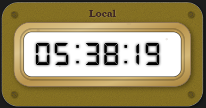
### Foundry Digital Clock
A retro digital timepiece:
#### Configuration Options
| Option | Type | Required | Default | Description |
| ------------------------ | ------- | -------- | ----------------------- | ------------------------------------------------------------------------------------------- |
| `entity` | string | No | - | Entity ID (optional, for tap action context) |
| `title` | string | No | "Local Time" | Card title |
| `title_font_size` | number | No | 14 | Font size for the title text |
| `title_color` | string | No | '#3e2723' | Color of the title text |
| `use_24h_format` | boolean | No | true | Use 24-hour format (false for 12h) |
| `show_seconds` | boolean | No | true | Show seconds display |
| `time_zone` | string | No | Local | Time zone (e.g., "America/New_York") |
| `ring_style` | string | No | 'brass' | Ring style: 'brass', 'silver', 'chrome', 'copper', 'black', 'white', 'blue', 'green', 'red' |
| `rivet_color` | string | No | '#6d5d4b' | Color of rivets |
| `plate_color` | string | No | '#f5f5f5' | Background plate color |
| `plate_transparent` | boolean | No | false | Make the plate transparent |
| `font_color` | string | No | '#000000' | Color of the digital digits |
| `font_bg_color` | string | No | '#ffffff' | Background color of the display area |
| `wear_level` | number | No | 50 | Intensity of wear marks (0-100) |
| `glass_effect_enabled` | boolean | No | true | Enable glass effect overlay |
| `aged_texture` | string | No | 'everywhere' | Aged texture mode: 'none', 'glass_only', 'everywhere' |
| `aged_texture_intensity` | number | No | 50 | Intensity of aged texture effect (0-100) |
| `tap_action` | object | No | `{action: 'more-info'}` | Action to perform on tap |
| `hold_action` | object | No | `{action: 'more-info'}` | Action to perform on hold |
| `double_tap_action` | object | No | `{action: 'more-info'}` | Action to perform on double tap |
Click to see examples
```yaml
type: custom:foundry-digital-clock-card
entity: sun.sun
title: Local
title_font_size: 12
ring_style: brass
rivet_color: '#6a5816'
plate_color: '#8c7626'
plate_transparent: false
font_bg_color: '#ffffff'
font_color: '#000000'
show_seconds: true
wear_level: 50
glass_effect_enabled: true
aged_texture: everywhere
aged_texture_intensity: 50
use_24h_format: false
time_zone: America/New_York
```
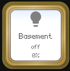
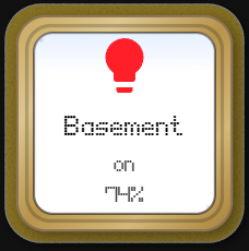
### Foundry Button Card
A robust industrial push-button with integrated status text and icon.
#### Configuration Options
| Option | Type | Required | Default | Description |
| ------------------------ | ------ | -------- | ------------ | --------------------------------------------- |
| `entity` | string | No | - | Entity to control/monitor |
| `icon` | string | No | - | Icon to display |
| `primary_info` | string | No | - | Primary text (top line) |
| `secondary_info` | string | No | - | Secondary text (middle line) |
| `secondary_info_2` | string | No | - | Extra info text (bottom line) |
| `card_width` | number | No | 240 | Maximum width of the card in pixels |
| `ring_style` | string | No | 'brass' | Ring style: 'brass', 'silver', 'chrome', etc. |
| `plate_color` | string | No | '#f5f5f5' | Button face color |
| `font_color` | string | No | '#000000' | Text color |
| `font_bg_color` | string | No | '#ffffff' | Text background inset color |
| `icon_color` | string | No | - | Color of the icon |
| `wear_level` | number | No | 50 | Wear intensity (0-100) |
| `aged_texture` | string | No | 'everywhere' | Texture mode |
| `aged_texture_intensity` | number | No | 50 | Texture intensity |
| `tap_action` | object | No | - | Action on tap |
Click to see examples
```yaml
type: custom:foundry-button-card
entity: light.basement_cans_group
icon: mdi:lightbulb
primary_info: Basement
secondary_info: "{{states('light.basement_cans_group')}}"
ring_style: brass
plate_color: '#8c7626'
font_bg_color: '#ffffff'
font_color: '#000000'
wear_level: 50
glass_effect_enabled: true
aged_texture: everywhere
aged_texture_intensity: 50
plate_transparent: false
secondary_info_2: >-
{{ (state_attr('light.basement_cans_group', 'brightness') | int(0) / 2.55) |
round(0) | int }}%
icon_color: |-
{% set rgb = state_attr('light.basement_cans_group', 'rgb_color') %}
{% if rgb %}
#{{ '%02x%02x%02x' | format(rgb[0], rgb[1], rgb[2]) }}
{% else %}
grey
{% endif %}
card_width: 240
tap_action:
action: more-info
```
### Foundry Thermometer
An industrial liquid-in-glass thermometer:
#### Configuration Options
| Option | Type | Required | Default | Description |
| ------------------------ | ------------ | -------- | ----------------------- | ----------------------------------------------------------------------------------------------------- |
| `entity` | string | **Yes** | - | Temperature entity to monitor |
| `title` | string | No | "Temperature" | Card title |
| `font_color` | string | No | "#3e2723" | Color of the title and scale text |
| `unit` | string | No | - | Unit of measurement string to display |
| `min` | number | No | -40 | Minimum temperature value |
| `max` | number | No | 120 | Maximum temperature value |
| `ring_style` | string | No | 'brass' | Casing style: 'brass', 'silver', 'chrome', 'copper', 'black', 'white', 'blue', 'green', 'red', 'none' |
| `liquid_color` | string/array | No | '#cc0000' | Color of the liquid (mercury) |
| `mercury_width` | number | No | 50 | Width of liquid column (percentage of tube) |
| `segments_under_mercury` | boolean | No | true | Render colored segments behind the liquid tube |
| `segments` | array | No | [] | Color zones (from/to/color) |
| `animation_duration` | number | No | 1.5 | Animation speed in seconds |
| `plate_color` | string | No | '#8c7626' | Background plate color |
| `plate_transparent` | boolean | No | false | Make the plate transparent |
| `rivet_color` | string | No | '#6a5816' | Color of rivets |
| `font_bg_color` | string | No | '#ffffff' | Background color of the tube scale area |
| `primary_tick_color` | string | No | '#333333' | Color of major ticks |
| `secondary_tick_color` | string | No | '#333333' | Color of minor ticks |
| `wear_level` | number | No | 50 | Intensity of wear marks (0-100) |
| `aged_texture` | string | No | 'everywhere' | Aged texture mode: 'none', 'glass_only', 'everywhere' |
| `aged_texture_intensity` | number | No | 50 | Intensity of aged texture effect (0-100) |
| `tap_action` | object | No | `{action: 'more-info'}` | Action to perform on tap |
Click to see examples
```yaml
type: custom:foundry-thermometer-card
entity: sensor.outside_temperature
min: 0
max: 100
ring_style: brass
title: Temp
mercury_width: 50
segments_under_mercury: true
animation_duration: 1.5
plate_color: '#8c7626'
rivet_color: '#ffffff'
font_bg_color: '#fcfcfc'
font_color: '#000000'
primary_tick_color: '#000000'
secondary_tick_color: '#444444'
segments:
- from: 0
to: 33
color: '#4CAF50'
- from: 33
to: 66
color: '#FFC107'
- from: 66
to: 100
color: '#F44336'
liquid_color: '#cc0000'
plate_transparent: false
wear_level: 50
aged_texture: everywhere
aged_texture_intensity: 50
unit: °C
```
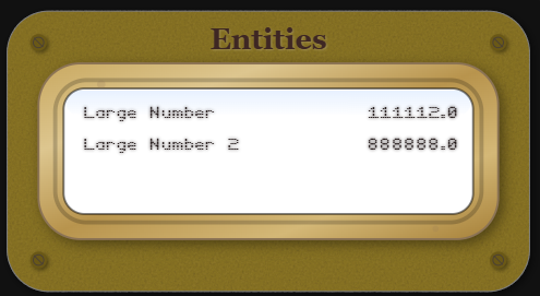
### Foundry Entities Card
A digital display for a list of entities.
#### Configuration Options
| Option | Type | Required | Default | Description |
| ------------------------ | ------- | -------- | ----------------------- | ----------------------------------------------------------------------------------- |
| `entities` | array | **Yes** | - | List of entities to display. Can be strings or objects. |
| `entities[].entity` | string | **Yes** | - | Entity ID |
| `entities[].name` | string | No | - | Override the display name for this entity |
| `entities[].secondary_info` | string | No | `'none'` | Secondary info shown below the value: `'none'`, `'entity-id'`, `'state'`, `'last-updated'`, `'last-changed'` |
| `entities[].decimals` | number | No | - | Number of decimal places to show for numeric entities (0–6). Hidden for non-numeric entities. |
| `entities[].time_format` | string | No | - | Display format for `timestamp` device-class entities: `'time_since'` (e.g. `5m ago`), `'time_since_verbose'` (e.g. `5 minutes ago`), or omit for the default locale date/time string. |
| `entities[].clock_format` | string | No | `'local'` | Hour format for date/time display (only when `time_format` is not a `time_since` variant): `'local'` (browser default), `'12h'` (force AM/PM), `'24h'` (force 24-hour). |
| `title` | string | No | "Entities" | Card title |
| `title_font_size` | number | No | 14 | Font size for the title text |
| `title_color` | string | No | '#3e2723' | Color of the title text |
| `ring_style` | string | No | 'brass' | Casing style: 'brass', 'silver', 'copper', 'black', 'white', 'blue', 'green', 'red' |
| `plate_color` | string | No | '#f5f5f5' | Background plate color |
| `plate_transparent` | boolean | No | false | Make the plate transparent |
| `rivet_color` | string | No | '#6d5d4b' | Color of rivets |
| `font_bg_color` | string | No | '#ffffff' | Background color of digital display area |
| `font_color` | string | No | '#000000' | Color of the digital text |
| `wear_level` | number | No | 50 | Intensity of wear marks (0-100) |
| `glass_effect_enabled` | boolean | No | true | Enable glass effect overlay |
| `aged_texture` | string | No | 'everywhere' | Aged texture mode: 'none', 'glass_only', 'everywhere' |
| `aged_texture_intensity` | number | No | 50 | Intensity of aged texture effect (0-100) |
| `tap_action` | object | No | `{action: 'more-info'}` | Action to perform on tap |
Click to see examples
```yaml
type: custom:foundry-entities-card
entities:
- entity: input_number.testlargenumber1
name: Large Number
secondary_info: none
decimals: 1
- entity: input_number.testlargenumber2
name: Large Number 2
secondary_info: none
decimals: 2
title: Entities
title_font_size: 14
ring_style: brass
rivet_color: '#6a5816'
plate_color: '#8c7626'
plate_transparent: false
font_bg_color: '#ffffff'
font_color: '#0a0000'
wear_level: 50
glass_effect_enabled: true
aged_texture: everywhere
aged_texture_intensity: 50
```
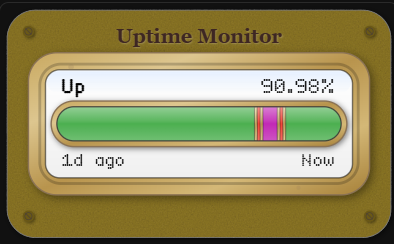
### Foundry Uptime Card
A detailed uptime monitoring card simulating an industrial vacuum tube display.
#### Configuration Options
| Option | Type | Required | Default | Description |
| ------------------------ | ------------ | -------- | ---------------- | ----------------------------------------------------------------------------------- |
| `entity` | string | **Yes** | - | Binary Sensor or entity to monitor |
| `title` | string | No | "Uptime Monitor" | Card title |
| `title_font_size` | number | No | 14 | Font size for the title text |
| `title_color` | string | No | '#3e2723' | Color of the title text |
| `hours_to_show` | number | No | 24 | Number of history hours to display |
| `update_interval` | number | No | 60 | Refresh interval in seconds |
| `show_footer` | boolean | No | true | Show start/end time labels |
| `ring_style` | string | No | 'brass' | Casing style: 'brass', 'silver', 'copper', 'black', 'white', 'blue', 'green', 'red' |
| `plate_color` | string | No | '#f5f5f5' | Background plate color |
| `plate_transparent` | boolean | No | false | Make the plate transparent |
| `rivet_color` | string | No | '#6d5d4b' | Color of rivets |
| `font_bg_color` | string | No | '#ffffff' | Background color of status area |
| `font_color` | string | No | '#000000' | Color of status text |
| `wear_level` | number | No | 50 | Intensity of wear marks (0-100) |
| `glass_effect_enabled` | boolean | No | true | Enable glass effect overlay |
| `aged_texture` | string | No | 'everywhere' | Aged texture mode: 'none', 'glass_only', 'everywhere' |
| `aged_texture_intensity` | number | No | 50 | Intensity of aged texture effect (0-100) |
| `ok` | string/array | No | 'on',... | States considered "Up" |
| `ko` | string/array | No | 'off',... | States considered "Down" |
| `alias.ok` | string | No | "Up" | Display text for OK state |
| `alias.ko` | string | No | "Down" | Display text for KO state |
| `color_thresholds` | array | No | [] | Array of { value, color } for score coloring |
Click to see examples
```yaml
type: custom:foundry-uptime-card
entity: binary_sensor.google_com
title: Uptime Monitor
hours_to_show: 24
ok: 'on'
ko: 'off'
ring_style: brass
rivet_color: '#6a5816'
plate_color: '#8c7626'
plate_transparent: false
font_bg_color: '#ffffff'
font_color: '#000000'
wear_level: 50
glass_effect_enabled: true
color_thresholds:
- value: 20
color: '#c229b5'
- value: 60
color: '#F44336'
- value: 99.9
color: '#FF9800'
- value: 100
color: '#4CAF50'
```
### Foundry Chart Card
Show entity history in a compact chart:
#### Configuration Options
| Option | Type | Required | Default | Description |
| ------------------------ | ------- | -------- | --------------- | --------------------------------------------------------------------------- |
| `entity` | string | **Yes** | - | Entity ID to chart |
| `title` | string | No | "Foundry Chart" | Card title |
| `hours_to_show` | number | No | 24 | Number of history hours to include |
| `points_per_hour` | number | No | - | Number of data points per hour (e.g. `2` = one point every 30 min). Takes priority over `bucket_count` when set. |
| `bucket_count` | number | No | 50 | Total number of data points for the chart (legacy; use `points_per_hour` instead) |
| `bucket_minutes` | number | No | null | Data point interval in minutes (overrides both `points_per_hour` and `bucket_count` when set) |
| `update_interval` | number | No | 60 | Refresh interval in seconds |
| `aggregation` | string | No | 'avg' | Aggregation: 'avg', 'min', or 'max' |
| `min_value` | number | No | auto | Minimum value for the chart scale |
| `max_value` | number | No | auto | Maximum value for the chart scale |
| `value_precision` | number | No | 2 | Decimal places for the current value display |
| `show_footer` | boolean | No | true | Show start/end time labels |
| `show_inspect_value` | boolean | No | true | During inspect, replace current value with inspected Y and show inspect bar |
| `show_x_axis_minmax` | boolean | No | false | Show X-axis min/max labels under chart (auto-hides footer start/Now labels) |
| `show_y_axis_minmax` | boolean | No | false | Show Y-axis min/max value labels on the chart axis |
| `x_axis_time_format` | string | No | `'local'` | Hour format for X-axis time labels: `'local'` (browser default), `'12h'` (force AM/PM), `'24h'` (force 24-hour). |
| `segments` | array | No | [] | Value color ranges (`from`, `to`, `color`) for line/fill coloring |
| `segment_blend_width` | number | No | 0 | Total blend width around each touching range boundary (value units) |
| `line_color` | string | No | '#d32f2f' | Line color |
| `line_width` | number | No | 2 | Line width |
| `fill_under_line` | boolean | No | false | Fill the area under the line |
| `grid_minor_color` | string | No | '#cfead6' | Minor grid color |
| `grid_major_color` | string | No | '#8fc79d' | Major grid color |
| `grid_opacity` | number | No | 0.6 | Grid opacity |
| `ring_style` | string | No | 'brass' | Casing style: 'brass', 'silver', 'chrome', 'copper', 'black', 'white', etc. |
| `plate_color` | string | No | '#f5f5f5' | Background plate color |
| `background_style` | string | No | 'gradient' | 'gradient' or 'solid'. Controls the background fill of the plate. |
| `face_color` | string | No | '#f8f8f0' | Color of the face when `background_style` is `solid`. |
| `plate_transparent` | boolean | No | false | Make the plate transparent |
| `rivet_color` | string | No | '#6d5d4b' | Color of rivets |
| `font_bg_color` | string | No | '#ffffff' | Background color of the chart screen |
| `number_color` | string | No | '#3e2723' | Color of the Title, Unit, and Scale numbers. |
| `wear_level` | number | No | 50 | Intensity of wear marks (0-100) |
| `glass_effect_enabled` | boolean | No | true | Enable glass effect overlay |
| `aged_texture` | string | No | 'everywhere' | Aged texture mode: 'none', 'glass_only', 'everywhere' |
| `aged_texture_intensity` | number | No | 50 | Intensity of aged texture effect (0-100) |
Click to see examples
```yaml
type: custom:foundry-chart-card
entity: sensor.outside_temperature
title: Outside Temp
hours_to_show: 24
bucket_count: 60
update_interval: 60
aggregation: avg
show_inspect_value: true
show_x_axis_minmax: false
show_y_axis_minmax: false
segment_blend_width: 4
segments:
- from: 10
to: 20
color: '#F44336'
- from: 20
to: 30
color: '#4CAF50'
- from: 30
to: 60
color: '#2196F3'
line_color: '#d32f2f'
line_width: 2
fill_under_line: true
grid_minor_color: '#cfead6'
grid_major_color: '#8fc79d'
grid_opacity: 0.6
ring_style: brass
plate_color: '#f5f5f5'
rivet_color: '#6d5d4b'
font_bg_color: '#ffffff'
font_color: '#000000'
title_color: '#3e2723'
wear_level: 50
glass_effect_enabled: true
aged_texture: everywhere
aged_texture_intensity: 50
```
### Foundry Bar Chart Card
Show entity history as a segmented bar chart:
#### Configuration Options
| Option | Type | Required | Default | Description |
| ------------------------ | ------- | -------- | -------------------- | --------------------------------------------------------------------------- |
| `entity` | string | **Yes** | - | Entity ID to chart |
| `title` | string | No | "Foundry Bar Chart" | Card title |
| `hours_to_show` | number | No | 24 | Number of history hours to include |
| `points_per_hour` | number | No | - | Number of bars per hour (e.g. `4` = one bar every 15 min). Takes priority over `bucket_count` when set. |
| `bucket_count` | number | No | 50 | Total number of bars for the chart (legacy; use `points_per_hour` instead) |
| `bucket_minutes` | number | No | null | Bar interval in minutes (overrides both `points_per_hour` and `bucket_count` when set) |
| `update_interval` | number | No | 60 | Refresh interval in seconds |
| `aggregation` | string | No | `'avg'` | Aggregation per bar: `'avg'`, `'min'`, or `'max'` |
| `min_value` | number | No | auto | Minimum value for the chart scale |
| `max_value` | number | No | auto | Maximum value for the chart scale |
| `value_precision` | number | No | 2 | Decimal places for the current value display |
| `show_footer` | boolean | No | true | Show start/end time labels |
| `show_inspect_value` | boolean | No | true | During inspect, replace current value with inspected Y and show inspect bar |
| `show_x_axis_minmax` | boolean | No | false | Show X-axis min/max labels under chart |
| `show_y_axis_minmax` | boolean | No | false | Show Y-axis min/max value labels on the chart axis |
| `x_axis_time_format` | string | No | `'local'` | Hour format for X-axis time labels: `'local'`, `'12h'`, or `'24h'` |
| `bar_color` | string | No | `'#d32f2f'` | Default bar color (used when no segments are defined) |
| `bar_padding` | number | No | 2 | Pixel gap between bars |
| `bar_range_blend` | string | No | `'single'` | How bar color is determined across segments: `'single'` or `'blend'` |
| `segments` | array | No | [] | Value color ranges (`from`, `to`, `color`) for bar coloring |
| `segment_blend_width` | number | No | 0 | Total blend width around each touching range boundary (value units) |
| `grid_minor_color` | string | No | `'#cfead6'` | Minor grid color |
| `grid_major_color` | string | No | `'#8fc79d'` | Major grid color |
| `grid_opacity` | number | No | 0.6 | Grid opacity |
| `ring_style` | string | No | `'brass'` | Casing style: `'brass'`, `'silver'`, `'chrome'`, `'copper'`, `'black'`, `'white'`, etc. |
| `plate_color` | string | No | `'#f5f5f5'` | Background plate color |
| `plate_transparent` | boolean | No | false | Make the plate transparent |
| `rivet_color` | string | No | `'#6d5d4b'` | Color of rivets |
| `font_bg_color` | string | No | `'#ffffff'` | Background color of the chart screen |
| `font_color` | string | No | `'#000000'` | Color of the digital text |
| `wear_level` | number | No | 50 | Intensity of wear marks (0-100) |
| `glass_effect_enabled` | boolean | No | true | Enable glass effect overlay |
| `aged_texture` | string | No | `'everywhere'` | Aged texture mode: `'none'`, `'glass_only'`, `'everywhere'` |
| `aged_texture_intensity` | number | No | 50 | Intensity of aged texture effect (0-100) |
| `tap_action` | object | No | `{action: 'more-info'}` | Action to perform on tap |
| `hold_action` | object | No | `{action: 'more-info'}` | Action to perform on hold |
| `double_tap_action` | object | No | `{action: 'more-info'}` | Action to perform on double tap |
Click to see examples
```yaml
type: custom:foundry-bar-chart-card
entity: sensor.outside_temperature
title: Outside Temp
hours_to_show: 24
bucket_count: 60
update_interval: 60
aggregation: avg
show_inspect_value: true
show_x_axis_minmax: false
show_y_axis_minmax: false
x_axis_time_format: local
segment_blend_width: 4
segments:
- from: 10
to: 20
color: '#F44336'
- from: 20
to: 30
color: '#4CAF50'
- from: 30
to: 60
color: '#2196F3'
bar_color: '#d32f2f'
bar_padding: 2
bar_range_blend: single
grid_minor_color: '#cfead6'
grid_major_color: '#8fc79d'
grid_opacity: 0.6
ring_style: brass
plate_color: '#f5f5f5'
rivet_color: '#6d5d4b'
font_bg_color: '#ffffff'
font_color: '#000000'
wear_level: 50
glass_effect_enabled: true
aged_texture: everywhere
aged_texture_intensity: 50
```
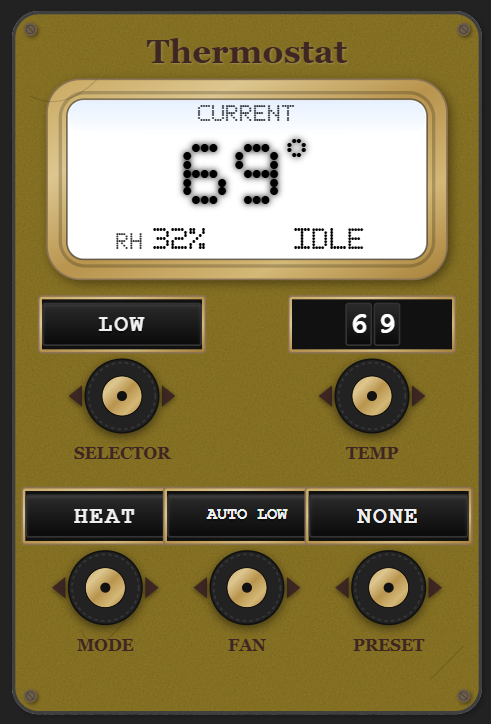
### Foundry Home Thermostat
A vintage-style thermostat controller with odometer-style displays and interactive controls.
#### Configuration Options
| Option | Type | Required | Default | Description |
| ------------------------ | ------- | -------- | ------------ | ------------------------------------------------------------------------------------------- |
| `entity` | string | **Yes** | - | Thermostat entity (climate domain) |
| `title` | string | No | "Thermostat" | Card title |
| `ring_style` | string | No | 'brass' | Casing style: 'brass', 'silver', 'copper', 'black', 'white', 'blue', 'green', 'red', 'none' |
| `plate_color` | string | No | '#8c7626' | Background plate color |
| `title_color` | string | No | '#3e2723' | Color of the title text and labels |
| `font_bg_color` | string | No | '#ffffff' | Background color of the odometer displays |
| `font_color` | string | No | '#000000' | Color of the odometer text |
| `rivet_color` | string | No | '#6d5d4b' | Color of rivets |
| `plate_transparent` | boolean | No | false | Make the plate transparent |
| `wear_level` | number | No | 50 | Intensity of wear marks (0-100) |
| `glass_effect_enabled` | boolean | No | true | Enable glass effect overlay |
| `aged_texture` | string | No | 'everywhere' | Aged texture mode: 'none', 'glass_only', 'everywhere' |
| `aged_texture_intensity` | number | No | 50 | Intensity of aged texture effect (0-100) |
Click to see examples
```yaml
type: custom:foundry-homethermostat-card
entity: climate.t6_pro_z_wave_programmable_thermostat_with_smartstart
title: Thermostat
ring_style: brass
plate_color: '#8c7626'
title_color: '#3e2723'
font_bg_color: '#ffffff'
font_color: '#000000'
rivet_color: '#6d5d4b'
plate_transparent: false
wear_level: 50
glass_effect_enabled: true
aged_texture: everywhere
aged_texture_intensity: 50
```
### Foundry Slider Card
A vertical slider control with vintage industrial aesthetics.
#### Configuration Options
| Option | Type | Required | Default | Description |
| ------------------------ | ------- | -------- | ------------------ | ------------------------------------------------------------------------------------------- |
| `entity` | string | No | - | Entity ID (optional, for control integration) |
| `title` | string | No | "Slider" | Card title |
| `min` | number | No | 0 | Minimum slider value |
| `max` | number | No | 100 | Maximum slider value |
| `step` | number | No | 1 | Slider step increment |
| `value` | number | No | 50 | Initial/current slider value |
| `ring_style` | string | No | 'brass' | Ring style: 'brass', 'silver', 'chrome', 'copper', 'black', 'white', 'blue', 'green', 'red' |
| `background_style` | string | No | 'gradient' | Screen face fill: `'gradient'` (default) or `'solid'`. Solid uses `face_color`. |
| `face_color` | string | No | '#8c7626' | Screen face color when `background_style` is `solid` |
| `plate_color` | string | No | '#8c7626' | Background plate color |
| `plate_transparent` | boolean | No | false | Make the plate transparent |
| `rivet_color` | string | No | '#6a5816' | Color of decorative rivets |
| `slider_color` | string | No | '#444444' | Color of the slider track |
| `knob_color` | string | No | '#c9a961' | Color of the slider knob (derived from ring_style) |
| `knob_shape` | string | No | 'square' | Knob shape: 'circular', 'square', 'rectangular' |
| `knob_size` | number | No | 100 | Knob size percentage (0-100) |
| `primary_tick_color` | string | No | 'rgba(0,0,0,0.22)' | Color of major tick marks |
| `secondary_tick_color` | string | No | 'rgba(0,0,0,0.22)' | Color of minor tick marks |
| `font_bg_color` | string | No | '#ffffff' | Screen Background — background color of the LED display (same as Entities card) |
| `font_color` | string | No | '#000000' | Digital Font Color — color of LED display digits (same as Entities card) |
| `number_color` | string | No | '#3e2723' | Color of the title text (replaces `title_color`) |
| `title_font_size` | number | No | 14 | Font size for the title |
| `value_font_size` | number | No | 36 | Font size for the value display |
| `show_value` | boolean | No | true | Show the digital value display |
| `wear_level` | number | No | 50 | Intensity of wear marks (0-100) |
| `aged_texture` | string | No | 'everywhere' | Aged texture mode: 'none', 'glass_only', 'everywhere' |
| `aged_texture_intensity` | number | No | 50 | Intensity of aged texture effect (0-100) |
Click to see examples
```yaml
type: custom:foundry-slider-card
title: Volume
min: 0
max: 100
step: 1
value: 50
ring_style: brass
background_style: gradient
face_color: '#8c7626'
plate_color: '#8c7626'
plate_transparent: false
rivet_color: '#6a5816'
slider_color: '#444444'
knob_shape: square
knob_size: 100
primary_tick_color: 'rgba(0,0,0,0.22)'
secondary_tick_color: 'rgba(0,0,0,0.22)'
font_bg_color: '#ffffff'
font_color: '#000000'
number_color: '#3e2723'
title_font_size: 14
value_font_size: 36
show_value: true
wear_level: 50
aged_texture: everywhere
aged_texture_intensity: 50
```
### Foundry Title Card
A minimal decorative title plate for labelling sections of your dashboard.
#### Configuration Options
| Option | Type | Required | Default | Description |
| ------------------------ | ------- | -------- | -------------- | --------------------------------------------- |
| `title` | string | No | "Title" | Text displayed on the plate |
| `title_font_size` | number | No | 18 | Font size of the title text |
| `title_color` | string | No | `'#3e2723'` | Color of the title text |
| `plate_color` | string | No | `'#f5f5f5'` | Background plate color |
| `plate_transparent` | boolean | No | false | Make the plate transparent (hides background) |
| `rivet_color` | string | No | `'#6d5d4b'` | Color of the two side rivets |
| `aged_texture` | string | No | `'everywhere'` | Aged texture mode: `'none'` or `'everywhere'` |
| `aged_texture_intensity` | number | No | 50 | Intensity of aged texture effect (0–100) |
| `theme` | string | No | - | Name of a built-in or custom theme to apply |
Click to see examples
```yaml
type: custom:foundry-title-card
title: Living Room
title_font_size: 18
title_color: '#3e2723'
plate_color: '#8c7626'
rivet_color: '#6a5816'
plate_transparent: false
aged_texture: everywhere
aged_texture_intensity: 50
theme: industrial
```
### Foundry Analog Meter Card
A vintage VU-style analog meter in a landscape rectangular chassis.
#### Configuration Options
| Option | Type | Required | Default | Description |
| ------------------------ | ------- | -------- | ----------------------- | ---------------------------------------------------------------------------------------------------- |
| `entity` | string | **Yes** | - | Entity ID to display |
| `title` | string | No | - | Card title (supports multi-line with `\n`) |
| `min` | number | No | 0 | Minimum meter value |
| `max` | number | No | 100 | Maximum meter value |
| `unit` | string | No | '' | Unit of measurement |
| `segments` | array | No | See below | Color segments configuration |
| `animation_duration` | number | No | 1.2 | Animation duration in seconds |
| `title_font_size` | number | No | 12 | Font size for the title text |
| `ring_style` | string | No | 'brass' | Ring style: 'brass', 'silver', 'chrome', 'copper', 'black', 'white', 'blue', 'green', 'red', 'none' |
| `rivet_color` | string | No | '#6a5816' | Color of the decorative rivets |
| `plate_color` | string | No | '#8c7626' | Color of the plate |
| `plate_transparent` | boolean | No | false | Make the plate transparent |
| `wear_level` | number | No | 50 | Amount of wear marks and age spots (0-100) |
| `glass_effect_enabled` | boolean | No | true | Enable glass effect overlay |
| `aged_texture` | string | No | 'everywhere' | Aged texture mode: 'none', 'glass_only', or 'everywhere' |
| `aged_texture_intensity` | number | No | 50 | Intensity of aged texture effect (0-100) |
| `background_style` | string | No | 'gradient' | Background style: 'gradient' or 'solid' |
| `face_color` | string | No | '#f8f8f0' | Color of the meter face |
| `number_color` | string | No | '#3e2723' | Color of value numbers |
| `primary_tick_color` | string | No | '#3e2723' | Color of major tick marks |
| `secondary_tick_color` | string | No | '#5d4e37' | Color of minor tick marks |
| `needle_color` | string | No | '#1a1a1a' | Color of the needle |
| `tap_action` | object | No | `{action: 'more-info'}` | Action to perform on tap (see Actions) |
| `hold_action` | object | No | `{action: 'more-info'}` | Action to perform on hold |
| `double_tap_action` | object | No | `{action: 'more-info'}` | Action to perform on double tap |
Click to see examples
```yaml
type: custom:foundry-analog-meter-card
entity: sensor.temperature
title: Analog Meter
title_font_size: 12
ring_style: brass
rivet_color: '#6a5816'
plate_color: '#8c7626'
plate_transparent: false
min: 0
max: 100
unit: ''
animation_duration: 1.2
wear_level: 50
glass_effect_enabled: true
aged_texture: everywhere
aged_texture_intensity: 50
segments:
- from: 80
to: 100
color: '#F44336'
number_color: '#3e2723'
primary_tick_color: '#3e2723'
secondary_tick_color: '#5d4e37'
needle_color: '#1a1a1a'
```
### Foundry Digital Meter Card
A vintage digital LED bar meter in a landscape rectangular chassis.
#### Configuration Options
| Option | Type | Required | Default | Description |
| ------------------------ | ------- | -------- | ----------------------- | ---------------------------------------------------------------------------------------------------- |
| `entity` | string | **Yes** | - | Primary entity ID to display on the top bar |
| `bottom_entity` | string | No | - | Secondary entity ID to display on the bottom bar |
| `card_title` | string | No | - | Card title displayed above the meter face |
| `title` | string | No | 'L' | Label for the top bar |
| `bottom_title` | string | No | 'R' | Label for the bottom bar |
| `min` | number | No | 0 | Minimum meter value |
| `max` | number | No | 100 | Maximum meter value |
| `unit` | string | No | 'dB' | Unit of measurement |
| `segments` | array | No | See below | Color segments configuration |
| `animation_duration` | number | No | 0.15 | Animation duration in seconds |
| `ring_style` | string | No | 'brass' | Ring style: 'brass', 'silver', 'chrome', 'copper', 'black', 'white', 'blue', 'green', 'red', 'none' |
| `rivet_color` | string | No | '#6d5d4b' | Color of the decorative rivets |
| `plate_color` | string | No | 'transparent' | Color of the plate |
| `plate_transparent` | boolean | No | false | Make the plate transparent |
| `wear_level` | number | No | 50 | Amount of wear marks and age spots (0-100) |
| `glass_effect_enabled` | boolean | No | true | Enable glass effect overlay |
| `aged_texture` | string | No | 'glass_only' | Aged texture mode: 'none', 'glass_only', or 'everywhere' |
| `aged_texture_intensity` | number | No | 20 | Intensity of aged texture effect (0-100) |
| `background_style` | string | No | 'gradient' | Background style: 'gradient' or 'solid' |
| `face_color` | string | No | '#111111' | Color of the meter face |
| `title_color` | string | No | '#9e9e9e' | Color of the card title text |
| `number_color` | string | No | '#9e9e9e' | Color of the labels and scale numbers |
| `primary_tick_color` | string | No | '#616161' | Color of major tick marks and outline |
| `secondary_tick_color` | string | No | '#424242' | Color of minor tick marks |
Click to see examples
```yaml
type: custom:foundry-digital-meter-card
entity: sensor.audio_level_left
bottom_entity: sensor.audio_level_right
card_title: Digital Meter
title: L
bottom_title: R
min: 0
max: 100
unit: dB
theme: industrial
segments:
- from: 0
to: 50
color: '#4caf50'
- from: 50
to: 60
color: '#8bc34a'
- from: 60
to: 80
color: '#ffeb3b'
- from: 80
to: 100
color: '#f44336'
```
## Dynamic Entity Themes
Foundry Cards allow you to dynamically change a card's theme based on the state of a Home Assistant entity (like an `input_select` dropdown helper). This means you can create a single dropdown on your dashboard that instantly changes the theme of your cards!
### How to Create a Theme Selector Helper
1. **Open the Helpers Page**
- Go to **Settings**
- Click **Devices & Services**
- Select the **Helpers** tab at the top
- Click **➕ Create Helper**
2. **Choose the Correct Helper Type**
- Select: **Dropdown** (This creates an `input_select` entity).
3. **Configure the Helper**
- Fill in the fields:
- **Name**: `Gauge Theme` (or any name you prefer)
- **Icon** (optional): `mdi:palette`
- **Options**: Paste each theme on its own line:
```text
industrial
racing
warm
cool
vintage
midnight
steampunk
military
retro
arctic
copper
neon
pink
blue
green
spring
summer
autumn
winter
purple
orange
yellow
teal
aerospace
cherry_blossom
deep_sea
mediterranean
stealth_black
pine_forest
```
Once your helper is created, open the visual editor for any Foundry Card, set the **Theme** dropdown to **Entity**, and select your new entity (e.g., `input_select.gauge_theme`)!
## Custom Themes
Foundry Cards include built-in themes (industrial, racing, warm, cool) that can be applied through the visual editor. You can also create your own custom themes using a `UserThemes.yaml` file.
### Creating Custom Themes
1. Create a file named `userthemes.yaml` (case-sensitive) in your `/www/` directory (same location as `foundry-card.js` and `themes.yaml`)
2. Define your custom themes using the YAML format shown below
3. Refresh your browser - your custom themes will automatically appear in the theme dropdown in the card editor
### Theme File Format
Each theme is defined with a name followed by its properties. Here's the structure:
```yaml
theme_name:
plate_color: '#8c7626' # Background plate color
rivet_color: '#6a5816' # Corner rivet color
title_color: '#3e2723' # Title text color
font_color: '#3e2723' # Digital display text color
font_bg_color: '#f8f8f0' # Digital display background
ring_style: 'brass' # Ring style: brass, silver, chrome, copper, black, white, blue, green, red
number_color: '#3e2723' # Gauge numbers color
primary_tick_color: '#3e2723' # Major tick marks color
secondary_tick_color: '#5d4e37' # Minor tick marks color
needle_color: '#C41E3A' # Gauge needle color
plate_transparent: false # true/false - transparent background
glass_effect_enabled: true # true/false - glass overlay effect
wear_level: 50 # 0-100 - amount of wear marks
aged_texture: 'everywhere' # none, glass_only, or everywhere
aged_texture_intensity: 50 # 0-100 - texture intensity
face_color: '#929090' # Gauge/clock face color
background_style: 'gradient' # gradient or solid
```
### Example Custom Theme
Here's an example `userthemes.yaml` with two custom themes:
```yaml
midnight:
plate_color: '#1a1a2e'
rivet_color: '#16213e'
title_color: '#eee'
font_color: '#00ff41'
font_bg_color: '#0a0e27'
ring_style: 'black'
number_color: '#eee'
primary_tick_color: '#eee'
secondary_tick_color: '#888'
needle_color: '#00ff41'
plate_transparent: false
glass_effect_enabled: true
wear_level: 20
aged_texture: 'glass_only'
aged_texture_intensity: 30
face_color: '#0f3460'
background_style: 'solid'
steampunk:
plate_color: '#8b4513'
rivet_color: '#654321'
title_color: '#f4e4c1'
font_color: '#f4e4c1'
font_bg_color: '#3e2723'
ring_style: 'copper'
number_color: '#f4e4c1'
primary_tick_color: '#f4e4c1'
secondary_tick_color: '#cd853f'
needle_color: '#ff6347'
plate_transparent: false
glass_effect_enabled: true
wear_level: 80
aged_texture: 'everywhere'
aged_texture_intensity: 70
face_color: '#d2691e'
background_style: 'gradient'
```
### Notes
- Theme names must be unique and use lowercase letters, numbers, and underscores only
- Not all properties are used by all cards (e.g., `needle_color` only applies to gauge cards)
- Custom themes will appear in the theme dropdown alongside built-in themes
- If a property is omitted, the card will use its default value
- If you change a value in a card that is controlled by the themes it will change your card to no theme.
### Theme Caching
To ensure your dashboard loads as quickly as possible, Foundry Cards aggressively cache your `themes.yaml` and `userthemes.yaml` files.
- **10-Minute Cache:** Once loaded, themes are cached in your browser's Local Storage for 10 minutes. During this time, navigating around your dashboard will instantly load themes without making any network requests to the server.
- **Forcing a Refresh:** If you edit your theme files and want to see the changes immediately (without waiting 10 minutes or clearing your browser data), simply append `?refreshcache=true` to your Home Assistant URL and hit Enter.
- Example: `http://homeassistant.local:8123/lovelace/home?refreshcache=true`
- _(If your URL already has `?` parameters, use `&refreshcache=true` instead)_
- This forces the cards to bypass all local caches, download the freshest copy of the theme files directly from the server, and restart the 10-minute timer.
## Development
Want to contribute or customize the cards?
### Prerequisites
1. **Install Node.js**
- Download and install Node.js from [nodejs.org](https://nodejs.org/), which includes `npm`.
### Setting Up Your Development Environment
1. **Clone the Repository**
```bash
git clone https://github.com/dprischak/Foundry-Card.git
cd Foundry-Card
```
2. **Install Dependencies**
```bash
npm install
```
### Development Workflow
1. **Create a branch and make the changes into that branch**
```bash
git checkout -b feature/your-feature-name
# or
git checkout -b fix/your-bug-fix
```
2. Make Your Changes:
- Write clean, readable code
- Follow the existing code style
- Add comments for complex logic
- Update documentation if needed
3. **Build the Project**
```bash
npm run build
```
4. **Code Quality**
The project enforces code quality through linting and formatting. These checks run automatically on Pull Requests and must pass.
**Run checks locally:**
```bash
# Check for linting errors
npm run lint
# Check for formatting issues
npm run format
```
**Fix issues automatically:**
```bash
# Fix linting errors
npm run lint:fix
# Fix formatting issues
npm run format:fix
```
5. **Commit your changes**
```bash
git add .
git commit -m "feat: add new feature" # or "fix: resolve bug"
```
6. **Push and Create a Pull Request**
```bash
git push origin feature/your-feature-name
```
Then open a pull request on GitHub with a clear description of your changes.
## Ways to Contribute
- **Report Bugs:** Open an issue with detailed steps to reproduce
- **Suggest Features:** Share your ideas for improvements
- **Fix Issues:** Look for open issues and submit fixes
- **Improve Documentation:** Help make the docs clearer and more comprehensive
## Roadmap
Future cards planned for the Foundry Card collection:
2023.3.2
- Bar Chart
2023.3.3
- Digital VU Meter
Future
- Standard Odometer
- Industrial Energy Map
- Automated Unit Testing
## Support
If you encounter any issues or have feature requests:
- [Open an issue](https://github.com/dprischak/Foundry-Card/issues)
- [Start a discussion](https://github.com/dprischak/Foundry-Card/discussions)
## License
This project is licensed under the MIT License - see the [LICENSE](LICENSE) file for details.
## Credits
Created by [dprischak](https://github.com/dprischak) and [KeithSobo](https://github.com/KeithSobo)
If you find this project useful, consider giving it a ⭐ on GitHub!
Support the development of this project:
[](https://buymeacoffee.com/keithsobo)
Even a symbolic gesture makes a difference. Thank you so much for your support ❤️