Ecosyste.ms: Awesome
An open API service indexing awesome lists of open source software.
https://github.com/dsmink/twig-bulma-form-theme-bundle
A Twig Form Theme for Bulma 0.3.x for use with the Symfony 2.8 / 3.x framework
https://github.com/dsmink/twig-bulma-form-theme-bundle
bulma-css forms symfony twig
Last synced: 3 days ago
JSON representation
A Twig Form Theme for Bulma 0.3.x for use with the Symfony 2.8 / 3.x framework
- Host: GitHub
- URL: https://github.com/dsmink/twig-bulma-form-theme-bundle
- Owner: dsmink
- License: mit
- Created: 2017-02-21T08:35:58.000Z (almost 8 years ago)
- Default Branch: master
- Last Pushed: 2023-05-18T11:30:21.000Z (almost 2 years ago)
- Last Synced: 2025-02-03T07:25:13.511Z (17 days ago)
- Topics: bulma-css, forms, symfony, twig
- Language: Twig
- Size: 72.3 KB
- Stars: 31
- Watchers: 6
- Forks: 13
- Open Issues: 0
-
Metadata Files:
- Readme: README.md
- Changelog: CHANGELOG.md
- License: LICENSE
Awesome Lists containing this project
README
# twig-bulma-form-theme
A Twig 3.x Form Theme for Bulma 0.9.x for use with Symfony 5/6 framework
---
# Twig (3.x) Bulma (v0.9.x) Form theme
Bulma is a modern CSS framework based on Flexbox. This form theme was created for use with the Twig Template engine. Twig is a modern template engine for PHP.
This form theme was built to work with Twig in combination with the Symfony Framework for websites built on top of the Bulma CSS framework.
## Index
* [How to use the form theme](#how-to-use-the-form-theme)
* [Icon support](#icon-support)
* [Examples](#examples)
* [Sources](#sources)
### How to use the form theme:
The easiest way to make use of the form theme in Symfony is to set this form theme in the configuration file. Have a look at the [Symfony documentation](https://symfony.com/doc/current/form/form_customization.html#making-application-wide-customizations). Also example files are provided in this repository.
### Icon support:
The theme also supports the use of icons. Bulma comes with support for the Font Awesome icon toolkit. It's realy easy to make a form widget support these themes with Symfony Form Type Extensions. An example Form Type Extension is provided within the examples directory in this repository.
## Examples
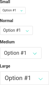
### widget sizes:
Widget size can be set by just using a classname. The following example is for use with the Symfony Form Type.
```php
$builder->add('firstname', TextType::class, [
'attr' => [
'class' => 'is-large'
],
...
]);
```

> **NOTE**
>
> The default size needs no extra class. Suppoted sizes are **is-small**, **is-medium** and **is-large**.
### Icons:
The following example is for use with the Symfony Form Type. This example is based on the Form Type Extension provided in the documentation examples directory.
```php
$builder
// Username widget with user icon
->add('username', TextType::class, [
'bulma_icon' => [
'icon' => 'user',
'position' => 'left',
],
...
])
// Password widget with lock icon
->add('password', PasswordType::class, [
'bulma_icon' => [
'icon' => 'lock',
'position' => 'left',
],
...
])
;
```

> **Need more icons?**
>
> Have a look at the bulma.io and fontawesome.io website to find out which icons are available and how to implement them.
### Dropdown with ChoiceType:
The following example is for use with the Symfony Form Type 'ChoiceType'
```php
->add('checkbox_dropdown', Type\ChoiceType::class, [
'choices' => [
// choice groups are supported (including 'group_by' method)
'Group header 1' => [
'Checkbox 1' => 1,
'Checkbox 2' => 2,
],
'Group header 2' => [
'Checkbox 3' => 3,
'Checkbox 4' => 4,
],
],
'label' => false, // = don't render top label (trigger button label is always rendered)
'expanded' => true, // required to use dropdown
'multiple' => true, // true = checkboxes, false = radio buttons
'attr' => [
'dropdown' => true, // required to use dropdown
'dropdown_arrow_icon' => false, // default to true
'class' => 'is-rounded is-outlined', // added to dropdown trigger button
],
])
```
Render it inside a form:
```html
{{ form_row(form.checkbox_dropdown) }}
{{ form_label(form.checkbox_dropdown) }}
{{ form_widget(form.checkbox_dropdown) }}
```

Add this styling if you need a scrollbar on your dropdowns
```css
.dropdown-content {
max-height: 25rem;
overflow-y: auto;
}
```
## Sources
Have a look at the following websites and their documentation for more information about this subject.
* The [Bulma](http://bulma.io/) CSS framework website;
* The [Font Awesome](http://fontawesome.io/) font and CSS toolkit;
* The [Twig](http://twig.symfony.com/) Template engine for PHP website;
* The [Symfony](http://symfony.com/) PHP framework website.