https://github.com/dynobo/lmdiag
Python Library providing Diagnostic Plots for Linear Regression
https://github.com/dynobo/lmdiag
Last synced: 5 months ago
JSON representation
Python Library providing Diagnostic Plots for Linear Regression
- Host: GitHub
- URL: https://github.com/dynobo/lmdiag
- Owner: dynobo
- License: mit
- Created: 2018-05-12T09:19:52.000Z (about 8 years ago)
- Default Branch: main
- Last Pushed: 2024-06-25T09:17:37.000Z (about 2 years ago)
- Last Synced: 2025-09-21T15:59:25.088Z (10 months ago)
- Language: Python
- Size: 2.87 MB
- Stars: 14
- Watchers: 2
- Forks: 5
- Open Issues: 2
-
Metadata Files:
- Readme: README.md
- Changelog: CHANGELOG
- License: LICENSE
Awesome Lists containing this project
README
# lmdiag
**Python Library providing Diagnostic Plots for Linear Regression Models.** (Like
[plot.lm](https://www.rdocumentation.org/packages/stats/versions/3.5.0/topics/plot.lm)
in R.)
I built this, because I missed the diagnostics plots of R for a university project.
There are some substitutions in Python for individual charts, but they are spread over
different libraries and sometimes don't show the exact same. My implementation tries to
copycat the R-plots, but I didn't reimplement the R-code: The charts are just based on
available documentation.
## Installation
`pip install lmdiag`
## Usage
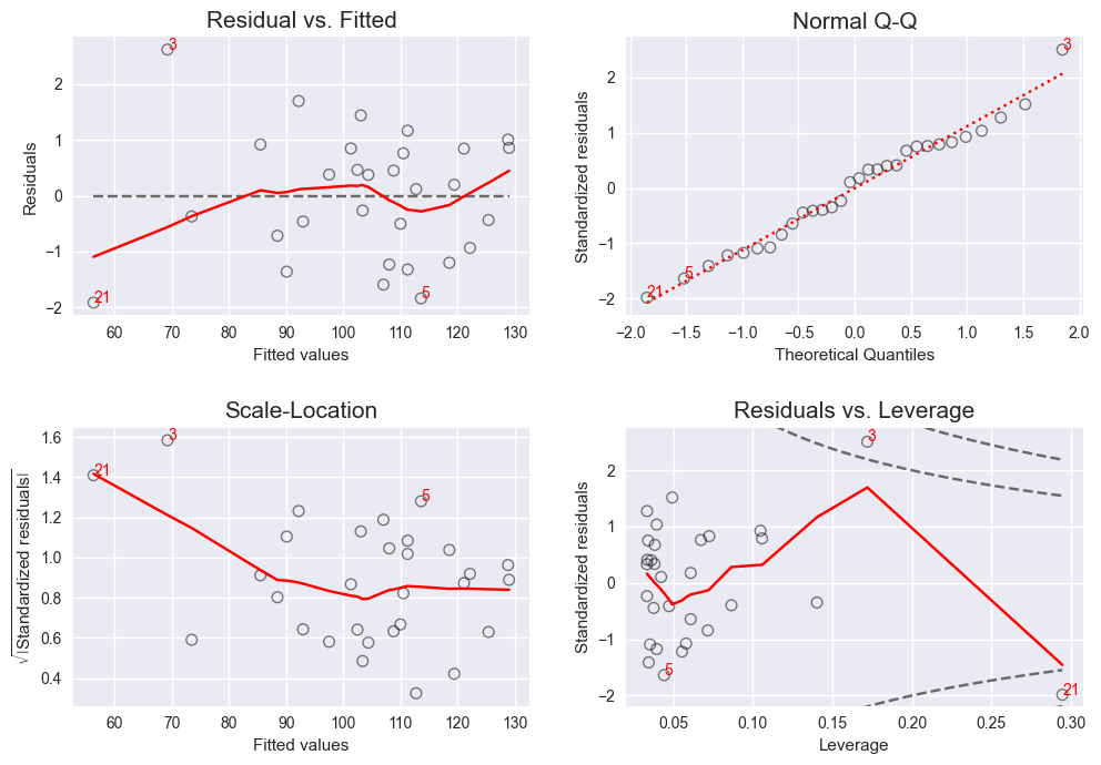
lmdiag generates plots for _fitted_ linear regression models from
[`statsmodels`](https://www.statsmodels.org/stable/index.html),
[`linearmodels`](https://bashtage.github.io/linearmodels/doc/index.html) and
[`scikit-learn`](https://scikit-learn.org/stable/).
You can find some usage examples in
[this jupyter notebook](https://github.com/dynobo/lmdiag/blob/master/example.ipynb).
### Example
```python
import numpy as np
import statsmodels.api as sm
import lmdiag
# Fit model with random sample data
np.random.seed(20)
X = np.random.normal(size=30, loc=20, scale=3)
y = 5 + 5 * X + np.random.normal(size=30)
X = sm.add_constant(predictor) # intercept required by statsmodels
lm = sm.OLS(y, X).fit()
# Plot lmdiag facet chart
lmdiag.style.use(style="black_and_red") # Mimic R's plot.lm style
fig = lmdiag.plot(lm)
fig.show()
```
### Methods
- Draw matrix of all plots:
`lmdiag.plot(lm)`
- Draw individual plots:
`lmdiag.resid_fit(lm)`
`lmdiag.q_q(lm)`
`lmdiag.scale_loc(lm)`
`lmdiag.resid_lev(lm)`
- Print description to aid plot interpretation:
`lmdiag.help()` (for all plots)
`lmdiag.help('')` (for individual plot)
### Increase performance
Plotting models fitted on large datasets might be slow. There are some things you can
try to speed it up:
#### 1. Tune LOWESS-parameters
The red smoothing lines are calculated using the "Locally Weighted Scatterplot
Smoothing" algorithm, which can be quite expensive. Try a _lower_ value for `lowess_it`
and a _higher_ value for `lowess_delta` to gain speed at the cost of accuracy:
```python
lmdiag.plot(lm, lowess_it=1, lowess_delta=0.02)
# Defaults are: lowess_it=2, lowess_delta=0.005
```
(For details about those parameters, see
[statsmodels docs](https://www.statsmodels.org/stable/generated/statsmodels.nonparametric.smoothers_lowess.lowess.html).)
#### 2. Change matplotlib backend
Try a different
[matplotlib backend](https://matplotlib.org/stable/users/explain/figure/backends.html).
Especially static backends like `AGG` or `Cairo` should be faster, e.g.:
```python
import matplotlib
matplotlib.use('agg')
```
### Setup development environment
```sh
python -m venv .venv
source .venv/bin/activate
pip install -e '.[dev]'
pre-commit install
```
### Certification