https://github.com/elbeicktalat/flutter_auth_buttons
Auth Buttons is a flutter widget library, include buttons for authenticating with the most popular social networks.
https://github.com/elbeicktalat/flutter_auth_buttons
dart flutter flutter-package release widget-library
Last synced: 3 months ago
JSON representation
Auth Buttons is a flutter widget library, include buttons for authenticating with the most popular social networks.
- Host: GitHub
- URL: https://github.com/elbeicktalat/flutter_auth_buttons
- Owner: elbeicktalat
- License: bsd-3-clause
- Created: 2020-10-18T16:31:23.000Z (over 5 years ago)
- Default Branch: main
- Last Pushed: 2024-07-28T05:10:01.000Z (almost 2 years ago)
- Last Synced: 2024-07-28T06:24:23.920Z (almost 2 years ago)
- Topics: dart, flutter, flutter-package, release, widget-library
- Language: Dart
- Homepage: https://pub.dev/packages/auth_buttons
- Size: 11.4 MB
- Stars: 32
- Watchers: 1
- Forks: 32
- Open Issues: 4
-
Metadata Files:
- Readme: README.md
- Changelog: CHANGELOG.md
- License: LICENSE
Awesome Lists containing this project
README
# auth_buttons
[](https://github.com/elbeicktalat/flutter_auth_buttons)
[](https://pub.dev/packages/auth_buttons)
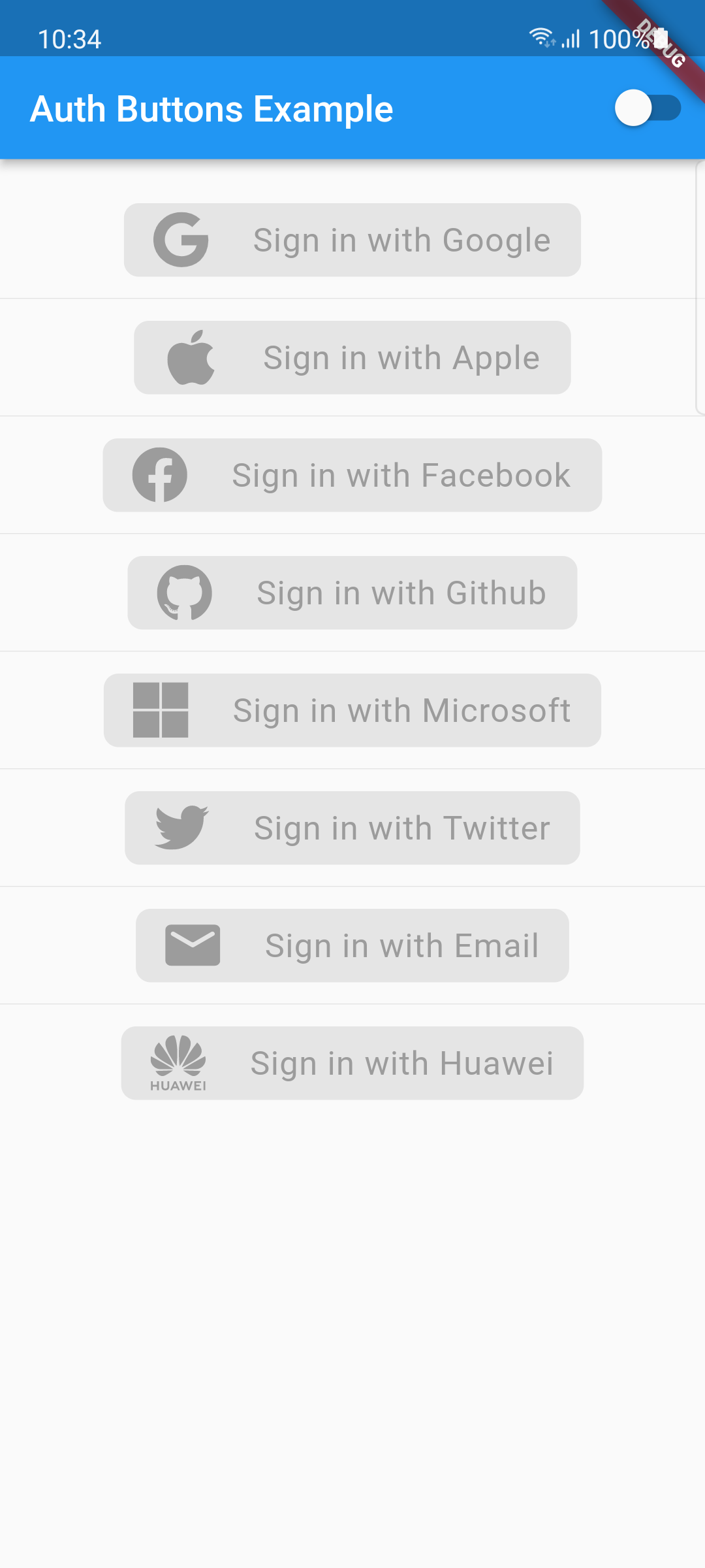
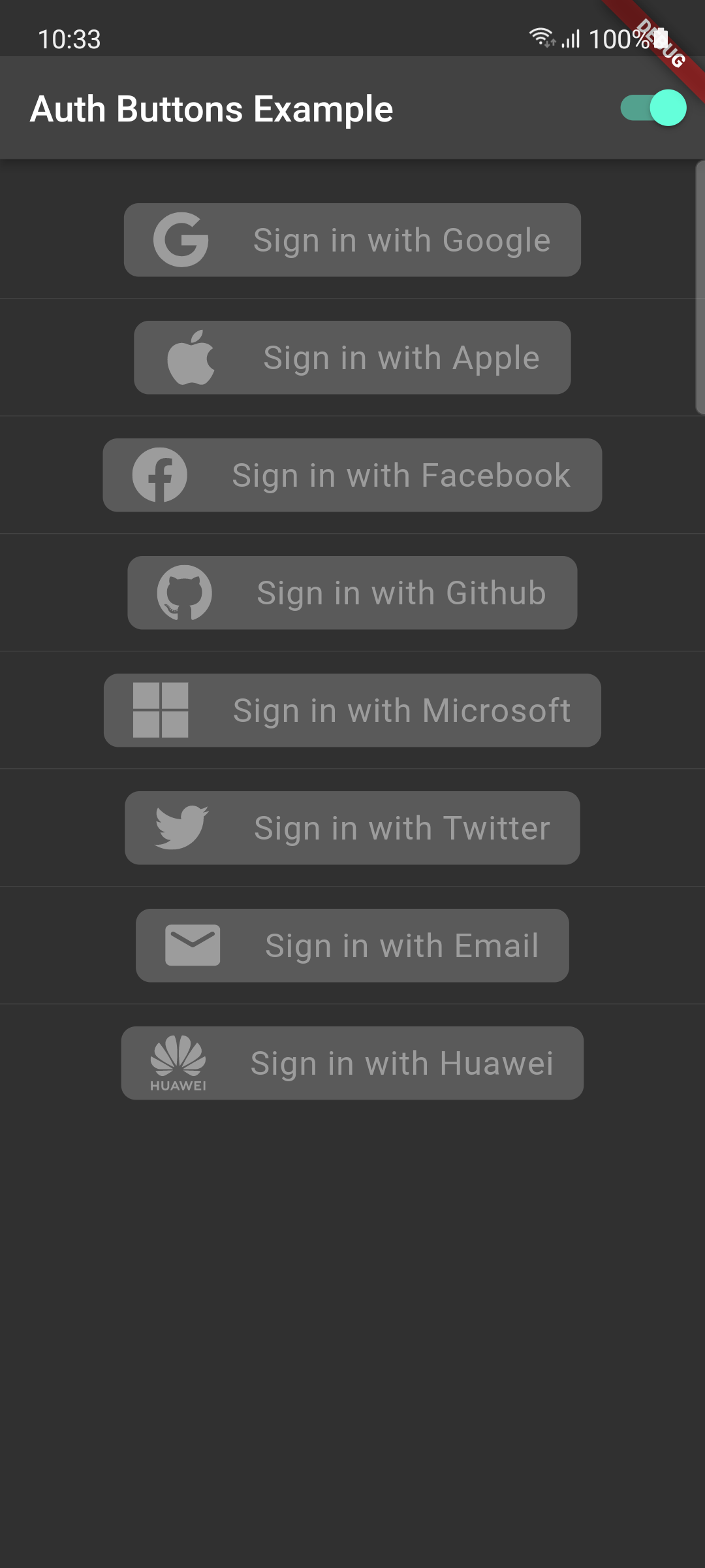
Auth Buttons is a flutter widget library, include buttons for authenticating with the most popular
social networks like: Google, Facebook, Apple and too other.
## Installation
1) Add this to your packages pubspec.yaml file:
```yaml
dependencies:
auth_buttons: <^last>
```
2) Install it
You can install it from the command line:
```bash
$ flutter pub get
```
3) Import it
Now in Dart code, you can use:
```dart
import 'package:auth_buttons/auth_buttons.dart';
```
## Recommendation
We recommend you to using `show` special when you want use some button.
`show` help you importing part of library.
```dart
import 'package:auth_buttons/auth_buttons.dart'
show GoogleAuthButton, AuthButtonStyle, AuthButtonType, AuthIconType;
```
We also recommend you to using the latest version.
## Overview
From the version `3.0.0`
all [AuthButtons](https://github.com/elbeicktalat/flutter_auth_buttons/blob/main/lib/src/shared/base/contracts/auth_button.dart)
are following the system mode.
see [ThemeMode](https://github.com/flutter/flutter/blob/02558d69d92384e7ed1b66f50006796342c8945a/packages/flutter/lib/src/material/app.dart#L41)
for more info.
From the version `3.0.0` you're able to
regroup [AuthButton](https://github.com/elbeicktalat/flutter_auth_buttons/blob/main/lib/src/shared/base/contracts/auth_button.dart)
s for sharing style properties,
to do this use the already existing [AuthButtonGroup](#grouped-buttons).
From the version `2.0.0` disabled state is supported.
1. [Enabled](#enabled-state)
1. [Disabled](#disabled-state)
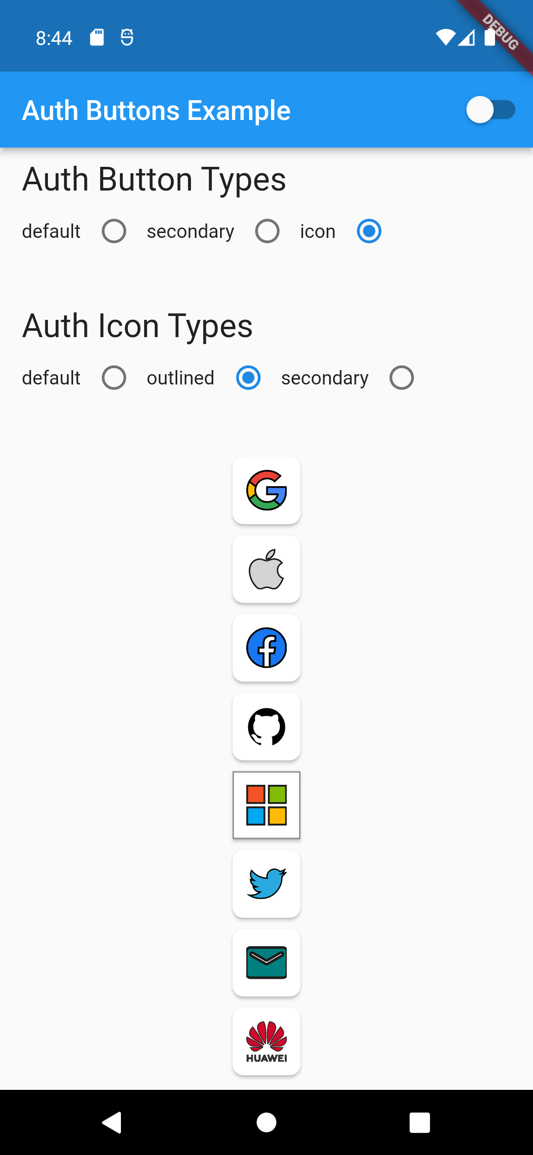
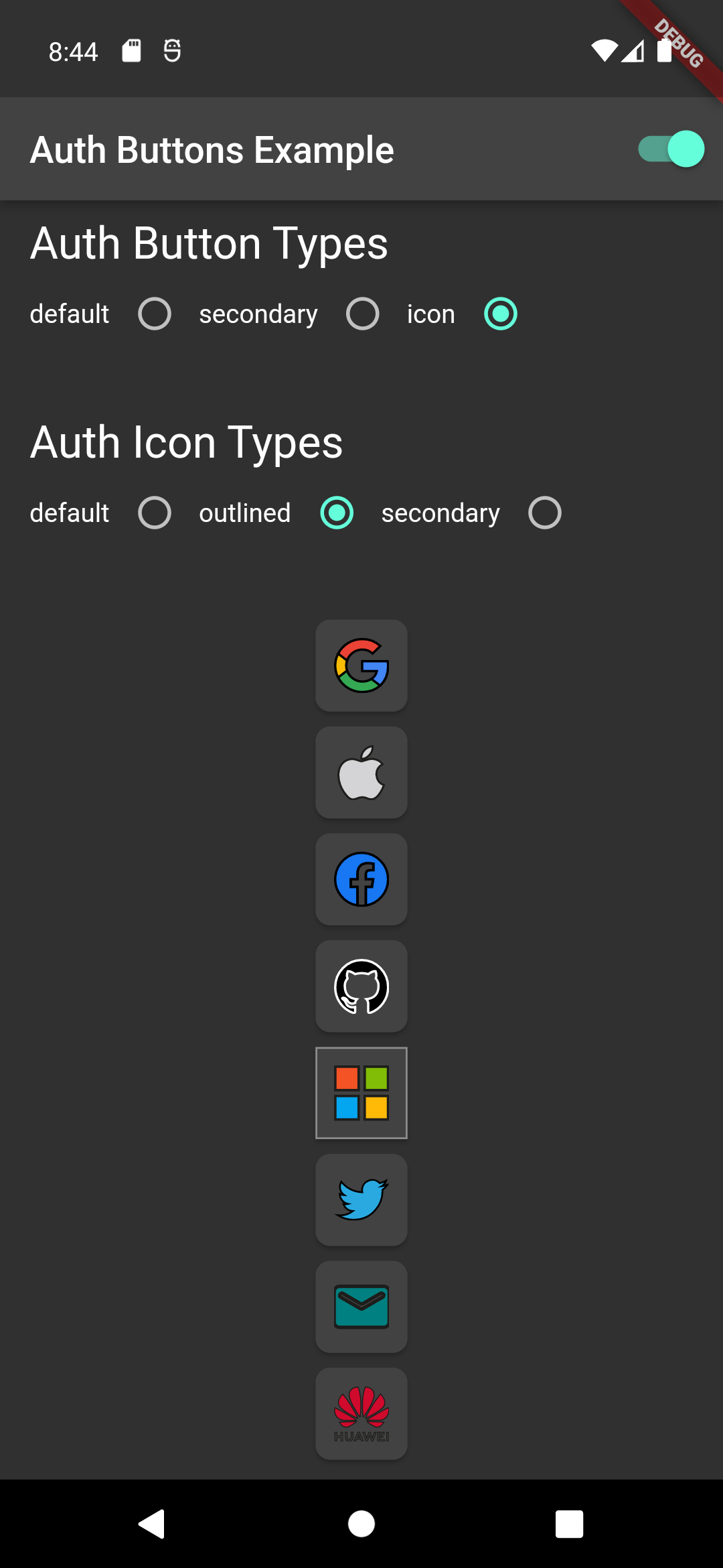
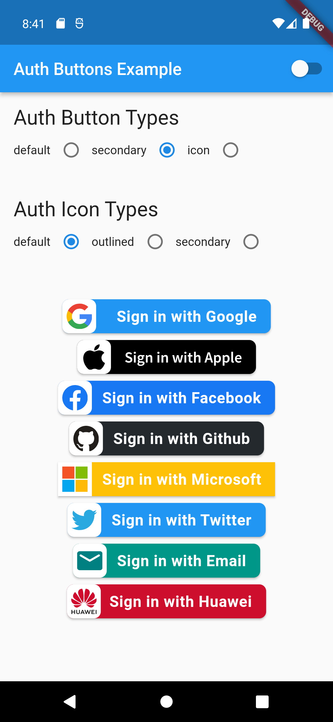
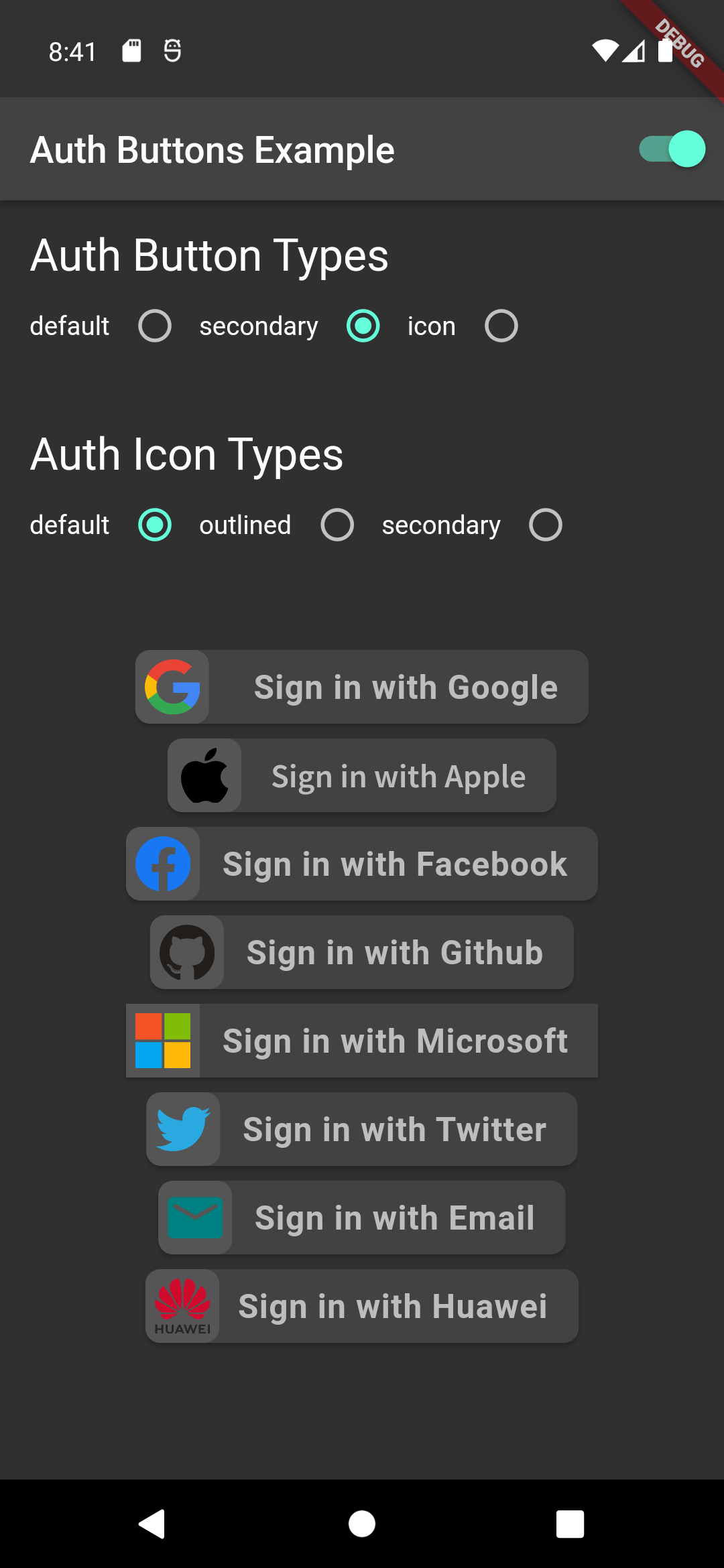
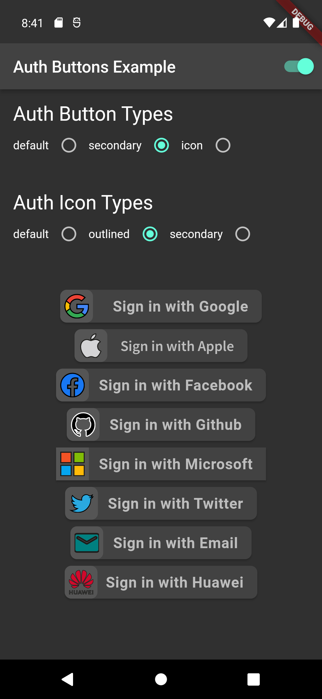
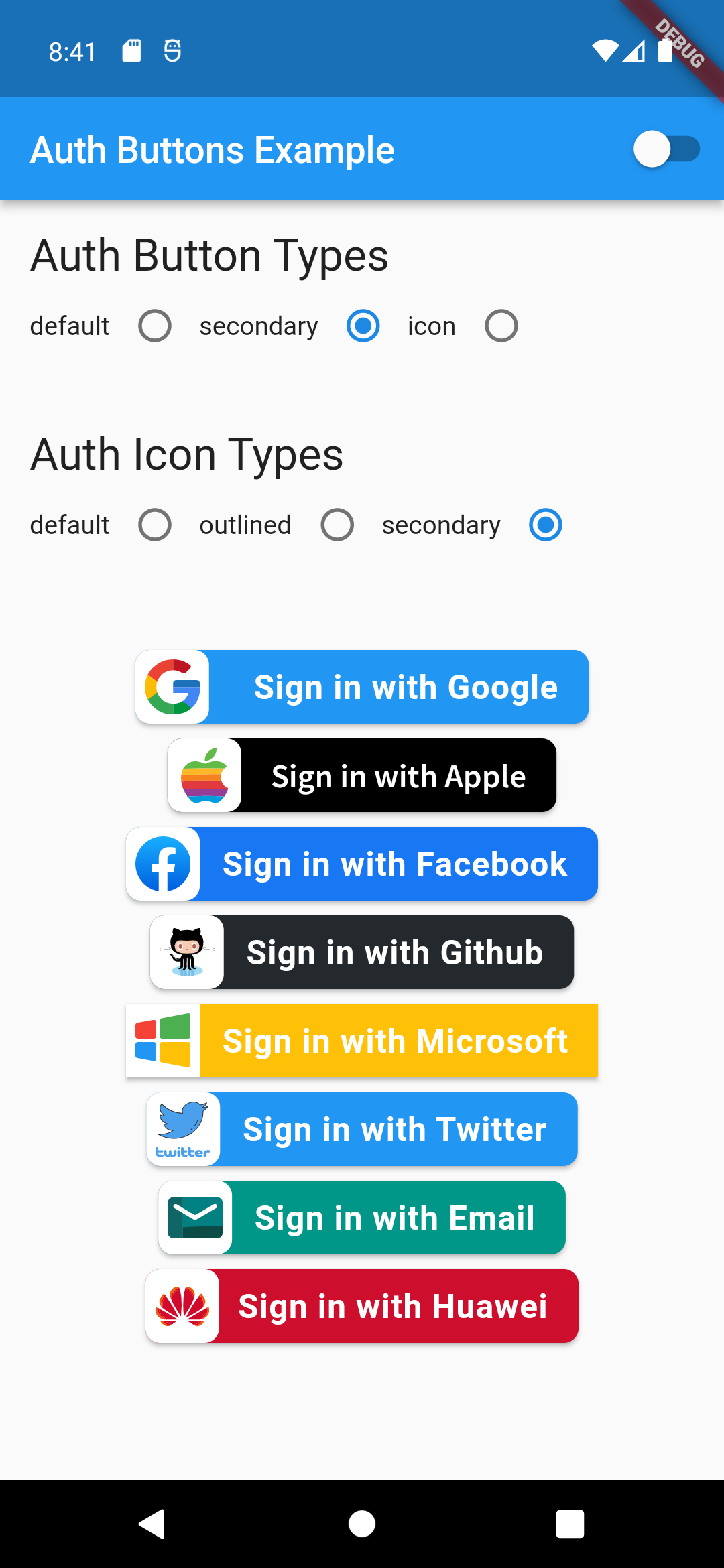
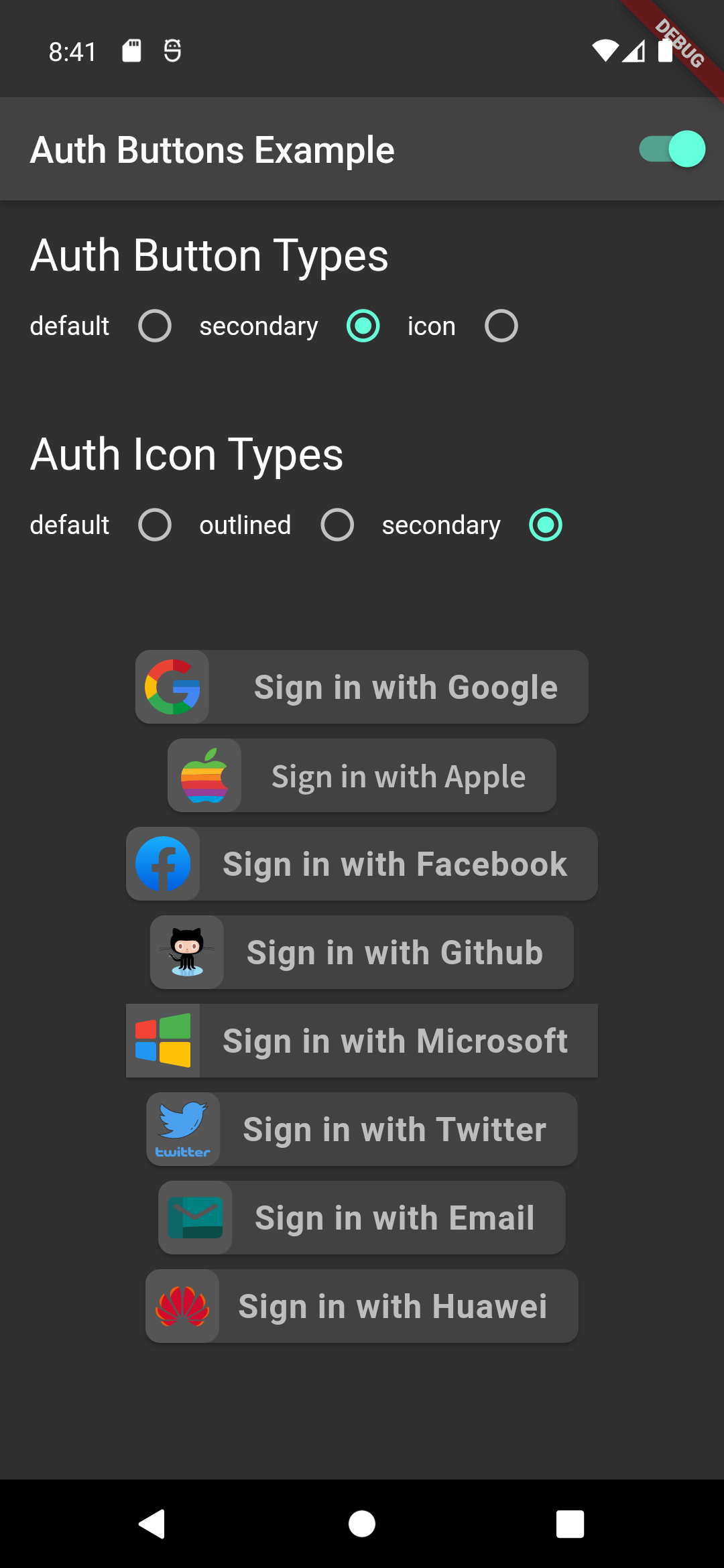
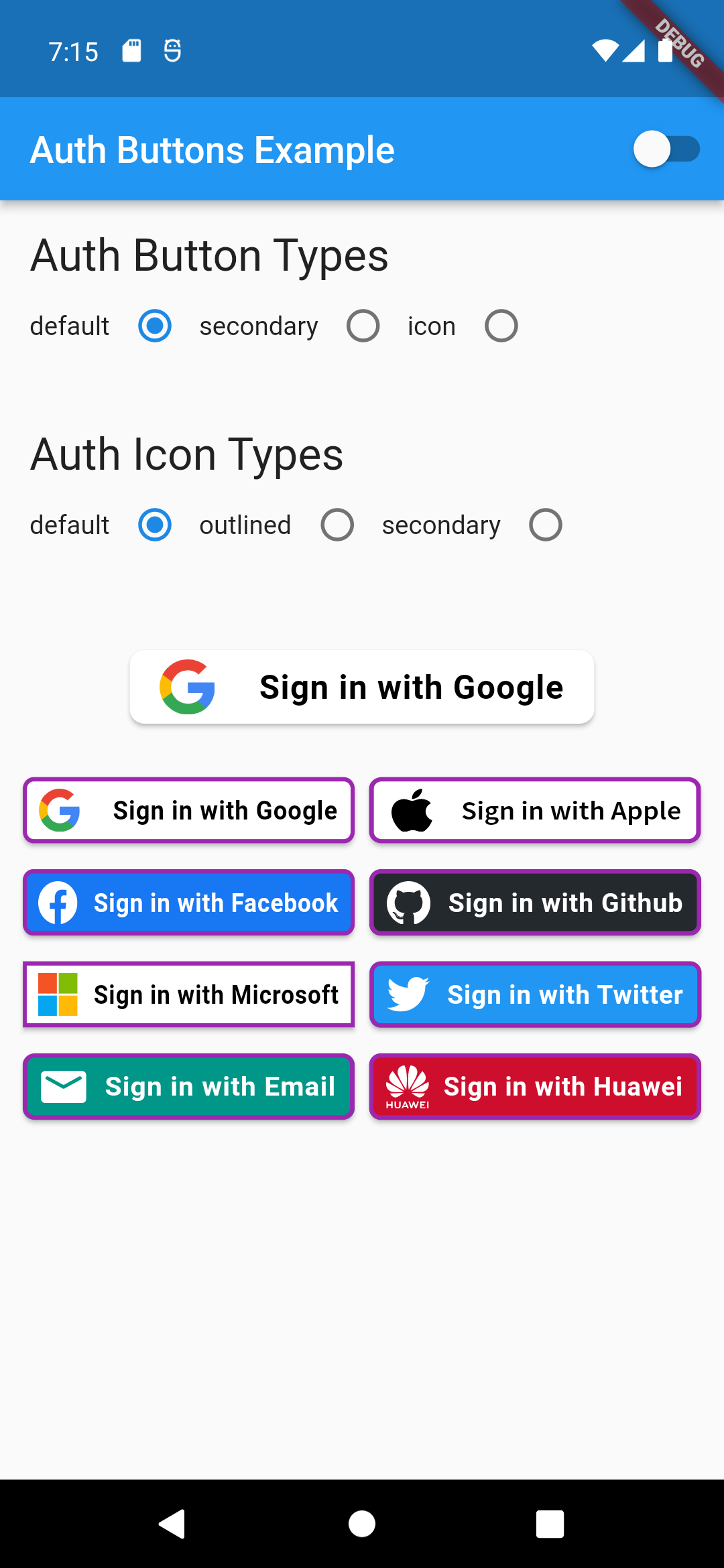
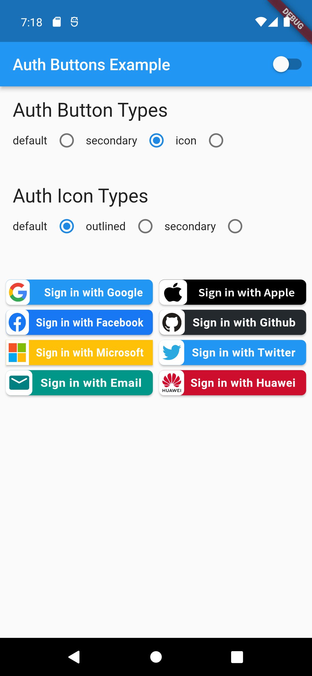
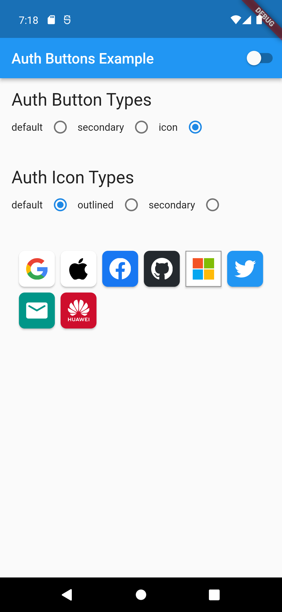
There are three Types you can choose between them:
1. [Default](#default-type)
1. [Icon](#icon-type)
1. [Secondary](#secondary-type)
## Suggestion
If you plain to use a non existing AuthButton like: Linkedin or any others along with the existing
one,
than make your custom one just use `CustomAuthButton` this provide you with a fast way to do so.
## Using
### Enabled State.
You need to use just the following code:
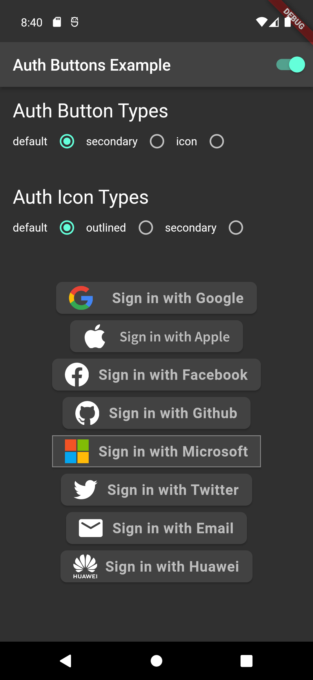
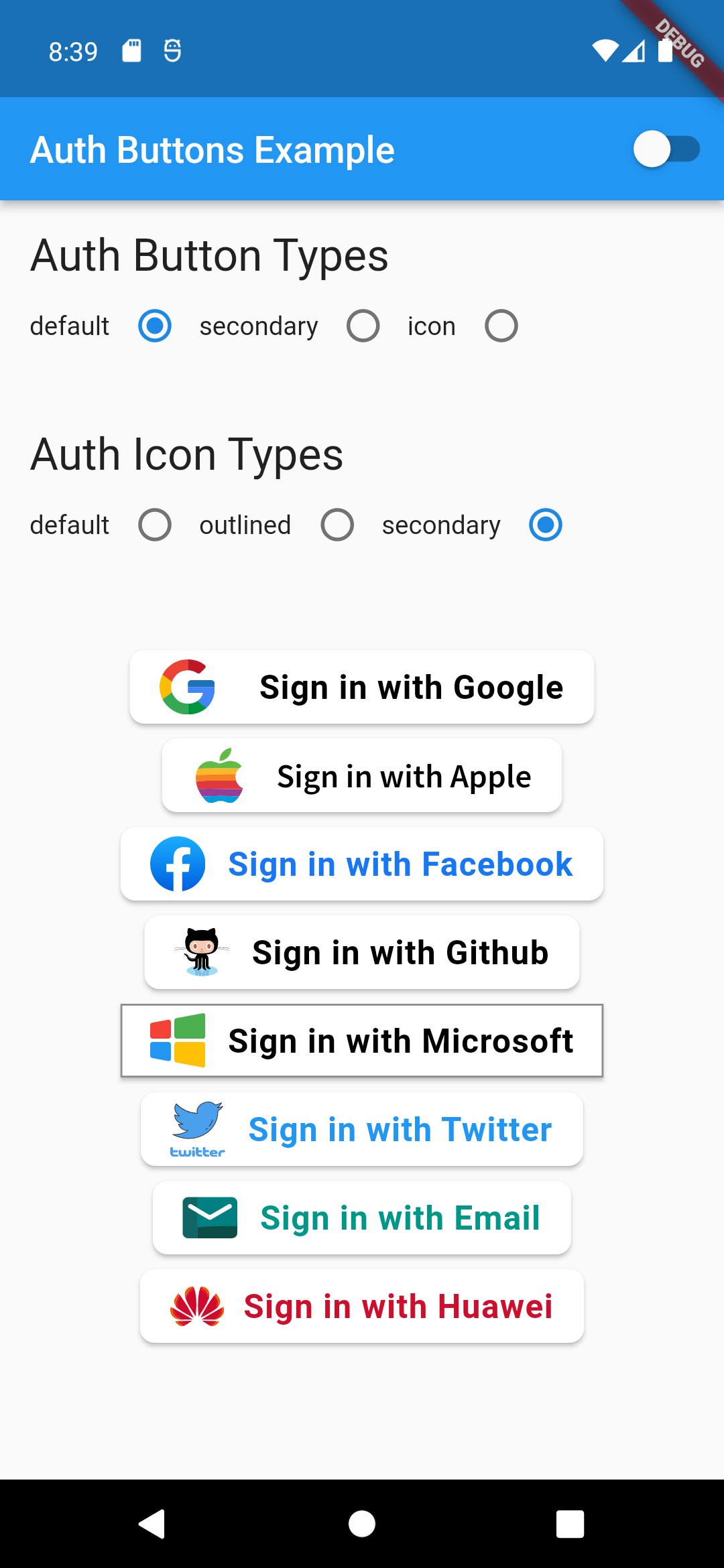
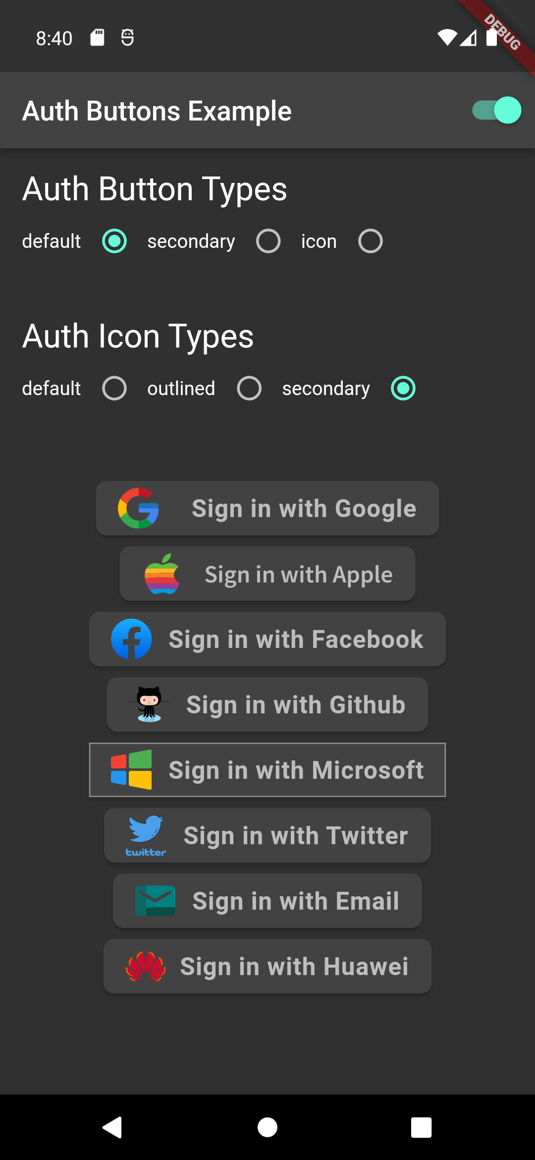
### Default Type
```dart
GoogleAuthButton(
onPressed: () {},
),
```
Light | Dark
:-------------------------:|:-------------------------:
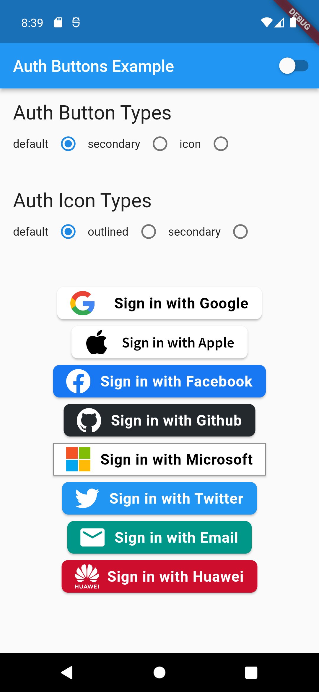 | 
```dart
GoogleAuthButton(
onPressed: () {},
style: AuthButtonStyle(
iconType: AuthIconType.outlined,
),
),
```
Light | Dark
:-------------------------:|:-------------------------:
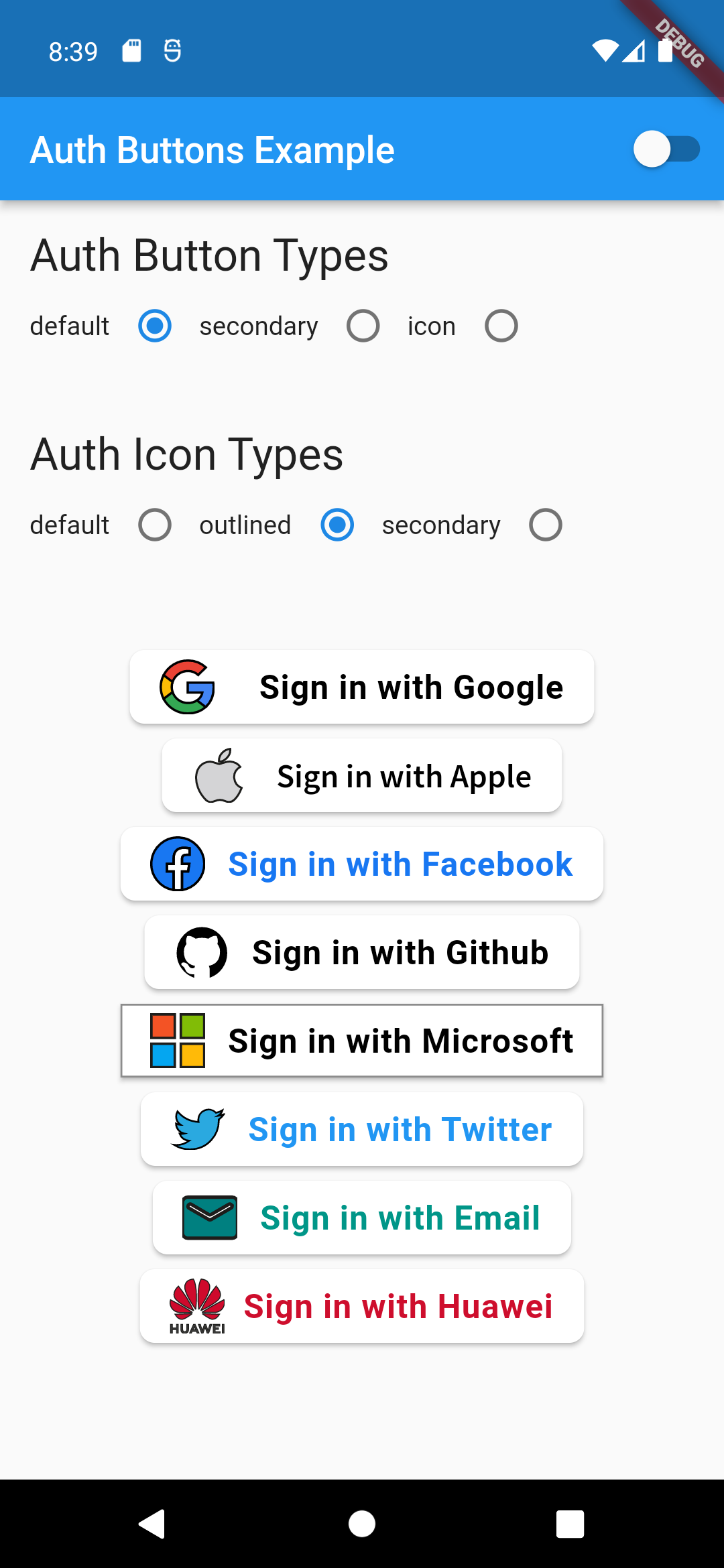 | 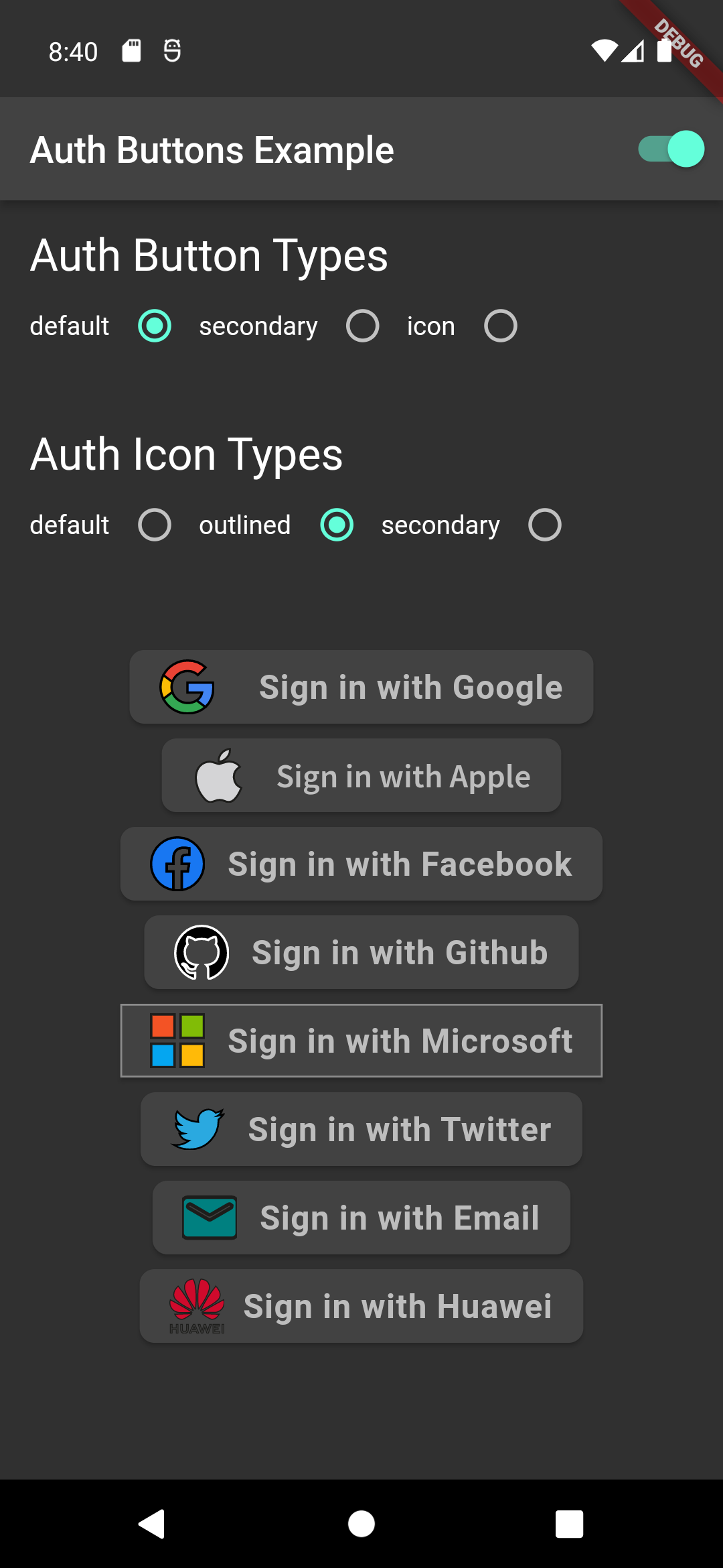
```dart
GoogleAuthButton(
onPressed: () {},
style: AuthButtonStyle(
iconType: AuthIconType.secondary,
),
),
```
Light | Dark
:-------------------------:|:-------------------------:
 | 
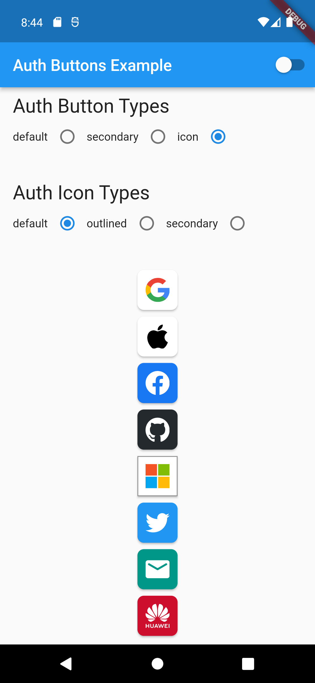
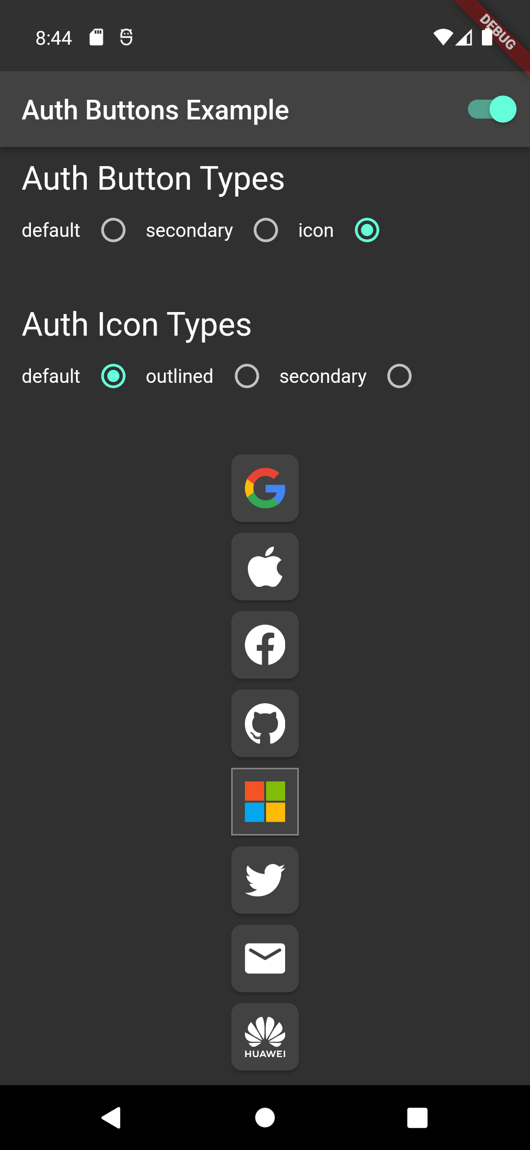
### Icon Type
```dart
GoogleAuthButton(
onPressed: () {},
style: AuthButtonStyle(
buttonType: AuthButtonType.icon,
),
),
```
Light | Dark
:-------------------------:|:-------------------------:
 | 
```dart
GoogleAuthButton(
onPressed: () {},
style: AuthButtonStyle(
buttonType: AuthButtonType.icon,
iconType: AuthIconType.outlined,
),
),
```
Light | Dark
:-------------------------:|:-------------------------:
 | 
```dart
GoogleAuthButton(
onPressed: () {},
style: AuthButtonStyle(
buttonType: AuthButtonType.icon,
iconType: AuthIconType.secondary,
),
),
```
Light | Dark
:-------------------------:|:-------------------------:
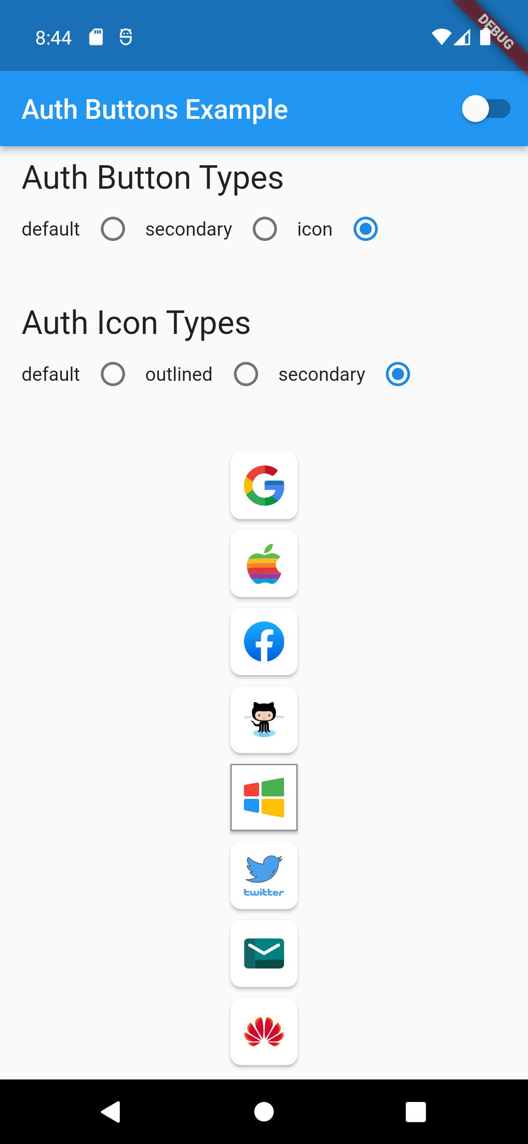 | 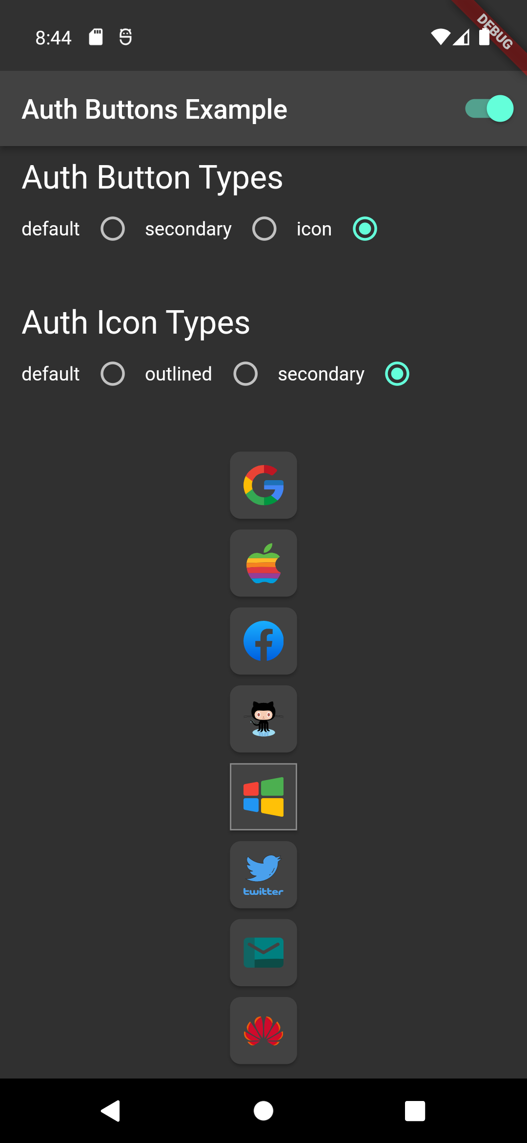
### Secondary Type
```dart
GoogleAuthButton(
onPressed: () {},
style: AuthButtonStyle(
buttonType: AuthButtonType.secondary,
),
),
```
Light | Dark
:-------------------------:|:-------------------------:
 | 
```dart
GoogleAuthButton(
onPressed: () {},
style: AuthButtonStyle(
buttonType: AuthButtonType.secondary,
iconType: AuthIconType.outlined,
),
),
```
Light | Dark
:-------------------------:|:-------------------------:
 | 
```dart
GoogleAuthButton(
onPressed: () {},
style: AuthButtonStyle(
buttonType: AuthButtonType.secondary,
iconType: AuthIconType.secondary,
),
),
```
Light | Dark
:-------------------------:|:-------------------------:
 | 
### Disabled State
Light | Dark
:-------------------------:|:-------------------------:
 | 
Do same think with the other buttons, when you want to customize any button
you can do it just passing a property which you want.
### Grouped buttons
Example
```dart
AuthButtonGroup(
style: const AuthButtonStyle(
width: 180,
height: 50,
borderColor: Colors.purple,
borderWidth: 3.0,
margin: EdgeInsets.only(bottom: 8.0),
),
buttons: [
GoogleAuthButton(),
AppleAuthButton(),
//....
]
),
```
Secondary | Icon
:-----------------------------------------------------------------------------------------------------------------------------------------------------------------------------------------------------:|:-------------------------:
 |
| 
Full property you can pass:
```dart
GoogleAuthButton(
key: const ValueKey(''),
onPressed: () {},
onLongPress: () {},
onHover: (bool value) {},
onFocusChange: (bool value) {},
focusNode: FocusNode(),
autofocus: false,
text: 'Sign in with Google',
isLoading: false,
themeMode: ThemeMode.system,
textDirection: TextDirection.ltr,
materialStyle: ButtonStyle(),
style: AuthButtonStyle(
buttonColor: Colors.blue,
splashColor: Colors.red,
elevation: 2.0,
borderRadius: 99.0,
textStyle: TextStyle(),
padding: const EdgeInsets.all(8.0),
margin: const EdgeInsets.all(8.0),
borderColor: Colors.amber,
borderWidth: 3.0,
buttonType: AuthButtonType.secondary,
width: 300.0,
height: 50.0,
iconSize: 40.0,
separator: 20.0,
iconBackground: Colors.white,
iconType: AuthIconType.outlined,
shadowColor: Colors.pink,
progressIndicatorColor: Colors.blue,
progressIndicatorValueColor: Colors.grey[300],
progressIndicatorStrokeWidth: 2.0,
progressIndicatorValue: 1.0,
iconColor: Colors.purple,
progressIndicatorType: AuthIndicatorType.circular,
visualDensity: VisualDensity.standard,
tapTargetSize: MaterialTapTargetSize.shrinkWrap,
),
```
[return up](#auth_buttons)