https://github.com/elite174/solid-simple-datepicker
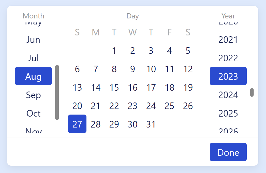
A nice, customizable and simple datepicker component for every day!
https://github.com/elite174/solid-simple-datepicker
component datepicker datepicker-component solidjs
Last synced: 12 months ago
JSON representation
A nice, customizable and simple datepicker component for every day!
- Host: GitHub
- URL: https://github.com/elite174/solid-simple-datepicker
- Owner: elite174
- License: mit
- Created: 2023-04-15T12:30:02.000Z (about 3 years ago)
- Default Branch: master
- Last Pushed: 2023-09-28T10:33:57.000Z (over 2 years ago)
- Last Synced: 2025-04-01T17:49:18.015Z (about 1 year ago)
- Topics: component, datepicker, datepicker-component, solidjs
- Language: TypeScript
- Homepage: https://solid-simple-datepicker.vercel.app
- Size: 227 KB
- Stars: 14
- Watchers: 1
- Forks: 0
- Open Issues: 1
-
Metadata Files:
- Readme: README.md
- Changelog: CHANGELOG.md
- License: LICENSE
Awesome Lists containing this project
README
# solid-simple-datepicker
[](https://www.npmjs.com/package/solid-simple-datepicker)

A nice, customizable and simple datepicker component for every day!
- 💥 0 dependencies
- ⚒️ fully customizable with CSS
- 📚 supports custom translations
## Installation
`npm i solid-simple-datepicker`
`yarn add solid-simple-datepicker`
`pnpm add solid-simple-datepicker`
## Usage
```tsx
import { SimpleDatepicker } from "solid-simple-datepicker";
import "solid-simple-datepicker/styles.css";
...
const [date, setDate] = createSignal();
return ;
```
## Props
```ts
export interface DatePickerProps {
selectedDate?: Date;
/**
* Start year to show in year list
* @default 1960
*/
startYear?: number;
/**
* End year to show in year list
* @default 2060
*/
endYear?: number;
/**
* Days to disable
* @type Number from 1 to 31
*/
disabledDays?: number[];
/**
* Months to disable
* @type Number from 0 to 11
*/
disabledMonths?: number[];
/**
* Years to disable
*/
disabledYears?: number[];
/**
* I18N object
*/
locale?: Locale;
/**
* The order in which datepicker sections should be displayed
* @type "d-m-y" | "d-y-m" | "m-d-y" | "m-y-d" | "y-m-d" | "y-d-m"
* @default "m-d-y"
*/
order?: SectionOrder;
/**
* Extra class applied to the container element
*/
class?: string;
/**
* Extra styles applied to the container element
*/
style?: JSX.StyleHTMLAttributes;
/**
* Tag for the container element
* @default "div"
*/
tag?: string;
/**
* Is footer visible
* @default true
*/
footer?: boolean;
/**
* The number from 0 (Sun) to 6 (Sat)
* @default 0 (Sunday)
*/
startWeekDay?: number;
/**
* The callback is called when the date is valid
* It won't be called when the date is unfilled (e.g. month is not selected)
* or the date is invalid (e.g. Feb 31 2000)
*/
onChange?: (date: Date) => void;
/**
* The callback is called when "Done" button of default footer component is clicked
*/
onFooterDone?: VoidFunction;
/**
* Custom footer component to show
*/
FooterComponent?: ParentComponent;
}
```
## Customization
You can easily customize the view of the Datepicker with CSS custom variables! Just pass extra class to the component with redefined CSS variables.
You can set the following variables (check styles.css):
```css
--sd-scrollbar-size: 6px;
--sd-scrollbar-border-radius: 8px;
--sd-button-border-radius: 4px;
--sd-button-height: 2rem;
--sd-button-width: 4rem;
--sd-button-inline-padding: 0.5rem;
--sd-button-focus-outline: 1px solid var(--sd-primary-color);
--sd-scrollbar-color: #888;
--sd-background-color: white;
--sd-text-color: #172454;
--sd-primary-color: #1e4cd7;
--sd-primary-hover-color: #1f3eae;
--sd-primary-focus-color: #94c4fc;
--sd-text-primary-color: white;
--sd-text-disabled-color: #aaa;
--sd-button-disabled-color: #e3e3e3;
--sd-list-caption-color: #999;
--sd-footer-border-color: #eee;
--sd-transition-time: 50ms;
--sd-transition-timing-function: ease-in-out;
--sd-section-gap: 1rem;
--sd-list-caption-gap: 0.25rem;
--sd-list-caption-font-size: 0.8rem;
--sd-padding: 0.5rem;
--sd-box-shadow: 0px 0.6px 1.8px rgba(0, 0, 0, 0.035), 0px 5px 14px rgba(0, 0, 0, 0.07);
--sd-border-radius: 8px;
--sd-footer-border-top: 1px solid var(--sd-footer-border-color);
```