Ecosyste.ms: Awesome
An open API service indexing awesome lists of open source software.
https://github.com/evanbacon/expo-quick-actions
Add home screen quick actions / shortcuts and custom icons to your Expo app
https://github.com/evanbacon/expo-quick-actions
expo kotlin react-native swift
Last synced: 5 days ago
JSON representation
Add home screen quick actions / shortcuts and custom icons to your Expo app
- Host: GitHub
- URL: https://github.com/evanbacon/expo-quick-actions
- Owner: EvanBacon
- License: mit
- Created: 2022-07-09T09:57:10.000Z (over 2 years ago)
- Default Branch: main
- Last Pushed: 2025-01-11T21:44:31.000Z (about 1 month ago)
- Last Synced: 2025-02-08T00:01:37.839Z (12 days ago)
- Topics: expo, kotlin, react-native, swift
- Language: TypeScript
- Homepage:
- Size: 25.7 MB
- Stars: 405
- Watchers: 6
- Forks: 12
- Open Issues: 10
-
Metadata Files:
- Readme: README.md
- License: LICENSE
Awesome Lists containing this project
README
# expo-quick-actions
> This is not an official Expo SDK package.
A comprehensive React Native library for home screen quick actions.
## Versioning
Ensure you use versions that work together!
| `expo` | `expo-quick-actions` |
| ------ | -------------------- |
| 52.0.0 | +3.0.0 |
| 51.0.0 | 2.0.0 |
| 50.0.0 | 1.0.0 |
| 49.0.0 | 0.0.0 |
## API documentation
```ts
import * as QuickActions from "expo-quick-actions";
```
### `Action`
The `Action` type is an object with the following properties:
- `id: string`: A unique identifier for the action.
- `title: string`: The title of the action.
- `subtitle?: string | null`: The subtitle of the action, iOS-only.
- `icon?: string | null`: Asset reference to use for the icon.
- `params?: Record | null`: Additional serial parameters for the action.
### `initial`
> `Action | null`
A static property that returns the initial quick action item that was used to open the app, if any.
```tsx
const initialAction = QuickActions.initial;
```
### `maxCount`
> `number | null`
A static property that returns the maximum number of quick action items that can be set.
- On iOS, this is hardcoded to 4.
- On Android, this is dynamically collected on start-up.
```tsx
// e.g. 15 on Pixel 6, null on iOS.
const maxCount = QuickActions.maxCount;
```
### `setItems`
> `(items: Action[]) => Promise`
An async function that sets the quick action items for the app. Both Apple and Android recommend a max of 4 items.
```ts
QuickActions.setItems([
{
id: "0",
title: "Open Settings",
subtitle: "Go here to configure settings",
icon: "heart",
params: { href: "/settings" },
},
]);
```
### `isSupported`
> `() => Promise`
An async function that returns whether the device supports home screen quick actions.
```ts
const isSupported = await QuickActions.isSupportedAsync();
```
### `addListener`
> `(listener: (payload: Action) => void) => Subscription`
Adds a listener that will fire when a quick action is triggered.
```ts
const subscription = QuickActions.addListener((action) => {
console.log(action);
});
```
## Icons
> Read the [Android design docs for shortcut icons](https://commondatastorage.googleapis.com/androiddevelopers/shareables/design/app-shortcuts-design-guidelines.pdf).
On iOS, there are three types of images you may want to use: default icons, SF Symbols, and custom template images. The `icon` property supports magic prefixes to access all the built-in icons:
### SF Symbols
> `UIApplicationShortcutIcon(systemImageName:)` -- Create an icon using a system image. You can use any of the names here that are usable with -systemImageNamed:.
Icons prefixed with `symbol:` are passed to `UIApplicationShortcutIcon(systemImageName:)`, e.g. `symbol:heart.fill` will use `UIApplicationShortcutIcon(systemImageName: "heart.fill")` which renders the SF Symbols icon named `heart.fill`. Learn more about [Apple SF Symbols](https://developer.apple.com/design/human-interface-guidelines/sf-symbols/overview/). Note: SF Symbols are only available on iOS as Apple copyright restricts using them on other platforms.
### System Icons
> `UIApplicationShortcutIcon(type:)` -- Create an icon using a system-defined image.
Icons matching one of the following will use a built-in icon: "compose", "play", "pause", "add", "location", "search", "share", "prohibit", "contact", "home", "markLocation", "favorite", "love", "cloud", "invitation", "confirmation", "mail", "message", "date", "time", "capturePhoto", "captureVideo", "task", "taskCompleted", "alarm", "bookmark", "shuffle", "audio", "update".
If no built-in icon is found, the icon will default to using a custom image with the same name, e.g. `heart` will use `UIApplicationShortcutIcon(templateImageName: "heart")`.
### Custom Images
Create an icon using a system-defined image.
> `UIApplicationShortcutIcon(templateImageName:)` -- Create an icon from a custom image. The provided image named will be loaded from the app's bundle and will be masked to conform to the system-defined icon style.
Icons prefixed with `asset:` are passed to `UIApplicationShortcutIcon(templateImageName:)`, e.g. `asset:heart` will use `UIApplicationShortcutIcon(templateImageName: "heart")` which will load the image named `heart` from the app's bundle and mask it to conform to the system-defined icon style.
## Hooks
Convenience hooks are exposed with the nested import `expo-quick-actions/hooks`.
```ts
import {
useQuickActionCallback,
useQuickAction,
} from "expo-quick-actions/hooks";
```
### useQuickActionCallback
> `(callback: (action: Action) => void) => void`
A hook that registers a callback that will fire when a quick action is triggered. This is useful for global updates like navigating or analytics.
```tsx
import { useQuickActionCallback } from "expo-quick-actions/hooks";
function Route() {
useQuickActionCallback((action) => {
// Do something with the action without explicitly re-rendering the component. This is useful for global updates like navigating or analytics.
console.log(">", action);
});
}
```
### useQuickAction
> `() => Action | null`
A hook that returns the current quick action. This is useful for updating the UI.
```tsx
import { useQuickAction } from "expo-quick-actions/hooks";
function Route() {
// Re-renders the component when the action changes. This is useful for updating the UI.
const action = useQuickAction();
}
```
## Expo Router
The philosophy in Expo Router is to treat opening the app from the home screen as linking to "/" (index route). In the future, I'd like to account for launching from native APIs like Share Sheet invocations, Siri, Quick Actions, Notifications, etc and linking to a well-known URL convention. This isn't the case today, but I did design around it.
Pass `params: { href: "..." }` and use a hook in the Layout Route to handle the invocation.
For example, using the hooks above:
```tsx
// app/(root)/_layout.tsx
import { useEffect } from "react";
import { Slot } from "expo-router";
import { useQuickActionRouting, RouterAction } from "expo-quick-actions/router";
import * as QuickActions from "expo-quick-actions";
export default function Layout() {
// Enable linking to the `href` param when a quick action is used.
useQuickActionRouting();
useEffect(() => {
// Now you can configure your quick actions to link places (including externally):
QuickActions.setItems([
{
title: "New Chat",
icon: "compose",
id: "0",
params: { href: "/compose" },
},
{
title: "Search",
icon: "search",
id: "1",
params: { href: "/search" },
},
{
title: "Leave Feedback",
subtitle: "Please provide feedback before deleting the app",
icon: "symbol:envelope",
id: "2",
params: { href: "mailto:[email protected]" },
},
]);
}, []);
return ;
}
```
This can be used with Typed Routes to ensure the `params.href` can only be linked to a valid route within your project.
## Config Plugin
There's an optional config plugin that you can use to add images and static iOS actions. Static Android actions are not currently supported because they don't support complex intent.
- `androidIcons`: An object of Android icons. The key is the `icon` property of the action. The value can be a string or an object with `foregroundImage` and `backgroundColor` properties. This generates very similar to `android.adaptiveIcon` as the underlying API is very similar. For simple icons, you can use a string value.
- `iosIcons`: An object of iOS icons. The key is the `icon` property of the action. The value can be a string or an object with `1x`, `2x`, and `3x` properties.
- `iosActions`: An array of iOS actions. These are static actions that will be available unless you clear them with the dynamic API. The `icon` property resolves the same as in the dynamic API, using `symbol:` and `asset:` prefixes.
**app.json**
```json
{
"plugins": [
[
"expo-quick-actions",
{
"androidIcons": {
"shortcut_one": {
"foregroundImage": "./assets/adaptive-icon.png",
"backgroundColor": "#282A35"
},
"shortcut_two": {
"foregroundImage": "./assets/adaptive-star.png",
"backgroundColor": "#ff0000"
},
"shortcut_three": "https://evanbacon.dev/pfp.png"
},
"iosIcons": {
"shortcut_one": "./assets/adaptive-icon.png",
"shortcut_two": {
"1x": "./assets/adaptive-icon.png"
}
},
"iosActions": [
{
"id": "1",
"title": "Shortcut One",
"subtitle": "Subtitle One",
"icon": "shortcut_one",
"params": {
"href": "https://evanbacon.dev"
}
}
]
}
]
]
}
```
## iOS Best Practice
### Use 4 Actions
Apple recommends using all four spots, utility-based apps like calculators will use less. If you can't think of four spots, then just make the actions deep link to a specific screen in your app.

### Avoid branded icons
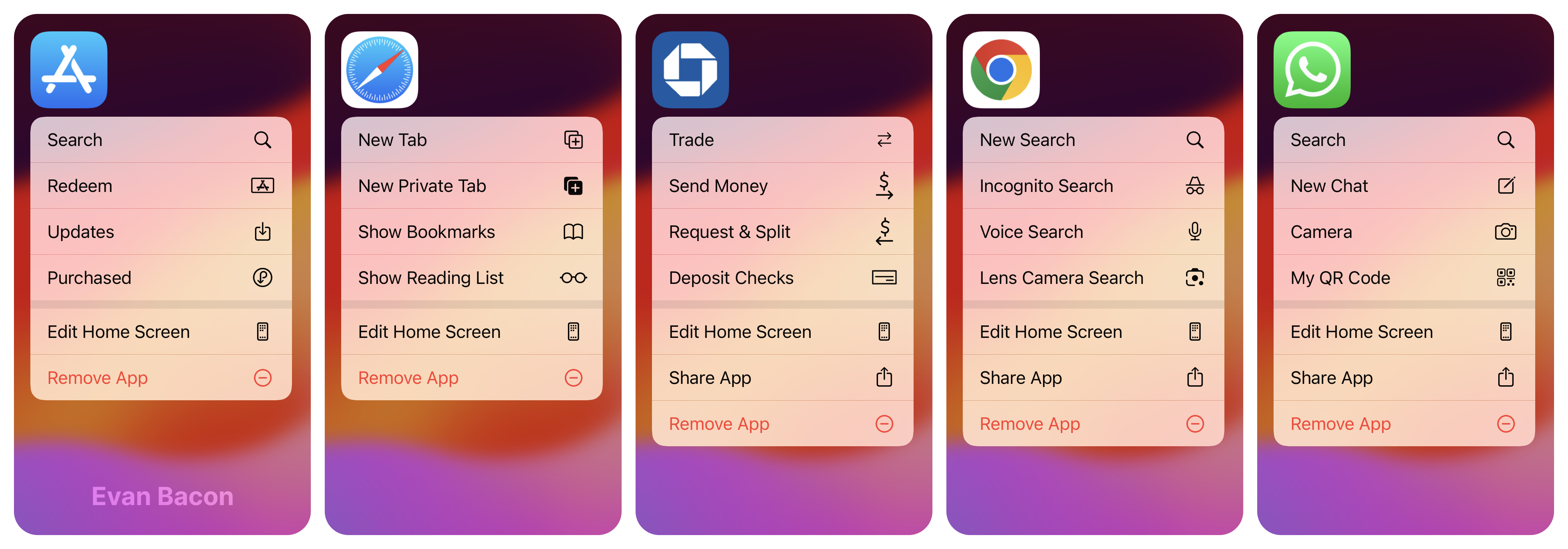
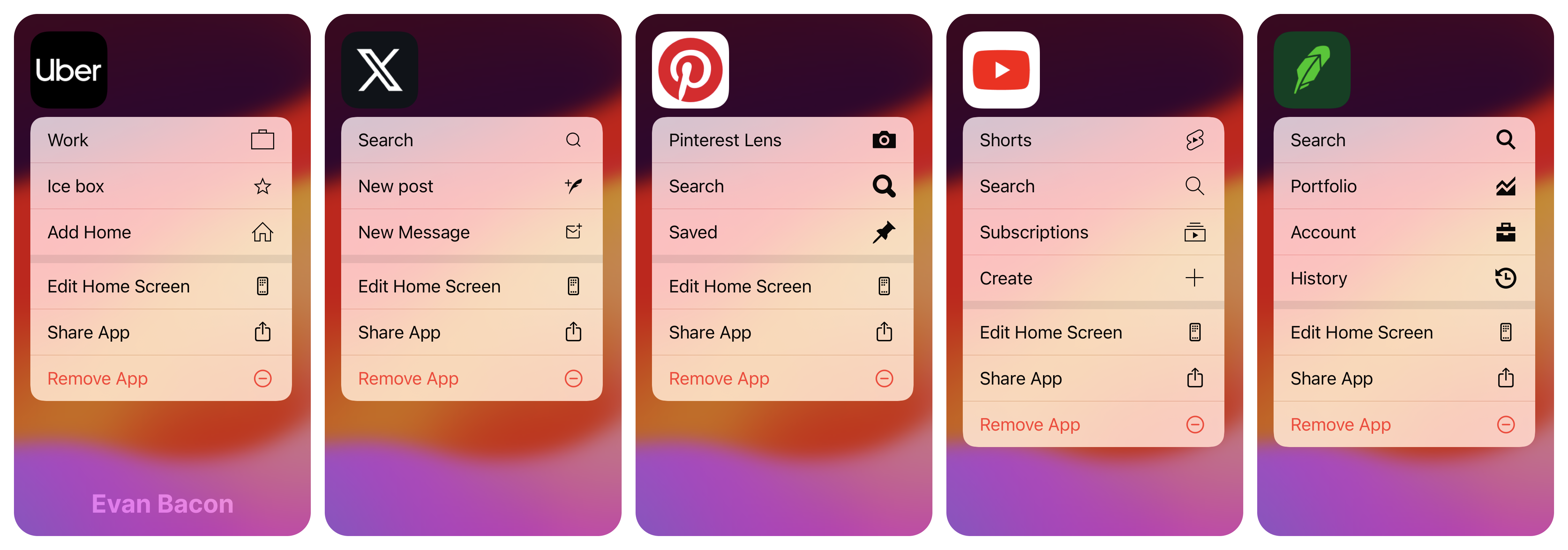
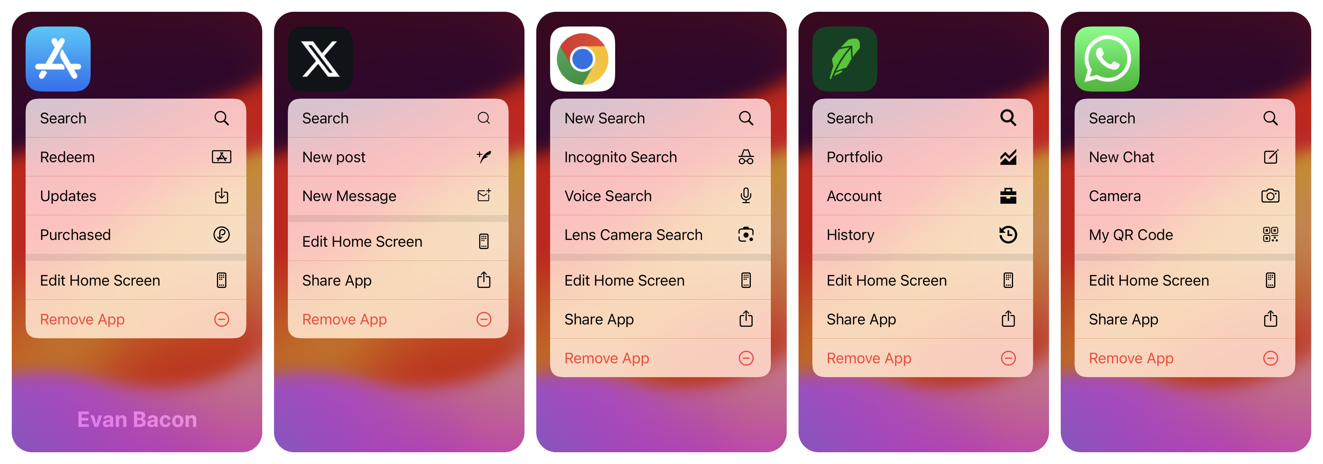
**Use SF Symbols**. While you can have custom icons on iOS (and I made it really easy via the Expo Config Plugin), opt towards using SF Symbols instead. This is because Apple injects their own actions ("Edit Home Screen", "Share App", "Remove App") and the icons will look out of place next to them––see the example below. If you absolute must use branded icons, then try to match the stroke-weight of the default icons.
If you want to use a custom icon, prefer outline icons to filled icons on iOS.

### Search action
iOS apps often **have a "Search" shortcut** that opens the app and focuses the search bar. This is a good default shortcut to have. Make it the last item in the list. E.g. Whatsapp, Twitter, Apple Mail, Amazon, Slack.

Here's the object you can use to add a basic "Search" action:
```js
{
"id": "search",
"title": "Search",
// Built-in icon for search
"icon": "search",
// SF Symbol equivalent
// "icon": "symbol:magnifyingglass",
"params": {
// Optional deep link to a search page (must be handled manually with something like Expo Router).
"href": "/search"
}
}
```
## Android Best Practice
**Use 4 actions** Android sometimes supports more, but I read somewhere in the Google docs that 4 is recommended.
### Use Adaptive Icons
Android shortcuts can be saved to the screen, iOS shortcuts cannot. This means that Android shortcuts should be thought of as alternative entry points to your app. The icon and name should reflect that. Because of this, I've made the Expo Config Plugin capable of generating full responsive app icons (as well as simple icons).
For example, if we want a "Compose" action like the one found in Gmail, that can be implemented as follows:
First, we'll add the icon and background color in the `app.json`:
```json
{
"plugins": [
[
"expo-quick-actions",
{
"androidIcons": {
"shortcut_compose": {
"foregroundImage": "./assets/adaptive-compose.png",
"backgroundColor": "#C84031"
}
}
}
]
]
}
```
Second, we'll add an image to our project at `./assets/adaptive-compose.png`. This will be the Material design "create" icon with about 30% padding on all sides.
Now if we run `npx expo prebuild -p android`, rebuild `npx expo run:android`, we can use the icon from source:
```js
// Add the compose action
QuickActions.setItems([
{
id: "compose",
icon: "shortcut_compose",
title: "Compose",
},
]);
```
You can see the results below, it even has the signature "wiggle" when you move the icon around.
https://github.com/EvanBacon/expo-quick-actions/assets/9664363/b3fe7608-1700-4247-8687-0c9dc7c6025e
## Troubleshooting
### The icon is a small circle on iOS
This can happen if the `icon` property is invalid. See how icons are resolved to learn more. If you're using a custom asset then you need to ensure all three scales are added to the asset catalog (default if only a string is passed in the Config Plugin).
---
# App Icon

This package experimentally has support for switching the app icon to align with how quick actions work on Android.
```ts
import * as AppIcon from "expo-quick-actions/icon";
```
- `AppIcon.isSupported` a boolean that indicates whether the device supports changing the app icon.
- `AppIcon.getIcon()` returns a Promise that resolves to the current icon name. This is undefined when the function is not supported in the given runtime (Expo Go, web)
- `AppIcon.setIcon(iconName)` set the app icon to the given name. This is undefined when the function is not supported in the given runtime (Expo Go, web)
> On Android, changing the icon will close the app.
## App Icon Config Plugin
You can add icons to change using the config plugin:
```json
{
"plugins": [
"expo-quick-actions/icon/plugin",
["./path/to/image.png", "https://example.com/image.png"]
]
}
```
These icons will be available as `"0"` and `"1"` respectively. Alternatively, you can specify the icon name by passing an object:
```json
{
"plugins": [
"expo-quick-actions/icon/plugin",
{
"myIcon": "./path/to/image.png"
}
]
}
```
This will be available as `"myIcon"`.
This config plugin supports dark mode icons on iOS by using the same config syntax as Expo config:
```json
{
"plugins": [
"expo-quick-actions/icon/plugin",
[
{
"light": "./path/to/light.png",
"dark": "./path/to/dark.png",
"tinted": "./path/to/tinted.png"
}
]
]
}
```