https://github.com/evrendev/interactive-rating-component
Frontend Mentor | Interactive rating component
https://github.com/evrendev/interactive-rating-component
animation-css css flexbox frontend-mentor scss vue
Last synced: 2 months ago
JSON representation
Frontend Mentor | Interactive rating component
- Host: GitHub
- URL: https://github.com/evrendev/interactive-rating-component
- Owner: evrendev
- Created: 2023-01-09T16:58:20.000Z (over 3 years ago)
- Default Branch: main
- Last Pushed: 2023-01-10T07:51:25.000Z (over 3 years ago)
- Last Synced: 2025-03-20T10:51:55.078Z (about 1 year ago)
- Topics: animation-css, css, flexbox, frontend-mentor, scss, vue
- Language: SCSS
- Homepage: https://evrendev.github.io/interactive-rating-component/
- Size: 281 KB
- Stars: 0
- Watchers: 1
- Forks: 0
- Open Issues: 0
-
Metadata Files:
- Readme: README.md
Awesome Lists containing this project
README
# Frontend Mentor - Interactive rating component solution
This is a solution to the [Interactive rating component challenge on Frontend Mentor](https://www.frontendmentor.io/challenges/interactive-rating-component-koxpeBUmI). Frontend Mentor challenges help you improve your coding skills by building realistic projects.
## Table of contents
- [Overview](#overview)
- [The challenge](#the-challenge)
- [Screenshot](#screenshot)
- [Links](#links)
- [Project Setup](#setup)
- [My process](#my-process)
- [Built with](#built-with)
- [What I learned](#what-i-learned)
- [Continued development](#continued-development)
- [Useful resources](#useful-resources)
- [Author](#author)
## Overview
### The challenge
Users should be able to:
- View the optimal layout for the site depending on their device's screen size
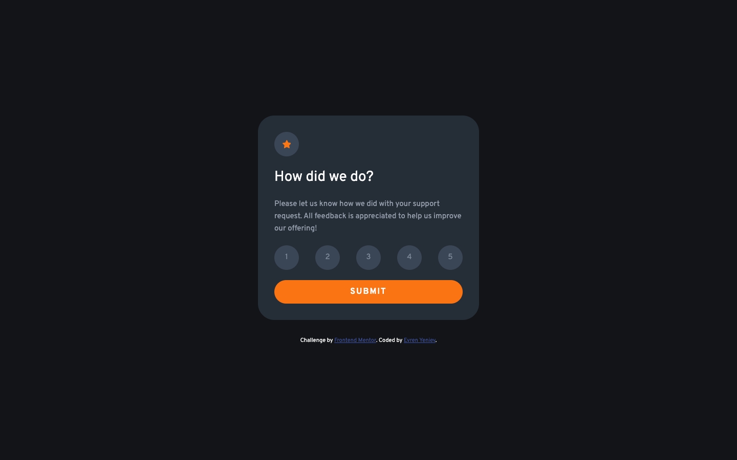
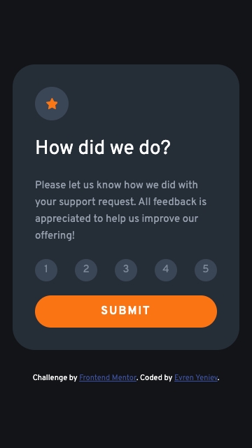
### Screenshot
### Links
- Solution URL: [@github](https://github.com/evrendev/interactive-rating-component)
- Live Site URL: [@github pages](https://evrendev.github.io/interactive-rating-component/)
### Setup
## Recommended IDE Setup
[VSCode](https://code.visualstudio.com/) + [Volar](https://marketplace.visualstudio.com/items?itemName=johnsoncodehk.volar) (and disable Vetur) + [TypeScript Vue Plugin (Volar)](https://marketplace.visualstudio.com/items?itemName=johnsoncodehk.vscode-typescript-vue-plugin).
## Customize configuration
See [Vite Configuration Reference](https://vitejs.dev/config/).
## Project Setup
```sh
npm install
```
### Compile and Hot-Reload for Development
```sh
npm run dev
```
### Compile and Minify for Production
```sh
npm run build
```
### Lint with [ESLint](https://eslint.org/)
```sh
npm run lint
```
## My process
I started by reviewing the design specification. I then started markup knowing that the mobile and desktop layouts would use the same cards, with different page layouts. From there, I stated the styling with mobile-first workflow and then created two media queries to handle the transition from the mobile to the desktop layouts.
### Built with
- Vue3 with Vite
- Semantic HTML5 markup
- Mobile-first workflow
- SCSS preprocessing
- CSS custom properties
- Flexbox
### What I learned
This project was an excellent excercise in CSS grid and I learned how CSS grid made the layout of the individual card and the page significantly easier than traditional CSS. I learned how to use minmax, auto, and 1fr to make the page flow from mobile-first to the desktop.
### Continued development
I am looking forward to the next project to build on the CSS grid experience and to add JavaScript for an additional challenge.
### Useful resources
- [Kevin Powell](https://www.kevinpowell.co/) - Kevin Powell is an excellent teacher and I relied heavily on the notes that I took from his CSS courses taught on scrimba.com.
- [A Complete Guide to Flexbox ](https://css-tricks.com/snippets/css/a-guide-to-flexbox//) - I have found css.tricks.com to be a valuable resourse for flexbox, and all things CSS.
## Author
- Frontend Mentor - [@evrendev](https://www.frontendmentor.io/profile/evrendev)
- Github - [@evrendev](https://github.com/evrendev)
- Twitter - [@evrendev](https://www.twitter.com/evrendev)