https://github.com/exyte/popupview
Toasts and popups library written with SwiftUI
https://github.com/exyte/popupview
popup swiftui swiftui-components swiftui-framework toast
Last synced: about 1 year ago
JSON representation
Toasts and popups library written with SwiftUI
- Host: GitHub
- URL: https://github.com/exyte/popupview
- Owner: exyte
- License: mit
- Created: 2020-04-23T09:43:26.000Z (about 6 years ago)
- Default Branch: master
- Last Pushed: 2025-04-11T14:44:27.000Z (about 1 year ago)
- Last Synced: 2025-04-25T14:50:49.193Z (about 1 year ago)
- Topics: popup, swiftui, swiftui-components, swiftui-framework, toast
- Language: Swift
- Homepage:
- Size: 21.4 MB
- Stars: 3,741
- Watchers: 24
- Forks: 280
- Open Issues: 6
-
Metadata Files:
- Readme: README.md
- License: LICENSE
Awesome Lists containing this project
README


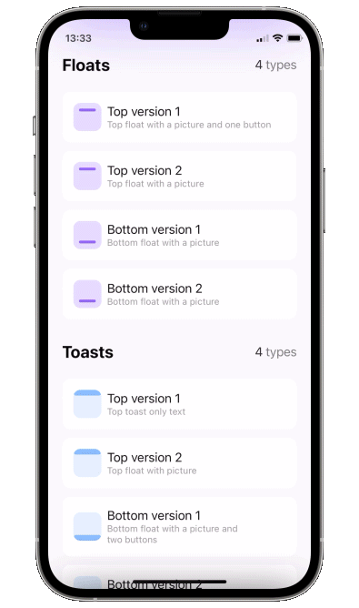
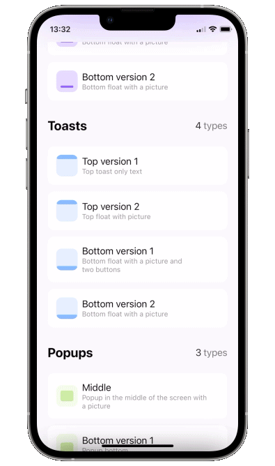
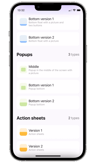
Floaters
Toasts
Popups
Sheets

Popup View
Toasts, alerts and popups library written with SwiftUI

[](https://swiftpackageindex.com/exyte/PopupView)
[](https://swiftpackageindex.com/exyte/PopupView)
[](https://swiftpackageindex.com/exyte/PopupView)
[](https://cocoapods.org/pods/ExytePopupView)
[](https://opensource.org/licenses/MIT)
# What's new in version 4
You can show multiple popups on top of anything, and they can also let the taps pass through to lower views.
There are 3 ways to display a popup: as a simple overlay, using SwiftUI's fullscreenSheet, and using UIKit's UIWindow. There are pros and cons for all of these, here is a table.
Overlay
Sheet
Window
Show on top of navbar
❌
✅
✅
Show on top of sheet
❌
❌
✅
Show multiple popups
✅
❌
✅
Taps "pass through" the transparent bg
✅
❌
✅
SwiftUI @State update mechanism works as expected
✅
✅
❌
Basically UIWindow based popup is the best option for most situations, just remember - to get adequate UI updates, use ObservableObjects or @Bindings instead of @State. This won't work:
```swift
struct ContentView : View {
@State var showPopup = false
@State var a = false
var body: some View {
Button("Button") {
showPopup.toggle()
}
.popup(isPresented: $showPopup) {
VStack {
Button("Switch a") {
a.toggle()
}
a ? Text("on").foregroundStyle(.green) : Text("off").foregroundStyle(.red)
}
} customize: {
$0
.type(.floater())
.closeOnTap(false)
.position(.top)
}
}
}
```
This will work:
```swift
struct ContentView : View {
@State var showPopup = false
@State var a = false
var body: some View {
Button("Button") {
showPopup.toggle()
}
.popup(isPresented: $showPopup) {
PopupContent(a: $a)
} customize: {
$0
.type(.floater())
.closeOnTap(false)
.position(.top)
}
}
}
struct PopupContent: View {
@Binding var a: Bool
var body: some View {
VStack {
Button("Switch a") {
a.toggle()
}
a ? Text("on").foregroundStyle(.green) : Text("off").foregroundStyle(.red)
}
}
}
```
# Update to version 4
New `DisplayMode` enum was introduced instead of `isOpaque`. `isOpaque` is now deprecated.
Instead of:
```swift
.popup(isPresented: $toasts.showingTopSecond) {
ToastTopSecond()
} customize: {
$0
.type(.toast)
.isOpaque(true) // <-- here
}
```
use:
```swift
.popup(isPresented: $floats.showingTopFirst) {
FloatTopFirst()
} customize: {
$0
.type(.floater())
.displayMode(.sheet) // <-- here
}
```
So, new `.displayMode(.sheet)` corresponds to old `.isOpaque(true)`, `.displayMode(.overlay)` corresponds to `.isOpaque(false)`.
Default `DisplayMode` is `.window`.
# What's new in version 3
- zoom in/out appear/disappear animations
- `disappearTo` parameter to specify disappearing animation direction - can be different from `appearFrom`
# Update to version 3
To include new .zoom type, `AppearFrom` enum cases were renamed.
Instead of:
```swift
.popup(isPresented: $floats.showingTopFirst) {
FloatTopFirst()
} customize: {
$0
.type(.floater())
.appearFrom(.top) // <-- here
}
```
use:
```swift
.popup(isPresented: $floats.showingTopFirst) {
FloatTopFirst()
} customize: {
$0
.type(.floater())
.appearFrom(.topSlide) // <-- here
}
```
# Update to version 2
Instead of:
```swift
.popup(isPresented: $floats.showingTopFirst, type: .floater(), position: .top, animation: .spring(), closeOnTapOutside: true, backgroundColor: .black.opacity(0.5)) {
FloatTopFirst()
}
```
use:
```swift
.popup(isPresented: $floats.showingTopFirst) {
FloatTopFirst()
} customize: {
$0
.type(.floater())
.position(.top)
.animation(.spring())
.closeOnTapOutside(true)
.backgroundColor(.black.opacity(0.5))
}
```
Using this API you can pass parameters in any order you like.
# Usage
1. Add a bool to control popup presentation state
2. Add `.popup` modifier to your view.
```swift
import PopupView
struct ContentView: View {
@State var showingPopup = false
var body: some View {
YourView()
.popup(isPresented: $showingPopup) {
Text("The popup")
.frame(width: 200, height: 60)
.background(Color(red: 0.85, green: 0.8, blue: 0.95))
.cornerRadius(30.0)
} customize: {
$0.autohideIn(2)
}
}
}
```
### Required parameters
`isPresented` - binding to determine if the popup should be seen on screen or hidden
`view` - view you want to display on your popup
#### or
`item` - binding to item: if item's value is nil - popup is hidden, if non-nil - displayed. Be careful - library makes a copy of your item during dismiss animation!!
`view` - view you want to display on your popup
### Available customizations - optional parameters
use `customize` closure in popup modifier:
`type`:
- `default` - usual popup in the center of screen
- toast - fitted to screen i.e. without padding and ignoring safe area
- floater - has padding and can choose to use or ignore safe area
- scroll - adds a scroll to your content, if you scroll to top of this scroll - the gesture will continue into popup's drag dismiss.
floater parameters:
- `verticalPadding` - padding which will define padding from the relative vertical edge or will be added to safe area if `useSafeAreaInset` is true
- `horizontalPadding` - padding which will define padding from the relative horizontal edge or will be added to safe area if `useSafeAreaInset` is true
- `useSafeAreaInset` - whether to include safe area insets in floater padding
scroll parameters:
`headerView` - a view on top which won't be a part of the scroll (if you need one)
`position` - topLeading, top, topTrailing, leading, center, trailing, bottomLeading, bottom, bottomTrailing
`appearFrom` - `topSlide, bottomSlide, leftSlide, rightSlide, centerScale, none`: determines the direction of appearing animation. If left empty it copies `position` parameter: so appears from .top edge, if `position` is set to .top. `.none` means no animation
`disappearTo` - same as `appearFrom`, but for disappearing animation. If left empty it copies `appearFrom`.
`animation` - custom animation for popup sliding onto screen
`autohideIn` - time after which popup should disappear
`dismissibleIn(Double?, Binding?)` - only allow dismiss after this time passes (forbids closeOnTap, closeOnTapOutside, and drag). Pass a boolean binding if you'd like to track current status
`dragToDismiss` - true by default: enable/disable drag to dismiss (upwards for .top popup types, downwards for .bottom and default type)
`closeOnTap` - true by default: enable/disable closing on tap on popup
`closeOnTapOutside` - false by default: enable/disable closing on tap on outside of popup
`backgroundColor` - Color.clear by default: change background color of outside area
`backgroundView` - custom background builder for outside area (if this one is set `backgroundColor` is ignored)
`isOpaque` - false by default: if true taps do not pass through popup's background and the popup is displayed on top of navbar. For more see section "Show over navbar"
`useKeyboardSafeArea` - false by default: if true popup goes up for keyboardHeight when keyboard is displayed
`dismissCallback` - custom callback to call once the popup is dismissed
### Draggable card - sheet
To implement a sheet (like in 4th gif) enable `dragToDismiss` on bottom toast (see example project for implementation of the card itself)
```swift
.popup(isPresented: $show) {
// your content
} customize: {
$0
.type (.toast)
.position(.bottom)
.dragToDismiss(true)
}
```
## Examples
To try the PopupView examples:
- Clone the repo `https://github.com/exyte/PopupView.git`
- Open `PopupExample.xcodeproj` in the Xcode
- Try it!
## Installation
### [Swift Package Manager](https://swift.org/package-manager/)
```swift
dependencies: [
.package(url: "https://github.com/exyte/PopupView.git")
]
```
## Requirements
* iOS 15.0+ / macOS 11.0+ / tvOS 14.0+ / watchOS 7.0+
* Xcode 12+
## Our other open source SwiftUI libraries
[AnchoredPopup](https://github.com/exyte/AnchoredPopup) - Anchored Popup grows "out" of a trigger view (similar to Hero animation)
[Grid](https://github.com/exyte/Grid) - The most powerful Grid container
[ScalingHeaderScrollView](https://github.com/exyte/ScalingHeaderScrollView) - A scroll view with a sticky header which shrinks as you scroll
[AnimatedTabBar](https://github.com/exyte/AnimatedTabBar) - A tabbar with a number of preset animations
[MediaPicker](https://github.com/exyte/mediapicker) - Customizable media picker
[Chat](https://github.com/exyte/chat) - Chat UI framework with fully customizable message cells, input view, and a built-in media picker
[OpenAI](https://github.com/exyte/OpenAI) Wrapper lib for [OpenAI REST API](https://platform.openai.com/docs/api-reference/introduction)
[AnimatedGradient](https://github.com/exyte/AnimatedGradient) - Animated linear gradient
[ConcentricOnboarding](https://github.com/exyte/ConcentricOnboarding) - Animated onboarding flow
[FloatingButton](https://github.com/exyte/FloatingButton) - Floating button menu
[ActivityIndicatorView](https://github.com/exyte/ActivityIndicatorView) - A number of animated loading indicators
[ProgressIndicatorView](https://github.com/exyte/ProgressIndicatorView) - A number of animated progress indicators
[FlagAndCountryCode](https://github.com/exyte/FlagAndCountryCode) - Phone codes and flags for every country
[SVGView](https://github.com/exyte/SVGView) - SVG parser
[LiquidSwipe](https://github.com/exyte/LiquidSwipe) - Liquid navigation animation