https://github.com/fatihilhan42/hollywood-theatrical-market-synopsis-1995-to-2021
In this project, the data of hollywood film production companies from 1995 to 2021 were examined. Significant tables and graphs were created using data visualization algorithms, with the tickets sold divided into categories.
https://github.com/fatihilhan42/hollywood-theatrical-market-synopsis-1995-to-2021
data data-analysis data-science data-visualization
Last synced: 2 months ago
JSON representation
In this project, the data of hollywood film production companies from 1995 to 2021 were examined. Significant tables and graphs were created using data visualization algorithms, with the tickets sold divided into categories.
- Host: GitHub
- URL: https://github.com/fatihilhan42/hollywood-theatrical-market-synopsis-1995-to-2021
- Owner: fatihilhan42
- Created: 2022-07-25T09:44:20.000Z (almost 3 years ago)
- Default Branch: main
- Last Pushed: 2022-07-25T10:34:05.000Z (almost 3 years ago)
- Last Synced: 2025-01-29T06:25:06.338Z (4 months ago)
- Topics: data, data-analysis, data-science, data-visualization
- Language: Jupyter Notebook
- Homepage:
- Size: 1.57 MB
- Stars: 0
- Watchers: 1
- Forks: 0
- Open Issues: 0
-
Metadata Files:
- Readme: README.md
Awesome Lists containing this project
README
# Hollywood-Theatrical-Market-Synopsis-1995-to-2021
In this project, the data of hollywood film production companies from 1995 to 2021 were examined. Significant tables and graphs were created using data visualization algorithms, with the tickets sold divided into categories.
First, we will download the libraries we will use.
### import
```Python
import pandas as pd
import numpy as np
import matplotlib.pyplot as plt
import seaborn as sns
import plotly.graph_objects as go
from plotly.subplots import make_subplots
import plotly.express as px
```
### After importing our libraries, we defined our dataset.
Annual Ticket Sales analysis
https://www.kaggle.com/datasets/johnharshith/hollywood-theatrical-market-synopsis-1995-to-2021
### We show the first five data.
```Python
AnnualTicketSales.head()
```

### Average Ticket Price change yearly
```Python
figure=plt.Figure()
plt.scatter(AnnualTicketSales['YEAR'], AnnualTicketSales['AVERAGE TICKET PRICE'])
plt.ylabel('AVERAGE TICKET PRICE')
plt.xlabel('YEAR')
plt.title('AVERAGE TICKET PRICE PER YEAR')
plt.show()
```

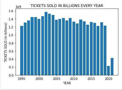
### Total tickets sold every year
```Python
plt.bar(AnnualTicketSales['YEAR'], AnnualTicketSales['TICKETS SOLD'])
plt.xlabel("YEAR")
plt.ylabel("TICKETS SOLD (in billions)")
plt.title("TICKETS SOLD IN BILLIONS EVERY YEAR")
plt.show()
```
### Correlation matrix
```Python
cormat=AnnualTicketSales.corr()
round(cormat,2)
```

### plotting the correlation matrix
```Python
sns.heatmap(cormat)
```

### plotting AVERAGE TICKET PRICE AND other variables in subplots to observe the correlation
```Python
plt_1=plt.figure(figsize=[15,5])
#plot 1
plt.subplot(1,3,1)
plt.scatter(y=AnnualTicketSales['AVERAGE TICKET PRICE'], x=AnnualTicketSales['TICKETS SOLD'])
plt.ylabel('AVERAGE TICKET PRICE')
plt.xlabel('TICKETS SOLD')
#plot 2
plt.subplot(1,3,2)
plt.scatter(y=AnnualTicketSales['AVERAGE TICKET PRICE'], x=AnnualTicketSales['TOTAL BOX OFFICE'])
plt.ylabel('AVERAGE TICKET PRICE')
plt.xlabel('TOTAL BOX OFFICE')
#plot 3
plt.subplot(1,3,3)
plt.scatter(y=AnnualTicketSales['AVERAGE TICKET PRICE'], x=AnnualTicketSales['TOTAL INFLATION ADJUSTED BOX OFFICE'])
plt.ylabel('AVERAGE TICKET PRICE')
plt.xlabel('TOTAL INFLATION ADJUSTED BOX OFFICE')
```

## Analyze for Genre
### TICKETS SOLD VS GENRE
### colors
```Python
colors = ['#ff9999','#66b3ff','#99ff99']
plt.pie(group_by_genre['TICKETS SOLD'], colors = colors, labels=group_by_genre['GENRE'], autopct='%1.1f%%', startangle=90, pctdistance=0.85)
#draw circle
centre_circle = plt.Circle((0,0),0.70,fc='white')
fig = plt.gcf()
fig.gca().add_artist(centre_circle)
# Equal aspect ratio ensures that pie is drawn as a circle
# ax1.axis('equal')
plt.tight_layout()
plt.title('TICKETS SOLD VS GENRE')
plt.show()
```

```Python
HighestGrossers
```

### Top 10 and Least 10 movies based on Tickets Sold
```Python
top_10_movies = HighestGrossers.nlargest(n=10, columns=['TICKETS SOLD'])
top_10_movies
```

## bar plot
```Python
fig, ax = plt.subplots()
ax.barh(top_10_movies['MOVIE'], top_10_movies['TICKETS SOLD'], align='center')
ax.invert_yaxis() # labels read top-to-bottom
ax.set_xlabel('TICKET SOLD')
ax.set_title('NUMBER OF TICKETS SOLD (IN 10 MILLIONS) FOR TOP 10 MOVIES')
```

## Bar plot creative types and movies in each type
## Total tickets sold every year
```Python
figure=plt.figure(figsize=(20,7))
plt.bar(PopularCreativeTypes['CREATIVE TYPES'], PopularCreativeTypes['MOVIES'])
plt.xlabel("CREATIVE TYPES")
plt.ylabel("MOVIES")
plt.title("NUMBER OF MOVIES IN EACH CREATIVE TYPE")
plt.show()
plt.show()
```

## Pie chart of Creative types and Average Gross
```Python
fig = plt.figure(figsize=[10,10])
ax = fig.add_axes([0,0,1,1])
ax.axis('equal')
ax.pie(PopularCreativeTypes['AVERAGE GROSS'], labels = PopularCreativeTypes['CREATIVE TYPES'],autopct='%1.2f%%')
plt.show()
```

# Top Distributors
```Python
TopDistributors
```

### Distributors vs Number of movies they released
```Python
fig=plt.figure(figsize=(5,10))
ax = sns.catplot(y='MOVIES', x='DISTRIBUTORS',kind='bar', data=TopDistributors, height=6, aspect=3)
plt.ylabel('MOVIES')
plt.xlabel('DISTRIBUTORS')
```

## Wide Releases Count Analysis
```Python
WideReleasesCount
```

### Let see the trendline of total movies released by 6 major production from 1995 to 2021
```Python
fig=plt.figure(figsize=(5,10))
ax = sns.catplot(y='TOTAL MAJOR 6', x='YEAR',kind='bar', data=WideReleasesCount, height=6, aspect=3)
plt.ylabel('TOTAL NUMBER OF MOVIES')
plt.xlabel('YEARS')
plt.title('TOTAL NUMBER OF MOVIES RELEASED BY 6 MAJOR PRODUCTION FROM 1995 RO 2021')
```

In our project above, we tried to show some important and striking graphics. You can find all the files of our project on our data science journey in the github repository.