https://github.com/fatihilhan42/olympics-data-analysis-with-python
I will examine the Data Analysis of the Olympics between 1896-2016, which we have done on Python.
https://github.com/fatihilhan42/olympics-data-analysis-with-python
data data-science dataanalysis datavisualization jupyter-notebook olympics python
Last synced: 3 months ago
JSON representation
I will examine the Data Analysis of the Olympics between 1896-2016, which we have done on Python.
- Host: GitHub
- URL: https://github.com/fatihilhan42/olympics-data-analysis-with-python
- Owner: fatihilhan42
- Created: 2022-04-18T12:33:46.000Z (over 4 years ago)
- Default Branch: main
- Last Pushed: 2022-04-18T13:29:56.000Z (over 4 years ago)
- Last Synced: 2025-03-23T22:48:44.204Z (over 1 year ago)
- Topics: data, data-science, dataanalysis, datavisualization, jupyter-notebook, olympics, python
- Language: Jupyter Notebook
- Homepage:
- Size: 4.73 MB
- Stars: 0
- Watchers: 1
- Forks: 0
- Open Issues: 0
-
Metadata Files:
- Readme: README.md
Awesome Lists containing this project
README
# Olympics-Data-Analysis-with-Python
I will examine the Data Analysis of the Olympics between 1896-2016, which we have done on Python.
First of all, we define the libraries that we will use in these first four lines of code.
### İmport
```Python
import numpy as np
import pandas as pd
import matplotlib.pyplot as plt
import seaborn as sns
%matplotlib inline
```
## Load dataset
```Python
athletes = pd.read_csv('C:/Users/Yusuf/Desktop/Olympics Data Analysis/athlete_events.csv')
region = pd.read_csv('C:/Users/Yusuf/Desktop/Olympics Data Analysis/noc_regions.csv')
```
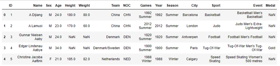
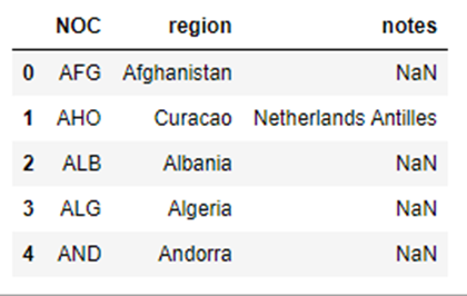
We display the csv files of the data we will use by specifying the location on the computer thanks to the code blocks you have seen above.
```Python
athletes.head()
```
```Python
region.head()
```
## Join the dataframes
```Python
athletes_df = athletes.merge(region, how = 'left', on = 'NOC')
athletes_df.head()
```
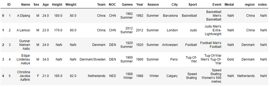
In these code blocks, we first displayed the countries where the athletes were located, and finally the region they were in, the names of the athletes, the year they competed, in which branch they competed, and their gender as a graphic.
```Python
athletes_df.shape
```
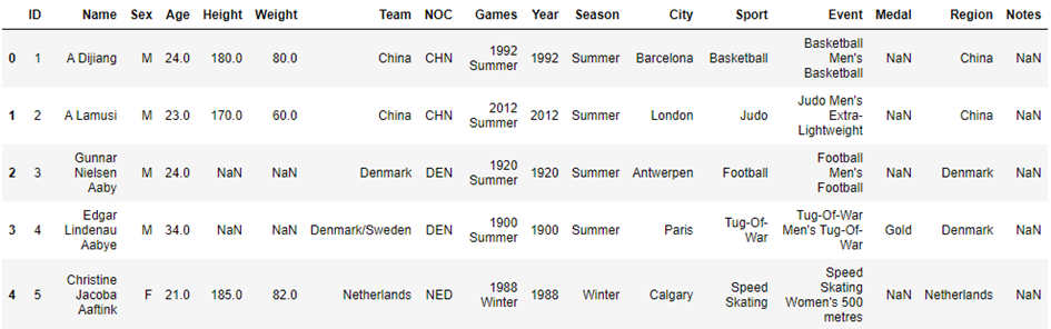
## Column names consistent
```Python
athletes_df.rename(columns={'region':'Region','notes':'Notes'},inplace=True );
```
```Python
athletes_df.head()
```
```Python
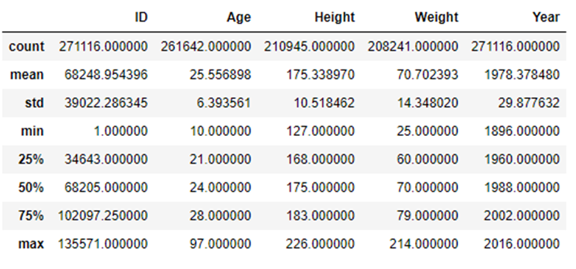
athletes_df.describe()
```
```Python
nan_values = athletes_df.isna()
nan_columns =nan_values.any()
nan_columns
```
```Python
athletes_df.isnull().sum()
```
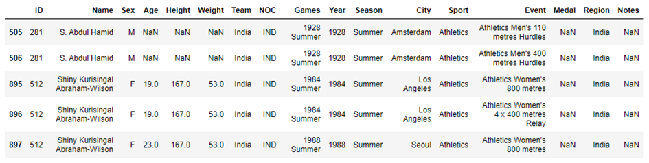
## India Details
```Python
athletes_df.query('Team == "India"').head(5)
```
## Top Countries Participating
```Python
top_10_countries = athletes_df.Team.value_counts().sort_values(ascending=False).head(10)
top_10_countries
```
```Python
#Plot forthe top 10 countries
plt.figure(figsize=(12,6))
#plt.xticks(rotation=20)
plt.title('Overall Participation by Country')
sns.barplot(x=top_10_countries.index, y=top_10_countries, palette = 'Set2' );
```
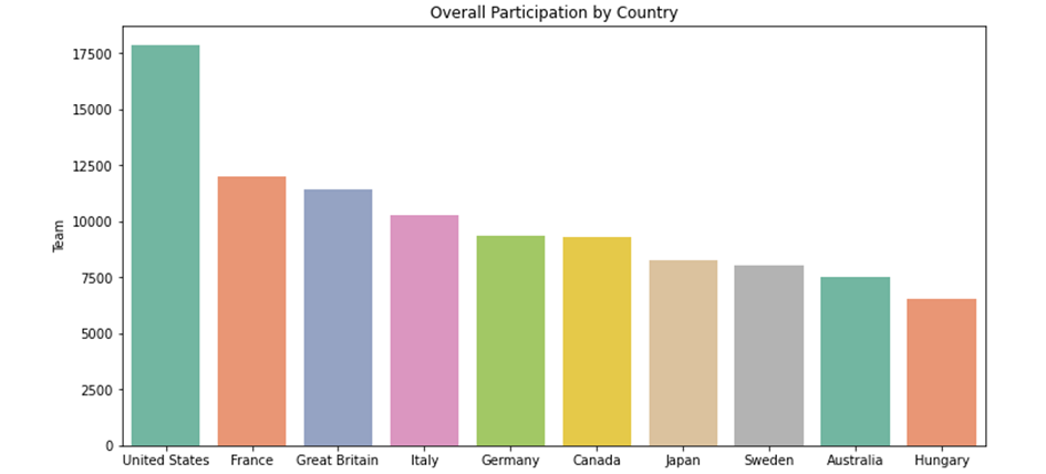
Here, after determining the 10 countries with the highest number of participants in the code blocks, we showed them graphically.
## Age Distribution of the participants
```Python
plt.figure(figsize=(12,6))
plt.title("Age distribution of the athletes")
plt.xlabel('Age')
plt.ylabel('Number of participants')
plt.hist(athletes_df.Age,bins = np.arange(10,80,2),color='red',edgecolor = 'white');
```
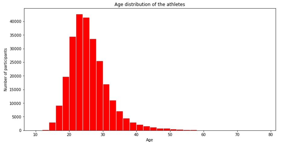
Here, we have shown how many people are in age ranges with a histographic graph.
```Python
winter_sports = athletes_df[athletes_df.Season == 'Winter'].Sport.unique()
winter_sports
```
```Python
#Summer Olympics Sports
summer_sports = athletes_df[athletes_df.Season == 'Summer'].Sport.unique()
summer_sports
```
We used the above codes to view the games played in summer and winter.
```Python
#Male and Female participants
gender_counts = athletes_df.Sex.value_counts()
gender_counts
```
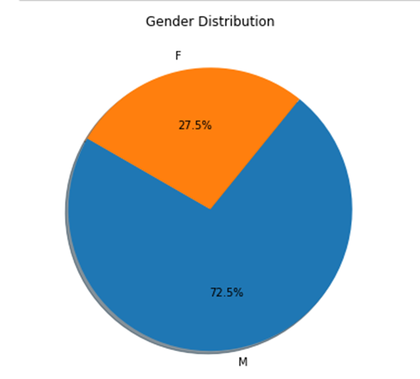
```Python
#Pie plot for male and female athletes
plt.figure(figsize=(12,6))
plt.title('Gender Distribution')
plt.pie(gender_counts,labels=gender_counts.index, autopct='%1.1f%%', startangle=150, shadow=True);
```
Plotly is a technical computing company headquartered in Montreal, Quebec, that develops online data analytics and visualization tools. Plotly provides online graphing, analytics, and statistics tools for individuals and collaboration, as well as scientific graphing libraries for Python, R, MATLAB, Perl, Julia, Arduino, and REST.
Here, we used the plotly library to graphically see the total male-female ratio in the Olympics.
```Python
#Total Medals
athletes_df.Medal.value_counts()
```
```Python
# Totall number of female athletes in each olympics
female_participants = athletes_df[(athletes_df.Sex=='F') & (athletes_df.Season=='Summer')][['Sex','Year']]
female_participants = female_participants.groupby('Year').count().reset_index()
female_participants.head()
```
```Python
# Totall number of female athletes in each olympics
female_participants = athletes_df[(athletes_df.Sex=='F') & (athletes_df.Season=='Summer')][['Sex','Year']]
female_participants = female_participants.groupby('Year').count().reset_index()
female_participants.tail()
```
In the code blocks you have seen above, we see the number of women competing by years, first with the head command, and the close years with the tail command.
```Python
womenOlympics = athletes_df[(athletes_df.Sex == 'F') & (athletes_df.Season == 'Summer')]
```
```Python
sns.set(style="darkgrid")
plt.figure(figsize=(20,10))
sns.countplot(x='Year', data=womenOlympics,palette="Spectral")
plt.title('Women Participation')
```
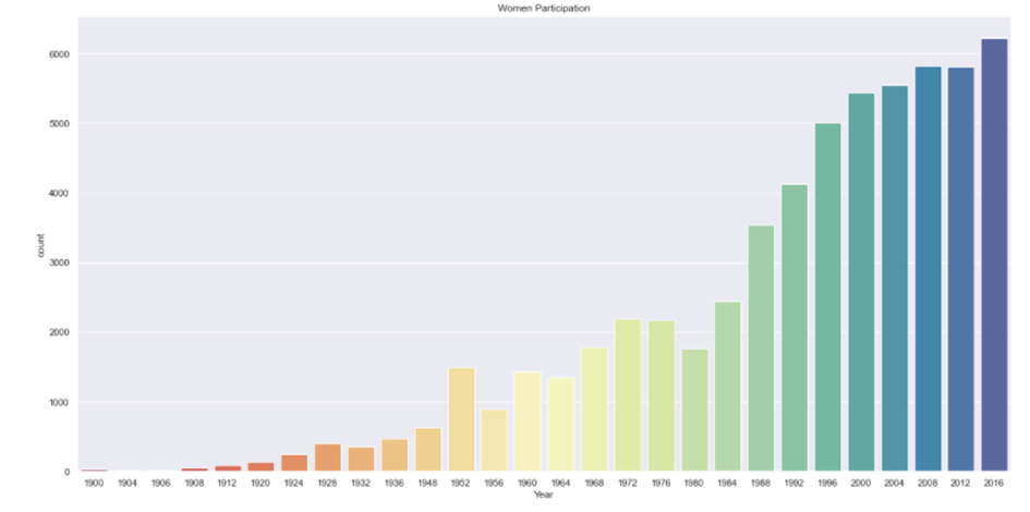
In the graph you have seen above, you can see the increase in female participants over the years. We did this using the plotly library.
```Python
part = womenOlympics.groupby('Year')['Sex'].value_counts()
plt.figure(figsize=(20,10))
part.loc[:,'F'].plot()
plt.title('Plotof Female Athletes over time')
```
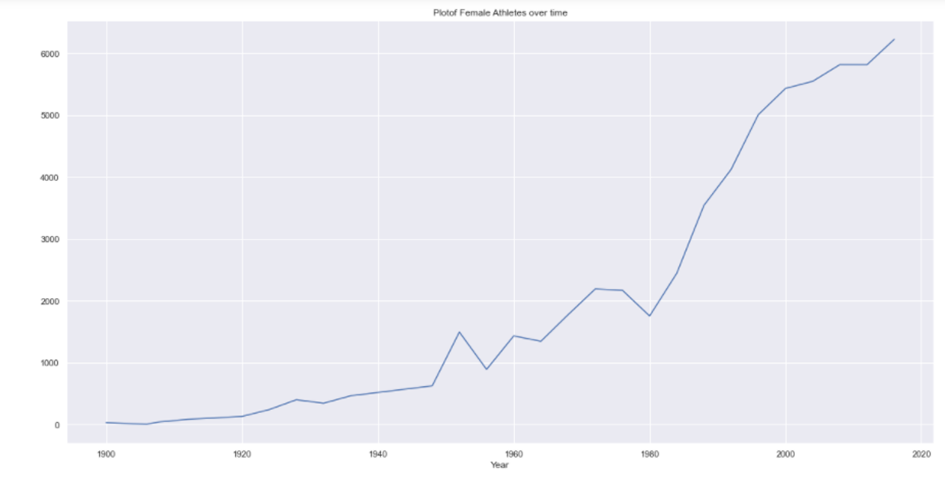
In the graph you see above, you can see the increase in female participants over the years. In this graph, we have taken the values linearly. We did this using the plotly library.
```Python
#Gold Medal Athletes
goldMedals = athletes_df[(athletes_df.Medal == 'Gold')]
goldMedals.head()
```
```Python
#take only the alues that are different from nan
goldMedals = goldMedals[np.isfinite(goldMedals['Age'])]
```
```Python
#Gold beyond 60
goldMedals['ID'][goldMedals['Age'] > 60].count()
```
```Python
sporting_event = goldMedals['Sport'][goldMedals['Age']>60]
sporting_event
```
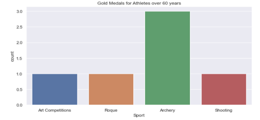
In the code blocks above, we first listed the gold medal winners, and then got the gold medal winners over the age of 60 and in which branches they did this on the screen.
```Python
# Plot for spoerting_event
plt.figure(figsize=(10,5))
plt.tight_layout()
sns.countplot(sporting_event)
plt.title('Gold Medals for Athletes over 60 years')
```
```Python
# Gold medals from each country
goldMedals.Region.value_counts().reset_index(name='Medal').head(5)
```
In the code blocks above, we captured the gold medal winners over the age of 60 and in which branches they did this. Afterwards, we used the plotly library to graphically show how many medals they received in which areas.
```Python
totalgoldMedals = goldMedals.Region.value_counts().reset_index(name='Medal').head(6)
2. g = sns.catplot(x="index", y="Medal", data=totalgoldMedals,height=5, kind="bar",palette="rocket")
3. g.despine(left=True)
4. g.set_xlabels("Top 5 Countries")
5. g.set_ylabels("Number ofMedals")
6. plt.title('Gold Medals per Country')
```
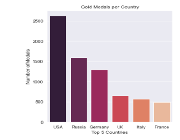
In the code blocks above, after listing the countries that won the most gold medals, we showed the top 5 countries and the number of medals on the graph.
```Python
#Rio Olympics
max_year = athletes_df.Year.max()
print(max_year)
team_names = athletes_df[(athletes_df.Year == max_year) & (athletes_df.Medal == 'Gold')].Team
team_names.value_counts().head(10)
```
```Python
sns.barplot(x=team_names.value_counts().head(20), y=team_names.value_counts().head(20).index)
plt.ylabel(None);
plt.xlabel('Countrywise Medals forthe year 2016')
```
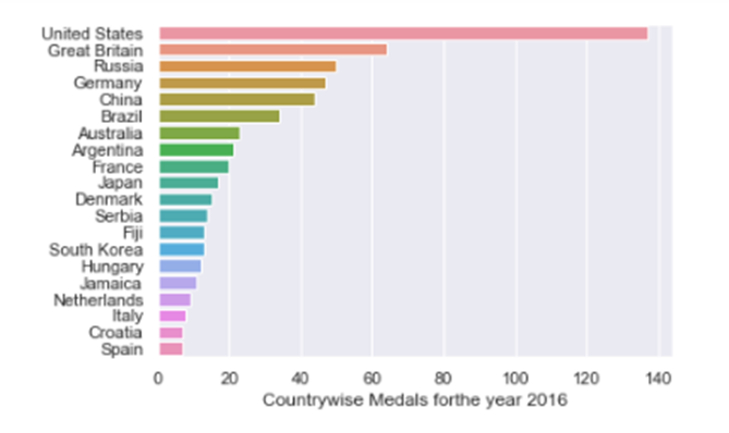
The above code blocks were first drawn numerically and then graphically, using the plotly library of medal numbers in the 2016-Rio Olympics.
```Python
not_null_medals = athletes_df[(athletes_df['Height'].notnull()) & (athletes_df['Weight'].notnull())]
```
```Python
plt.figure(figsize=(12,10))
axis = sns.scatterplot(x="Height", y="Weight", data=not_null_medals, hue= "Sex")
plt.title("Height vs Wight of Olympic Medalists")
```
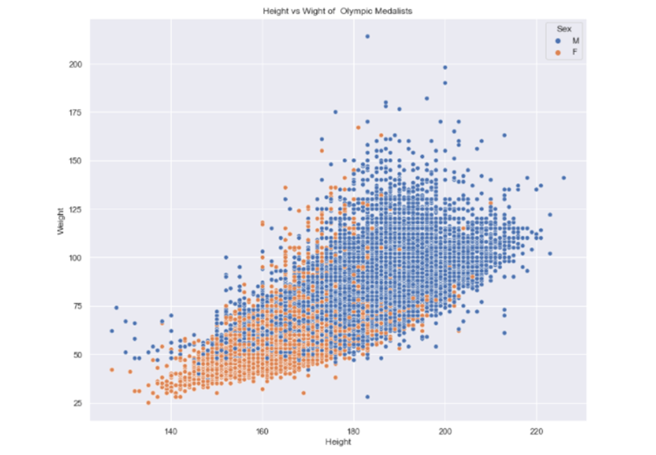
In the code blocks above, the weight and height of the competitors are shown on the graph as male and female