https://github.com/fatihilhan42/world-happiness-report-2021-data-analysis-using-python
In this project, we tried to reflect the happiness rates of countries graphically and schematically by using data sets of 2021 with data analysis data visualization methods.
https://github.com/fatihilhan42/world-happiness-report-2021-data-analysis-using-python
Last synced: 2 months ago
JSON representation
In this project, we tried to reflect the happiness rates of countries graphically and schematically by using data sets of 2021 with data analysis data visualization methods.
- Host: GitHub
- URL: https://github.com/fatihilhan42/world-happiness-report-2021-data-analysis-using-python
- Owner: fatihilhan42
- Created: 2022-08-03T13:57:41.000Z (almost 3 years ago)
- Default Branch: main
- Last Pushed: 2022-08-03T14:01:25.000Z (almost 3 years ago)
- Last Synced: 2025-01-29T06:24:55.950Z (4 months ago)
- Language: Jupyter Notebook
- Size: 657 KB
- Stars: 0
- Watchers: 1
- Forks: 0
- Open Issues: 0
-
Metadata Files:
- Readme: README.md
Awesome Lists containing this project
README
# World-Happiness-Report-2021-Data-Analysis-Using-Python
In this project, we tried to reflect the happiness rates of countries graphically and schematically by using data sets of 2021 with data analysis data visualization methods.
## Libraries and Utilities
```Python
import numpy as np
import pandas as pd
import seaborn as sns
import matplotlib.pyplot as plt
%matplotlib inline
```
### Let's take a look at our top five data
```Python
data.head()
```

### Plot between Ladder score and GDP
```Python
plt.rcParams['figure.figsize'] = (15,7)
plt.title('Plot between Ladder score and GDP')
sns.scatterplot(x = happy_df.ladder_score, y = happy_df.logged_GDP_per_capita, hue = happy_df.regional_indicator, s = 200);
plt.legend(loc = 'upper left',fontsize = '10')
plt.xlabel('Ladder score')
plt.ylabel('GDP per capita')
```

### GDP by Region
```Python
gdp_region.plot.pie(autopct = '%1.1f%%')
plt.title('GDP by Region')
plt.ylabel('')
```

### Correlation Map
```Python
cor = happy_df.corr(method = 'pearson')
f, ax = plt.subplots(figsize = (10,5))
sns.heatmap(cor, mask = np.zeros_like(cor, dtype = np.bool), cmap = 'Blues', square = True, ax = ax)
```

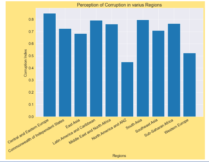
### Perception of Corruption in varius Regions
```Python
dplt.rcParams['figure.figsize'] = (12,8)
plt.title('Perception of Corruption in varius Regions')
plt.xlabel('Regions', fontsize = 15)
plt.ylabel('Corruption Index ', fontsize = 15)
plt.xticks(rotation = 30,ha='right')
plt.bar(corruption.index, corruption.perceptions_of_corruption)
```
### Top 10 happiest countries Life Expectancy&&Bottom 10 least happy countries Life Expectancy
```Python
fig, axes = plt.subplots(1,2, figsize= (16,6))
plt.tight_layout(pad = 2)
xlabels = top_10.country_name
axes[0].set_title('Top 10 happiest countries Life Expectancy')
axes[0].set_xticklabels(xlabels, rotation = 45, ha = 'right')
sns.barplot(x = top_10.country_name, y = top_10.healthy_life_expectancy, ax = axes[0])
axes[0].set_xlabel('Country Name')
axes[0].set_ylabel('Life expectancy')
xlabels=bottom_10.country_name
axes[1].set_title('Bottom 10 least happy countries Life Expectancy')
axes[1].set_xticklabels(xlabels,rotation = 45, ha ='right')
sns.barplot(x = bottom_10.country_name, y= bottom_10.healthy_life_expectancy, ax = axes[1])
axes[1].set_xlabel('Country Name')
axes[1].set_ylabel('Life expectancy')
```

### Freedom to make life choices
```Python
plt.rcParams['figure.figsize'] = (15,7)
sns.scatterplot(x = happy_df.freedom_to_make_life_choices, y = happy_df.ladder_score, hue = happy_df.regional_indicator, s=200)
plt.legend(loc = 'upper left', fontsize = '12')
plt.xlabel('Freedom to make life choices')
plt.ylabel('Ladder score')
```

### top five Country of Countries with Most Perception of Corruption
```Python
country = happy_df.sort_values(by='perceptions_of_corruption').head(10)
plt.rcParams['figure.figsize'] = (12,6)
plt.title('Countries with Most Perception of Corruption')
plt.xlabel('Country', fontsize = 13)
plt.ylabel('Corruption Index', fontsize = 13)
plt.xticks(rotation = 30,ha='right')
plt.bar(country.country_name, country.perceptions_of_corruption)
```

### last five country of Countries with Most Perception of Corruption
```Python
country = happy_df.sort_values(by='perceptions_of_corruption').tail(10)
plt.rcParams['figure.figsize'] = (12,6)
plt.title('Countries with Most Perception of Corruption')
plt.xlabel('Country', fontsize = 13)
plt.ylabel('Corruption Index', fontsize = 13)
plt.xticks(rotation = 30,ha='right')
plt.bar(country.country_name, country.perceptions_of_corruption)
```

### Corruption vs Hapiness
```Python
plt.rcParams['figure.figsize'] = (15,7)
sns.scatterplot(x = happy_df.ladder_score, y = happy_df.perceptions_of_corruption, hue=happy_df.regional_indicator, s=200)
plt.legend(loc='lower left', fontsize = '14')
plt.xlabel('Ladder score')
plt.ylabel('Corruption')
```

### Hope to see you in another project. Take good care of yourself.
