https://github.com/fgazzelloni/updvwr
Unlocking the power of data visualization with R: This is a collection of data visualizations with code made with R
https://github.com/fgazzelloni/updvwr
data datavisualisation-website datavisualization datavisualization-project rstats rstudio tidytuesday-analysis tidytuesday-challenge tidytuesday-visualisations visualization
Last synced: about 7 hours ago
JSON representation
Unlocking the power of data visualization with R: This is a collection of data visualizations with code made with R
- Host: GitHub
- URL: https://github.com/fgazzelloni/updvwr
- Owner: Fgazzelloni
- License: mit
- Created: 2023-08-14T08:14:32.000Z (almost 3 years ago)
- Default Branch: main
- Last Pushed: 2025-12-05T20:48:51.000Z (7 months ago)
- Last Synced: 2025-12-09T10:03:27.814Z (7 months ago)
- Topics: data, datavisualisation-website, datavisualization, datavisualization-project, rstats, rstudio, tidytuesday-analysis, tidytuesday-challenge, tidytuesday-visualisations, visualization
- Language: CSS
- Homepage: https://fgazzelloni.github.io/UPDVwR/
- Size: 242 MB
- Stars: 1
- Watchers: 1
- Forks: 0
- Open Issues: 0
-
Metadata Files:
- Readme: README.md
- License: LICENSE.md
Awesome Lists containing this project
README
# Unlocking the Power of Data Visualization with R
> “Visualization is not an accessory to analysis — it’s the language through which data speaks.”
## Overview
This is a collection of reproducible examples demonstrating how to transform raw data into visual stories using R. The project explores a variety of datasets and visualization techniques, showing how the R ecosystem enables creative and transparent data communication.
Each example highlights a different aspect of visualization, from exploratory graphics to storytelling and mapping, using open data from the [#TidyTuesday](https://github.com/rfordatascience/tidytuesday), [#30DayChartChallenge](https://github.com/30DayChartChallenge), [#30daymapchallenge](https://30daymapchallenge.com/), and [#duboischallenge](https://www.datavisualizationsociety.org/news/2025/2/3/2025-du-bois-visualization-challenge) projects and other public sources.
## Motivation
Data visualization is not just about making charts, it’s about understanding patterns, communicating insights, and promoting reproducibility.
This repository aims to help learners and practitioners:
- Discover the versatility of R for visual analytics;
- Learn by example through real-world datasets;
- Apply principles of clarity, design, and reproducibility.
## Structure
The repository is organized into thematic sections, including:
- **Basics of ggplot2** – foundational plots and aesthetic mapping
- **Advanced Visualizations** – facets, themes, and custom functions
- **Spatial Data** – creating maps with `sf`, `rnaturalearth`, and `ggplot2`
- **Interactive Graphics** – visualizing data dynamically with `plotly` and `leaflet`
- **Case Studies** – reproducible analyses from #TidyTuesday datasets
Each folder contains a Quarto (`.qmd`) or R Markdown (`.Rmd`) file, code snippets, and rendered output.
## Tools and Packages
The examples make use of several core packages from the R ecosystem:
```r
library(ggplot2)
library(dplyr)
library(tidyr)
library(sf)
library(viridis)
library(patchwork)
library(rnaturalearth)
```
Other packages such as **plotly**, **leaflet**, and **gganimate** are introduced for interactive and animated graphics.
### Example Highlight
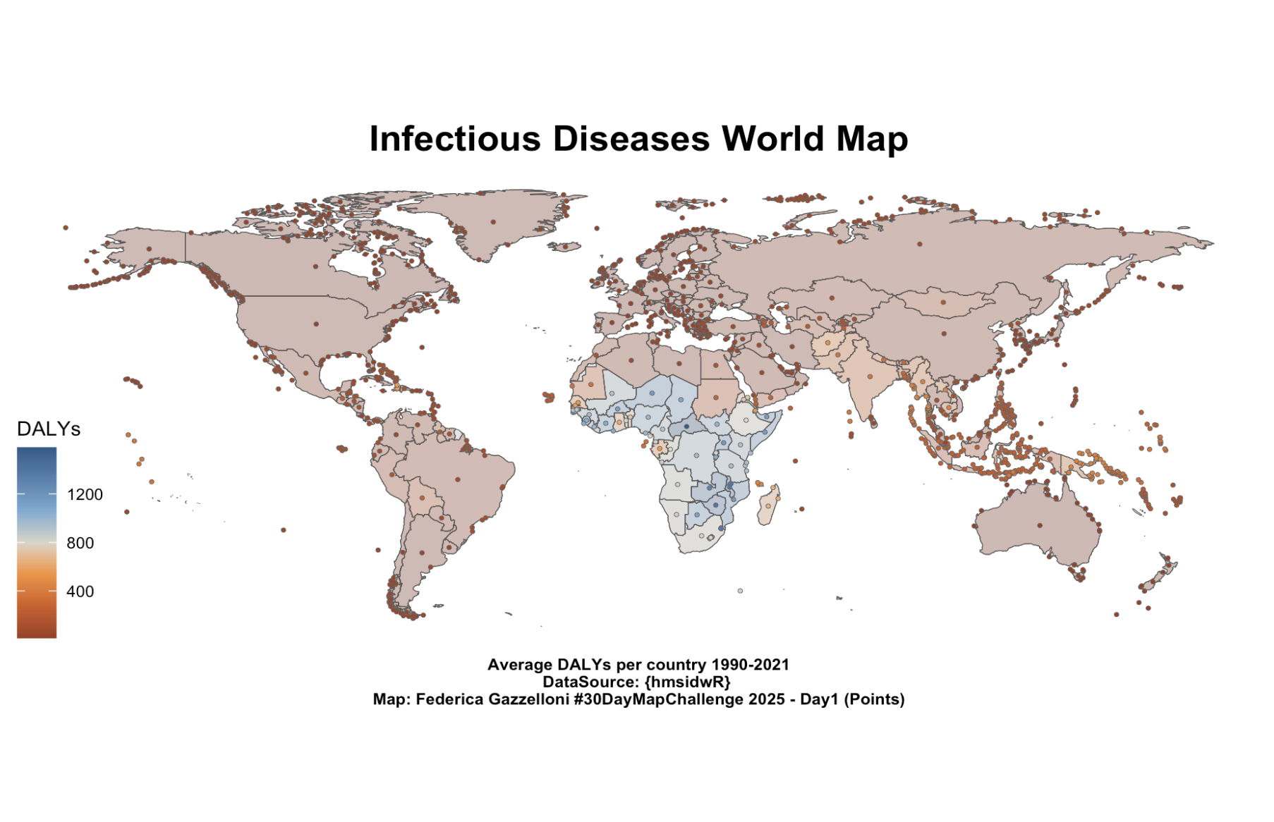
One featured example visualizes **Disability-Adjusted Life Years (DALYs) across countries from 1990–2021** — created for **Day 1 (“Points”)** of the **#30DayMapChallenge**. Each point represents the centroid of a country, coloured according to its average DALY value, revealing global disparities in infectious disease burden.
### How to Use
Clone this repository and open it in RStudio or VS Code:
`git clone https://github.com//data-visualization-with-R.git`
`quarto::quarto_render("path/to/file.qmd")`
All examples are self-contained and reproducible.
### License
This project is licensed under the MIT License.
### Author
Developed and maintained by Federica Gazzelloni
📧 fede.gazzelloni@gmail.com
🌐 [federicagazzelloni.com](https://federicagazzelloni.com/)