Ecosyste.ms: Awesome
An open API service indexing awesome lists of open source software.
https://github.com/filipchalupa/collapsible-react-component
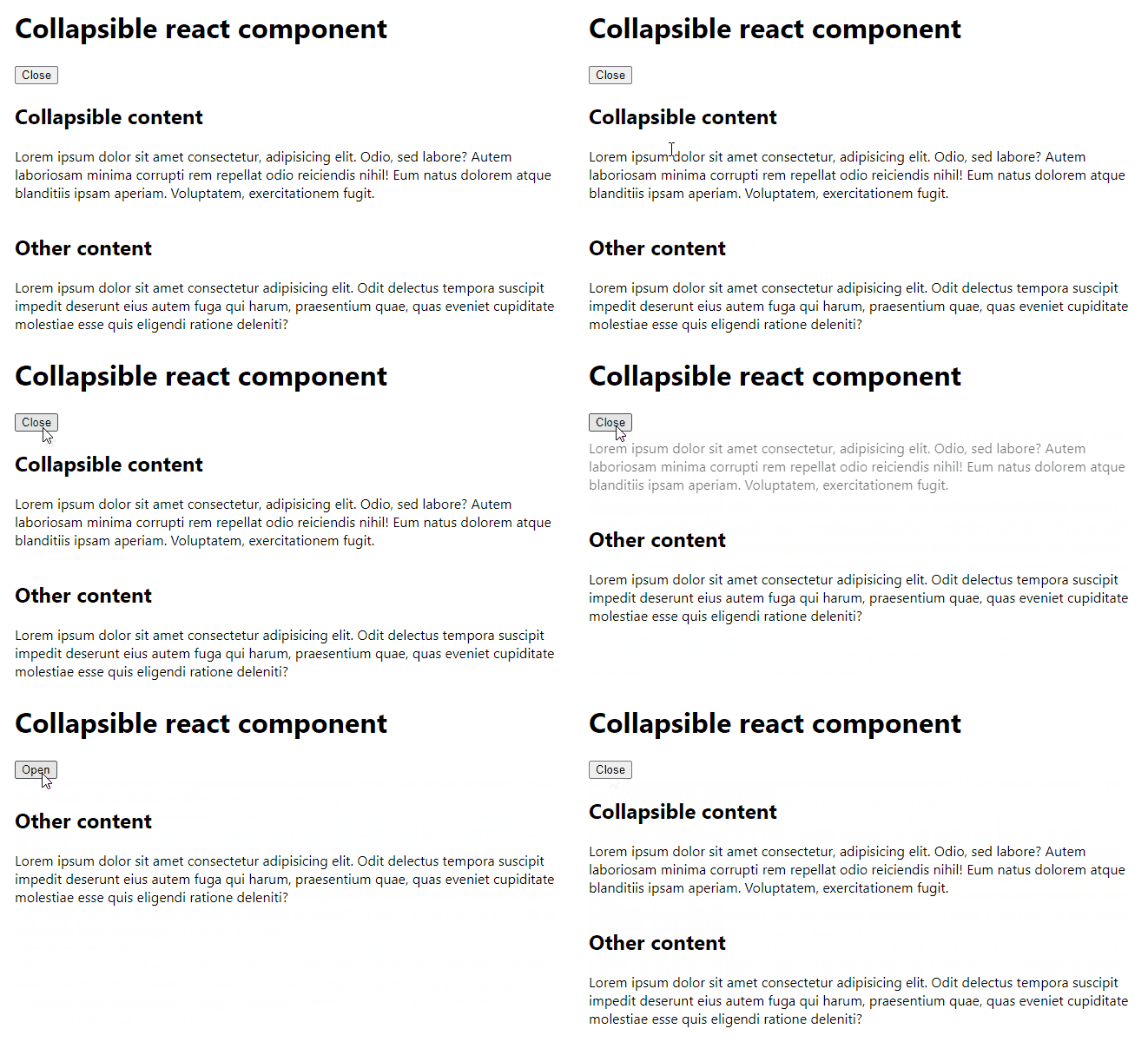
React component to collapse and expand content with an animation.
https://github.com/filipchalupa/collapsible-react-component
component package react
Last synced: about 15 hours ago
JSON representation
React component to collapse and expand content with an animation.
- Host: GitHub
- URL: https://github.com/filipchalupa/collapsible-react-component
- Owner: FilipChalupa
- Created: 2022-01-07T13:33:51.000Z (almost 3 years ago)
- Default Branch: main
- Last Pushed: 2024-06-05T15:36:05.000Z (5 months ago)
- Last Synced: 2024-10-13T14:12:52.185Z (25 days ago)
- Topics: component, package, react
- Language: TypeScript
- Homepage: https://www.npmjs.com/package/collapsible-react-component
- Size: 6.74 MB
- Stars: 3
- Watchers: 3
- Forks: 2
- Open Issues: 3
-
Metadata Files:
- Readme: README.md
Awesome Lists containing this project
README
# Collapsible react component
> Collapses and expands content with an animation.
[](https://www.npmjs.com/package/collapsible-react-component) 

Try [interactive demo](https://codesandbox.io/s/collapsible-react-component-example-8t6c3b?file=/src/App.js).
## Install
```bash
npm install collapsible-react-component
```
## Usage
```tsx
import React from 'react'
import { Collapsible } from 'collapsible-react-component'
import 'collapsible-react-component/dist/index.css'
const Example = () => {
const [open, setOpen] = React.useState(true)
return (
<>
{
setOpen(!open)
}}
>
{open ? 'Close' : 'Open'}
{
console.log('Collapsible box used to be', open ? 'open' : 'closed')
}}
onTransitionEnd={(open) => {
console.log('Collapsible box is now', open ? 'open' : 'closed')
}}
revealType='bottomFirst'
>
Lorem ipsum dolor sit amet consectetur, adipisicing elit. Odio, sed
labore? Autem laboriosam minima corrupti rem repellat odio reiciendis
nihil! Eum natus dolorem atque blanditiis ipsam aperiam. Voluptatem,
exercitationem fugit.
>
)
}
```
### Props
| Name | Required | Default | Type | Description |
| ------------------- | -------- | ------------- | ------------------------- | ------------------------------------------------------------------------------------ |
| `open` | ✅ | none | `boolean` | Determines wheter the children content should be visible. |
| `children` | ✅ | none | `ReactNode` | Collapsible content. |
| `onTransitionStart` | | noop | `(open: boolean) => void` | Callback invoked when transition starts. `open` is the starting state. |
| `onTransitionEnd` | | noop | `(open: boolean) => void` | Callback after content is fully expanded or fully closed. `open` is the final state. |
| `revealType` | | `bottomFirst` | `bottomFirst \| topFirst` | Type of transition animation. |
## Development
Run
```sh
npm ci
npm run dev
```
and
```sh
cd example
npm ci
npm run dev
```