https://github.com/fletchcoder/hola-fresca
https://github.com/fletchcoder/hola-fresca
bootstrap css3 html5 javascript
Last synced: 3 months ago
JSON representation
- Host: GitHub
- URL: https://github.com/fletchcoder/hola-fresca
- Owner: fletchcoder
- Created: 2023-04-21T22:37:44.000Z (about 2 years ago)
- Default Branch: main
- Last Pushed: 2023-12-29T06:17:50.000Z (over 1 year ago)
- Last Synced: 2025-01-02T15:18:38.394Z (5 months ago)
- Topics: bootstrap, css3, html5, javascript
- Language: HTML
- Homepage: https://hola-fresca-mexican-grill.vercel.app
- Size: 6.38 MB
- Stars: 0
- Watchers: 1
- Forks: 0
- Open Issues: 0
-
Metadata Files:
- Readme: README.md
Awesome Lists containing this project
README
# Hola Fresca Mexican Grill
This is a sample Mexican Restaurant called Hola Fresca that was made using a template from templatemo.com. It features five different pages: a home page, a menu, an order form, a reviews page, and a contact form. The project was an assignment that involved using varied colors and imagery to mimic the look and feel of an actual restaurant's website.
All pages utilize Bootstrap icons for the social media links in the header and footer sections and feature a contact section ahead of the footer.
The navbar at the top navigates to the different sections on the home page and the "Order" button takes users to the order page.
The "Contact Us" button in the footer will link to the contact page. The footer also has a mailto link to the made-up email of [email protected] and a tel link to the made-up number of the restaurant. The rest of the links in the footer will just link to the current page; this is the same with any links in the main content sections of any of the pages.
## Built With
* HTML
* CSS
* JavaScript
* Bootstrap

## Home Page
The main page of the website provides an overview of the restaurant. It is split into 7 sections:
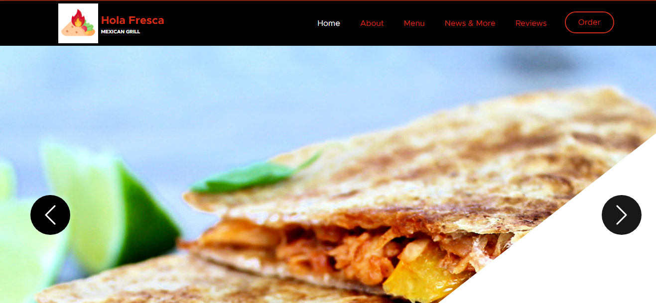
* An image slider featuring various images of the location and food items
* A welcome section that provides additional links to the other pages with icons
* A background of the restaurant with information on the owner and Hola Fresca's mission
* A menu preview with 3 of the menu items
* A form that allows for users to submit a resume and apply for the restaurant
* A news section with two sample news stories
* A reviews section with four sample reviews that prompts users to write a review
The image slider uses JavaScript to automatically cycle through the images on a timer and also has buttons that fade in when moused over to manually cycle the images. The welcome section has images that shrink and are highlighted in red when moused over due to CSS. The owner blurb also features similar Bootstrap icons as the footer/header; they change to red and black when moused over. The menu previews also change colors on their links to the menu page. The hiring form has a button that allows users to upload files from their computer and has a submit button at the bottom that changes colors as well. The reviews section has a cycle that rotates between the various reviews and pops out the reviewer when their review shows; the reviewers are faded out otherwise.

## Menu Page
The main page includes a banner at the top and showcases the 5 items on the menu:
* Tamales
* Tacos
* Burritos
* Quesadillas
* Bowls
This page features CSS hovering styles similar to the home page and retains the same contact section, header, and footer.

## Order Page
The order page mainly features a form that allows the users to place a mock order to the restaurant. Users are prompted to choose between a single item or a meal combo. Afterwards, they may choose between the five items on the menu and select the amount that they would like to order. Finally, there is a section to choose payment method and submit the order. Otherwise, this page retains the same features as the previous pages.

## Reviews Page
The review page includes a banner at the top to announce the page like the menu page. It has a headline to attract user attention towards the reviews. Each review has a picture of the reviewer, the name of the reviewer, the review itself, and like and reply buttons. The like and reply buttons change color when hovered. Beneath the reviews, there is a prompt for a user to write their own review in a textfield. The button labeled "POST REVIEW" is there just to complete the look.

## Contact Page
The contact page has a contact form that has fields for first name, last name, email, and a place for users to submit their issue/concern. As with all the other pages, the "Send Message" button is there to complete the look of the form and for nothing else.