https://github.com/giuseppeg/react-layout-areas
🍫 Powerful component-based layouts built with CSS Grid areas
https://github.com/giuseppeg/react-layout-areas
Last synced: over 1 year ago
JSON representation
🍫 Powerful component-based layouts built with CSS Grid areas
- Host: GitHub
- URL: https://github.com/giuseppeg/react-layout-areas
- Owner: giuseppeg
- License: mit
- Created: 2018-12-27T17:12:33.000Z (over 7 years ago)
- Default Branch: master
- Last Pushed: 2018-12-27T18:38:37.000Z (over 7 years ago)
- Last Synced: 2025-03-30T22:32:02.159Z (over 1 year ago)
- Language: JavaScript
- Homepage: https://codesandbox.io/s/ovyz2ql8rq
- Size: 86.9 KB
- Stars: 22
- Watchers: 1
- Forks: 0
- Open Issues: 0
-
Metadata Files:
- Readme: README.md
- License: LICENSE
Awesome Lists containing this project
README
# React Layout Areas
🍫 Powerful component-based layouts built with CSS Grid areas.
```
npm i --save react-layout-areas
```
The library exports a `Layout` component that gets an `areas` prop to define [grid template areas](https://developer.mozilla.org/en-US/docs/Web/CSS/grid-template-areas).
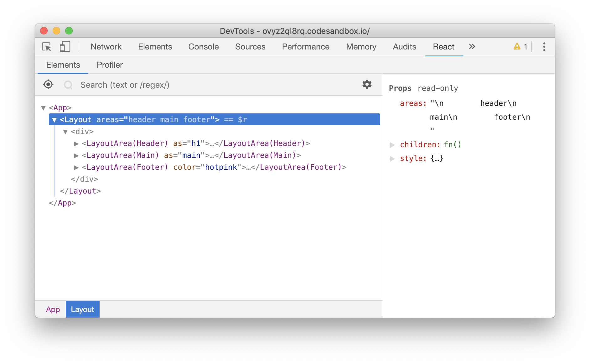
The `Layout` component generates matching components for each area defined in the `areas` template and calls its `children` with them.
```jsx
import React from "react";
import Layout from "react-layout-areas";
function App() {
return (
{({ Header, Main, Footer }) => (
<>
howdy
main
footer
>
)}
);
}
```
produces
### Prior work and the reasoning behind this library
This library was inspired by [`atomic-layout`](https://github.com/kettanaito/atomic-layout) and the amazing work of [Artem Zakharchenko](https://twitter.com/kettanaito). I highly recommend you to watch [the talk he gave at React Vienna in 2018](https://www.youtube.com/watch?v=x_93DjN_bUA).
I always believed that in order to reach the composition holy grail a layout shouldn't be built in UI components but rather created with ad-hoc layout components. You can read in length about this topic on [my blog](http://giuseppegurgone.com/margins-and-composability-in-css) and in [the SUIT CSS docs](https://github.com/suitcss/suit/blob/master/doc/components.md#adapting-to-ancestral-context).
The reason why I implemented this library is because I wanted it to be simpler than atomic-layout and with 0 dependencies.
## Responsive Grids
Because I wanted to keep the library (API) minimal I decided to not include any built-in machinary to make responsive grids (areas).
Responsive layouts can be implemented by changing the template `areas` prop and either the [`window.matchMedia` API](https://developer.mozilla.org/docs/Web/API/Window/matchMedia) or [`ResizeObserver`](https://developers.google.com/web/updates/2016/10/resizeobserver).
## API
```js
type LayoutProps = {
// A valid grid-template-areas value.
// See https://developer.mozilla.org/en-US/docs/Web/CSS/grid-template-areas
areas: string,
// By default the Layout component renders a div
// but it can take an element name (string)
// or another component to render.
as?: string | React.ComponentType<*>,
// Optional, inline o block level grids.
display?: 'inline' | 'block'
}
```
```js
// Passed to the children function. eg Header
type LayoutAreaProps = {
// By default the Layout component renders a div
// but it can take an element name (string)
// or another component to render.
as?: string | React.ComponentType<*>
}
```
Note that all the components use inline styles, therefore when setting the `as` prop to a `React.ComponentType`, the component needs to spread the `style` prop to its root element.
## LICENSE
MIT