https://github.com/gogoair/react-collapsy
Simple accordion component
https://github.com/gogoair/react-collapsy
accordion collapse react
Last synced: 5 months ago
JSON representation
Simple accordion component
- Host: GitHub
- URL: https://github.com/gogoair/react-collapsy
- Owner: gogoair
- License: mit
- Created: 2017-12-20T11:59:18.000Z (over 8 years ago)
- Default Branch: master
- Last Pushed: 2018-12-15T23:08:54.000Z (over 7 years ago)
- Last Synced: 2025-08-09T14:21:16.284Z (11 months ago)
- Topics: accordion, collapse, react
- Language: JavaScript
- Size: 14.6 KB
- Stars: 5
- Watchers: 5
- Forks: 4
- Open Issues: 0
-
Metadata Files:
- Readme: README.md
- License: LICENSE
Awesome Lists containing this project
README
# react-collapsy
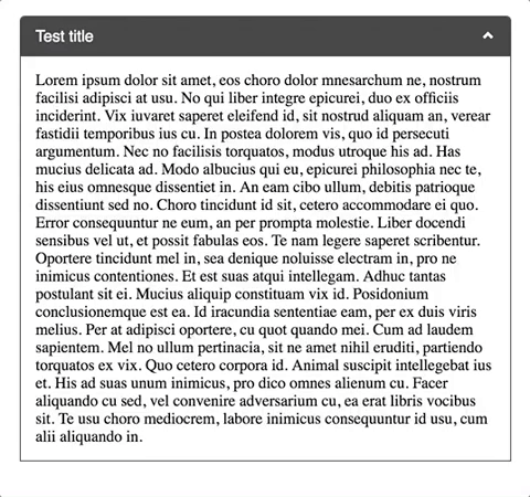
Simple lightweight (1.5kb minified+gzipped) accordion component
## Usability
This plugin require for you to have react, after that import react-collapsy
```javascript
import Accordion from 'react-collapsy';
```
and include css files
```javascript
require('../node_modules/react-collapsy/lib/index.css');
```
## Usage
After you imported libs, somewhere in your component's code:
```javascript
Some content
```
## props/options
#### isOpen
If passed Accordion will be render expanded
```javascript
```
#### onToggle
onToggle will fire after Accordion expands/collapses with boolean value passed in which will indicated if Accordion is open or closed (true, false)
```javascript
console.log('Is Accordion open?:', isOpen) } /> // if expanded true will be passed
```
#### title
If passed title will be displayed
```javascript
```
#### headerClass/contentWrapperClass
If passed classes will be added to header div and content wrapper div, respectfully. (e.g. 'Accordion__header ' + this.props.headerClass)
```javascript
```
## Example project
Clone/download the repo followed by npm (i) install && npm start, so you can check this magnificent component in local. If you have any comment, suggestion, issue, please report it, as I will try to keep this component alive.