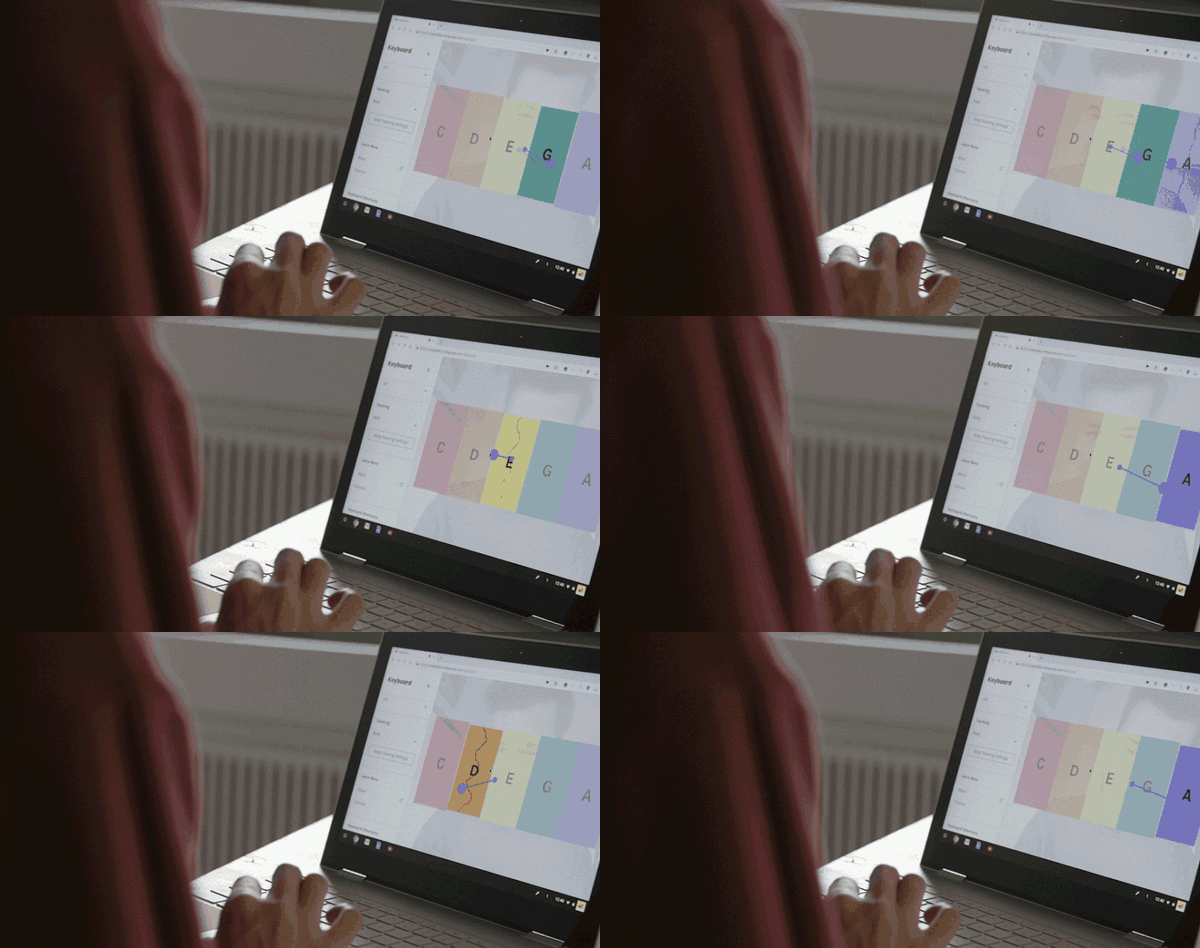
https://github.com/googlecreativelab/creatability-components
Web components for making creative tools more accessible.
https://github.com/googlecreativelab/creatability-components
a11y accessibility aria posenet webcomponents
Last synced: 11 months ago
JSON representation
Web components for making creative tools more accessible.
- Host: GitHub
- URL: https://github.com/googlecreativelab/creatability-components
- Owner: googlecreativelab
- License: other
- Created: 2018-10-18T21:09:30.000Z (over 7 years ago)
- Default Branch: dev
- Last Pushed: 2025-02-13T02:16:23.000Z (about 1 year ago)
- Last Synced: 2025-04-12T11:58:34.009Z (about 1 year ago)
- Topics: a11y, accessibility, aria, posenet, webcomponents
- Language: TypeScript
- Homepage: https://creatability.withgoogle.com
- Size: 5.44 MB
- Stars: 293
- Watchers: 23
- Forks: 51
- Open Issues: 24
-
Metadata Files:
- Readme: README.md
- Contributing: CONTRIBUTING.md
- License: LICENSE
Awesome Lists containing this project
README
# Creatability Accessible Web Components
[Creatability](https://experiments.withgoogle.com/collection/creatability) is a set of experiments made in collaboration with creators and allies in the accessibility community. They explore how creative tools – drawing, music, and more – can be made more accessible using web and AI technology. We hope they inspire others to make new projects, so we've started open-sourcing components here for anyone to use. Note this repo is under development. Contributions welcome!

## Basics
Copy the packaged file in [dist/acc-components.js](https://github.com/googlecreativelab/creatability-components/raw/dev/dist/acc-components.js) into your html file and you will receive the following HTML elements:
* [``](https://googlecreativelab.github.io/creatability-components/docs/api/classes/_components_button_.buttonelement.html) - standard button
* [``](https://googlecreativelab.github.io/creatability-components/docs/api/classes/_components_content_.contentelement.html) - a container for main content. Easily pairs with inputs such as `` and displays webcam for using body as cursor input.
* [``](https://googlecreativelab.github.io/creatability-components/docs/api/classes/_components_group_.groupelement.html) - a group of UI controls
* [``](https://googlecreativelab.github.io/creatability-components/docs/api/classes/_components_input_mode_select_.inputmodeselectelement.html) - used to select the current input method (i.e. mouse/keyboard/touch or body pose).
* [``](https://googlecreativelab.github.io/creatability-components/docs/api/classes/_components_item_.itemelement.html) - data used to populate an `` dropdown or an ``.
* [``](https://googlecreativelab.github.io/creatability-components/docs/api/classes/_components_mouse_input_.mouseinputelement.html) - an input that combines mouse/keyboard/touch into one normalized input.
* [``](https://googlecreativelab.github.io/creatability-components/docs/api/classes/_components_optgroup_.optgroupelement.html) - similar to `` a method of nesting within an ``
* [``](https://googlecreativelab.github.io/creatability-components/docs/api/classes/_components_pose_input_.poseinputelement.html) - an element providing easy tracking of a selected body part to use as a cursor input.
* `` - a group of radio buttons
* [``](https://googlecreativelab.github.io/creatability-components/docs/api/classes/_components_range_.rangeelement.html) - a slider / range element
* [``](https://googlecreativelab.github.io/creatability-components/docs/api/classes/_components_select_.selectelement.html) - a select / dropdown element
* [``](https://googlecreativelab.github.io/creatability-components/docs/api/classes/_components_side_panel_.sidepanel.html) - collapsable panel that you can place UI components in, also includes tabbable "skip to content" shortcut.
* `` - data to use as a slide within ``
* [``](https://googlecreativelab.github.io/creatability-components/docs/api/classes/_components_slideshow_.slideshowelement.html) - a slideshow with next/previous navigation
* [``](https://googlecreativelab.github.io/creatability-components/docs/api/classes/_components_snackbar_.snackbarelement.html) - a floating temporary UI notification system. Ideal for use with ARIA-LIVE.
* [``](https://googlecreativelab.github.io/creatability-components/docs/api/classes/_components_toggle_.toggleelement.html) - similar to a checkbox
## Usage
A simple example of including the library then supporting mouse/keyboard and body tracking inputs.
```html
const inputSelector = document.querySelector('acc-input-mode-select');
// all of the input's events bubble up to the selector
inputSelector.addEventListener('input', function onInput(event){
const input = event.target;
// position mapped to the content's coordinate space
// by default this is document.body, it can be set to any
// element with inputSelector.contentElement = htmlElement;
// or <acc-input-mode-select contentselector="#content">
// exists on individual inputs as well
const x = input.contentX;
const y = input.contentY;
}
```
In pure JavaScript these elements behave like normal HTMLElement's:
```js
const input = document.createElement('acc-pose-input');
//or use document.querySelector('acc-pose-input')
input.addEventListener('input', (event)=>{
console.log(event.target.position);
});
//this triggers the loading and initialization of any resources
input.initialize();
```
### Input Event Cycle
All input types dispatch the following events:
* `'initializing'` when the input begins to load and initialize any necessary resources.
* `'ready'` when the input has completed initializing and is now operating
* `'input'` dispatched every time the input has a new value
* `'stop'` dispatched if the input has stopped such as by switching inputs or calling `input.stop()`.
* `'change'` dispatched when an attribute/property changes values
## Side Panel and Content
Quickly scaffold an application with a collapsable sidebar and content area that resizes accordingly and can display webcam when in use.
```html
```
## Snackbar
Snackbar is meant to be a temporary notification UI. **Snackbar is ideal for [ARIA Live Regions](https://developer.mozilla.org/en-US/docs/Web/Accessibility/ARIA/ARIA_Live_Regions). To use as a Live Region YOU must add the `aria-live` attribute to the element directly in the HTML.** When its message changes (or show() is invoked) it will display for its set `duration` in seconds. Typically there is only one per application, the code below is for demonstration purposes.
```html
Example 1 will show for 5 seconds every time this content changes or until "DISMISS" is clicked
Example 2 will show up indefinitely until "DISMISS" is clicked and will be styled boldly as an error alert.
Example 3 will show up for 4 seconds every time its content changes.
setTimeout(function() {
// changing a snackbar's content will trigger it to show up again
// and with aria-live it will be read by screen readers when changed
const snack1 = document.querySelectorAll('#snackbar-1');
snack1.innerHTML = `
<img alt="A heart icon" src="https://upload.wikimedia.org/wikipedia/commons/thumb/c/c8/Love_Heart_symbol.svg/1000px-Love_Heart_symbol.svg.png" width="32">
<div style="display: inline-block; transform: translate(0, -50%); padding-left: 8px;">
<strong>Example 1 updated</strong> this changed message will get read by screen readers.
</div>`;
}, 10000);
```
## Tutorial
The tutorial element gives you a simple slide show. It extends `AbstractModal` so it can be added to the screen by adding an "open" attribute. Each of the `` children will be rendered as a slide-show.
```html
```
## Contributors
* [Kyle Phillips](https://github.com/hapticdata)
* [Yotam Mann](https://github.com/tambien)
* [Use All 5](https://github.com/useallfive)
_This is not an official Google product_