https://github.com/gss-fed/vital-ui-kit-react
Simple, Themeable, Customizable React UI library
https://github.com/gss-fed/vital-ui-kit-react
component-library react storybook styled-components uikit
Last synced: about 1 year ago
JSON representation
Simple, Themeable, Customizable React UI library
- Host: GitHub
- URL: https://github.com/gss-fed/vital-ui-kit-react
- Owner: GSS-FED
- License: mit
- Created: 2018-03-22T10:16:03.000Z (over 8 years ago)
- Default Branch: master
- Last Pushed: 2025-03-24T23:55:01.000Z (over 1 year ago)
- Last Synced: 2025-04-05T07:43:02.397Z (about 1 year ago)
- Topics: component-library, react, storybook, styled-components, uikit
- Language: TypeScript
- Homepage: https://gss-fed.github.io/vital-ui-kit-react/
- Size: 27.1 MB
- Stars: 68
- Watchers: 9
- Forks: 9
- Open Issues: 45
-
Metadata Files:
- Readme: README.md
- Changelog: CHANGELOG.md
- Contributing: CONTRIBUTING.md
- License: LICENSE
- Code of conduct: CODE_OF_CONDUCT.md
Awesome Lists containing this project
README


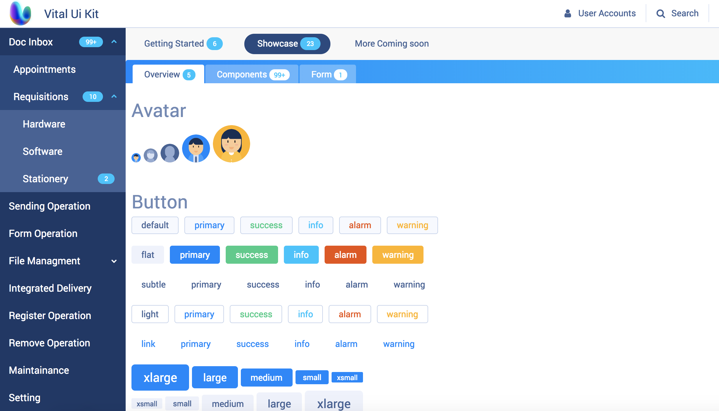
Vital UI Kit React
Simple, Themeable, Customizable React UI library
View Storybook »
Look for css version? »


## Intro
[Vital UI Kit](https://github.com/GSS-FED/vital-ui-kit) provide many UI components which are built for [Vital Cloud Services Family](https://www.gsscloud.com/en/). Vital UI Kit React encapsulated css style and components in order to achieve these goals:
- Themeable, build with styled-components. 💅
- Compound style components allows hight flexibility.
- Consistent development environment, by encapsulating internal UI style.
- Easy to use, provide detailed API.
## Demo
### Speed
An example of Offical Document contains all Vital UI Kit components
### Bit
## Getting Started
### Installation
```bash
# Install peer denpendcy, we use styled-components
# yarn
yarn add @vital-ui/react styled-components
# npm
npm i --save @vital-ui/react styled-components
## or install individual packages
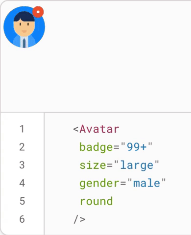
yarn add @vital-ui/react-avatar
```
```js
// VitalProvider contains default theme and icon, you can override it.
import { ThemeProvier, Button } from '@vital-ui/react' // You can use `ThemeProvider` by styled-components, or @vital-ui/react-theme
// recommend importing the global reset style.
import { globalStyle } from '@vital-ui/react';
import { createGlobalStyle } from 'styled-components'
const GlobalStyle = createGlobalStyle`
${globalStyle.linkStyle};
${globalStyle.reset};
${globalStyle.vitalTypographyStyle};
${globalStyle.robotoFontFamily};
`;
/* ... */
render() {
return (
Vital 💜 React!
)
}
```
## Contributing
Make sure read our [contributing guide](https://github.com/GSS-FED/vital-ui-kit-react/blob/master/CONTRIBUTING.md) to learn about our development process.
## Roadmap
- docs
- Table(expand content)
- Calendar