https://github.com/guru-technolabs/animated_weight_picker
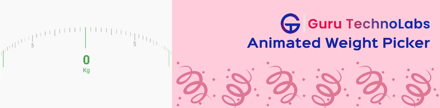
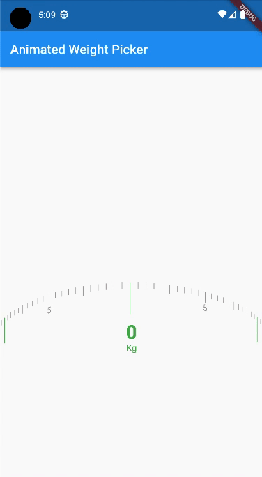
Animated Weight Picker allows to select a weight by swiping or dragging a handle along a scale.
https://github.com/guru-technolabs/animated_weight_picker
animated-weight-picker animations animations-demostration flutter-animation flutter-apps
Last synced: 7 months ago
JSON representation
Animated Weight Picker allows to select a weight by swiping or dragging a handle along a scale.
- Host: GitHub
- URL: https://github.com/guru-technolabs/animated_weight_picker
- Owner: guru-technolabs
- License: mit
- Created: 2023-01-20T14:03:40.000Z (over 3 years ago)
- Default Branch: main
- Last Pushed: 2024-08-04T01:20:53.000Z (almost 2 years ago)
- Last Synced: 2025-10-23T04:56:58.413Z (7 months ago)
- Topics: animated-weight-picker, animations, animations-demostration, flutter-animation, flutter-apps
- Language: Dart
- Homepage: https://www.gurutechnolabs.com/services/flutter-app-development/
- Size: 756 KB
- Stars: 4
- Watchers: 1
- Forks: 4
- Open Issues: 3
-
Metadata Files:
- Readme: README.md
- Changelog: CHANGELOG.md
- License: LICENSE
Awesome Lists containing this project
README
# Flutter Animated Weight Picker


## Supported Platforms
| ANDROID | IOS |
|---|:---:|
## Intro
A Flutter plugin for showing animated weight picker.
To get weight or any type of value from user.
- [Features](#features)
- [Getting started](#getting-started)
- [Installation](#installation)
- [Usage and Examples](#usage-and-examples)
- [Options](#options)
## Features
* The AnimatedWeightPicker is a Flutter package that allows for the selection of weight values in an animated and visually appealing way.
* The package provides a customizable weight picker widget that can be easily integrated into any Flutter project.
* The widget supports both metric and imperial weight units, and allows for the selection of values in increments as small as 0.
* It also includes features such as the ability to set a custom minimum and maximum value, and the ability to customize the appearance of the picker.
## Getting started
### Installation
To install the ```animated_weight_picker``` package in your Flutter project,
add the following line to your pubspec.yaml file
```dart
dependencies:
animated_weight_picker: ^1.0.0
```
Then run ```flutter pub get``` to update your dependencies.
To use the package in your code, add the following import statement
```dart
import 'package:animated_weight_picker/animated_weight_picker.dart';
```
You can then use the AnimatedWeightPicker widget in your code.
## Usage and Examples
```dart
// use in statefull widget or in stateless widget in stateless widget you need
// a statemanagement service or you are unable to change value in setState
final double min = 0;
final double max = 10;
String selectedValue = '';
@override
void initState() {
selectedValue = min.toString();
super.initState();
}
@override
Widget build(BuildContext context) {
return Scaffold(
appBar: AppBar(
title: const Text('Animated Weight Picker'),
),
body: Center(
child: AnimatedWeightPicker(
min: min,
max: max,
onChange: (newValue) {
setState(() {
selectedValue = newValue;
});
},
),
),
);
}
```
## Options
### For Animated Weight Picker:
| Option | Description | Type | Required |
|---|---|---|:---:|
[min](#) | Start or Minimum value of a weight picker/value picker | double | Yes
[max](#) | End or Maximum value of a weight picker/value picker | double | Yes
[division](#) | Interval by value | double | No
[squeeze](#) | Space between two value | double | No
[dialHeight](#) | Height of the centered or selected value view | double | No
[dialThickness](#) | Width/thickness of the centered or selected value view | double | No
[dialColor](#) | Color of the centered or selected value view | Color | No
[majorIntervalAt](#) | Number of intervals between major intervals | int | No
[majorIntervalHeight](#) | Height of the major intervals | double | No
[majorIntervalThickness](#) | Width/thickness of the major intervals | double | No
[majorIntervalColor](#) | Color of the major intervals | Color | No
[showMajorIntervalText](#) | Whether to show text on major intervals | bool | No
[majorIntervalTextSize](#) | Text size on major intervals | double | No
[majorIntervalTextColor](#) | Text color on major intervals | Color | No
[subIntervalAt](#) | Number of intervals between sub intervals | int | No
[subIntervalHeight](#) | Height of the sub intervals | double | No
[subIntervalThickness](#) | Width/thickness of the sub intervals | double | No
[subIntervalColor](#) | Color of the sub intervals | Color | No
[showSubIntervalText](#) | Whether to show text on sub intervals | bool | No
[subIntervalTextSize](#) | Text size on sub intervals | double | No
[subIntervalTextColor](#) | Text color on sub intervals | Color | No
[minorIntervalHeight](#) | Height of the minor intervals | double | No
[minorIntervalThickness](#) | Width/thickness of the minor intervals | double | No
[minorIntervalColor](#) | Color of the minor intervals | Color | No
[showMinorIntervalText](#) | Whether to show text on minor intervals | bool | No
[minorIntervalTextSize](#) | Text size on minor intervals | double | No
[minorIntervalTextColor](#) | Text color on minor intervals | Color | No
[showSelectedValue](#) | Whether to show selected value | bool | No
[selectedValueColor](#) | Color of the selected value | Color | No
[selectedValueStyle](#) | Style of the selected value text | TextStyle | No
[showSuffix](#) | Whether to show suffix | bool | No
[suffixText](#) | Text of the suffix | String | No
[suffixTextColor](#) | Color of the suffix text | Color | No
[suffix](#) | Custom suffix widget | Widget | No
[onChange](#) | Callback function when value is changed | Function(String newValue) | No
# LICENSE!
Animated Weight Picker is [MIT-licensed](https://github.com/guru-technolabs/animated_weight_picker/blob/main/LICENSE "MIT-licensed").
## Thanks
If something is missing or you want to add some feature, feel free to open a ticket or contribute!
# Give Feedback
We're always eager to hear about how our components are being used. If you've used one of our components in a project, please share the link with us at sales@gurutechnolabs.com.
We're also happy to answer any questions or receive suggestions you may have about our work.