https://github.com/gyandeeparyan/data-rendering
https://github.com/gyandeeparyan/data-rendering
chartjs-2 expressjs mongodb mongoose nextjs14 reactcontextapi vercel
Last synced: about 2 months ago
JSON representation
- Host: GitHub
- URL: https://github.com/gyandeeparyan/data-rendering
- Owner: gyandeeparyan
- Created: 2024-10-20T03:26:00.000Z (over 1 year ago)
- Default Branch: master
- Last Pushed: 2024-10-27T14:42:26.000Z (over 1 year ago)
- Last Synced: 2025-07-25T17:05:19.288Z (8 months ago)
- Topics: chartjs-2, expressjs, mongodb, mongoose, nextjs14, reactcontextapi, vercel
- Language: JavaScript
- Homepage: https://data-rendering.vercel.app
- Size: 610 KB
- Stars: 0
- Watchers: 1
- Forks: 0
- Open Issues: 0
-
Metadata Files:
- Readme: README.md
Awesome Lists containing this project
README
# Q2 | Dashboard
Imagine you are working on a project to build a product analytics platform for your company. The platform provides users with real-time data on sales, user engagement, etc. Your task is to develop a front-end application that includes interactive data visualization charts, advanced filtering options, and efficient cookie management for user preferences.
Additionally, the user will be sharing a view of the page with specific filters enabled and dates selected through the browser URL. Other users can then access the shared view by simply visiting this URL upon authentication
## Screenshots


## Features
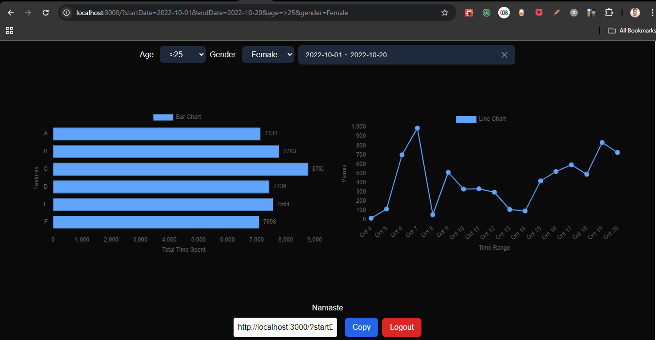
- Build a bar chart to represent the Features. A,B,C.. are features and x axis is total time spent between the selected date range.
- Implement a line chart to display the time trend of a particular category upon clicking in the bar chart. Chart should have pan, zoom-in, zoom-out options on time range.
les to distinguish between the same.
- Include 2 filters: Age (15-25, >25), Age (male, female).
- Add a date range selector component that allows users to choose a specific time range for analytics data. Update the graph based on the selected time range and filters
- Implement a cookie management system to store user preferences of filters and date range. When users revisit the page, their previous settings are applied by retrieving data from cookies. Provide an option for users to reset or clear their preferences.
- Ensure that the frontend application is responsive and works seamlessly on various devices, including desktops, tablets, and mobiles.
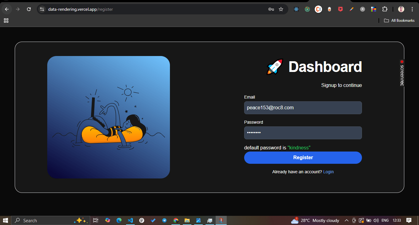
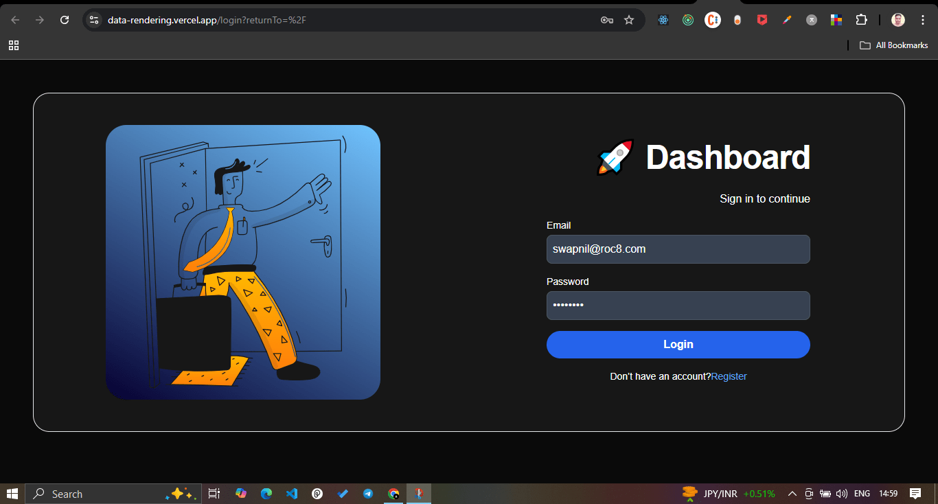
- Implement a basic user login interface. Users should be able to sign up, log in, and log out.
- Users should be able to share a chart created with date range and filters to another user via a URL. The second user will have to log in first to view the chart because the data is confidential.
## Tech Stack
Next.js, React Context , Chart.js , Express.js MongoDB, Mongoose, TailwindCSS , Vercel
## Run Locally
Clone the project
```bash
git clone https://github.com/gyandeeparyan/data-rendering
```
Go to the project directory
```bash
cd data-rendering
```
Install dependencies
```bash
npm install
```
Start the server
```bash
npm run dev
```
## Demo
- https://data-rendering.vercel.app/
## Feedback
- [Send anonymous feedback](https://sameeksha.vercel.app/u/gyan?utm_feedback_type=git-roc8-dashboard)