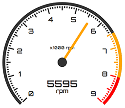
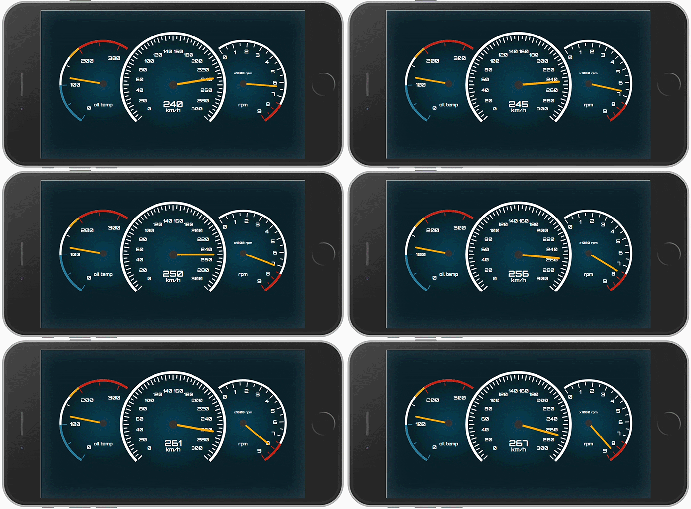
https://github.com/hawkgs/ng2-gauge
⏲ SVG gauge component for Angular
https://github.com/hawkgs/ng2-gauge
analog-gauge angular angular-gauge angular2-gauge gauge ng-gauge ng2-gauge
Last synced: 3 months ago
JSON representation
⏲ SVG gauge component for Angular
- Host: GitHub
- URL: https://github.com/hawkgs/ng2-gauge
- Owner: hawkgs
- License: mit
- Created: 2017-05-27T10:42:38.000Z (over 8 years ago)
- Default Branch: master
- Last Pushed: 2024-02-04T15:55:13.000Z (almost 2 years ago)
- Last Synced: 2025-08-09T12:04:01.043Z (4 months ago)
- Topics: analog-gauge, angular, angular-gauge, angular2-gauge, gauge, ng-gauge, ng2-gauge
- Language: TypeScript
- Homepage:
- Size: 986 KB
- Stars: 54
- Watchers: 2
- Forks: 14
- Open Issues: 3
-
Metadata Files:
- Readme: README.md
- Changelog: CHANGELOG.md
- License: LICENSE
Awesome Lists containing this project
- trackawesomelist - ng2-gauge (⭐53) - SVG gauge component for Angular. (Recently Updated / [Sep 01, 2024](/content/2024/09/01/README.md))
- awesome-angular - ng2-gauge - SVG gauge component for Angular. (Table of contents / Third Party Components)
- fucking-awesome-angular - ng2-gauge - SVG gauge component for Angular. (Table of contents / Third Party Components)
README
          # ng2-gauge

SVG gauge component for Angular


      Suitable for building virtual dashboards (initially designed for that).


**v1.3.2** | [CHANGELOG](./CHANGELOG.md)

## Installation

```

npm install ng2-gauge --save

```

## How to?

You should import the `GaugeModule` to your desired module:

```typescript

import { NgModule } from '@angular/core';

import { GaugeModule } from 'ng2-gauge';

@NgModule({

  imports: [CommonModule, GaugeModule],

})

export class SharedModule {}

```

Then you can simply use the component in your template:

```typescript

@Component({

  selector: 'app-my-component',

  template: `

    `,

})

export class MyComponent {

  value$: Observable;

}

```

## Options

The component provides a list of the following options:

- **`max: number`** _(required)_ – The maximal value of the gauge. It is suggested to use a number that is divisible by 10^n (e.g. 100, 1000, etc.)

- **`value: number`** – The current value of the gauge

- **`unit: string`** – The unit of the gauge (i.e. mph, psi, etc.)

- **`size: number`** – Size/width of the gauge _in pixels_

- **`arcStart: number`** – The start/beginning of the scale arc _in degrees_. Default `225`

- **`arcEnd: number`** – The end of the scale arc _in degrees_. Default: `135`

- **`digitalDisplay: boolean`** – Displays the current value as digital number inside the gauge

- **`darkTheme: boolean`** – Enables the dark theme

- **`activateRedLightAfter: number`** - Shows a red light when the specified limit is reached

- **`sectors: Sectors[]`** – Defines the coloring of specified sectors

- **`config: GaugeConfig`** _(Not recommended)_ – Alters the default configuration; This may lead to unexpected behavior; [GaugeConfig](./src/app/gauge/shared/config.ts)

### Sectors

Sectors are used for marking parts of the arc with a different color.

**Example:**

```typescript

const max = 9000;

const sectors = [

  {

    from: 6500,

    to: 8000,

    color: 'orange',

  },

  {

    from: 8000,

    to: 9000,

    color: 'red',

  },

];

```

## Styling

The component provides two themes - light (default) and dark. Yet, you can easily alter the CSS through the parent component in order to fit your needs. The font used for the gauge is Orbitron (Google Fonts).