https://github.com/heliomarpm/ion-calendar
📅 A date picker component for ionic6+
https://github.com/heliomarpm/ion-calendar
angular angular-component angular2 calendar component datepicker datepicker-component ion-calendar ionic ionic-component ionic6 ionic7
Last synced: 9 months ago
JSON representation
📅 A date picker component for ionic6+
- Host: GitHub
- URL: https://github.com/heliomarpm/ion-calendar
- Owner: heliomarpm
- License: mit
- Created: 2021-05-15T02:12:42.000Z (about 5 years ago)
- Default Branch: main
- Last Pushed: 2025-04-20T22:17:51.000Z (over 1 year ago)
- Last Synced: 2025-04-20T23:23:55.583Z (over 1 year ago)
- Topics: angular, angular-component, angular2, calendar, component, datepicker, datepicker-component, ion-calendar, ionic, ionic-component, ionic6, ionic7
- Language: TypeScript
- Homepage: https://ioncalendar-demo.web.app/
- Size: 936 KB
- Stars: 3
- Watchers: 2
- Forks: 3
- Open Issues: 6
-
Metadata Files:
- Readme: README.md
- Contributing: docs/CONTRIBUTING.md
- Funding: .github/FUNDING.yml
- License: LICENSE
- Code of conduct: docs/CODE_OF_CONDUCT.md
Awesome Lists containing this project
README
📅 Ionic Component IonCalendar
[![DeepScan grade][url-deepscan-badge]][url-deepscan]
[![CodeFactor][url-codefactor-badge]][url-codefactor]
![CodeQL][url-codeql]
![Publish][url-publish]
[![NPM version][url-npm-badge]][url-npm]
[![Downloads][url-downloads-badge]][url-downloads]


_*live demo:* [click here](https://ioncalendar-demo.web.app)_
## Summary
The `@heliomarpm/ion-calendar` is a calendar component for Ionic Framework-based applications. \
It uses [Luxon](https://moment.github.io/luxon/) to handle dates and times, so it's fully compatible with
International Organization for Standardization (ISO) 8601 formats.
## The main features are:
* Fully customizable layout;
* Customizable date format;
* Multiple selection mode;
* Range selection mode;
* Calendar can be placed in content area or as an overlay;
* Theming using SCSS variables.
* Disable weekdays or weekends.
* Setting days event.
* Setting localization.
* Material design from Ionic Framework.
* Adapted for Ionic dark theme
## Support
- @angular/core `^16.+"`
- @ionic/angular `^6.+"`
## Installation
You can install the library using `npm` or `yarn`:
```bash
npm i @heliomarpm/ion-calendar
# or
yarn add @heliomarpm/ion-calendar
```
## Example Usage
### Import module
```typescript
import { NgModule } from '@angular/core';
import { IonicApp, IonicModule } from '@ionic/angular';
...
import { AppComponent } from './app.component';
import { IonCalendarModule } from '@heliomarpm/ion-calendar';
@NgModule({
declarations: [AppComponent],
imports: [
...,
IonicModule.forRoot(),
IonCalendarModule
],
...
})
export class AppModule {}
```
### Change Defaults
```typescript
import { NgModule } from '@angular/core';
import { IonicApp, IonicModule } from '@ionic/angular';
...
import { AppComponent } from './app.component';
import { IonCalendarModule } from '@heliomarpm/ion-calendar';
@NgModule({
declarations: [AppComponent],
imports: [
...,
IonicModule.forRoot(),
// See ICalendarComponentOptions for options
IonCalendarModule.forRoot({
doneLabel: 'Confirm',
closeIcon: true
})
],
...
})
export class AppModule {}
```
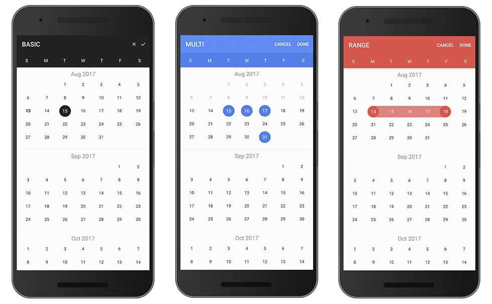
## Components Mode
### Basic
```html
```
```typescript
import { Component } from '@angular/core';
@Component({
selector: 'page-home',
templateUrl: 'home.html'
})
export class HomePage {
date: string;
type: 'string'; // 'string' | 'js-date' | 'luxon' | 'time' | 'object'
constructor() { }
onChange($event) {
console.log($event);
}
...
}
```
### Date range
```html
```
```typescript
import { Component } from '@angular/core';
import { ICalendarComponentOptions } from '@heliomarpm/ion-calendar';
@Component({
selector: 'page-home',
templateUrl: 'home.html'
})
export class HomePage {
dateRange: { from: string; to: string; };
type: 'string'; // 'string' | 'js-date' | 'luxon' | 'time' | 'object'
optionsRange: ICalendarComponentOptions = {
pickMode: 'range'
};
constructor() { }
...
}
```
### Multi Date
```html
```
```typescript
import { Component } from '@angular/core';
import { ICalendarComponentOptions } from '@heliomarpm/ion-calendar';
@Component({
selector: 'page-home',
templateUrl: 'home.html'
})
export class HomePage {
dateMulti: string[];
type: 'string'; // 'string' | 'js-date' | 'luxon' | 'time' | 'object'
optionsMulti: ICalendarComponentOptions = {
pickMode: 'multi'
};
constructor() { }
...
}
```
### Input Properties
| Name | Type | Default | Description
| - | - | - | -
| options | ICalendarComponentOptions | null | options
| format | string | 'yyyy-MM-dd' | value format
| type | string | 'string' | value type
| readonly | boolean | false | readonly
### Output Events
| Name | Type | Description
| - | - | -
| onChange | EventEmitter | event for model change
| onMonthChange | EventEmitter | event for month change when displayMode = month
| onWeekChange | EventEmitter | event for month change when displayMode = week
| onSelect | EventEmitter | event for click day-button
| onSelectStart | EventEmitter | event for click day-button
| onSelectEnd | EventEmitter | event for click day-button
### ICalendarComponentOptions
| Name | Type | Default | Description
| - | - | - | -
| from | Date | `new Date()` | start date
| to | Date | 0 (Infinite) | end date
| color | string | `'primary'` | 'primary', 'secondary','tertiary', 'success', 'warning', 'danger', 'dark', 'medium', 'light', 'custom', 'transparent'
| colorSubtitle | string | `undefined` | 'primary', 'secondary','tertiary', 'success', 'warning', 'danger', 'dark', 'medium', 'light', 'custom', 'transparent'
| pickMode | string | `single` | 'multi', 'range', 'single'
| showToggleButtons | boolean | `true` | show toggle buttons
| monthsTitle | Array | `['JAN', 'FEB', ..., 'NOV', 'DEC']` | month picker format
| showMonthPicker | boolean | `true` | show month picker
| showYearPicker | boolean | `true` | show year picker
| defaultTitle | string | '' | default title in days
| defaultSubtitle | string | '' | default subtitle in days
| disableWeeks | Array | `[]` | week to be disabled (0-6) |
| monthFormat | string | `'MMM yyyy'` | month title format |
| weekdays | Array | `['S', 'M', 'T', 'W', 'T', 'F', 'S']` | weeks text
| weekStart | number | `0` | set week start day `0` of sundaty, `1` of monday
| IDayConfig | Array<**_IDayConfig_**> | `[]` | days configuration
| displayMode | string | `month` | 'month', 'week'
| showAdjacentMonthDay | boolean | `true` | show days of adjacent months when `displayMode: 'month'`
| showMonthAdjacentDays | boolean | `false` | show the month on days adjacent to the selected month when `displayMode: 'week'`
| weeks | number | `1` | number of week to show in week display mode
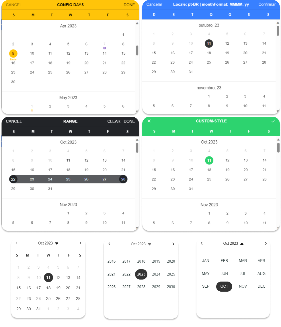
| locale | ICalendarLocale | {locale: 'en', weekdays: 'initial' } | change calendar locale and set default name to weeks
## Modal Mode
### Basic
Import ion2-calendar in component controller.
```typescript
import { Component } from '@angular/core';
import { ModalController } from '@ionic/angular';
import { CalendarModalComponent, ICalendarModalOptions, IDayConfig, ICalendarResult } from '@heliomarpm/ion-calendar';
@Component({
selector: 'page-home',
templateUrl: 'home.html'
})
export class HomePage {
constructor(public modalCtrl: ModalController) {}
openCalendar() {
const options: ICalendarModalOptions = {
title: 'BASIC'
};
const myCalendar = await this.modalCtrl.create({
component: CalendarModalComponent,
componentProps: { options }
});
myCalendar.present();
const event: any = await myCalendar.onDidDismiss();
const date: ICalendarResult = event.data;
if (event.role === 'done') {
console.log('date:', date); // date selected
}
}
}
```
### Date range
Set pickMode to 'range'.
```typescript
openCalendar() {
const options: ICalendarModalOptions = {
pickMode: 'range',
title: 'RANGE'
};
const myCalendar = await this.modalCtrl.create({
component: CalendarModal,
componentProps: { options }
});
myCalendar.present();
const event: any = await myCalendar.onDidDismiss();
const date = event.data;
const from: ICalendarResult = date.from;
const to: ICalendarResult = date.to;
console.log(date, from, to);
}
```
### Multi Date
Set pickMode to 'multi'.
```typescript
openCalendar() {
const options = {
pickMode: 'multi',
title: 'MULTI'
};
const myCalendar = await this.modalCtrl.create({
component: CalendarModal,
componentProps: { options }
});
myCalendar.present();
const event: any = await myCalendar.onDidDismiss();
const date: ICalendarResult = event.data;
console.log(date);
}
```
### Disable weeks
Use index eg: `[0, 6]` denote Sunday and Saturday.
```typescript
openCalendar() {
const options: ICalendarModalOptions = {
disableWeeks: [0, 6]
};
const myCalendar = await this.modalCtrl.create({
component: CalendarModal,
componentProps: { options }
});
myCalendar.present();
const event: any = await myCalendar.onDidDismiss();
const date: ICalendarResult = event.data;
console.log(date);
}
```
### Localization
```typescript
openCalendar() {
const options: ICalendarModalOptions = {
locale: { locale: 'zn-CN', weekdays:'short' },
weekStart: 1,
monthFormat: 'yyyy 年 MM 月',
defaultDate: new Date()
};
const myCalendar = await this.modalCtrl.create({
component: CalendarModal,
componentProps: { options }
});
myCalendar.present();
const event: any = await myCalendar.onDidDismiss();
const date: ICalendarResult = event.data;
console.log(date);
}
```
### Days Config
Configure one day.
```typescript
openCalendar() {
let holidays: IDayConfig[] = [];
holidays.push({date: new Date(2023, 0, 1), title: '🎉', subTitle: 'New Year'});
holidays.push({date: new Date(2023, 4, 1), subTitle: 'Labor Day', disable: true});
holidays.push({date: new Date(2023, 11, 25), subTitle: '🎅', disable: true});
const options: ICalendarModalOptions = {
from: new Date(2023, 0, 1),
to: new Date(2023, 11, 31),
defaultDate: new Date(),
efaultScrollTo: new Date(),
IDayConfig: holidays,
color: 'success'
};
const myCalendar = await this.modalCtrl.create({
component: CalendarModal,
componentProps: { options }
});
myCalendar.present();
const event: any = await myCalendar.onDidDismiss();
const date: ICalendarResult = event.data;
console.log(date);
}
```
# API
### Modal Options
| Name | Type | Default | Description
| - | - | - | -
| from | Date | `new Date()` | start date
| to | Date | `undefined` | end date
| title | string | `'CALENDAR'` | title
| color | string | `'primary'` | 'primary', 'secondary', 'danger', 'light', 'dark'
| defaultScrollTo | Date | from | let the view scroll to the default date
| defaultDate | Date | `null` | default date data, apply to single
| defaultDates | Array | `null` | default dates data, apply to multi
| defaultDateRange | { from: Date, to: Date } | `null` | default date-range data, apply to range
| defaultTitle | string | '' | default title in days
| defaultSubtitle | string | '' | default subtitle in days
| cssClass | string | `''` | Additional classes for custom styles, separated by spaces.
| canBackwardsSelected | boolean | `false` | can backwards selected
| pickMode | string | `single` | 'multi', 'range', 'single'
| disableWeeks | Array | `[]` | week to be disabled (0-6)
| closeLabel | string | `CANCEL` | cancel button label
| doneLabel | string | `DONE` | done button label
| clearLabel | string | `null` | clear button label
| closeIcon | boolean | `false` | show cancel button icon
| doneIcon | boolean | `false` | show done button icon
| monthFormat | string | `'MMM yyyy'` | month title format
| weekdays | Array | `['S', 'M', 'T', 'W', 'T', 'F', 'S']` | weeks text
| weekStart | number | `0` (0 or 1) | set week start day
| weeks | number | `1` | number of weeks will be displayed when `displayMode: week`
| IDayConfig | Array<**_IDayConfig_**> | `[]` | days configuration
| step | number | `12` | month load stepping interval to when scroll
| autoDone | boolean | false | done automatically when selecting date
| showAdjacentMonthDay | boolean | true | show days of adjacent months
### onDidDismiss Output `{ data } = event`
| pickMode | Type
| -------- | -
| single | { date: **_ICalendarResult_** }
| range | { from: **_ICalendarResult_**, to: **_ICalendarResult_** }
| multi | Array<**_ICalendarResult_**>
### onDidDismiss Output `{ role } = event`
| Value | Description
| ---------- | -
| 'cancel' | dismissed by click the cancel
| 'done' | dismissed by click the done button
| 'backdrop' | dismissed by click the backdrop
#### IDayConfig
| Name | Type | Default | Description
| -------- | ------- | -------- | -
| cssClass | string | `''` | separated by spaces
| date | Date | required | configured days
| marked | boolean | false | highlight color
| disable | boolean | false | disable
| title | string | none | displayed title eg: `'today'`
| subTitle | string | none | subTitle subTitle eg: `'New Year\'s
### ICalendarResult
| Name | Type |
| ------- | ------ |
| time | number |
| secondas| number |
| dateObj | Date |
| string | string |
| year | number |
| month | number |
| day | number |
## Dependencies
- [@angular/core](https://angular.io): Angular - the core framework
- [@ionic/angular](https://ionicframework.com/): Ionic Angular specific building blocks on top of @ionic/core components.
- [luxon](moment.github.io/luxon): Luxon is a library for working with dates and times in JavaScript.
## Contributing
Please make sure to read the [Contributing Guide](https://github.com/heliomarpm/ion-calendar/blob/main/docs/CONTRIBUTING.md) before making a pull request.
Thank you to all the people who already contributed to project!

###### Made with [contrib.rocks](https://contrib.rocks).
That said, there's a bunch of ways you can contribute to this project, like by:
- :beetle: Reporting a bug
- :page_facing_up: Improving this documentation
- :rotating_light: Sharing this project and recommending it to your friends
- :dollar: Supporting this project on GitHub Sponsors or Ko-fi
- :star2: Giving a star on this repository
## Donate
If you appreciate that, please consider donating to the Developer.
## License
[MIT © Heliomar P. Marques](LICENSE) 🔝
----
[url-npm]: https://www.npmjs.com/package/@heliomarpm/ion-calendar
[url-npm-badge]: https://img.shields.io/npm/v/@heliomarpm/ion-calendar.svg
[url-downloads-badge]: https://img.shields.io/npm/dm/@heliomarpm/ion-calendar.svg
[url-downloads]: http://badge.fury.io/js/@heliomarpm/ion-calendar.svg
[url-license-badge]: http://img.shields.io/badge/license-MIT-blue.svg?style=flat
[url-deepscan-badge]: https://deepscan.io/api/teams/19612/projects/25662/branches/805908/badge/grade.svg
[url-deepscan]: https://deepscan.io/dashboard#view=project&tid=19612&pid=25662&bid=805908
[url-codefactor-badge]: https://www.codefactor.io/repository/github/heliomarpm/ion-calendar/badge
[url-codefactor]: https://www.codefactor.io/repository/github/heliomarpm/ion-calendar
[url-codeql]: https://github.com/heliomarpm/ion-calendar/actions/workflows/codeql.yml/badge.svg
[url-publish]: https://github.com/heliomarpm/ion-calendar/actions/workflows/publish.yml/badge.svg