https://github.com/helti/vue-jsx-table
基于element-ui二次封装的表格
https://github.com/helti/vue-jsx-table
element-table element-ui jsx table vue
Last synced: about 1 year ago
JSON representation
基于element-ui二次封装的表格
- Host: GitHub
- URL: https://github.com/helti/vue-jsx-table
- Owner: HelTi
- Created: 2021-08-22T02:54:49.000Z (almost 5 years ago)
- Default Branch: main
- Last Pushed: 2021-11-22T14:42:20.000Z (over 4 years ago)
- Last Synced: 2025-05-24T21:47:36.731Z (about 1 year ago)
- Topics: element-table, element-ui, jsx, table, vue
- Language: Vue
- Homepage:
- Size: 2.02 MB
- Stars: 9
- Watchers: 1
- Forks: 4
- Open Issues: 0
-
Metadata Files:
- Readme: README.md
Awesome Lists containing this project
README
# 文档
[文档示例](https://helti.github.io/vue-jsx-table/)
此组件基于element-table二次开发,以实际业务出发,封装了常用的功能,通过配置的方式生成表格,
并且实现**多级表头** **expand展开项** **自定义表头**功能等
[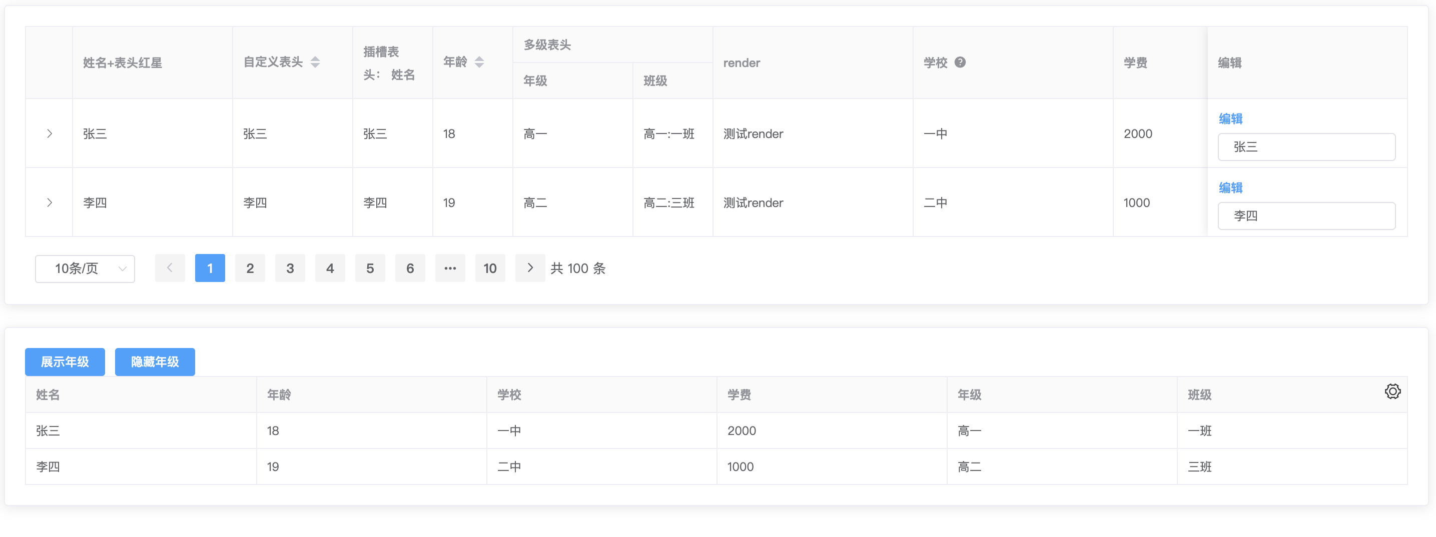](https://imgtu.com/i/hpyJmt)
## 使用
使用之前需要项目中引入element-ui
```js
npm i vue-jsx-table
import 'vue-jsx-table/dist/vue-jsx-table.css'
import vueJsxTable from 'vue-jsx-table'
Vue.use(vueJsxTable)
```
### cdn方式
```js
```
## 普通表格
对于表格配置columns、tableData选项是必须的。
```js
data() {
return {
columns: [
{
type: 'selection',
fixed: 'left',
selectable: this.rowSelectableHandle,
},
{
label: '年龄',
prop: 'age',
width: 300,
sortable: true,
},
{
label: '学校',
prop: 'school',
width: 200,
},
{
label: '学费',
prop: 'fee',
width: 200,
},
{
label: '编辑',
prop: 'edit',
slot: 'edit',
fixed: 'right',
width: 200,
},
],
tableData:[]
};
},
```
## 多级表头
给 column 设置 children,可以渲染出分组表头。
```js
{
label: '多级表头',
children: [
{
label: '年级',
prop: 'grade',
width: 120,
},
{
label: '班级',
prop: 'class',
},
],
},
```
## 自定义渲染内容 render
给column设置render选项,Funtion(row, column, $index)
```js
{
label: 'render',
prop: 'render',
width: 200,
render: (row, column, $index) => {
return (
this.cellClick(row, column, $index)}>
测试render
);
},
},
```
## 设置展开项
只需要对column配置项设置type:expand,展开的内容可以使用插槽slot,也可以使用render,如果同时配置slot,render,则slot会被忽略。
```js
{
type: 'expand',
slot: 'expand',
},
```
## 自定义插槽
只需要对 column配置项设置 solt:'',slot为插槽的名字
```js
{
label: '编辑',
prop: 'edit',
slot: 'edit',
fixed: 'right',
width: 200,
},
```
## 自定义表头
只需要对 column配置项设置 renderHeader,~~renderHeader为element-ui的原生配置~~ (官方不推荐使用column上的render-header函数,推荐使用插槽 !!,控制台会有提示,,囧),你也可以使通过配置slotHeader项使用插槽,**注意插槽名称不能重复,定义了插槽配置已定义在模板中声明**
### renderHeader
```js
{
label: '自定义表头',
prop: 'name',
width: 120,
sortable: true,
renderHeader: (column, scope) => {
console.log('scope', scope);
return {column.label};
},
},
```
### 表头插槽 slotHeader
```js
{
label: '姓名',
prop: 'name',
slotHeader: 'slotHeader',
},
插槽表头: {{ column.label }}
```
## 分页控件pageSize 改变、currentPage 改变,都会触发page-change,Function({currentPage,pageSize})
```js
pageChangeHandle(val) {
this.paginationParams.pageNo = val.currentPage;
this.paginationParams.pageSize = val.pageSize;
},
```
## 表格列内容为组件
通过solt插槽,也可以使用render函数来渲染组件
```js
```
### Table Attributes
所有的Table Attributes通过v-bind="$attrs"实现,额外增加的Table Attributes:
| 参数 | 说明 | 类型 | 默认值 |
| ---- | ---- | ---- | ---- |
| columns | 表格的列 | Array | [] |
| columnsKeyName | column 的 key,如果需要使用 filter-change 事件,则需要此属性标识是哪个 column 的筛选条件(Table-column Attributes的column-key) | string | - |
| align | 对齐方式| String | left |
| showPagination | 是否展示分页控件 | Boolean | true |
| currentPage | 当前分页控件的当前页 | Number | 1 |
| pageSizes | 分页控件的pageSizes | Array | [10, 20, 30, 50] |
| pageSize | 分页控件的pageSize| Array | [] |
| layout | 分页控件的layout | String | 'sizes, prev, pager, next,total' |
| total | 分页控件的total | Number | 0 |
| paginationStyle | 分页控件的样式style | Object | - |
| showOverflowTooltip | 当内容过长被隐藏时显示 tooltip,如果column没单独配置showOverflowTooltip,则使用该属性,默认为true | Boolean | true |
| showTableSetting | 展示表格设置 | Boolean | false |
| hideColumns | 需要隐藏的列,label名称,有些场景需要根据部分条件展示隐藏列 | Array | [] |
| customClass | 自定义样式class | Array | ['vue-jsx-table-wrapper'] |
### Table Events
所有的 Table Events 通过v-on="$listeners"实现,额外增加的 Table Events:
| 参数 | 说明 | 类型 | 默认值 |
| ---- | ---- | ---- | ---- |
| size-change | page-change,current-change改变都会触发此事件,为了方便分页改变而增加 | Function | 'function({pageSize: 10,currentPage: 1,}) {}'|
| size-change | pageSize 改变时会触发 | - | - |
| current-change | currentPage 改变时会触发 | - | - |
### 配置列 columns
| 参数 | 说明 | 类型 | 默认值 |
| ---- | ---- | ---- | ---- |
| prop | 对应列内容的字段名| string | - |
| slot | 列的插槽名字(注意如果嵌套表格,slot名称不能有重复的,插槽作用域({ row, $index })) | string | - |
| label | 显示的标题 | string | - |
| width | 对应列的宽度 | Number | - |
| showOverflowTooltip | 当内容过长被隐藏时显示 tooltip | Boolean | - |
| fixed | 列是否固定在左侧或者右侧(true, left, right),true 表示固定在左侧 | string, boolean | - |
| render | jsx渲染函数 | function | render(row, column, $index) |
| type | selection/index/expand | string | - |
| renderHeader | 表头,列标题 Label 区域渲染使用的 Function| Function(column, scope }),column为配置项,scope为原生组件的scope 。(该属性不是原生参数)| - |
| cellredstar | 表头文字前是否打红星标志 | Boolean | false |
| sortable | 对应列是否可以排序,如果设置为 'custom',则代表用户希望远程排序,需要监听 Table 的 sort-change 事件 | boolean, string (true, false, 'custom') | false |
| formatter | 用来格式化内容(element-ui原有属性)| Function(row, column, cellValue, index) | - |
| selectable | 仅对 type=selection 的列有效,类型为 Function,Function 的返回值用来决定这一行的 CheckBox 是否可以勾选| Function(row, index) | - |
| showHeaderTooltip | 鼠标移到表头是否展示文案提示信息| Boolean | - |
| headerTooltipText | 表头展示文案信息内容| String | - |