https://github.com/helti/vue-pithy-progress
vue progress component. circle, semi-circle, progress-bar
https://github.com/helti/vue-pithy-progress
Last synced: 6 months ago
JSON representation
vue progress component. circle, semi-circle, progress-bar
- Host: GitHub
- URL: https://github.com/helti/vue-pithy-progress
- Owner: HelTi
- License: mit
- Created: 2020-08-31T14:18:20.000Z (almost 6 years ago)
- Default Branch: master
- Last Pushed: 2020-09-16T14:37:17.000Z (almost 6 years ago)
- Last Synced: 2024-04-14T07:47:28.324Z (over 2 years ago)
- Language: Vue
- Size: 664 KB
- Stars: 1
- Watchers: 2
- Forks: 0
- Open Issues: 0
-
Metadata Files:
- Readme: README.md
- License: LICENSE
Awesome Lists containing this project
README
# vue-pithy-progress
Progress bar component for Vue.js(2.x). This project contains three common components(circle-progress、semi-circle-progres、progress-bar)uses SVG to show progress.
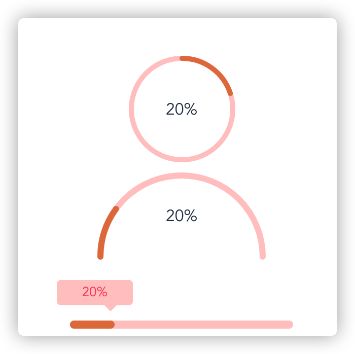
English|[中文](./README_CN.md)
## Installation
```bash
npm install vue-pithy-progress
```
## Usage
### Global registration
```bash
import VuePithyProgress from 'vue-pithy-progress'
import 'vue-pithy-progress/dist/vue-pithy-progress.css'
Vue.use(VuePithyProgress)
```
### Use single component
```bash
import semiCircleProgress from 'vue-pithy-progress/lib/semi-circle-progress.umd.min.js'
import 'vue-pithy-progress/lib/semi-circle-progress.css'
export default {
name: 'App',
data() {
return {
percentage: 10
}
},
components: { semiCircleProgress }
}
```
## demo
```js
increase
export default {
name: 'App',
data() {
return {
percentage: 10
}
},
methods: {
changeProgrss() {
this.percentage += 10
}
}
}
```
## circle-progress
### props
| Name | Default value | Type | Description |
| ---- | ---- | ---- | ---- |
| percentage | 0 | Number | Rate of progress. |
| r | 50 | Number | Radius of circle. |
| stroke-width | 5 | Number | The width of the progress bar. |
| bg-color | #ffffff | String | The background color of the circle.|
| stroke-bg-color | #ffcaca | String | The background color of the progress bar. |
| stroke-color | #e57d4b | String | The color of progress bar. |
| stroke-linecap | round | String | The type of stroke linecap for circle.(sqaure butt round) |
| duration | 0.3 | Number | Transition time for progress changes. |
### slots
| Name | Description |
| ---- | ---- |
| default | custom text content. |
## semi-circle-progress
### props
| Name | Default value | Type | Description |
| ---- | ---- | ---- | ---- |
| percentage | 0 | Number | Rate of progress. |
| r | 50 | Number | Radius of circle. |
| stroke-width | 5 | Number | The width of the progress bar. |
| bg-color | #ffffff | String | The background color of the circle.|
| stroke-bg-color | #ffcaca | String | The background color of the progress bar. |
| stroke-color | #e57d4b | String | The color of progress bar. |
| stroke-linecap | round | String | The type of stroke linecap for circle.(sqaure butt round) |
| duration | 0.3 | Number | Transition time for progress changes. |
### slots
| Name | Description |
| ---- | ---- |
| default | custom text content. |
## progress-abr
### props
| Name | Default value | Type | Description |
| ---- | ---- | ---- | ---- |
| percentage | 0 | Number | Rate of progress. |
| height | 8 | Number | Height of progress bar. |
| unit | px | String | The css pixel unit. |
| width | 100% | String | The width of progress bar.|
| bg-color | #ffcaca | String | The background color of the progress bar. |
| color | #e57d4b | String | The font color of progress bar. |
| show-top-tip | true | Boolean | Show top tips of progress bar. |
| tip-bg-color | #ffcaca | String | Background color of top tips. |
| tip-font-color | #ff445a | String | Font color of top tips. |
### slots
| Name | Description |
| ---- | ---- |
| default | custom text content(Top tip). |
## Dev
```bash
npm install
npm run serve
```
## build
```bash
npm run build
```
## License
[MIT](./LICENSE)