Ecosyste.ms: Awesome
An open API service indexing awesome lists of open source software.
https://github.com/hesto2/react-animated-list
Parent component that automatically animates the addition/removal of its children
https://github.com/hesto2/react-animated-list
Last synced: about 2 months ago
JSON representation
Parent component that automatically animates the addition/removal of its children
- Host: GitHub
- URL: https://github.com/hesto2/react-animated-list
- Owner: hesto2
- License: mit
- Created: 2019-10-19T00:17:32.000Z (about 5 years ago)
- Default Branch: master
- Last Pushed: 2023-01-05T00:45:56.000Z (almost 2 years ago)
- Last Synced: 2024-09-19T23:18:43.238Z (3 months ago)
- Language: TypeScript
- Size: 2.89 MB
- Stars: 7
- Watchers: 2
- Forks: 2
- Open Issues: 45
-
Metadata Files:
- Readme: README.md
- License: LICENSE
Awesome Lists containing this project
README
# React Animated List
## Intro
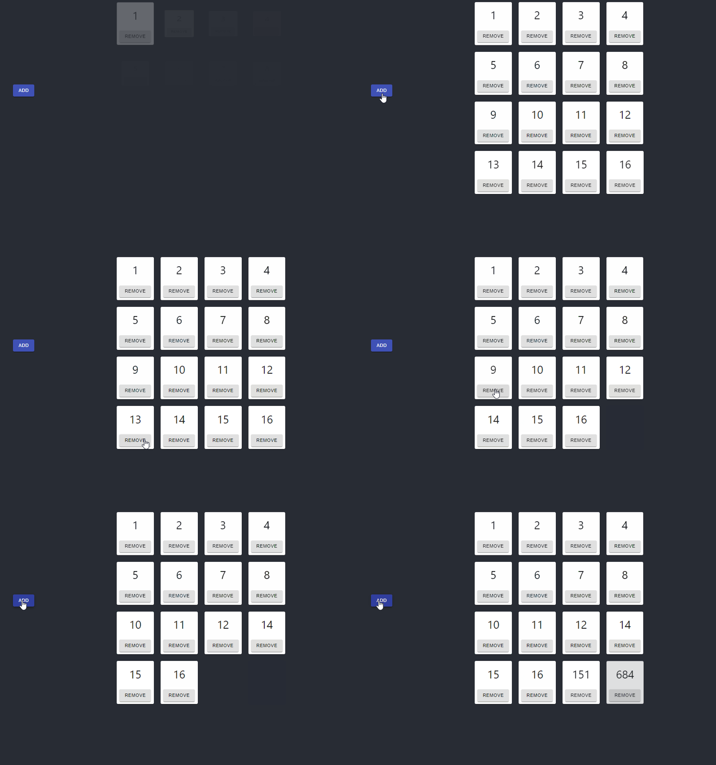
React animated list is a simple way you can have any of your array-based elements be automatically animated. This applies to when they are both rendered, and removed.
[](https://codesandbox.io/s/nifty-platform-dj1iz?fontsize=14&hidenavigation=1&theme=dark)

## Getting Started
### Installing
`yarn add react-animated-list`
### Usage
`react-animated-list` exports a named component `AnimatedList`. Importing this will allow you to wrap a list of other components you want animated as follows:
```
import { AnimatedList } from 'react-animated-list';
import { MyOtherComponent } from './MyOtherComponent';
const MyComponent = ({myData}) => (
{otherComponents.map((c) => (
))}
)
```
**Note that the `key` property is required on the child components, this is used to determine which elements to animate in/out**
The `AnimatedListComponent` can be configured with the following properties:
| Name | Type | Default | Description |
| :----------------------- | :------------------------------------------ | :------ | :-------------------------------------------------------------------------------------------------------------------------------------------------------- |
| animation | `grow`, `fade`, `slide`, `zoom`, `collapse` | `grow` | The type of animation to use |
| animationProps | | none | The props that should be passed to the Material UI component that handles the rendering. See https://material-ui.com/api/grow/#grow-api for more examples |
| initialAnimationDuration | number | 750 | How long the `enter` animation for the list should take on the initial render |