https://github.com/hirishu10/react-native-customized-box
React Native Customized Input Box is very simple and easy to use.
https://github.com/hirishu10/react-native-customized-box
box-style custom-inputbox hirishu10 inputbox npm password-toggle-box react react-native react-native-inputbox required-box
Last synced: 3 months ago
JSON representation
React Native Customized Input Box is very simple and easy to use.
- Host: GitHub
- URL: https://github.com/hirishu10/react-native-customized-box
- Owner: hirishu10
- License: mit
- Created: 2022-01-14T17:22:45.000Z (over 4 years ago)
- Default Branch: main
- Last Pushed: 2022-02-04T08:19:51.000Z (over 4 years ago)
- Last Synced: 2025-09-28T19:15:52.827Z (10 months ago)
- Topics: box-style, custom-inputbox, hirishu10, inputbox, npm, password-toggle-box, react, react-native, react-native-inputbox, required-box
- Language: TypeScript
- Homepage:
- Size: 522 KB
- Stars: 1
- Watchers: 1
- Forks: 0
- Open Issues: 0
-
Metadata Files:
- Readme: README.md
- License: LICENSE
Awesome Lists containing this project
README
# react-native-customized-box ·    
React Native Customized Box is very simple and easy to use.
# Content
- [Getting started](#getting-started)
- [Overview](#overview)
- [Method and Props Configuration](#method-and-props-configuration)
- [Author](#author)
- [License](#license)
# Getting started
## Prerequisites
- Node (version 12 or greater).
- Yarn (version 1.5 or greater).
- React, React-Native should be installed
- A fork of the repo (for any contributions).
## Installation
> Using NPM
```bash
npm i --save react-native-customized-box
```
> Using Yarn
```bash
yarn add react-native-customized-box
```
# Overview
#### 📖 Below we provide examples with code how to use!
```jsx
import CustomBox from "react-native-customized-box";
```
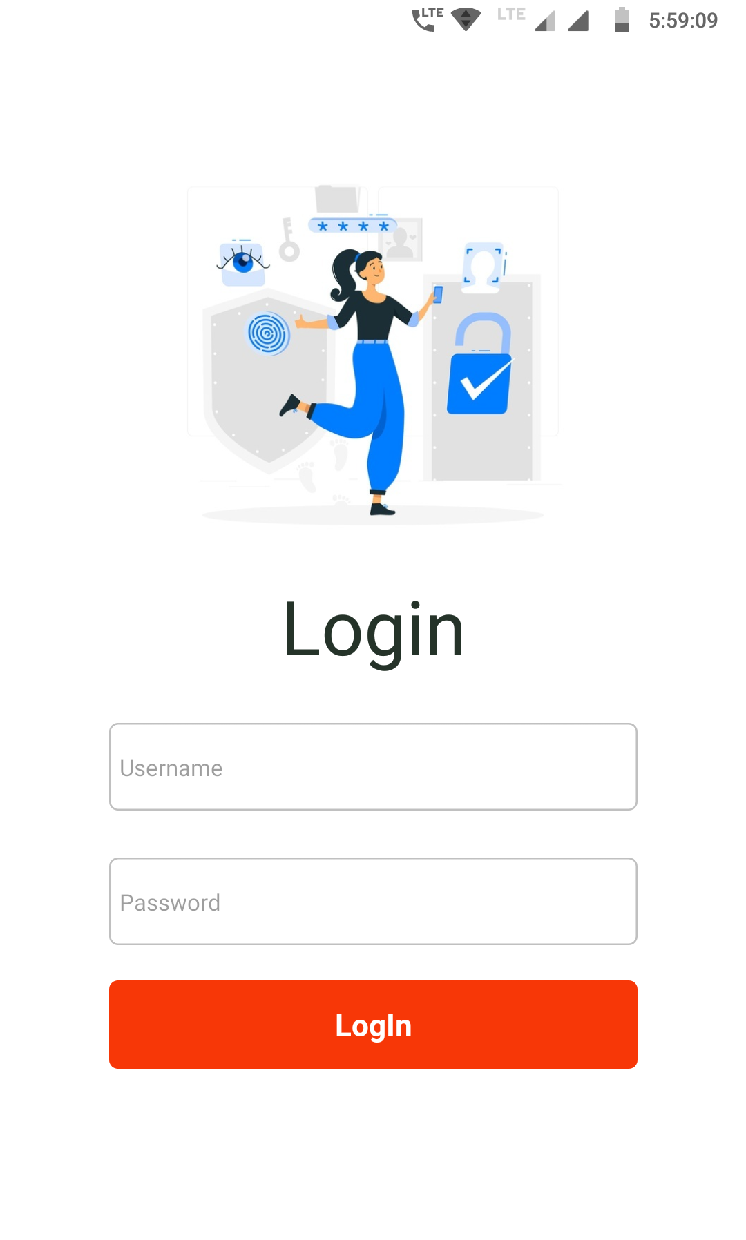
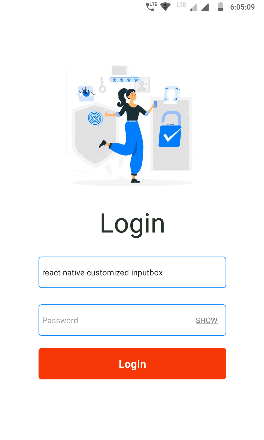
#### ► Example - 1
> → Box fully customizable
| | |
| :-----------------------------------------------------------------------------------------: | :-----------------------------------------------------------------------------------------: |
|  |
|  |
|
> **Code Snippet ↓**
```jsx
```
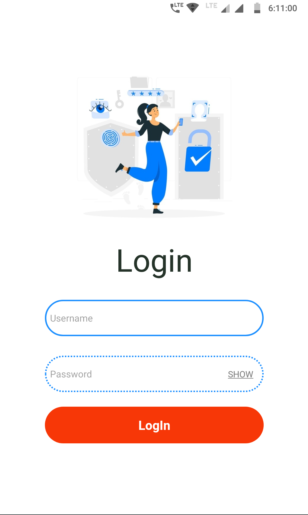
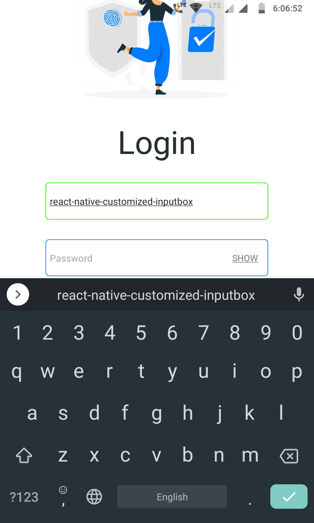
#### ► Example - 2
> → Toggle feature enabled
| | |
| :-----------------------------------------------------------------------------------------: | :-----------------------------------------------------------------------------------------: |
|  |
|  |
|
> **Code Snippet ↓**
```jsx
```
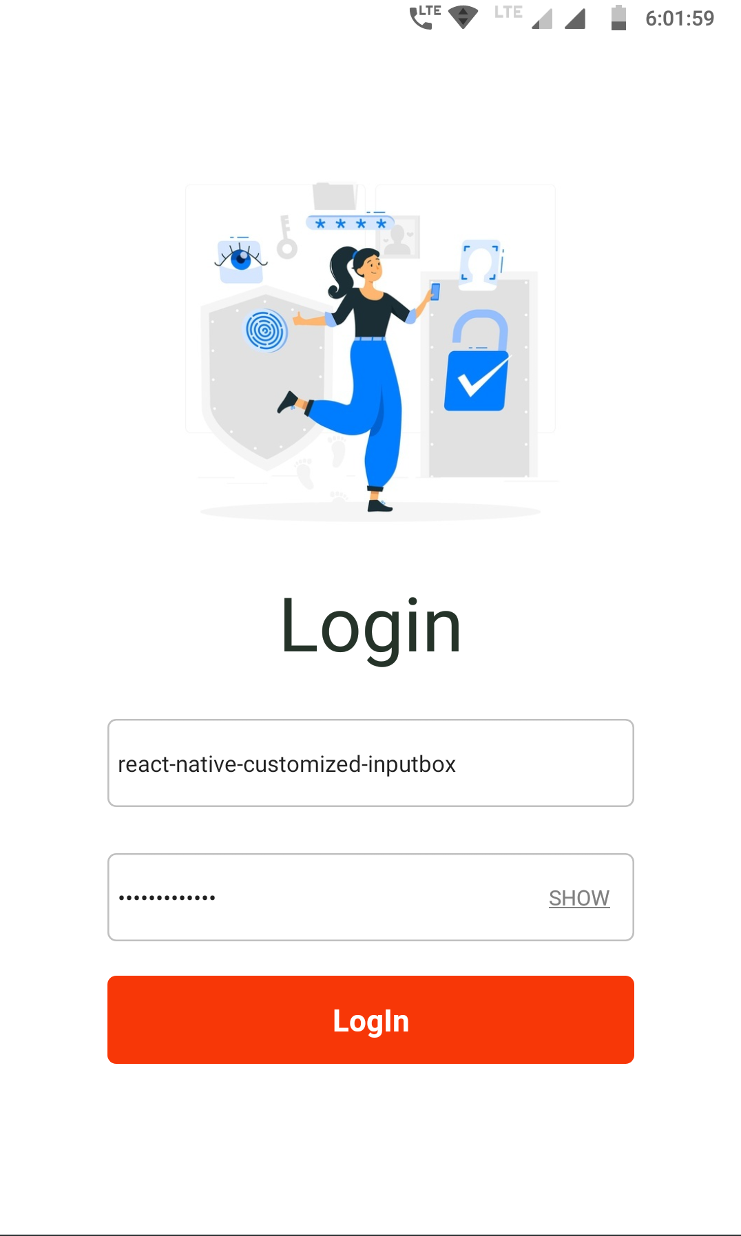
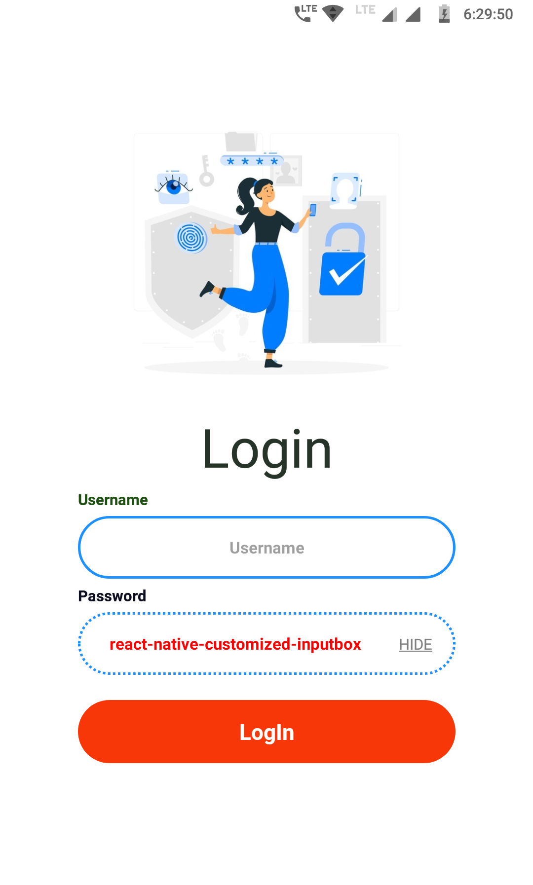
#### ► Example - 3
> → Box color change while focusing
| | |
| :-----------------------------------------------------------------------------------------: | :-----------------------------------------------------------------------------------------: |
|  |
|  |
|
> **Code Snippet ↓**
```jsx
```
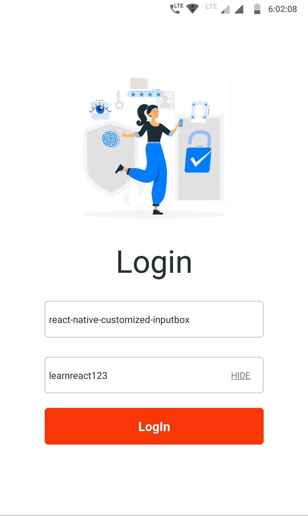
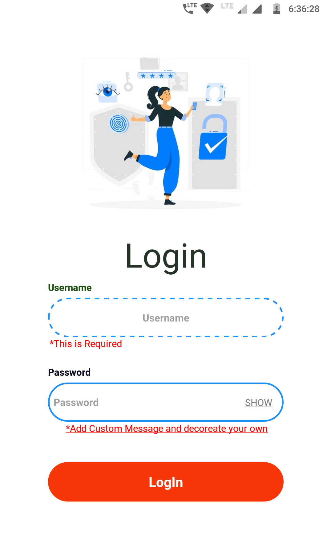
#### ► Example - 4
> → Label and Required option enable to give error on condition
| | |
| :-----------------------------------------------------------------------------------------: | :-----------------------------------------------------------------------------------------: |
|  |
|  |
|
> **Code Snippet ↓**
```jsx
*Add Custom Message and decoreate your own,
style: { textAlign: "center", textDecorationLine: "underline" },
}}
/>
```
# Method and Props Configuration
🔧 Below are the method which you can use to customized the Box in your style
| Method | Type | Description |
| :--------------- | :------: | :------------------------------------------------------------------------------------------------------------------------------------------------------------------------------------ |
| `width` | Number | This is not \*Mandatory By `default` set to `300` but you can change and add your own |
| `height` | Number | This is not \*Mandatory By `default` set to `50` but you can change and add your own |
| `placeholder` | String | Provide text for the Placeholder |
| `toggle` | Boolean | Provide `True` to display `SHOW/HIDE` by **default** set to `False` |
| `boxColor` | String | Provide Color for the _`InputBox`_ by `default` color set to `silver` |
| `focusColor` | String | Provide Color for change the box color while focusing the _`InputBox`_ |
| `boxStyle` | Object | Provide custom `style`/decoration for the _`InputBox`_ |
| `inputStyle` | Object | Provide custom `style`/decoration for the Text inside the _`InputBox`_ |
| `labelConfig` | Object | **`text:`** Provide text for the Label (String) **`style:`** Provide custom style for the Label (Object) |
| `requiredConfig` | Object | **`text:`** Provide custom mandatory message to display like(\*This is Required) you can add your own (String) **`style:`** Provide custom style for the required text (Object) |
| `values` | String | You can use this to set predefine values or get the current _`InputBox`_ value |
| `onChangeText` | Function | Function like `onChangeText` |
# Author
#### Thank You All 🙏🏻
Made with 🖤 by
**Author** : [Rishu Chowdhary](https://github.com/hirishu10)
**Email** : hi.10rishu@gmail.com
# License
#### MIT License 📄
This project is licensed under the MIT License - see the [LICENSE.md](https://github.com/hirishu10/react-native-customized-box/blob/main/LICENSE) file for details