https://github.com/hmil/project-badge
Create fancy badges for your projects in plain JS
https://github.com/hmil/project-badge
Last synced: about 1 year ago
JSON representation
Create fancy badges for your projects in plain JS
- Host: GitHub
- URL: https://github.com/hmil/project-badge
- Owner: hmil
- License: mit
- Created: 2014-10-18T13:36:03.000Z (almost 12 years ago)
- Default Branch: master
- Last Pushed: 2017-03-19T21:11:40.000Z (over 9 years ago)
- Last Synced: 2025-06-28T02:04:52.596Z (about 1 year ago)
- Language: CoffeeScript
- Size: 60.5 KB
- Stars: 7
- Watchers: 0
- Forks: 0
- Open Issues: 1
-
Metadata Files:
- Readme: README.md
- License: LICENSE_MIT
Awesome Lists containing this project
README
project-badge
=============
Create fancy badges for your projects in plain JS.
# Usage
## In the browser
Download [badge.js](https://raw.githubusercontent.com/hmil/project-badge/master/dist/badge.js), and start having fun with badges !
```html
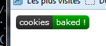
var myBadge = new badge.Boolean({
text: 'cookies',
status: true,
statusText: 'baked !'
});
document.body.appendChild(myBadge.asDOMNode());
```
Et voilà, a shiny custom badge in just two lines of code and 3 config parameters.
## In node
This module is available as an npm package `npm install project-package`
You should check out [node-canvas](https://github.com/Automattic/node-canvas) which provides a compatible canvas API in node.
Actually, it's what's being used in [node-project-badge](https://github.com/hmil/node-project-badge) to provide a CLI badge generator.
# One badge for every thing
Progress:
```javascript
var myBadge = new badge.Progress({
text: 'baking',
progress: 32,
});
```
  
*Common usage: code coverage*
```javascript
var myBadge = new badge.Info({
text: 'baking time',
info: '12\'30'
});
```

*Common usage: package verison, date of last build*
```javascript
var myBadge = new badge.Boolean({
text: 'taste',
status: true,
successText: 'yummy',
failureText: 'yuck !',
unknownText: 'what ?'
});
myBadge.renderTo(ctx, 0, 0);
myBadge.status = false;
myBadge.renderTo(ctx, 120, 0);
myBadge.status = null;
myBadge.renderTo(ctx, 240, 0);
```

*Common usage: build: passing/failure*
# API Reference
## badge.config(conf)
Use this function to set global configuration settings. Available settings are:
```coffeescript
'color-success': '#0a0'
'color-failure': '#a00'
'color-unknown': '#aaa'
'color-warning': '#880'
'color-info': '#3BC2EB'
'color-background': '#444'
'color-text': '#fff'
'font': '11px Verdana' # the same font for all texts
'border-radius': 5 # like css border-radius
'padding': 5 # x padding for the text
'text-height': 14 # text position, y-axis
'width': 50 # default width
'height': 20 # default height
```
## badge.Boolean
A badge that can take two states (namely 'failure' and 'success') depending
on the value of 'status'
### Parameters
- `text` (String): the text shown on the left hand side of the badge
- `status` (true/false): defines the state the badge is in
- `successText` (String): text shown on the right side of the badge in case of success
- `failureText` (String): text shown on the right side of the badge in case of failure
- `unknownText` (String): text shown on the right side of the badge in case the status is null
- `statusText`: (String): text shown on the right side of the badge regardless of the state
statusText has precedence over (failure|success)Text
### Typical use cases
- Show the result of a build in a CI environment (*à la* Travis-ci)
## badge.Info
A badge that shows a single information as a key-value pair
### Parameters
- `text` (String): the text shown on the left hand side of the badge (key)
- `info` (String): the text shown on the right hand side of the badge (value)
### Typical use cases
- Show the current version of a package
- Show the date of last build (useful when shown together with a build status badge)
## badge.Progress
A badge that shows a real value bounded between a minimum and a maximum.
The badge is color coded to indicate wether the value is in the "bad", "warning"
or "good" interval (defined by the `bounds` parameter).
### Parameters
- `text` (String): the text shown on the left hand side of the badge (key)
- `progress` (Number): the real value to show ranging from 0 to 100
- `progressText` (String): the text shown on the right hand side of the badge (value)
- `unit` (String): a string appended to the progressText (default: '%')
- `bounds` (Array): two values that delimit the bad, warning and good zones (default: [40, 80])
### Typical use cases
- Show code coverage (it was designed specifically for this use).
- Show any bounded continuous value.
## badge.Badge
Base class for any badge class. You may create a badge of type badge directly but
it won't generally be of great use.
It defines the badge public interface and handles the rendering pipeline.
### Public API
The public API is defined by the parent class Badge and should not be overriden.
- `constructor(params: {key: value})`
Constructs a badge and applies all parameters to this instance
- `badge.[param]`
All parameters are directly accessible on the badge's instance. For instance:
```javascript
// All badges drawn with this instance will now use the text 'build'
badge.text = 'build';
```
- `renderTo(ctx: RenderingContext [, x: Number] [, y: Number]) -> void`
Renders the badge on the provided rendering context at position (x, y).
Is rendered at (0,0) by default.
- `measure(ctx: RenderingContext) -> Dimentions`
measures the width and height the badge will occupy. Base implementation measures
the width taken by `text` and two margins and returns the configured height
- `Dimentions = {w: Number, h: Number}`
Format used to represent badge dimentions
### Rendering pipeline
The following methods are called in this order and may be overriden to implement custom graphics:
- `drawBorder(ctx: RenderingContext, dimentions: Dimentions) -> void`
begins and constructs a path that defines the badge's borders (does not close nor draw it)
- `drawBackground(ctx: DrawingContext, dimentions: Dimentions) -> void`
draws the badge's background
- `drawBackgroundEffects(ctx: DrawingContext, dimentions: Dimentions) -> void`
applies effects once the background was drawn
- `drawForeground(ctx: DrawingContext, dimentions: Dimentions) -> void`
draws the badge's foreground
- `drawForegroundEffects(ctx: DrawingContext, dimentions: Dimentions) -> void`
applies effects once the foreground was drawn
To implement custom measurments, override `doMeasure`
- `doMeasure(ctx: RenderingContext) -> Dimentions`
Actually performs the measure
### Parameters
The following parameters are assumed to be necessary for any class implementing a badge
- `text` (String): default text shown in the badge, left aligned
# Changelog
**0.2.0** -- *Mar 19, 2017*
- Add "unknown" status badge (thanks @tforgione)
- Add npm task to build the lib with grunt
**0.1.0** -- *Oct 19, 2014*
- Initial project-badge release