https://github.com/honkmaster/TTProgressHUD
TTProgressHUD is a light weight HUD written in SwiftUI meant to display the progress of an ongoing task on iOS.
https://github.com/honkmaster/TTProgressHUD
ios swift5 swiftui
Last synced: about 1 year ago
JSON representation
TTProgressHUD is a light weight HUD written in SwiftUI meant to display the progress of an ongoing task on iOS.
- Host: GitHub
- URL: https://github.com/honkmaster/TTProgressHUD
- Owner: honkmaster
- License: mit
- Created: 2020-07-29T19:29:46.000Z (almost 6 years ago)
- Default Branch: master
- Last Pushed: 2022-05-31T10:06:36.000Z (about 4 years ago)
- Last Synced: 2024-07-12T04:36:51.509Z (almost 2 years ago)
- Topics: ios, swift5, swiftui
- Language: Swift
- Homepage: https://github.com/honkmaster/TTProgressHUD
- Size: 154 KB
- Stars: 233
- Watchers: 4
- Forks: 25
- Open Issues: 1
-
Metadata Files:
- Readme: README.md
- License: LICENSE
Awesome Lists containing this project
- awesome-swiftui-libraries - TTProgressHUD - TTProgressHUD is a light weight HUD written in SwiftUI meant to display the progress of an ongoing task on iOS (Loading-Indicator / Content)
README
# TTProgressHUD
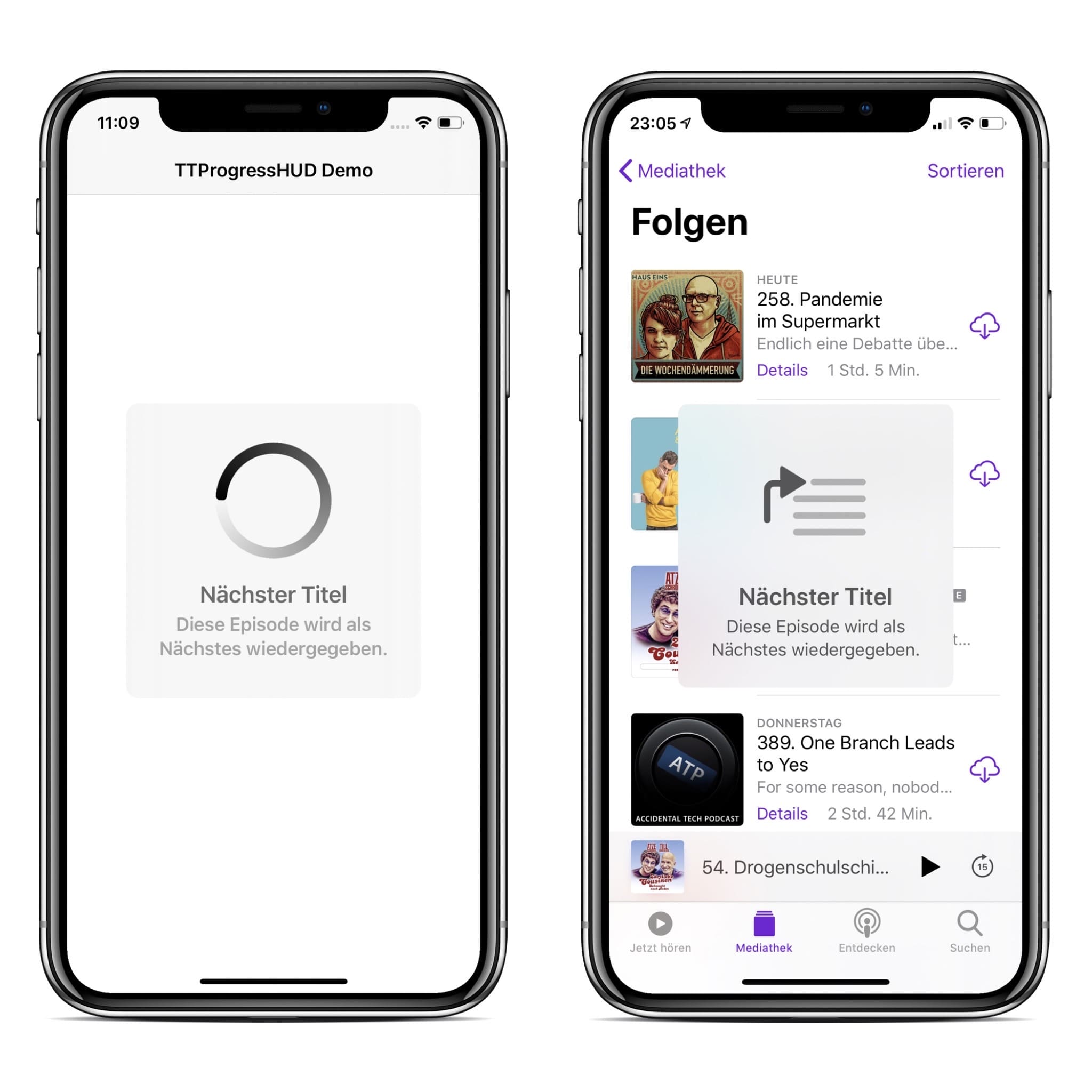
`TTProgressHUD` is a light weight HUD written in SwiftUI meant to display the progress of an ongoing task on iOS. `TTProgressHUD` (left) was designed to look as similar as possible to the Apple HUD (example from Podcast.app, right).
## Installation
Xcode 11 and iOS 13 is required.
### Swift Package Manager
* Xcode: File -> Swift Packages -> Add Package Dependency
* Paste https://github.com/honkmaster/TTProgressHUD
### Manually
Drag `TTProgressHUD.swift` and `TTProgressHUDConfig.swift` into your project.
## Usage
**Use `TTProgressHUD` wisely! Only use it if you absolutely need to perform a task before taking the user forward. Bad use case examples: pull to refresh, infinite scrolling, sending message.**
### Import
Import the `TTProgressHUD` package:
```swift
import TTProgressHUD
```
### Instantiate and show the HUD view
```swift
struct ContentView: View {
@State var hudVisible = true
@State var hudConfig = TTProgressHUDConfig()
var body: some View {
TTProgressHUD($hudVisible, config: hudConfig)
}
}
```
## Customization
`TTProgressHUD` can be customized via the `TTProgressHUDConfig` struct.
The default values were chosen so that `TTProgressHUD` looks as similar as possible to the Apple HUD.
```swift
public init(
type: TTProgressHUDType = .loading,
title: String? = nil,
caption: String? = nil,
minSize: CGSize = CGSize(width: 100.0, height: 100.0),
cornerRadius: CGFloat = 12.0,
backgroundColor: Color = .clear,
foregroundColor: Color = Color(.systemBackground),
titleForegroundColor: Color = .primary,
captionForegroundColor: Color = .secondary,
shadowColor: Color = .clear,
shadowRadius: CGFloat = 0.0,
borderColor: Color = .clear,
borderWidth: CGFloat = 0.0,
lineWidth: CGFloat = 10.0,
imageViewSize: CGSize = CGSize(width: 100, height: 100),
imageViewForegroundColor: Color = .primary,
successImage: String = "checkmark.circle",
warningImage: String = "exclamationmark.circle",
errorImage: String = "xmark.circle",
shouldAutoHide: Bool = false,
allowsTapToHide: Bool = false,
autoHideInterval: TimeInterval = 10.0,
hapticsEnabled: Bool = true
){...}
```
## Haptic Feedback
`TTProgressHUD` will automatically trigger haptic feedback depending on which HUD is being displayed. The feedback maps as follows:
* `TTProgressHUDType.success` <-> `UINotificationFeedbackTypeSuccess`
* `TTProgressHUDType.warning` <-> `UINotificationFeedbackTypeWarning`
* `TTProgressHUDType.error` <-> `UINotificationFeedbackTypeError`
## Contributing to this project
If you have feature requests or bug reports, feel free to help out by sending pull requests or by [creating new issues](https://github.com/honkmaster/TTProgressHUD/issues/new). Please take a moment to
review the guidelines written by [Nicolas Gallagher](https://github.com/necolas):
* [Bug reports](https://github.com/necolas/issue-guidelines/blob/master/CONTRIBUTING.md#bugs)
* [Feature requests](https://github.com/necolas/issue-guidelines/blob/master/CONTRIBUTING.md#features)
* [Pull requests](https://github.com/necolas/issue-guidelines/blob/master/CONTRIBUTING.md#pull-requests)
## License
`TTProgressHUD` is distributed under the terms and conditions of the [MIT license](hhttps://github.com/honkmaster/TTGaugeView/blob/master/LICENSE).
## Credits
`TTProgressHUD` is brought to you by [Tobias Tiemerding](http://tiemerding.com) and based on [SVProgressHUD](https://github.com/SVProgressHUD/SVProgressHUD). If you're using `TTProgressHUD` in your project, attribution would be very appreciated.