https://github.com/inRush/TipDialog
flutter tip dialog
https://github.com/inRush/TipDialog
dart dialog flutter loading ui-component
Last synced: 10 months ago
JSON representation
flutter tip dialog
- Host: GitHub
- URL: https://github.com/inRush/TipDialog
- Owner: inRush
- License: mit
- Created: 2018-08-17T06:50:20.000Z (over 7 years ago)
- Default Branch: master
- Last Pushed: 2022-05-01T05:25:43.000Z (almost 4 years ago)
- Last Synced: 2024-11-09T19:41:35.756Z (over 1 year ago)
- Topics: dart, dialog, flutter, loading, ui-component
- Language: Dart
- Size: 170 KB
- Stars: 77
- Watchers: 2
- Forks: 12
- Open Issues: 0
-
Metadata Files:
- Readme: README.md
- Changelog: CHANGELOG.md
- License: LICENSE
Awesome Lists containing this project
README
# TipDialog
> 1. Please use 3.0.0 or above version, because earlier versions have serious performance issues
> 2. if example no working, please google questions about Flutter upgrade AndroidX,
> [AndroidX Migration - Flutterblock](https://flutter.dev/docs/development/androidx-migration)
> 3. if run your app, it shows `Error: Cannot run with sound null safety`, please upgrade version to 4.0.0
> [Reference](https://dart.dev/null-safety/migration-guide)
[中文版](https://github.com/inRush/TipDialog/blob/master/README.zh-CN.md)
A Flutter Tip Dialog
| Loading Type Dialog | Success Tye Dialog | Fail Type Dialog |
| --- | --- | --- |
|  | 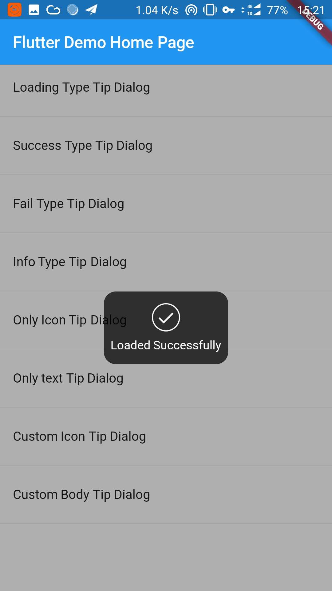|  |
| Info Type Dialog | Only Icon Dialog | Onl Text Dialog |
| --- | --- | --- |
| 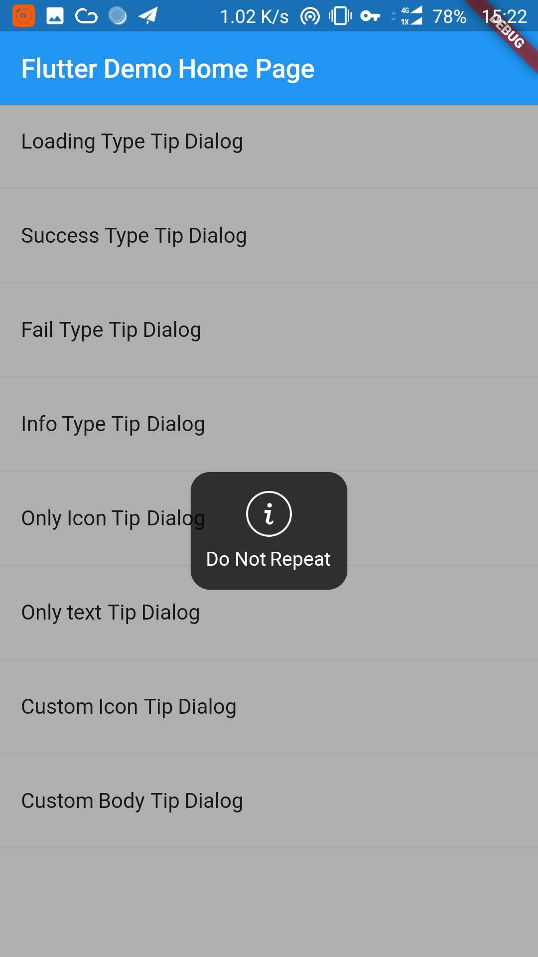| 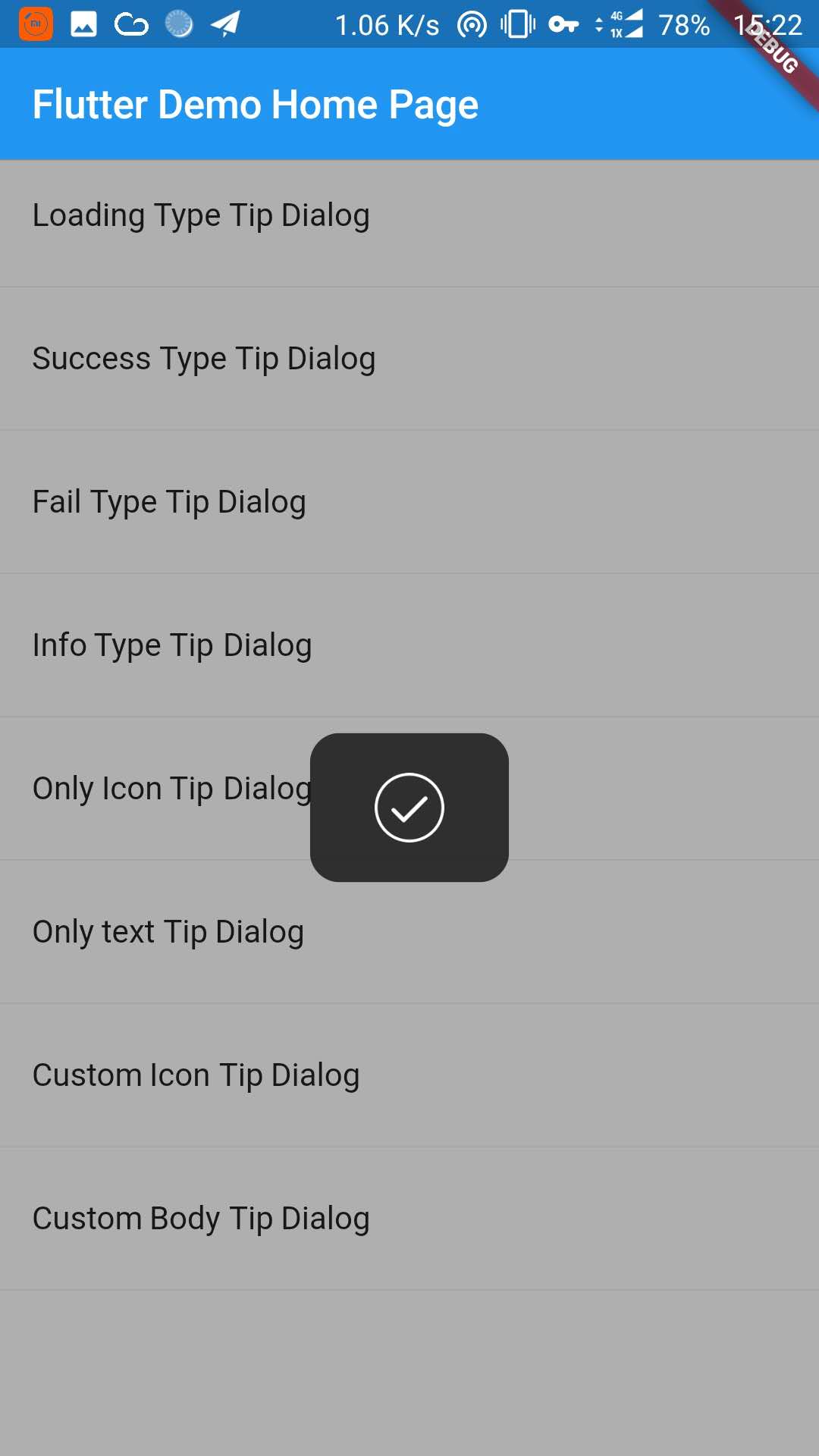| |
| Custom Icon Dialog | Custom Body Dialog |
| --- | --- |
| 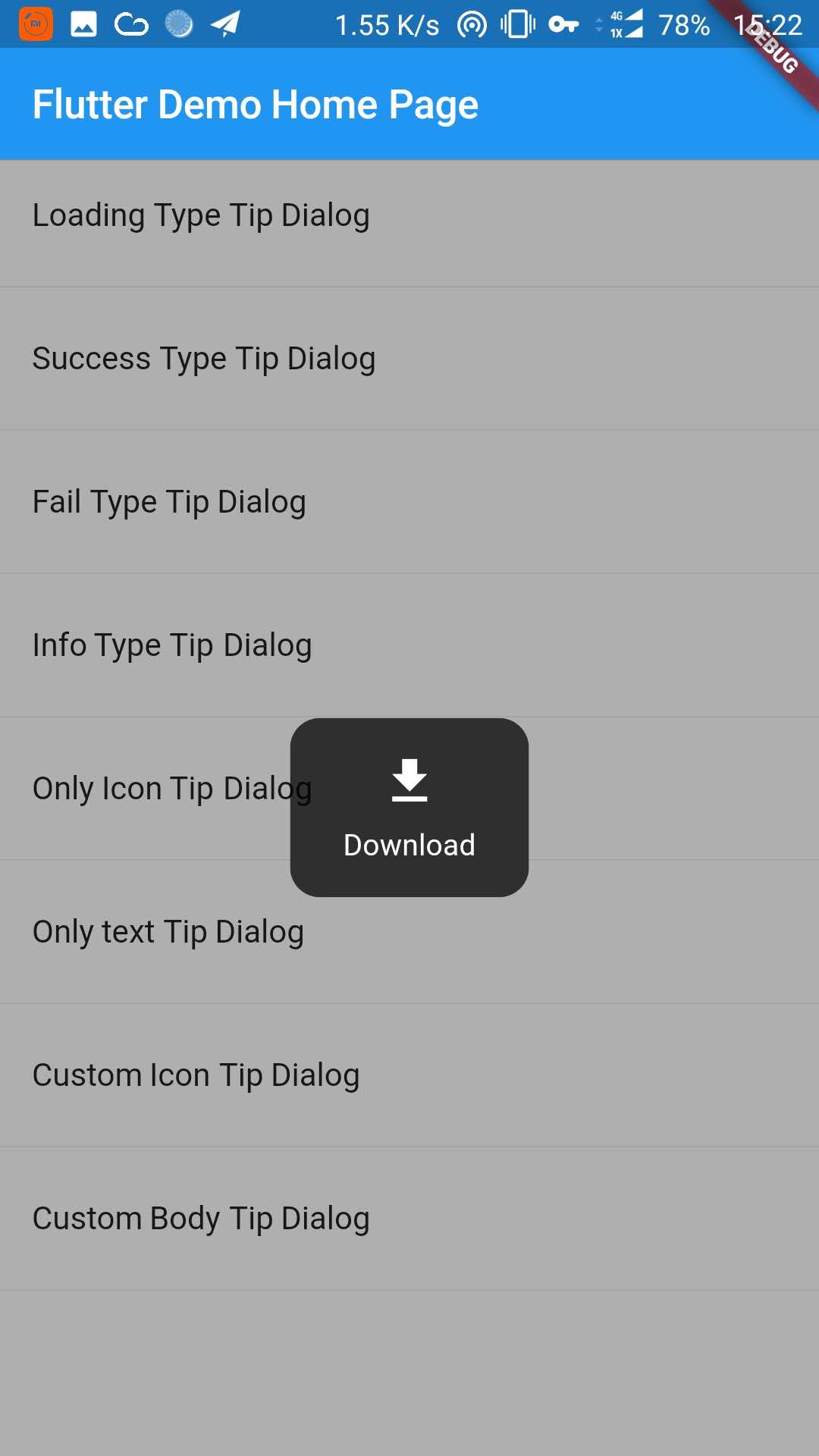| 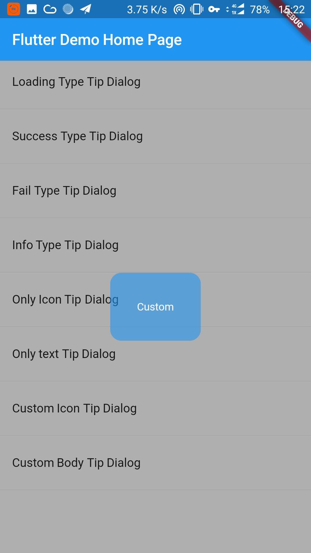|
## 1. Depend on it
Add this to your package's pubspec.yaml file:
``` dart
dependencies:
tip_dialog: ^4.0.0
```
## 2. Install it
You can install packages from the command line:
with Flutter:
```
$ flutter packages get
```
## 3. Import it
Now in your Dart code, you can use:
```dart
import 'package:tip_dialog/tip_dialog.dart';
```
## 4. Use
#### Available attributes
```
/// [TipDialogContainer]
@required this.child,
/// automatically disappear time
this.duration: const Duration(seconds: 3),
/// mask layer alpha
this.maskAlpha: 0.3
// outside touchable, default false
// if true and onOutsideTouch not set, when use TipDialogHelper.loading(), you can touch mask layer to dismiss
// if true and onOutsideTouch set, when touching the mask layer, onOutsideTouch will be called.
this.outsideTouchable: false
// outside touch callback {@link OutsideTouchCallback}
this.onOutsideTouch
```
#### Global Use
```dart
/// Use [TipDialogContainer] globally
/// This widget can be globally supported
void main() => runApp(new MyApp());
class MyApp extends StatelessWidget {
@override
Widget build(BuildContext context) {
return new MaterialApp(
title: 'TipDialog Demo',
theme: new ThemeData(),
home: Stack(
children: [
MyHomePage(title: 'TipDialog Demo Home Page'),
// add [TipDialogContainer] widget here
TipDialogContainer(duration: const Duration(seconds: 2))
],
),
);
}
}
/// use TipDialogHelper to show or dismiss tip
Widget build(BuildContext context) {
return new Scaffold(
appBar: new AppBar(
title: new Text(widget.title),
elevation: 0.5,
),
body: new ListView(children: [
_buildItem("Loading Type Tip Dialog", () async {
TipDialogHelper.loading("Loading");
await new Future.delayed(new Duration(seconds: 5));
TipDialogHelper.dismiss();
}),
new Divider(),
_buildItem("Success Type Tip Dialog", () async {
TipDialogHelper.success("Loaded Successfully");
}),
new Divider(),
_buildItem("Only text Tip Dialog", () async {
TipDialogHelper.show(new TipDialog(
type: TipDialogType.NOTHING,
tip: "Do Not Repeat",
));
}),
new Divider(),
_buildItem("Custom Icon Tip Dialog", () async {
TipDialogHelper.show(new TipDialog.customIcon(
icon: new Icon(
Icons.file_download,
color: Colors.white,
size: 30.0,
textDirection: TextDirection.ltr,
),
tip: "Download",
));
}),
new Divider(),
_buildItem("Custom Body Tip Dialog", () async {
TipDialogHelper.show(new TipDialog.builder(
bodyBuilder: (context) {
return new Container(
width: 120.0,
height: 90.0,
alignment: Alignment.center,
child: new Text(
"Custom",
style: new TextStyle(color: Colors.white),
/// if TipDialogContainer are outside of MaterialApp,
/// here is a must to set
textDirection: TextDirection.ltr,
),
);
},
color: Colors.blue.withAlpha(150),
));
}),
new Divider(),
]));
}
```
>Use a custom widget when using [TipDialogContainer] globally, there may be appear some unexpected errors.
>such as Text or Icon, will appear similar to the following error.
***No Directionality widget found.***
>Just set TextDirection just fine. See the custom Widget in the example for details.
## 5. Default Dialog Type
```
enum TipDialogType { NOTHING, LOADING, SUCCESS, FAIL, INFO }
NOTHING: no icon
LOADING: have a loading icon
SUCCESS: have a success icon
FAIL: have a fail icon
INFO: have a info icon
CUSTOM: custom tip dialog type, just a sign, do nothing
```
## 6. TipDialogHelper Method
```dart
/// tipDialog: Need to display the widget
///
/// isAutoDismiss: decide whether to disappear automatically, default is true
/// if true, the dialog will not automatically disappear
/// otherwise, the dialog will automatically disappear after the [Duration] set by [TipDialogContainer]
void show(Widget tipDialog, {bool isAutoDismiss: true});
/// dismiss dialog
void dismiss();
/// show info dialog
void info(String tip);
/// show fail dialog
void fail(String errMsg);
/// show success dialog
void success(String success);
/// show loading dialog
void loading(String loadingTip);
```
>See the example directory for more details.
## 7. Change log
### [4.0.0]
* migrating to null safety
### [3.1.0]
* add outside touchable features
### [3.0.0]
* fix performance issues
* easier way to call
### [2.1.0]
* add TipDialogHelper and deprecated TipDialogConnector
### [2.0.1]
* fix dismiss bug
* upgrade android build gradle to 5.1.1
### [2.0.0]
* set default auto dismiss duration as 2 seconds
* delete [TipDialogContainer] Partial parameters
-- show
-- outSideTouchable
-- defaultTip
-- defaultType
* change show method parameter isLoading to isAutoDismiss
* force display mask layer
### [1.1.2] - (MODIFY)
* fix infinite call dismiss bug
* fixed an issue where setting the isLoading value is invalid
### [1.1.1] - (MODIFY)
* fix bugs that occur when using globally
### [1.1.0] - (FUNCTION CHANGE)
* add tip dialog global support
### [1.0.1] - (MODIFY).
* fix loading view version bug.
* set default loading duration
### [1.0.0] - first release.
* add release.