https://github.com/ir3ne/v-tmline
A flexible and customizable timeline component for Vue 3 applications.
https://github.com/ir3ne/v-tmline
npm npm-package timeline timeline-component vue vuejs
Last synced: 2 months ago
JSON representation
A flexible and customizable timeline component for Vue 3 applications.
- Host: GitHub
- URL: https://github.com/ir3ne/v-tmline
- Owner: ir3ne
- License: mit
- Created: 2024-12-24T11:09:07.000Z (over 1 year ago)
- Default Branch: main
- Last Pushed: 2025-03-04T15:23:20.000Z (about 1 year ago)
- Last Synced: 2026-02-27T09:11:20.125Z (3 months ago)
- Topics: npm, npm-package, timeline, timeline-component, vue, vuejs
- Language: Vue
- Homepage: https://ir3ne.github.io/v-tmline/
- Size: 914 KB
- Stars: 7
- Watchers: 1
- Forks: 0
- Open Issues: 6
-
Metadata Files:
- Readme: README.md
- License: LICENSE
Awesome Lists containing this project
README
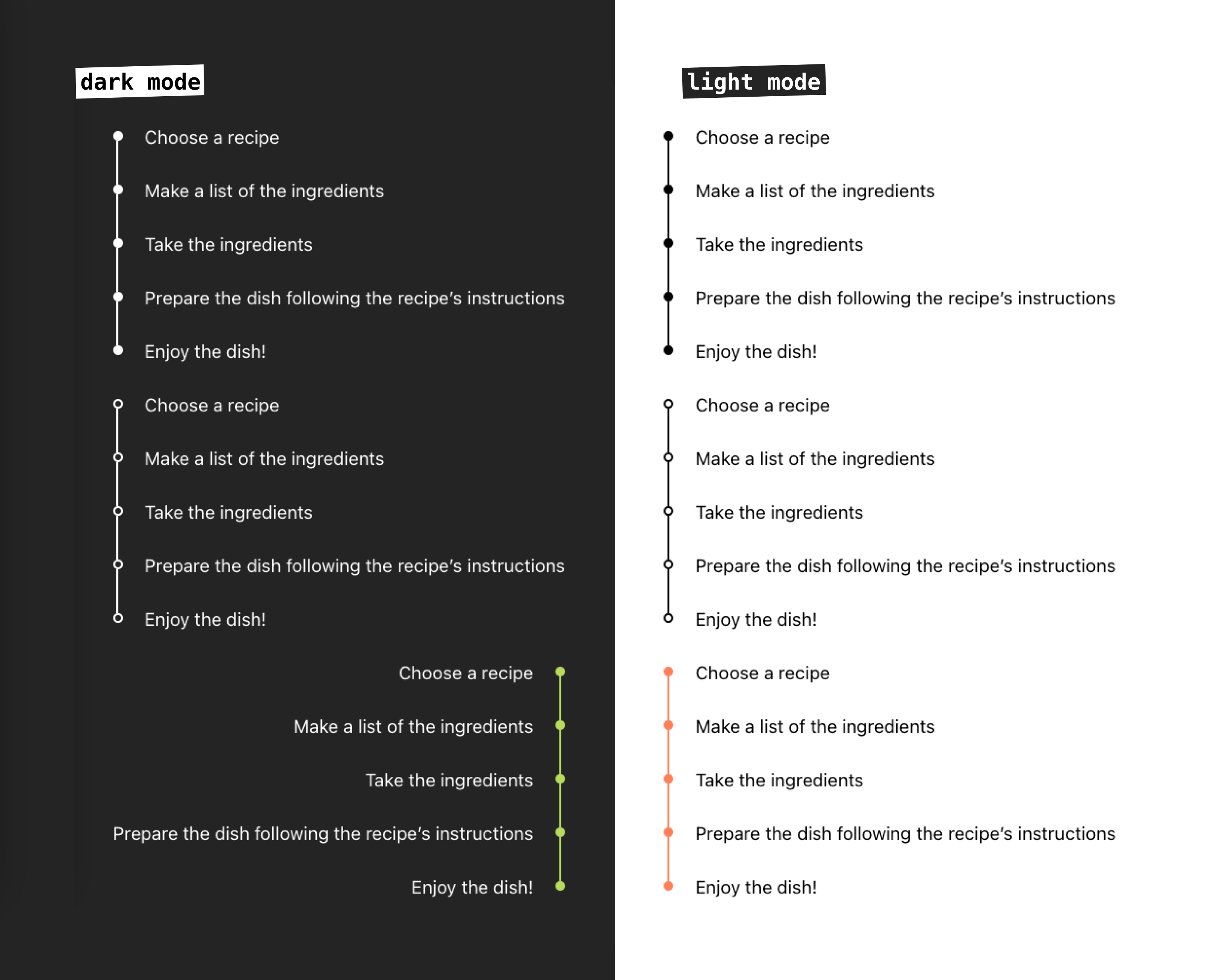
Vue Timeline Component


A flexible and customizable timeline component for Vue 3 applications.
Display a vertical timeline of events with customizable styles, alignments, and content.
For both light and dark themes. 🌝 🌚
Feel free to report issues, make PR's and start discussions.

## Live demo
[Official Documentation](https://ir3ne.github.io/v-tmline/)
## Npm package page
[v-tmline](https://www.npmjs.com/package/v-tmline)
## Features
- Customizable bullets style: filled or outlined
- Custom colors
- Left and right alignment
- Support slots and named slots
- Support for light and dark mode
## Installation
```bash
npm install v-tmline
```
## Usage
Import and use the component in your Vue application:
```vue
import { Timeline } from 'v-tmline'
const timelineItems = [
{
id: 1,
label: 'First Point'
},
{
id: 2,
label: 'Second Point'
},
{
id: 3,
label: 'Third Point'
}
]
```
## Props
| Prop | Type | Default | Description | Available Options |
|------|------|---------|-------------|-------------------|
| items | Array | required | Array of timeline items. Each item must be an object with at least a `label` property | - |
| mode | String | 'light' | Theme mode of the timeline | 'light', 'dark' |
| fill | String | 'filled' | Style of timeline dots | 'filled', 'outlined' |
| colored | String | '' | Custom color for the timeline (CSS color value) | Any valid CSS color |
| align | String | 'left' | Alignment of the timeline | 'left', 'right' |
## Timeline Items
Each item in the `items` array should have the following structure:
```javascript
{
id?: string | number, // Optional unique identifier
label: string // Required text to display
}
```
## Customization
### Basic Timeline
```vue
```
### Custom Colored Timeline
```vue
```
### Dark Mode Timeline
```vue
```
### Right-Aligned Timeline
```vue
```
### Custom Content using Slots
You can customize the content of each timeline item using the slot feature: default or named slot.
#### Default Slot
```vue
Default: {{ item.label }}
```
#### Named Slot
```vue
💫 {{ item.label }}
{{ item.company }}
📚 {{ item.label }}
{{ item.school }}
```
## Styling
The component uses the following CSS classes that you can override:
- `.re-timeline` - Main timeline container
- `.re-timeline-item` - Individual timeline item
- `.re-timeline-item-tail` - Timeline connector line
- `.re-timeline-item-head` - Timeline dot
- `.re-timeline-item-content` - Content container
## Full Example
```vue
import { Timeline } from 'v-tmline'
const timelineItems = [
{
id: 1,
label: 'Project Started',
},
{
id: 2,
label: 'First Milestone',
},
{
id: 3,
label: 'Project Completed',
}
]
{{ item.label }}
Custom content here
.custom-timeline-content {
padding: 10px;
border-radius: 4px;
background-color: #f5f5f5;
}
```
## License
[MIT License](./LICENSE)
## Contributing
Contributions are welcome! Please feel free to submit a Pull Request.