https://github.com/jacklam718/react-native-dialog-component
A react native dialog component support custom animation for IOS & Android.
https://github.com/jacklam718/react-native-dialog-component
android animation component dialog ios react react-native react-native-dialog
Last synced: over 1 year ago
JSON representation
A react native dialog component support custom animation for IOS & Android.
- Host: GitHub
- URL: https://github.com/jacklam718/react-native-dialog-component
- Owner: jacklam718
- License: mit
- Created: 2017-01-29T04:14:49.000Z (over 9 years ago)
- Default Branch: master
- Last Pushed: 2018-08-12T15:24:28.000Z (almost 8 years ago)
- Last Synced: 2025-03-26T10:36:17.532Z (over 1 year ago)
- Topics: android, animation, component, dialog, ios, react, react-native, react-native-dialog
- Language: JavaScript
- Homepage: https://www.npmjs.com/package/react-native-dialog-component
- Size: 1.91 MB
- Stars: 81
- Watchers: 3
- Forks: 29
- Open Issues: 11
-
Metadata Files:
- Readme: README.md
- License: LICENSE.md
Awesome Lists containing this project
README
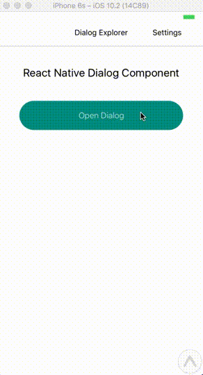
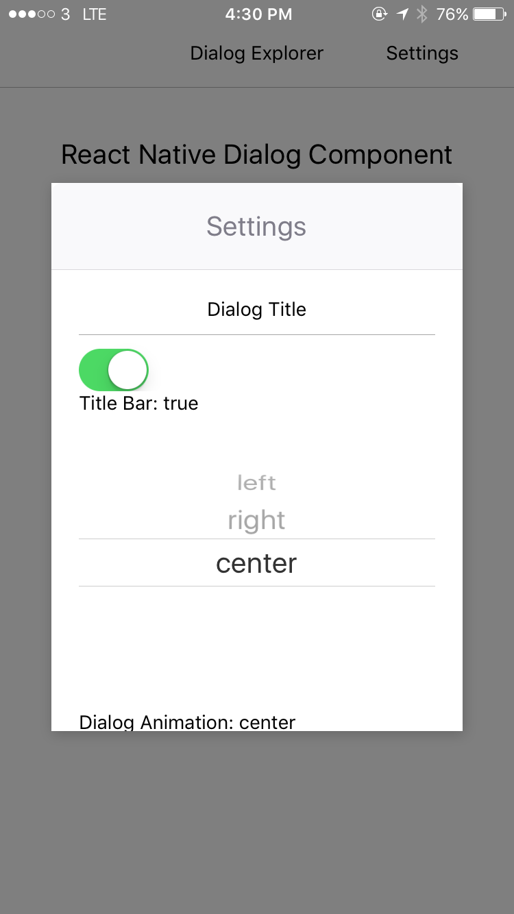
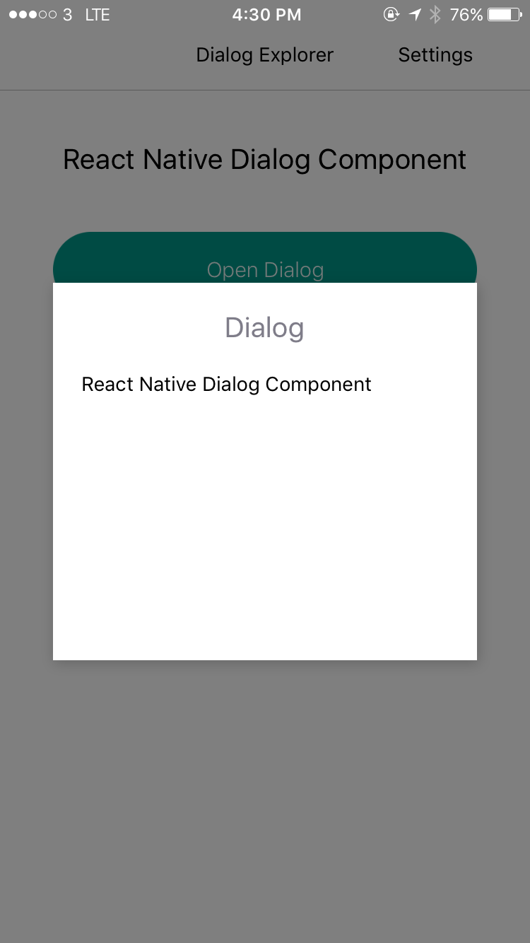
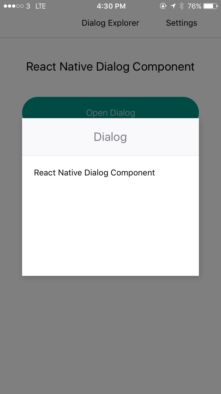
          ## React Native Dialog Component

React Native Dialog Component for iOS & Android.

Pull request are welcomed. Please follow [Airbnb JS Style Guide](https://github.com/airbnb/javascript)

#### Preview


## Try With Exponent

[Exponent](https://exp.host/@jacklam718/dialog-component-explorer)

## Installation

```

npm install --save react-native-dialog-component

# OR

yarn add react-native-dialog-component

```

## Exposed Modules

* DialogManager

* DialogComponent

* Dialog

* DialogContent

* DialogButton

* DialogTitle

* Overlay

* Animation

* FadeAnimation

* ScaleAnimation

* SlideAnimation

## Examples

[Example](https://github.com/jacklam718/react-native-dialog-component/blob/master/dialogComponentExample/DialogComponentExample.js)

## Usage With `DialogManager`

```javascript

import DialogManager, { ScaleAnimation, DialogContent } from 'react-native-dialog-component';

```

#### show

```javascript

DialogManager.show({

  title: 'Dialog',

  titleAlign: 'center',

  animationDuration: 200,

  ScaleAnimation: new ScaleAnimation(),

  children: (


          React Native Dialog Component


  ),

}, () => {

  console.log('callback - show');

});

```

#### update

```javascript

DialogManager.update({

  title: 'Dialog Updated',

  titleAlign: 'center',

  animationDuration: 200,

  ScaleAnimation: new ScaleAnimation(),

  children: (


          New Content


  ),

}, () => {

  console.log('callback - update dialog');

});

```

#### dismiss

```javascript

// dismiss dialog

DialogManager.dismiss(() => {

  console.log('callback - dismiss');

});

```

#### dismiss all

```javascript

DialogManager.dismissAll(() => {

  console.log('callback - dismiss all');

});

```

## Usage with `DialogComponent`

```javascript

import { DialogComponent }from 'react-native-dialog-component';

   {

      this.dialogComponent.show();

    }}

  />

   { this.dialogComponent = dialogComponent; }}

  >


      Hello


```

## Usage - With Animation

```javascript

import { DialogComponent, SlideAnimation } from 'react-native-dialog-component';

   {

      this.dialogComponent.show();

    }}

  />

   { this.dialogComponent = dialogComponent; }}

    dialogAnimation = { new SlideAnimation({ slideFrom: 'bottom' }) }

  >


      Hello


```

## Usage - With Dialog Title

```javascript

import { DialogComponent, DialogTitle } from 'react-native-dialog-component';

   {

      this.dialogComponent.show();

    }}

  />

  }

    ref={(dialogComponent) => { this.dialogComponent = dialogComponent; }}

  >


      Hello


```

## Usage - Wrape the content use DialogContent

```javascript

import { DialogComponent, DialogTitle } from 'react-native-dialog-component';

   {

      this.dialogComponent.show();

    }}

  />

  }

    ref={(dialogComponent) => { this.dialogComponent = dialogComponent; }}

  >


        Hello


```

## Props

### DialogComponent

| Prop | Type | Default | Note |

|---|---|---|---|

| `title` | `React Element` | | You can pass a `DialogTitle` component or pass a `View` for customizing titlebar |

| `width` | `Number` | Your device width | The Width of Dialog, you can use fixed width or use percentage

| `height` | `Number` | 300 | The Width of Dialog, you can use fixed height or use percentage

| `dialogAnimation` |  | `FadeAnimation` | animation for dialog | |

| `dialogStyle` | `Object` or `Number` | | | |

| `animationDuration` | `Number` | `200` | | |

| `overlayPointerEvents` | `String` | | Available option: `auto`, `none` |

| `overlayBackgroundColor` | `String` | `#000` |

| `overlayOpacity` | `Number` | `0.5` |

| `dismissOnTouchOutside` | `Bool` | `true` | When touch overlay will close dialog, but if `haveOverlay` is false then the `dismissOnTouchOutside` won't work| |

| `dismissOnHardwareBackPress` | `Bool` | `true` | Only for Android | |

| `haveOverlay` | `Bool` | `true` | If false won't show overlay when dialog show | |

| `show` | `Bool` | `false` |  | |

| `onShown` | `Function` | | You can pass onShown function as a aallback function, will call the function while dialog shown | |

| `onDismissed` | `Function` | | You can pass onDismissed function as a callback function, will call the function while dialog dismissed | |

| `actions` | `Array` | | Array of `DialogButton` component for example: ```[]``` | |

### DialogContent

| Prop | Type | Default | Note |

|---|---|---|---|

| `contentStyle` | | | Dialog's content container| |

### DialogTitle

| Prop | Type | Default | Note |

|---|---|---|---|

| `title` | `String` | | | |

| `titleStyle` | `Object` or `Number` | | | |

| `titleTextStyle` | `Object` or `Number` | | | |

| `titleAlign` | `String` | `center` | | |

| `haveTitleBar` | `Bool` | `true` | | |

### DialogButton

| Prop | Type | Default | Note |

|---|---|---|---|

| `text` | `String` | | | |

| `align` | `String` | `center` | The position of the button. Available option: `left`, `center`, `right` | |

| `onPress` | `Function` | | | |

| `buttonStyle` | `Object` or `Number` | | | |

| `textStyle` | `Object` or `Number` | | | |

| `textContainerStyle` | `Object` or `Number` | | | |

| `disabled` | `Boolean` | `false` | | |

| `activeOpacity` | `Number` | | | |

## Animation

### Params for (*)Animation

### FadeAnimation

| Param | Type | Default | Note |

|---|---|---|---|

| `toValue` | Number | 0 | |

| `animationDuration` | Number | 150 | |

### ScaleAnimation

| Param | Type | Default | Note |

|---|---|---|---|

| `toValue` | Number | 0 | |

### SlideAnimation

| Param | Type | Default | Note |

|---|---|---|---|

| `toValue` | Number | 0 | |

| `slideFrom` | String | `bottom` | Available option: `top`, `bottom`, `left`, `right` |