https://github.com/jamalihassan0307/glassmorphic_ui_kit
Modern, glassmorphic UI in Flutter, elegantly implemented by Jamalihassan0307. Expect smooth blur, frosted effects, and gradient magic.
https://github.com/jamalihassan0307/glassmorphic_ui_kit
flutter flutter-packages flutter-plugin glassmorphic glassmorphism-effect glassmorphism-ui jamalihassan0307 pakages-kit pub-dev
Last synced: 8 days ago
JSON representation
Modern, glassmorphic UI in Flutter, elegantly implemented by Jamalihassan0307. Expect smooth blur, frosted effects, and gradient magic.
- Host: GitHub
- URL: https://github.com/jamalihassan0307/glassmorphic_ui_kit
- Owner: jamalihassan0307
- License: mit
- Created: 2025-04-02T12:53:50.000Z (over 1 year ago)
- Default Branch: main
- Last Pushed: 2025-10-13T14:08:35.000Z (9 months ago)
- Last Synced: 2026-07-03T05:10:02.979Z (22 days ago)
- Topics: flutter, flutter-packages, flutter-plugin, glassmorphic, glassmorphism-effect, glassmorphism-ui, jamalihassan0307, pakages-kit, pub-dev
- Language: Dart
- Homepage: https://pub.dev/packages/glassmorphic_ui_kit
- Size: 36.1 MB
- Stars: 5
- Watchers: 1
- Forks: 2
- Open Issues: 0
-
Metadata Files:
- Readme: README.md
- Changelog: CHANGELOG.md
- License: LICENSE
Awesome Lists containing this project
README
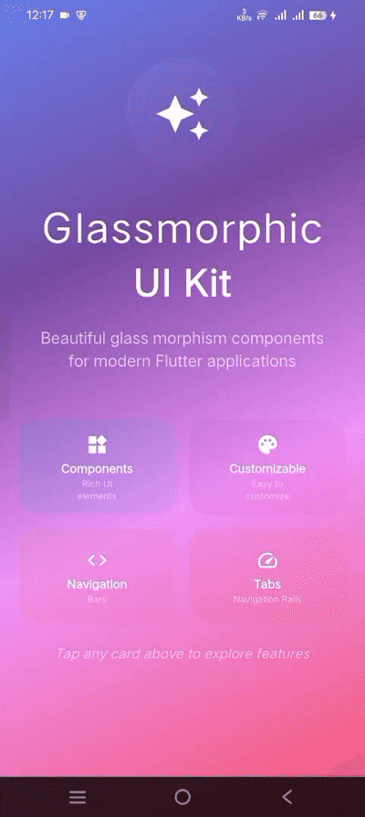
🌟 Glassmorphic UI Kit 🌟
Modern, beautiful glass effects for Flutter apps


---
# Glassmorphic UI Kit 🌟
A Flutter package designed to implement modern glassmorphic UI trends with smooth blur effects, frosted glass appearance, and gradient overlays. Enhance your app's user experience with sleek, futuristic designs.
[](https://pub.dev/packages/glassmorphic_ui_kit)
[](https://pub.dev/packages/glassmorphic_ui_kit/score)
[](https://pub.dev/packages/glassmorphic_ui_kit/score)
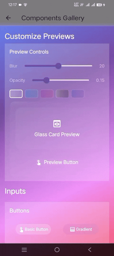
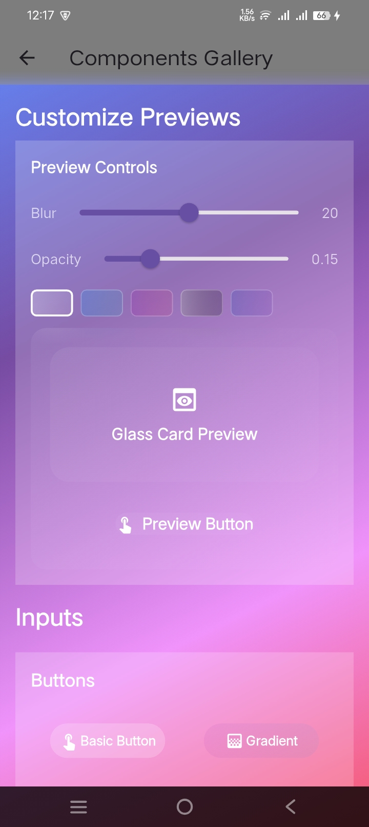
## Features 🛠️
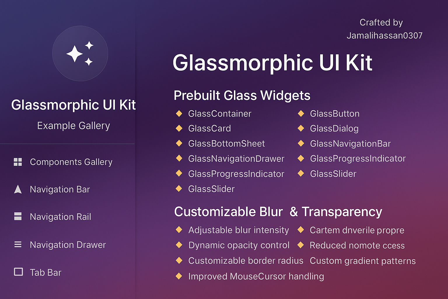
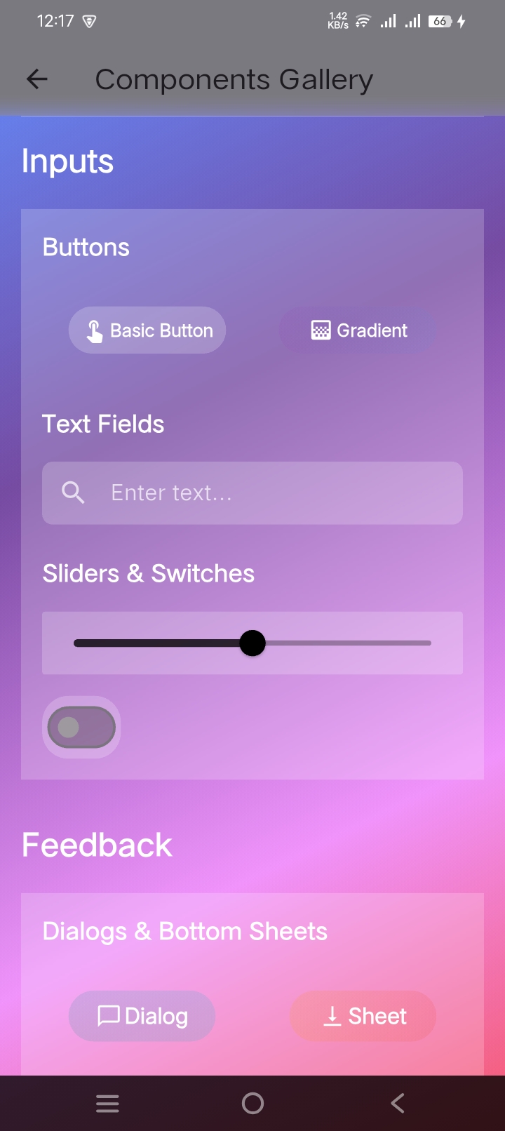
### 1. Prebuilt Glass Widgets
- `GlassContainer`: Base component for glass effects
- `GlassButton`: Blurred button with ripple effect
- `GlassCard`: Frosted-glass card for UI elements
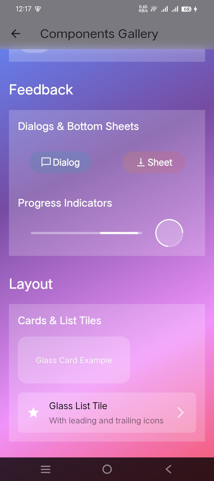
- `GlassDialog`: Customizable glass dialog
- `GlassBottomSheet`: Blurred bottom sheet with opacity control
- `GlassNavigationBar`: Modern navigation bar with glass effect
- `GlassNavigationDrawer`: Drawer with glass effect and custom tiles
- `GlassProgressIndicator`: Progress bar with glass effect
- `GlassSlider`: Customizable slider with glass effect
- `GlassTextField`: Text input with glass effect
### 2. Customizable Blur & Transparency
- Adjustable blur intensity
- Dynamic opacity control
- Customizable border radius
- Improved MouseCursor handling
### 3. Gradient Overlays
- Linear gradient support
- Radial gradient support
- Dynamic gradient animations
- Custom gradient patterns
### 4. Performance Optimized
- Efficient rendering
- Smooth animations
- Reduced widget rebuild cycles
- Better state management
- Flutter's Skia engine optimized
### 5. Cross-Platform Support
- iOS ✓
- Android ✓
- Web ✓
- Windows & macOS ✓
## Getting Started 🚀
Add the package to your `pubspec.yaml`:
```yaml
dependencies:
glassmorphic_ui_kit: ^1.1.6
```
## Usage Examples 💻
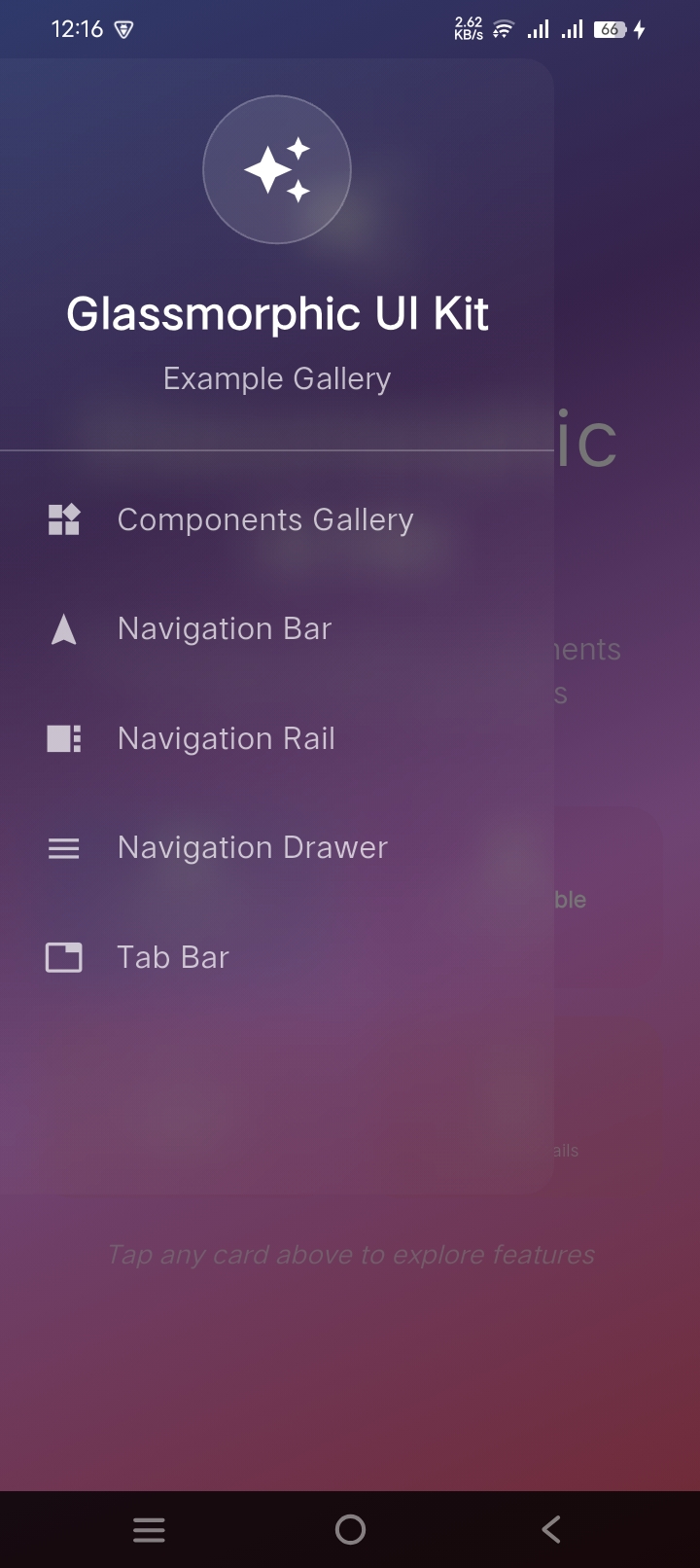
### Navigation Components
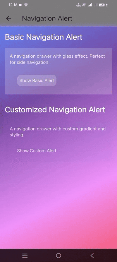
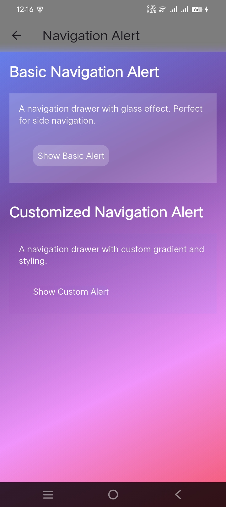
#### 1. Navigation Drawer
```dart
GlassNavigationDrawer(
blur: 10,
opacity: 0.2,
gradient: LinearGradient(
begin: Alignment.topLeft,
end: Alignment.bottomRight,
colors: [
Colors.white.withAlpha(51),
Colors.white.withAlpha(26),
],
),
children: [
UserAccountsDrawerHeader(
decoration: BoxDecoration(color: Colors.transparent),
accountName: Text('John Doe'),
accountEmail: Text('john.doe@example.com'),
currentAccountPicture: CircleAvatar(
child: Icon(Icons.person),
),
),
ListTile(
leading: Icon(Icons.home, color: Colors.white),
title: Text('Home', style: TextStyle(color: Colors.white)),
onTap: () => Navigator.pop(context),
),
],
)
```
#### 2. Navigation Bar
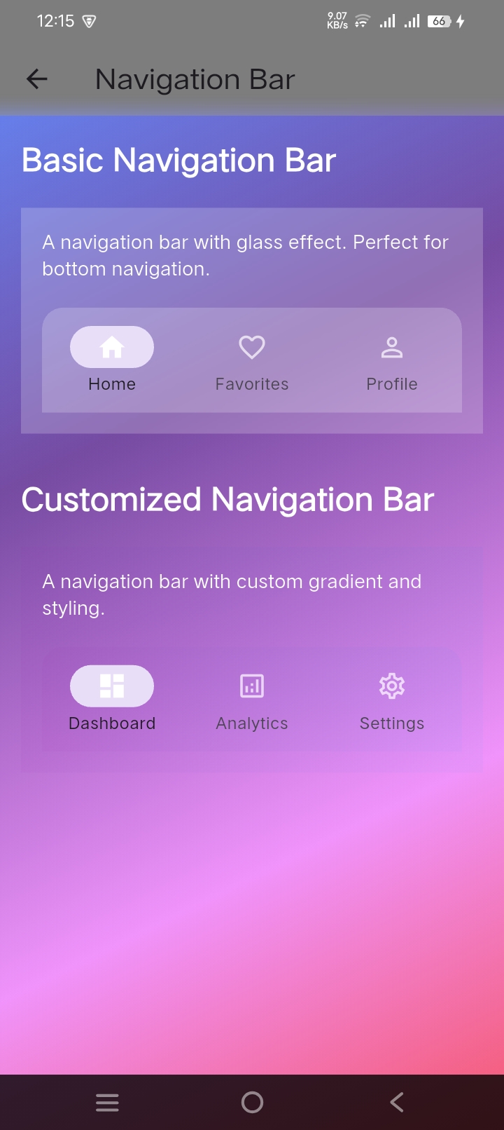
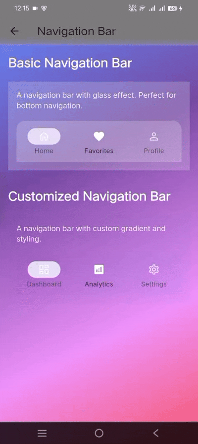
```dart
GlassNavigationBar(
selectedIndex: _selectedIndex,
onDestinationSelected: (index) => setState(() => _selectedIndex = index),
destinations: [
GlassNavigationDestination(
icon: Icon(Icons.home_outlined, color: Colors.white70),
selectedIcon: Icon(Icons.home, color: Colors.white),
label: 'Home',
),
GlassNavigationDestination(
icon: Icon(Icons.favorite_outline, color: Colors.white70),
selectedIcon: Icon(Icons.favorite, color: Colors.white),
label: 'Favorites',
),
GlassNavigationDestination(
icon: Icon(Icons.person_outline, color: Colors.white70),
selectedIcon: Icon(Icons.person, color: Colors.white),
label: 'Profile',
),
],
)
```
#### 3. Navigation Rail
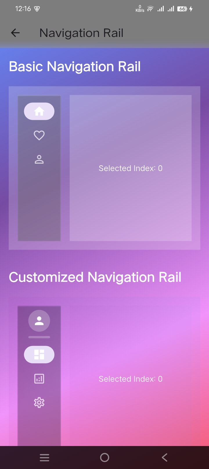
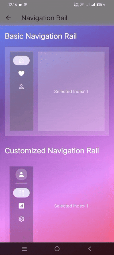
```dart
GlassNavigationRail(
selectedIndex: _selectedIndex,
onDestinationSelected: (index) => setState(() => _selectedIndex = index),
elevation: 1,
gradient: LinearGradient(
colors: [
Colors.purple.withAlpha(77),
Colors.blue.withAlpha(51),
],
),
leading: CircleAvatar(
radius: 20,
backgroundColor: Colors.white24,
child: Icon(Icons.person, color: Colors.white),
),
destinations: const [
GlassNavigationRailDestination(
icon: Icon(Icons.dashboard_outlined),
selectedIcon: Icon(Icons.dashboard),
label: Text('Dashboard'),
),
GlassNavigationRailDestination(
icon: Icon(Icons.analytics_outlined),
selectedIcon: Icon(Icons.analytics),
label: Text('Analytics'),
),
],
)
```
#### 4. Tab Bar
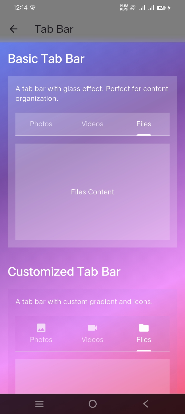
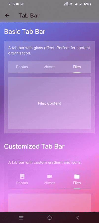
```dart
GlassTabBar(
controller: _tabController,
tabs: const [
Tab(text: 'Photos'),
Tab(text: 'Videos'),
Tab(text: 'Files'),
],
)
```
### Basic Components
#### 1. Glass Container
```dart
GlassContainer(
width: 300,
height: 200,
blur: 20,
borderRadius: BorderRadius.circular(15),
gradient: LinearGradient(
begin: Alignment.topLeft,
end: Alignment.bottomRight,
colors: [
Colors.white.withAlpha(51),
Colors.white.withAlpha(26),
],
),
child: Center(child: Text("Glassmorphic Container")),
)
```
#### 2. Glass Button
```dart
GlassButton(
onPressed: () => print('Button pressed'),
blur: 10,
borderRadius: BorderRadius.circular(15),
gradient: LinearGradient(
colors: [
Colors.blue.withAlpha(77),
Colors.purple.withAlpha(51),
],
),
padding: EdgeInsets.symmetric(horizontal: 32, vertical: 16),
child: Row(
mainAxisSize: MainAxisSize.min,
children: [
Icon(Icons.add, color: Colors.white),
SizedBox(width: 8),
Text("Glass Button", style: TextStyle(color: Colors.white)),
],
),
)
```
#### 3. Glass Card
```dart
GlassCard(
width: double.infinity,
height: 200,
blur: 20,
borderRadius: BorderRadius.circular(20),
gradient: LinearGradient(
begin: Alignment.topLeft,
end: Alignment.bottomRight,
colors: [
Colors.white.withAlpha(51),
Colors.white.withAlpha(26),
],
),
child: Padding(
padding: EdgeInsets.all(16),
child: Column(
crossAxisAlignment: CrossAxisAlignment.start,
children: [
Text(
"Glass Card Title",
style: TextStyle(
color: Colors.white,
fontSize: 24,
fontWeight: FontWeight.bold,
),
),
SizedBox(height: 8),
Text(
"This is a card with glass effect that can contain any widget.",
style: TextStyle(color: Colors.white70),
),
],
),
),
)
```
#### 4. Glass Dialog
```dart
showDialog(
context: context,
builder: (context) => GlassDialog(
title: Text(
'Glass Dialog',
style: TextStyle(
color: Colors.white,
fontSize: 24,
fontWeight: FontWeight.bold,
),
),
content: Text(
'This is a glassmorphic dialog with blur effect and gradient overlay.',
style: TextStyle(color: Colors.white),
),
actions: [
GlassButton(
onPressed: () => Navigator.pop(context),
child: Text('Cancel', style: TextStyle(color: Colors.white)),
),
GlassButton(
onPressed: () => Navigator.pop(context, true),
child: Text('Confirm', style: TextStyle(color: Colors.white)),
),
],
),
)
```
#### 5. Glass Bottom Sheet
```dart
showModalBottomSheet(
context: context,
backgroundColor: Colors.transparent,
builder: (context) => GlassContainer(
height: 300,
gradient: LinearGradient(
begin: Alignment.topLeft,
end: Alignment.bottomRight,
colors: [
Colors.white.withAlpha(51),
Colors.white.withAlpha(26),
],
),
child: Column(
mainAxisSize: MainAxisSize.min,
children: [
ListTile(
leading: Icon(Icons.share, color: Colors.white),
title: Text('Share', style: TextStyle(color: Colors.white)),
onTap: () => Navigator.pop(context),
),
ListTile(
leading: Icon(Icons.edit, color: Colors.white),
title: Text('Edit', style: TextStyle(color: Colors.white)),
onTap: () => Navigator.pop(context),
),
],
),
),
)
```
#### 6. Glass Text Field
```dart
GlassTextField(
controller: _textController,
hintText: 'Enter text...',
blur: 10,
borderRadius: BorderRadius.circular(15),
gradient: LinearGradient(
colors: [
Colors.white.withAlpha(51),
Colors.white.withAlpha(26),
],
),
style: TextStyle(color: Colors.white),
cursorColor: Colors.white,
decoration: InputDecoration(
prefixIcon: Icon(Icons.search, color: Colors.white70),
border: InputBorder.none,
hintStyle: TextStyle(color: Colors.white70),
),
)
```
#### 7. Glass Progress Indicator
```dart
GlassProgressIndicator(
value: 0.7, // 70% progress
height: 8.0,
blur: 10,
borderRadius: BorderRadius.circular(4),
gradient: LinearGradient(
colors: [
Colors.blue.withAlpha(77),
Colors.purple.withAlpha(51),
],
),
)
```
#### 8. Glass Slider
```dart
GlassSlider(
value: _sliderValue,
onChanged: (value) => setState(() => _sliderValue = value),
min: 0.0,
max: 100.0,
divisions: 10,
label: '${_sliderValue.round()}',
activeColor: Colors.white.withAlpha(200),
inactiveColor: Colors.white.withAlpha(100),
blur: 10,
borderRadius: BorderRadius.circular(10),
)
```
#### 9. Animated Glass Container
```dart
AnimatedGlassContainer(
duration: Duration(milliseconds: 500),
width: _isExpanded ? 300 : 200,
height: _isExpanded ? 200 : 100,
blur: _isExpanded ? 20 : 10,
gradient: LinearGradient(
colors: [
Colors.white.withAlpha(_isExpanded ? 51 : 26),
Colors.white.withAlpha(_isExpanded ? 26 : 13),
],
),
child: Center(
child: Text(
"Tap to Animate",
style: TextStyle(color: Colors.white),
),
),
)
```
## Usage 💻
### Basic Glass Container
```dart
GlassContainer(
width: 300,
height: 200,
blur: 20,
borderRadius: BorderRadius.circular(15),
gradient: LinearGradient(
colors: [
Colors.white.withAlpha(51), // 0.2 opacity
Colors.white.withAlpha(26), // 0.1 opacity
],
),
child: Center(child: Text("Glassmorphic Container")),
)
```
### Glass Button
```dart
GlassButton(
onPressed: () => print('Button pressed'),
blur: 10,
borderRadius: BorderRadius.circular(15),
child: Text("Glass Button"),
)
```
### Glass Bottom Navigation Bar
```dart
GlassBottomNavigationBar(
currentIndex: _currentIndex,
onTap: (index) => setState(() => _currentIndex = index),
items: const [
GlassBottomNavigationBarItem(
icon: Icon(Icons.home),
label: 'Home',
),
GlassBottomNavigationBarItem(
icon: Icon(Icons.search),
label: 'Search',
),
],
)
```
### Glass Drawer
```dart
GlassDrawer(
blur: 10,
opacity: 0.2,
child: Column(
children: [
GlassDrawerTile(
leading: Icon(Icons.home),
title: Text('Home'),
onTap: () {},
),
GlassDrawerTile(
leading: Icon(Icons.settings),
title: Text('Settings'),
onTap: () {},
),
],
),
)
```
### Glass Progress Indicator
```dart
GlassProgressIndicator(
value: 0.7, // 70% progress
height: 8.0,
blur: 10,
borderRadius: BorderRadius.circular(4),
)
```
### Glass Navigation Rail
```dart
GlassNavigationRail(
selectedIndex: _selectedIndex,
onDestinationSelected: (index) => setState(() => _selectedIndex = index),
elevation: 1, // New parameter for proper elevation
gradient: LinearGradient(
colors: [
Colors.purple.withAlpha(77),
Colors.blue.withAlpha(51),
],
),
leading: Column(
children: [
CircleAvatar(
radius: 20,
backgroundColor: Colors.white24,
child: Icon(Icons.person, color: Colors.white),
),
SizedBox(height: 8),
Container(
width: 40,
height: 4,
decoration: BoxDecoration(
color: Colors.white24,
borderRadius: BorderRadius.circular(2),
),
),
],
),
destinations: const [
GlassNavigationRailDestination(
icon: Icon(Icons.dashboard_outlined, color: Colors.white70),
selectedIcon: Icon(Icons.dashboard, color: Colors.white),
label: Text('Dashboard'),
),
GlassNavigationRailDestination(
icon: Icon(Icons.analytics_outlined, color: Colors.white70),
selectedIcon: Icon(Icons.analytics, color: Colors.white),
label: Text('Analytics'),
),
],
)
```
## Theming 🎨
You can create a consistent glass effect theme across your app:
```dart
final glassTheme = GlassTheme(
blur: 10.0,
opacity: 0.2,
borderRadius: BorderRadius.circular(15),
gradient: LinearGradient(
begin: Alignment.topLeft,
end: Alignment.bottomRight,
colors: [
Colors.white.withAlpha(51),
Colors.white.withAlpha(26),
],
),
);
// Use the theme
GlassContainer(
blur: glassTheme.blur,
opacity: glassTheme.opacity,
borderRadius: glassTheme.borderRadius,
gradient: glassTheme.gradient,
child: YourWidget(),
)
```
## Additional Information 📚
### Customization
All components support extensive customization:
- Blur intensity
- Opacity levels
- Gradient colors
- Border radius
- Animations
### Best Practices
1. Use against contrasting backgrounds
2. Maintain readable text contrast
3. Consider performance impact with multiple overlapping effects
4. Test on various devices for consistent appearance
5. Use withAlpha instead of withOpacity for better precision
### Contributing
Contributions are welcome! Please feel free to submit a Pull Request.
### License
This project is licensed under the MIT License - see the [LICENSE](LICENSE) file for details.
## Support ❤️
If you find this package helpful, please give it a ⭐️ on [GitHub](https://github.com/jamalihassan0307/glassmorphic_ui_kit)!
For issues, feature requests, or questions, please file an issue on the GitHub repository.
### Best Practices for Navigation Components
1. Always wrap buttons that use `Scaffold.of(context)` with a `Builder` widget
2. Use proper constraints to prevent overflow in navigation layouts
3. Set appropriate elevation values for navigation components
4. Handle state management properly in navigation screens
5. Consider responsive design for different screen sizes
## Contact
- 👨💻 Developed by [Jam Ali Hassan](https://github.com/jamalihassan0307)
- 🌐 [Portfolio](https://jamalihassan0307.github.io/portfolio.github.io)
- 📧 Email: jamalihassan0307@gmail.com
- 🔗 [LinkedIn](https://www.linkedin.com/in/jamalihassan0307)