https://github.com/jdtsmith/kind-icon
Completion kind text/icon prefix labelling for emacs in-region completion
https://github.com/jdtsmith/kind-icon
Last synced: 5 months ago
JSON representation
Completion kind text/icon prefix labelling for emacs in-region completion
- Host: GitHub
- URL: https://github.com/jdtsmith/kind-icon
- Owner: jdtsmith
- License: agpl-3.0
- Created: 2021-11-09T20:42:51.000Z (over 4 years ago)
- Default Branch: main
- Last Pushed: 2025-03-11T15:26:58.000Z (over 1 year ago)
- Last Synced: 2025-03-11T16:33:07.963Z (over 1 year ago)
- Language: Emacs Lisp
- Size: 164 KB
- Stars: 183
- Watchers: 5
- Forks: 5
- Open Issues: 0
-
Metadata Files:
- Readme: README.md
- License: LICENSE
Awesome Lists containing this project
README


# kind-icon — colorful icons for completion in Emacs
This emacs package adds configurable icon or text-based completion prefixes based on the `:company-kind` property that many completion backends (such as lsp-mode, eglot, and Emacs' elisp-mode) provide.
## Examples
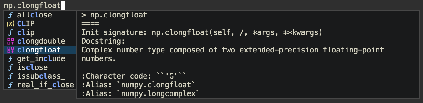
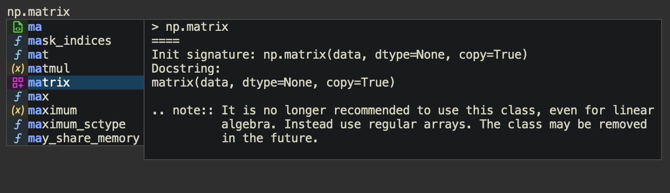
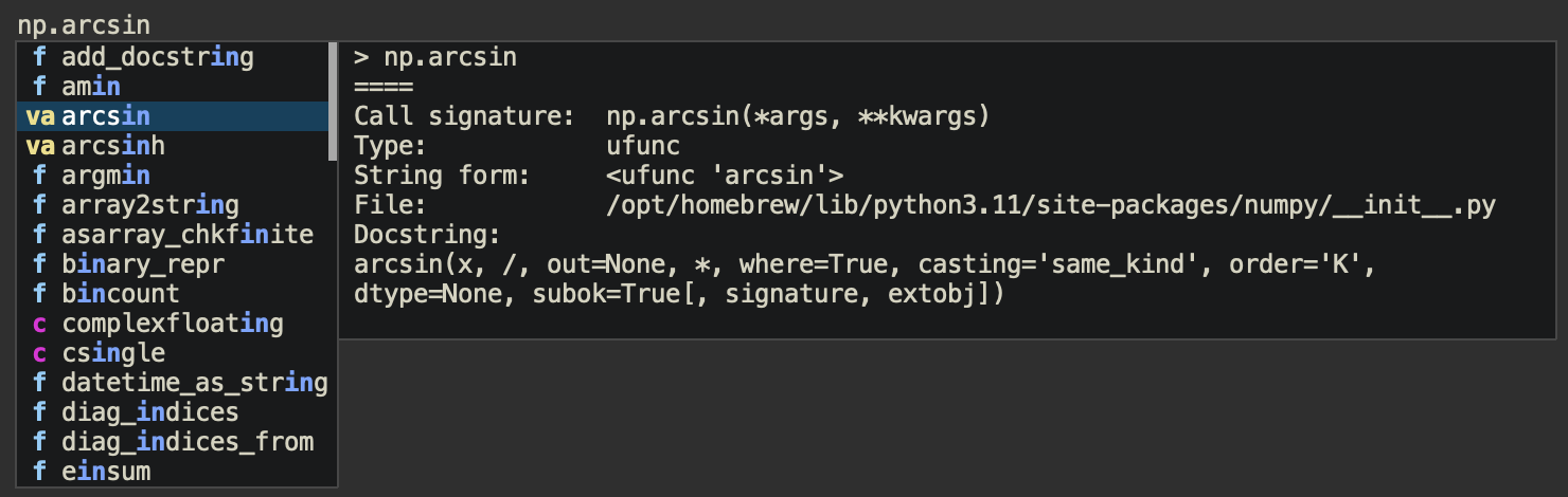
A few examples of `kind-icon` in action.
### SVG icons
With the new default transparent icon background, with `corfu` (and `corfu-popupinfo`).
With blended icon backgrounds:
### Text-only icons:
### With Company:

## Installation
Get it from ELPA (e.g. `M-x package-install RET kind-icon RET`). Note that icon support requires the small library [svg-lib](https://github.com/rougier/svg-lib). At present `kind-icon` has been tested extensively with the excellent [corfu](https://github.com/minad/corfu) in-buffer completion front-end (from the maker of vertico, consult, marginalia, and more).
`kind-icon` works either as a "margin-formatter" (for supporting UI's such as corfu) or by wrapping the completion function, for other completion UI's which can handle the Emacs 28+ [`affixation-function`](https://git.savannah.gnu.org/cgit/emacs.git/tree/doc/lispref/minibuf.texi?id=d8e037eeaa7eef26349bc0fb3fa00e10a5c4b894#n1819) completion property.
### Using margin-formatters (preferred):
To enable for completion UI's with margin-formatters capability such as [corfu](https://github.com/minad/corfu):
```elisp
(use-package kind-icon
:ensure t
:after corfu
;:custom
; (kind-icon-blend-background t)
; (kind-icon-default-face 'corfu-default) ; only needed with blend-background
:config
(add-to-list 'corfu-margin-formatters #'kind-icon-margin-formatter))
```
### Wrapping completion-in-region:
The more generic approach of wrapping the `completion-in-region-function` would look like:
```elisp
(use-package kind-icon
:ensure t
:config
(add-hook 'my-completion-ui-mode-hook
(lambda ()
(setq completion-in-region-function
(kind-icon-enhance-completion
completion-in-region-function)))))
```
for whichever `completion-ui` you are using. Note that for this method to work, your completion UI must support the Emacs 28 `affixation-function` property.
### Using with company
[Company](https://github.com/company-mode/company-mode) has its own distinct margin formatter system, but `kind-icon` can easily be adapted to it with the following setup:
```elisp
(use-package kind-icon
:ensure t
:after company
:config
(let* ((kind-func (lambda (cand) (company-call-backend 'kind cand)))
(formatter (kind-icon-margin-formatter `((company-kind . ,kind-func)))))
(defun my-company-kind-icon-margin (cand _selected)
(funcall formatter cand))
(setq company-format-margin-function #'my-company-kind-icon-margin)))
```
>[!IMPORTANT]
> The company config above requires you to use lexical binding. Simply add `;;; -*- lexical-binding: t -*-` at the top of your `init.el`.
## Configuration
The configuration defaults should work fine, but `kind-icon` can be customized to change the icons and colors, preference of icons vs. short-text (or mixed) prefixes, and more. See [the wiki](https://github.com/jdtsmith/kind-icon/wiki) for configuration ideas including alternative icon sets.
### Variables
`kind-icon` has a few customization variables that allow you to configure its appearance. The easiest way to edit them is `M-x customize-group kind-icon`, which automatically takes care of cleaning the cache upon changes. If you change them directly from lisp during a session (e.g. with `setq`), call `M-x kind-icon-reset-cache` to reset the temporary `kind-icon` cache, so that the changes will take effect.
#### Important configuration variables:
- `kind-icon-use-icons`: If non-nil (the default), prefer icons for prefix badges. Otherwise, use text labels. Individual kind entries can also have their icons disabled by removing the `:icon` property in the mapping (see below). If `svg-lib` is unable to download a named icon and it is not cached on disk, text labels for that kind will be used as a fallback.
- `kind-icon-mapping`: This is the top level configuration mapping `:company-kind` "types" like `'variable` and `'function`. Each item in this list has the format `(sym short-text :keyword value ...)` where `sym` is the kind (a symbol), and `short-text` is the abbreviated text to display (if icons are not used), both of which must be present. The rest of the list is a property list with optional keys `:icon` and `:face`. The latter will be used to set the text foreground and (possibly) background colors on the badge. The former specifies an icon to use, and is simply a string name, by default from the free [material icon library](https://pictogrammers.com/library/mdi/) used by [svg-lib](https://github.com/rougier/svg-lib). Try `M-x customize-variable kind-icon-mapping` for a nice interface including an icon Preview button. Pro-tip: keep your code buffer open with completion popped-up alongside the customization buffer. When you apply changes, they are immediately applied.
>[!NOTE]
> As of kind-icon v0.2, additional keywords supported by svg-lib can be utilized, including `:collection`, which allows the use of other icon libraries. In recent svg-lib versions, these include vscode-icons. Please note that **only monochrome icons are supported**; if you configure icons which have hard-coded colors in the SVG file (as some vscode-icons do), they will not be displayed correctly. If you want to switch the collection for _all_ icons, add (e.g) `:collection "octicon"` to `kind-icon-default-style`, and update `kind-icon-mapping` to include `:icon`'s from that collection.
- `kind-icon-default-face`: A face from which the icon background color will be taken and blended with the `:face` foreground color in the mapping table to create a custom background color. If not set, the frame default background color will be used for this purpose. Similarly, the foreground color for this face, if set, will be used if a `:face` foreground is missing from the mapping.
- `kind-icon-blend-background`: If non-nil, computes a blend between a nominal background color (from either the background property of `kind-icon-default-face`, if set, or frame background color) and the foreground :face. If `kind-icon-blend-background` is nil, the background is taken from the :face background, `kind-icon-default-face`, transparent by default.
- `kind-icon-blend-frac`: The fractional blend between custom badge `:face` foreground and background (see above) color to use as a custom background for each badge. A value of 0.0 simply replicates the background color. Values should likely stay below 0.3 or so.
- `kind-icon-default-style`: Default style to build `svg-lib` icons with. Normally there is no need to configure this. Note that `svg-lib` accepts `:background nil` to produce SVG with transparent backgrounds; this will be overridden if `kind-icon-blend-background` is non-nil. Set `:height` to a slightly smaller value if line spacing issues occur. You can switch the default `svg-lib` "collection" from material by adding, e.g. `:collection "octicon"` to this plist (see `svg-lib-icon-collections`).
### Colors
If you don't like the default colors of the icons, you can customize the associated face, choose another pre-existing face, or substitute your own face. You can also change how the background color is displayed.
#### Foreground color
Icon foreground colors are matched in the default mapping to the face colors used by font-lock in programming modes (variables, function names, etc.). This gives consistency with in-buffer highlighting. These colors are taken from the `:face` `:foreground` color in `kind-icon-mapping`. If no `:face` is set for some kind, the foreground is taken from `kind-icon-default-face` foreground, or, as a backup, the default frame foreground.
#### Background color
By default, `kind-icon` uses no special background color for the icons, which means selection highlighting covers the entire row (candidate + icon). It can optionally create _blended_ background colors for each icon, mixing of a bit of the icon's foreground color with the normal completion background (control the mix with `kind-icon-blend-frac`). See `kind-icon-blend-background`. Note that if you enable this, and your completion UI uses a different background color from your normal buffer, you should configure the face it uses with `kind-icon-default-face`.
### Icons
Check the [material icon library](https://pictogrammers.com/library/mdi/) for the default icons you can use, more than 7,000 of them! All you need to "use" an icon is its name. The easiest approach is to `M-x customize-variable kind-icon-mapping`, find the kind you are interested in, and change its icon. Hit the `Preview` button and check the message buffer to confirm it's the icon you were after, and Apply your changes.
**Note that `svg-lib`, which `kind-icon` uses, downloads and caches icons, by default in `.emacs.d/.cache/svg-lib/`.** If no network connection is present, and the icon has not been cached on disk, the short-text is used as a backup for that session.
And yes, you can use **any icons**!

In recent versions you can use icons from other "collections" supported by svg-lib; just add a `:collection` key to `kind-icon-mapping` (see above).
### Old School: Text-based Icons
You can also use simple text-based prefixes instead of icons. The icons are quite lightweight so there shouldn't be much performance difference, but some may prefer a simpler look. A "text" icon is composed of either one or two characters (anything longer will be trimmed). Simply set the `kind-icon-use-icons` variable to `nil` and (if desired) customize the "Short-Text" in the mapping. Note that if you are not connected to the network, even if you have enabled icons, any icons which are not cached on disk will be replaced by their short text equivalents.
### Previewing
Use `M-x kind-icon-preview-all` to reset and preview all icons (text and SVG icons both) in a view buffer. This also has the effect of pre-downloading all icons, courtesy svg-lib. Current defaults:

### Theme changes
When the theme changes, the blend colors (if enabled) may need to be recomputed; use `kind-icon-reset-cache` to do so. If you want to enable this to happen automatically, see [this post](https://github.com/jdtsmith/kind-icon/issues/34#issuecomment-1668560185).
### Debugging Tips
If you get an error mentioning `corfu--post-command`, and notice that you don't get a backtrace even after invoking `toggle-debug-on-error`, this is because backtraces are inhibited during post-command hooks. To re-enable them, evaluate the following (e.g. in your `*scratch*` buffer):
```elisp
(advice-add 'corfu--post-command :around
(lambda (func)
(condition-case err
(funcall func)
((debug error) (signal (car err) (cdr err))))))
```
## Related Packages
A small set of packages related to `kind-icon`:
- [corfu](https://github.com/minad/corfu) is a sleek in-buffer completion frontend which fully supports standard emacs completions providers (aka completion at point functions — CAPFs). It was the original to include the margin-formatter function support which kind-icon uses.
- [company-mode](https://github.com/company-mode/company-mode) is the all-inclusive completion system, and includes built-in support for icons based on the Microsoft VSCode set.
- [all-the-icons](https://github.com/iyefrat/all-the-icons.el) is font-based icon library which can be used to enrich dired, neotree, the mode line and others with icons.
- [all-the-icons-completion](https://github.com/iyefrat/all-the-icons-completion/) builds on `all-the-icons` to enrich minibuffer-based completion, including support for the excellent [marginalia](https://github.com/minad/marginalia) annotator.
- [nerd-icons](https://github.com/rainstormstudio/nerd-icons.el) makes it easy to use many of the same icons supported via SVG download within a single installed [NerdFont](https://www.nerdfonts.com). See [the wiki](https://github.com/jdtsmith/kind-icon/wiki) for config.
- [nerd-icons-completion](https://github.com/rainstormstudio/nerd-icons-completion) builds on `nerd-icons` to offer minibuffer-based completion.
- [nerd-icons-corfu](https://github.com/LuigiPiucco/nerd-icons-corfu): A simple margin formatter for corfu using nerd icons. Similar functionality as is described in [the wiki](https://github.com/jdtsmith/kind-icon/wiki).
## Notes
If you are using the emacs-mac fork of emacs on MacOS >=10.13, you should compile with `librsvg` support, as the native SVG support using WebKit2 is slow and will impact performance.
In some situations, svg-lib renders icons which are taller than the associated font. This can be fixed by reducing the `:height` in `kind-icon-default-style`, e.g. to 0.9 or 0.8.
## Thanks
- to @rougier for the excellent [svg-lib](https://github.com/rougier/svg-lib).
- to @minad, who developed [corfu](https://github.com/minad/corfu) (among many others) and contributed many great ideas to `kind-icon`.
- to @dgutov, maintainer of [company](https://github.com/company-mode/company-mode), from which color-matching to font-lock faces was inspired.