https://github.com/jean343/styless
Style your components declaratively with familiar less syntax
https://github.com/jean343/styless
babel less styled-components styled-components-theme
Last synced: 5 months ago
JSON representation
Style your components declaratively with familiar less syntax
- Host: GitHub
- URL: https://github.com/jean343/styless
- Owner: jean343
- License: mit
- Created: 2018-08-05T13:49:04.000Z (almost 8 years ago)
- Default Branch: master
- Last Pushed: 2023-01-03T18:31:05.000Z (over 3 years ago)
- Last Synced: 2025-08-31T07:51:49.842Z (10 months ago)
- Topics: babel, less, styled-components, styled-components-theme
- Language: JavaScript
- Size: 1.9 MB
- Stars: 66
- Watchers: 3
- Forks: 3
- Open Issues: 46
-
Metadata Files:
- Readme: README.md
- License: LICENSE
Awesome Lists containing this project
README
[](https://travis-ci.org/jean343/styless)
[](https://www.npmjs.com/package/babel-plugin-styless)
[](https://github.com/semantic-release/semantic-release)
[](https://github.com/styled-components/styled-components)
# :gem:Styless:gem:
Styless enables [less](http://lesscss.org/) syntax in your [styled-components](https://www.styled-components.com)
## Installation
```sh
$ yarn add --dev babel-plugin-styless
```
**.babelrc**
```json
{
"plugins": ["babel-plugin-styless"]
}
```
Note that `styless` should appear before `babel-plugin-styled-components` if used.
## Key features
- Simplifies the code
use `@main` instead of `${props => props.theme.main}`
- Uses variables directly in your styled components
```less
@size: if(@small, 4px, 10px);
```
- Uses operations directly in your styled components
use `@size * 3` instead of `${props => parseFloat(props.size) * 3 + "px"}`
- Uses functions directly in your styled components.
```less
color: darken(@highlight, 5%);
```
There is no need to import `darken`.
- Supports `rgb`, `hsl` and `hsv` color spaces
```less
color: hsv(90, 100%, 50%);
```
- Migrate less to styled-components seamlessly.
There is no confusion when transitioning from less to styled-components caused by `width: 3px * 2`.
- Supports variable overwritten
```less
const Button = styled.button`
@highlight: blue; // can be overwritten by theme or props
background: darken(@highlight, 5%); // make green darken by 5%
`;
```
```jsx
click me // green (set in props) overwrites red (set in theme)
```
- Supports imports and mixins
```less
const Button = styled.button`
@import (reference) "variables";
.bg-light-blue;
`;
```
- Supports css props
```less
```
- Still supports the styled-components syntax for more complex jobs!
```jsx
`${props => props.main}`
```
## Your first Styless component
```less
const Button = styled.button`
@main: palevioletred;
@size: 1em;
font-size: @size;
margin: @size;
padding: @size / 4 @size;
border-radius: @size / 2;
color: @main;
border: 2px solid @main;
background-color: white;
`;
```
```jsx
Normal
Themed
Themed large
```
This is what you'll see in your browser :tada:, play with it on [codesandbox](https://codesandbox.io/s/p30ywzqkr7)

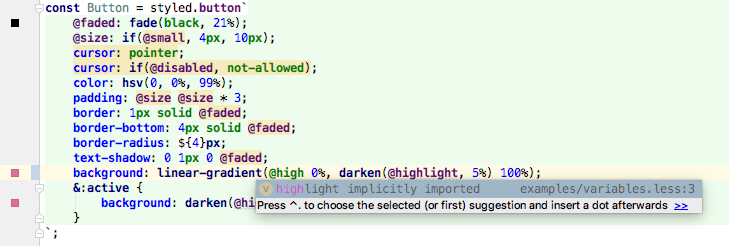
## Advanced Styless component example
```less
const Button = styled.button`
@faded: fade(black, 21%);
@size: if(@small, 4px, 10px);
cursor: pointer;
cursor: if(@disabled, not-allowed);
color: hsv(0, 0%, 99%);
padding: @size @size * 3;
border: 1px solid @faded;
border-bottom: 4px solid @faded;
border-radius: ${4}px;
text-shadow: 0 1px 0 @faded;
background: linear-gradient(@highlight 0%, darken(@highlight, 5%) 100%);
&:active {
background: darken(@highlight, 10%);
}
`;
```
```jsx
// Notice that the @highlight variable is resolved from the theme, and overwritten from a props in the second button.
Click me
Or me
But not me
```
This is what you'll see in your browser :tada:, play with it on [codesandbox](https://codesandbox.io/s/6zq4jyo5qz)

*Note* that with [webstorm-styled-components](https://github.com/styled-components/webstorm-styled-components),
we get syntax highlighting, color preview and ctrl+click access to variables!
## FAQ
- How to refer to a `constants.less` file, see the receipe for [theme](docs/receipe-theme.md).
- Cool, how does it work? Head over to the [explanations](docs/explanation.md).
- Why less? The `@color` systax reduces the confusion from `$color` when comparing to the SC syntax `${props}`. If there is enough demand, a scss plugin could be created.
- The styled-components mixins such as `${hover};` must be terminated with a semi colon. The following will not work.
```less
const Button = styled.button`
${hover}
color: red;
`;
```
- How to import a less files for all components? As SC components are small in nature, it can be convenient to have a common less file be imported in all components. Add the following to your `.babelrc` to have `common.less` imported automatically.
```
[
"styless",
{
"cwd": "babelrc",
"import": "../less/common.less"
}
]
```
- Can this be used to load variable sheets such as Antd.
Yes, in `.babelrc`, add the following or see https://stackoverflow.com/a/59472390/3666615 for more detals.
```
[
"styless",
{
"import": "~antd/lib/style/themes/default.less",
"lessOptions": {
"javascriptEnabled": true
}
}
]
```