Ecosyste.ms: Awesome
An open API service indexing awesome lists of open source software.
https://github.com/jeremybanka/corners
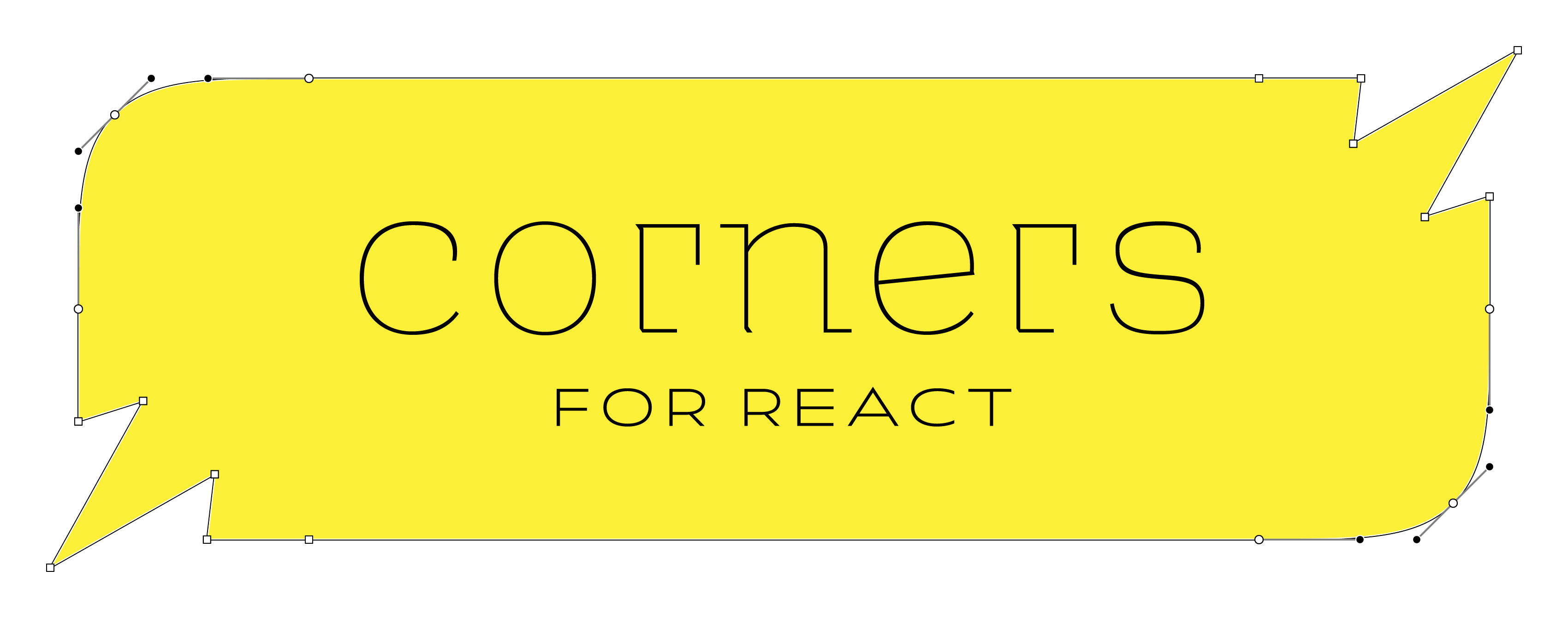
React component library for dynamically-sized DOM elements with beautiful corners.
https://github.com/jeremybanka/corners
Last synced: 2 months ago
JSON representation
React component library for dynamically-sized DOM elements with beautiful corners.
- Host: GitHub
- URL: https://github.com/jeremybanka/corners
- Owner: jeremybanka
- License: mit
- Created: 2021-12-17T01:06:25.000Z (about 3 years ago)
- Default Branch: main
- Last Pushed: 2024-05-22T15:13:53.000Z (8 months ago)
- Last Synced: 2024-05-22T16:34:16.262Z (8 months ago)
- Language: TypeScript
- Homepage: https://cornersjs.org
- Size: 192 MB
- Stars: 3
- Watchers: 3
- Forks: 1
- Open Issues: 5
-
Metadata Files:
- Readme: README.md
- License: LICENSE
Awesome Lists containing this project
README

```shell

npm i corners

```

```shell

pnpm add corners

```


Create react components with angled or smooth-rounded corners.

* [Features](#features)

* [API](#api)

* [Examples](#examples)

## Features

- [x] premade component factories:

  ```

  const MyRoundedButton = rounded.button

  ```

- [x] make your own factory:

  ```

  const dogEared = corners(chamfer, null, null, null).size(40)

  const MyDogEaredButton = dogEared.button

  ```

- [x] CSS clip-path ensures corners are rendered as empty space

- [x] Components may be dynamically sized: a resize observer is used to detect changes to component size and update the clip-path

- [x] Specify the corner size when calling a factory (e.g. `rounded.size(10).div`)

- [x] Support for drop shadows (e.g. `corners(round).options({shadow: {...}}).div`)

- [x] Support for positioning elements outside of the target element

- [ ] Clipping Paths that are inset (or spread ?) from the target element

- [ ] Layers that are inset or spread from the target element

- [ ] Simultaneous use of clipping path and layers

## API

### corners

```ts

corners(...cornerFns).with({ cornerSize, useClipPath, above, below }) => ComponentFactory

```

Creates a new component factory with the given corner functions. The corner functions are applied in the order they are given.

| Argument    | Type                                               | Required? | Description                                                                       |

| ----------- | -------------------------------------------------- | --------- | --------------------------------------------------------------------------------- |

| cornerFns   | Nullable<[DrawCorner](#drawcorner)>[] | Yes       | 1, 2, or 4 functions that specify the corners for this factory in clockwise order |

| cornerSize  | `number`                                           | No        | Equivalent to `N` in css `border-radius: Npx`                                     |

| useClipPath | `boolean`                                          | No        | `true` is equivalent to css `overflow: hidden`                                    |

| above       | Partial<[Layer](#layer)>[]            | No        | Layers with the same shape as the component, but rendered above the component     |

| below       | Partial<[Layer](#layer)>[]            | No        | Layers with the same shape as the component, but rendered below the component     |

| Returns          | Type                                               | Description                                                                  |

| ---------------- | -------------------------------------------------- | ---------------------------------------------------------------------------- |

| ComponentFactory | [ComponentFactory](#componentfactory) | A new component factory with the given corner functions and options applied. |

### DrawCorner

#### (p1, p2, idx) => pathPoints

A function that draws a corner

| Argument | Type                        | Required? | Description                                                                                      |

| -------- | --------------------------- | --------- | ------------------------------------------------------------------------------------------------ |

| p1       | `{ x: number; y: number; }` | Yes       | The first point of the corner                                                                    |

| p2       | `{ x: number; y: number; }` | Yes       | The second point of the corner                                                                   |

| idx      | `number`                    | Yes       | The index of the corner. `0` = top right, `1` = bottom right, `2` = bottom left, `3` = top left. |

| Returns    | Type       | Description       |

| ---------- | ---------- | ----------------- |

| pathPoints | `string[]` | svg path commands |

### Layer

A layer takes the same shape as the component it is applied to.

| Property | Type                | Required? | Description                    |

| -------- | ------------------- | --------- | ------------------------------ |

| color    | string              | Yes       | The color of the layer         |

| x        | number              | Yes       | The x offset of the layer      |

| y        | number              | Yes       | The y offset of the layer      |

| blur     | number              | Yes       | The blur radius of the layer   |

| spread   | number              | Yes       | The spread radius of the layer |

| stroke   | Stroke | No        | The stroke of the layer        |

## Examples

### Make a "dog-eared" component

```

 /¯¯¯¯¯¯¯¯¯|

/          |

|          |

|__________|

```

(it should look like a dog-eared page)

```jsx harmony

import type { FC } from "react"

import corners, { chamfer } from "corners"

const upperLeftDogeared = corners(null, null, null, chamfer).with({ cornerSize: 20 })

const DogearedDiv = upperLeftDogeared.div

const MyComponent: FC = () => (


    Hello, World!


)

```

### Make a "squircled" component with a drop shadow

```jsx harmony

import type { FC } from "react"

import { rounded } from "corners"

const LAYER: Record> = {

  FAINT_SHADOW: { color: `#0003`, spread: -4, blur: 12, y: -4 },

  LIGHT_FILL: { color: `#f3f3f3` },

}

const RoundedSpanWithShadow = rounded.span.with({

  cornerSize: 15,

  below: [LAYER.LIGHT_FILL, LAYER.FAINT_SHADOW],

  useClipPath: false,

})

const MyComponent: FC = () => (


    Hello, World!


)

```

## LICENSE

MIT


