https://github.com/jgeek00/segmented-button-slide
Flutter package. Segmented button with slider indicator based on the iOS one, but adapted to the Material UI.
https://github.com/jgeek00/segmented-button-slide
dart flutter material package segmented-button
Last synced: over 1 year ago
JSON representation
Flutter package. Segmented button with slider indicator based on the iOS one, but adapted to the Material UI.
- Host: GitHub
- URL: https://github.com/jgeek00/segmented-button-slide
- Owner: JGeek00
- License: apache-2.0
- Created: 2023-10-25T20:58:31.000Z (over 2 years ago)
- Default Branch: master
- Last Pushed: 2024-07-29T22:04:03.000Z (almost 2 years ago)
- Last Synced: 2025-02-28T12:33:01.538Z (over 1 year ago)
- Topics: dart, flutter, material, package, segmented-button
- Language: Dart
- Homepage: https://pub.dev/packages/segmented_button_slide
- Size: 1.01 MB
- Stars: 4
- Watchers: 1
- Forks: 2
- Open Issues: 1
Awesome Lists containing this project
README
# Segmented Button Slide
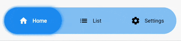
Segmented Button Slide takes inspiration from the iOS segmented button, adapting it to the Material interface.
### How to use it
Install it by running the following command.
```
flutter pub add segmented_button_slide
```
#### Full example
By default it takes as much width as it can, so it's a good idea to wrap it inside a widget with a defined width.
```dart
int selectedOption = 0;
...
SegmentedButtonSlide(
selectedEntry: selectedOption,
onChange: (selected) => setState(() => selectedOption = selected),
entries: const [
SegmentedButtonSlideEntry(
icon: Icons.home_rounded,
label: "Home",
),
SegmentedButtonSlideEntry(
icon: Icons.list_rounded,
label: "List",
),
SegmentedButtonSlideEntry(
icon: Icons.settings_rounded,
label: "Settings",
),
],
colors: SegmentedButtonSlideColors(
barColor: Theme.of(context).colorScheme.primaryContainer.withOpacity(0.5),
backgroundSelectedColor: Theme.of(context).colorScheme.primaryContainer,
),
slideShadow: [
BoxShadow(
color: Colors.blue.withOpacity(1),
blurRadius: 5,
spreadRadius: 1,
)
],
margin: const EdgeInsets.all(16),
height: 70,
padding: const EdgeInsets.all(16),
borderRadius: BorderRadius.circular(8),
selectedTextStyle: const TextStyle(
fontWeight: FontWeight.w700,
color: Colors.green,
),
unselectedTextStyle: const TextStyle(
fontWeight: FontWeight.w400,
color: Colors.red,
),
hoverTextStyle: const TextStyle(
color: Colors.orange,
),
),
```
#### Detailed explanation
* **[REQUIRED] ``entries``** accepts a list of ``SegmentedButtonSlideEntry``. Each ``SegmentedButtonSlideEntry`` is formed by an icon and a label. You must declare at least one of the two.
* **[REQUIRED] ``selectedEntry``** accepts an ``int``. Defines the item that's currently selected.
* **[REQUIRED] ``onChange``** returns the selected value when the user changes the selection.
* **[REQUIRED] ``colors``** accepts an instance of ``SegmentedButtonSlideColors``. All of it's attributes are mandatory.
* ``barColor`` defines the background color of the full bar.
* ``backgroundSelectedColor`` defines the background color of the item that's currently selected.
* **``slideShadow``** defines the boxShadow of the slider (item that's currently selected).
* **``barShadow``** defines the boxShadow of the full bar (the background).
* **``margin``** creates a margin around the whole widget.
* **``height``** defines the height of the widget.
* **``fontSize``** sets the fontSize of the text. It doesn't affect to the icon.
* **``iconSize``** sets the size of the icon. It doesn't affect to the text.
* **``textOverflow``** defines how the text (only) should overflow.
* **``animationDuration``** defines the duration of all the animations of the widget. By default it's set to 250 milliseconds.
* **``curve``** defines the curve of all the animations of the widget. By default it's set to ``ease``.
* **``padding``** defines the distance between the selectable items and the outer container.
* **``borderRadius``** defines the border radius for the outer container and for the individual items.
* **``selectedTextStyle``** accepts a ``TextStyle`` object that defines the style for the icon and the text when the option is selected.
* **``unselectedTextStyle``** accepts a ``TextStyle`` object that defines the style for the icon and the text when the option is not selected.
* **``hoverTextStyle``** accepts a ``TextStyle`` object that defines the style for the icon and the text when the option is hovered.
#### Migration from v1 to v2
Segmented button slide v2 includes some breaking changes.
* ``foregroundSelectedColor``, ``foregroundUnselectedColor`` and ``hoverColor`` have been removed.
* Now you can define that three colors with the ``selectedTextStyle``, ``unselectedTextStyle`` and ``hoverTextStyle`` attributes.