Ecosyste.ms: Awesome
An open API service indexing awesome lists of open source software.
https://github.com/jglovier/microframe
:microscope: :triangular_ruler: :pencil2: Microframe is a micro (<200px wide), grid based wireframe PSD template for UI and UX designers mocking up website and app layouts.
https://github.com/jglovier/microframe
Last synced: about 1 month ago
JSON representation
:microscope: :triangular_ruler: :pencil2: Microframe is a micro (<200px wide), grid based wireframe PSD template for UI and UX designers mocking up website and app layouts.
- Host: GitHub
- URL: https://github.com/jglovier/microframe
- Owner: jglovier
- License: mit
- Created: 2013-06-06T02:01:22.000Z (over 11 years ago)
- Default Branch: main
- Last Pushed: 2022-01-28T22:12:02.000Z (about 3 years ago)
- Last Synced: 2024-11-14T20:48:30.756Z (3 months ago)
- Homepage:
- Size: 223 KB
- Stars: 298
- Watchers: 28
- Forks: 53
- Open Issues: 1
-
Metadata Files:
- Readme: README.md
- License: license.txt
Awesome Lists containing this project
README
# Microframe Template
**Microframe is a micro (200px wide), grid based wireframe PSD template for mocking up website and app layouts. The repo includes:**
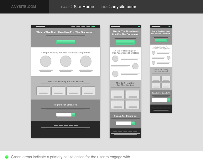
1. A [Microframe PSD Template](https://github.com/jglovier/microframe/blob/master/responsive-microframe.psd?raw=true "Download Now") with a 12 column grid and 3 sample layouts (12 column, 6 column, and 4 column layouts).
2. A [Blank Microframe PSD Template](https://github.com/jglovier/microframe/blob/master/responsive-microframe-blank.psd?raw=true "Download Now") with 12 column grid (*empty so you don't have to delete layers every time*).
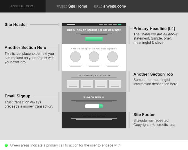
3. A [Microframe Detail PSD Template](https://github.com/jglovier/microframe/blob/master/micrframe-detail-template.psd?raw=true "Download Now") which you can place your Microframe PSDs in to explain/present to clients, or simply detail components for your own reference. The Detail PSD also has a view for laying out your layout variations (as seen in the two screens below).
## Features
### Grid Based
The PSD uses guides to create a 12 column grid which you can use to align your elements all pertty like.
### Includes 3 Layouts for Responsive Designs
There is a 12 column layout (for standard laptop/desktop views), a 6 column layout (for tablet views), and a 4 column layout (for mobile views). Each layout is grouped into a Photoshop group.
## Questions
### Why Should I Wireframe?
Because it helps you isolate the abstract challenges of layout design from the aesthetic details of UI design. If you really want to know more about why I'm a big proponent of wireframing as the second or third step (markerboard and/or pencil and paper should always come first), read [Markerboard Mentality](http://stemmings.com/markerboard-mentality/).
### Why Do I Need Your Template?
To save you time.
### Why Is It Micro?
Great question. I've simply found that working in very small pixel units helps me to focus on the overall layout more than nudging pixels one way or another. Also because it makes creating SASS forumulas for percentage width layouts really simple. ;-)
### Should I Modify The Template?
Yes! It includes a sample layout to get you started, just so you get a feel for how to use the thing. But once you grok that just delete all the layers that you don't want and just start using the space to create your own layout.
You also might want to save out a blank copy as your own template. Then, each time you go to start a new project open your personalized starter template, save a copy of it for your new project, and start laying out your page elements for that project.
### Can I Fork Your Repo?
Um, yes! That's how this open source stuff works, my friend. Please fork and make it your own, or make it better and share with the world!
### Can I Submit Issues or Feature Requests?
Yeah buddy! Just use the repo issues tracker and I'll address things as I am able.