Ecosyste.ms: Awesome
An open API service indexing awesome lists of open source software.
https://github.com/jgroth/kompendium
Documentation generator for Stencil components https://kompendium.dev/
https://github.com/jgroth/kompendium
documentation kompendium stencil typescript webcomponents
Last synced: about 1 month ago
JSON representation
Documentation generator for Stencil components https://kompendium.dev/
- Host: GitHub
- URL: https://github.com/jgroth/kompendium
- Owner: jgroth
- License: mit
- Created: 2020-02-23T21:51:02.000Z (over 4 years ago)
- Default Branch: main
- Last Pushed: 2024-10-02T14:38:24.000Z (about 1 month ago)
- Last Synced: 2024-10-03T07:10:51.752Z (about 1 month ago)
- Topics: documentation, kompendium, stencil, typescript, webcomponents
- Language: TypeScript
- Homepage:
- Size: 1.49 MB
- Stars: 8
- Watchers: 2
- Forks: 5
- Open Issues: 30
-
Metadata Files:
- Readme: README.md
- Changelog: CHANGELOG.md
- License: LICENSE
- Code of conduct: CODE_OF_CONDUCT.md
Awesome Lists containing this project
README

# Kompendium
 [](https://www.npmjs.com/package/kompendium) [](https://github.com/semantic-release/semantic-release)
# Introduction
Kompendium is a simple, fast and elegant tool for generating documentation for components made with Stencil.
Just type everything in Markdown, from your code blocks to description texts of example components. Then enjoy a lightning fast responsive compendium of your components, with component API and live playground.
### Please note
Kompendium is still in development. Consider this an early preview!
# Features
* **Live playground** — No matter if you are updating your docs, working on your examples, or tweaking css, Kompendium will instantly auto-refresh and you will see the latest changes right away. No need for manual rebuilding and refreshing the browser!
* **Elegant design** — Your examples and their description text are displayed on the left part of the documentation, while the code that generates them is resides on the right, and is smartly divided into tabs that show contents of connected files. It goes without saying that the layout is fully responsive and flawlessly adapts to tablets and phones.
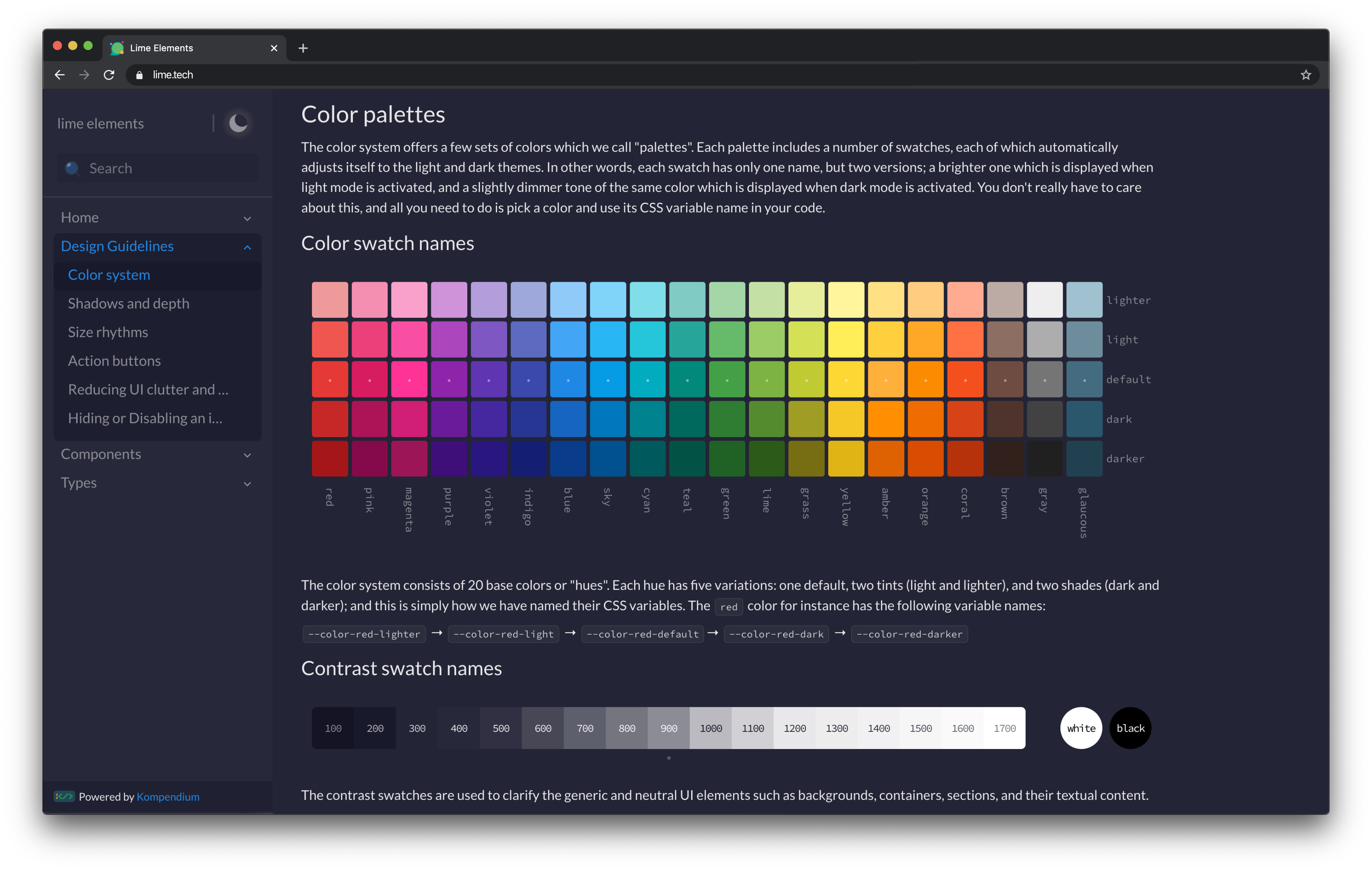
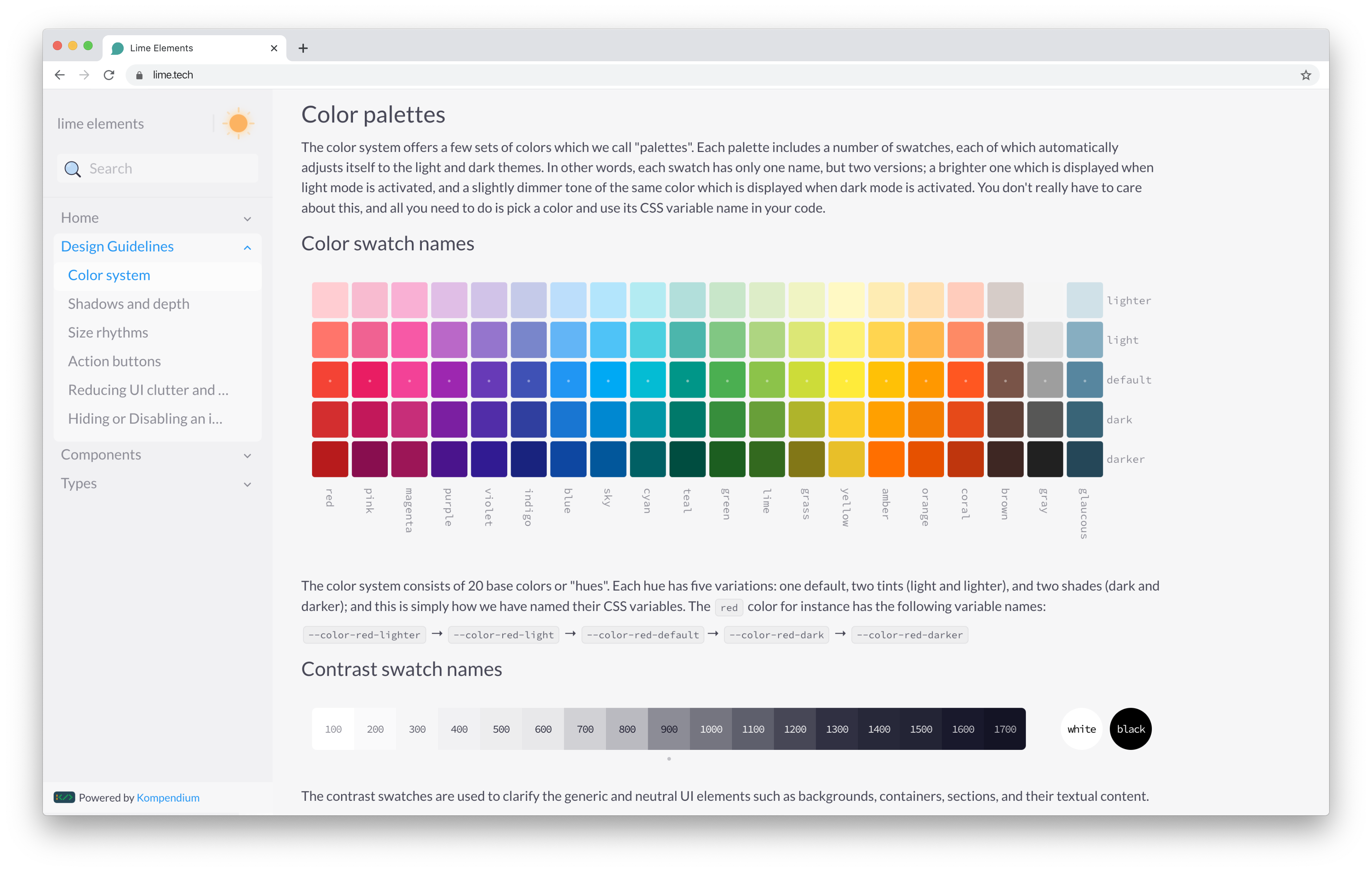
* **Dark mode** — Kompendium seamlessly switches between light and dark theme using `prefers-color-scheme` media query. All colors get automatically dimmed in dark mode, to provide a more decent experience and a more accessible user interface. Additionally, users can easily switch to their desired theme and Kompendium will remember their choice.
* **Multi page** — Kompendium divides your documentation into several pages, making sure that linkability is provided.
* **Markdown support** — Who doesn’t want to write in Markdown? While coding and articulating features, functionalities, and notes.
* **Admonitions support** — You can easily add admonitions within your markdown text to generate side content that do not interrupt the document flow. Kompendium comes with custom-made visual support for six types of these call-out blocks (`info`, `warning`, `danger`, `note`, `tip`, and `important`). [read more](https://github.com/elviswolcott/remark-admonitions).
* **Syntax highlighting** — Tabs that show the source code of for example `.tsx` or `.scss` files used in the Stencil example components have inbuilt syntax highlighting for each language. Also, code-blocks inside your documentations can benefit from syntax highlighting, if you specify their respective language. For the highlighting, we have hand-picked colors that look gorgeous both in light- and dark-mode.
* **Debug mode** — You can isolate individual examples of the components which are showcased in the documentation, simply by pressing a button. This feature helps cleaning up the DOM and therefore an easier debugging experience.
* **Search** — Kompendium has a simple search engine that makes finding information easier for users.
# Demo
You can see a live demo of Kompendium, being used by Lime Technologies to create their [component library and design system docs](https://lundalogik.github.io/lime-elements/versions/latest).


# Contributing
Please see CONTRIBUTING for details.
# Credits
* [Johan Groth](https://github.com/jgroth) — Development
* [Adrian Schmidt](https://github.com/adrianschmidt) — Development
* [Kiarokh Moattar](https://github.com/Kiarokh) — Design
# License
The MIT License (MIT).
_____________
# Documentation
## Getting started
### Installation
Kompendium is available as a package on NPM and is installed using the NPM CLI
````
npm install kompendium
````
## Configuration
Next, we need to configure Kompendium to generate our documentation. Kompendium runs using the `docs-custom` target in Stencil. We also need to copy the Kompendium components to our `www` folder in order to use them with the Stencil dev server.
````ts
stencil.config.ts
import { Config } from '@stencil/core';
import { kompendium } from 'kompendium';
export const config: Config = {
namespace: 'my-project',
outputTargets: [
{
type: 'docs-custom',
strict: true,
generator: kompendium()
},
{
type: 'www',
serviceWorker: null,
copy: [{
src: '../node_modules/kompendium/dist/',
dest: 'assets/kompendium/'
}]
}
]
};
````
To get the generated documentation up and running, simply use the `kompendium-app` component in your `index.html` file. Don't forget to also include the scripts and styles, both for your own components and the ones that we copied during the build.
````html
index.html
My Project
````
### Running the dev server
Next, we can start the dev server by running
````
stencil build --dev --watch --serve --docs
````
## Writing documentation
The generated documentation is fetched from the doc blocks inside the components source files. If we would have a component like the one below, it would generate the corresponding documentation. Kompendium understands how to read Markdown, so any additional markup will automatically be parsed.
````tsx
my-component.tsx
import { Component, h, Prop } from '@stencil/core';
/**
* This is a sample component
*
* Kompendium will parse the doc blocks and render it using Markdown
*/
@Component({
tag: 'my-component',
shadow: true,
})
export class MyComponent {
/**
* This is a sample property
*/
@Prop()
public name: string;
render() {
return
Hello, {this.name}!
;
}
}
````
## Adding examples
To improve the documentation even more, you can add examples of how to use your components. An example component is just another component that displays how your component is used. The example will be displayed both live and with the source code for the example.
To include an example, the custom `@exampleComponent` doc block decorator should be used together with the name of the component. There is no limit to the number of components you can include.
````tsx
my-component.tsx
import { Component, h, Prop } from '@stencil/core';
/**
* This is a sample component
*
* Kompendium will parse the doc blocks and render it using Markdown
*
* @exampleComponent my-component-example
*/
@Component({
tag: 'my-component',
shadow: true,
})
export class MyComponent {
/**
* This is a sample property
*/
@Prop()
public name: string;
render() {
return
Hello, {this.name}!
;
}
}
````
The example component in this case is very simple
````tsx
my-component-example.tsx
import { Component, h } from '@stencil/core';
/**
* This is an example for the `my-component` component
*/
@Component({
tag: 'my-component-example',
shadow: true,
})
export class MyComponentExample {
render() {
return ;
}
}
````
It's recomended to either name all the examples in a similar fashion, or to place them in an examples/ folder or similar. This way, it's very easy to exclude them from the production build by excluding them in the Stencil configuration.
## Type information
Kompendium can generate documentation about any custom Typescript types that you use in your components. You might have props or events that implement a custom interface and this should be documented as well so it is easy for the consumer of your components to use them.
### Configuration
All types needs to be exported from a single file. The default name of this file is ./src/types.ts, but this can be configured if needed.
````ts
stencil.config.ts
{
type: 'docs-custom',
strict: true,
generator: kompendium({
typeRoot: './src/interface.d.ts'
})
}
````
**Note:** This file should also be exported from the `index.ts` file so type hints will be available when consuming the components in a code editor.
### Example
````tsx
my-component.tsx
import { Component, h, Prop } from '@stencil/core';
import { MyData } from './my-data.ts';
/**
* This is a sample component
*
* Kompendium will parse the doc blocks and render it using Markdown
*/
@Component({
tag: 'my-component',
shadow: true,
})
export class MyComponent {
/**
* This is a sample property
*/
@Prop()
public data: MyData;
render() {
return
Hello, {this.data.name}!
;
}
}
````
````ts
my-data.ts
/**
* This is a custom interface used in `my-component`
*/
export interface MyData {
/**
* The name to display when the component renders
*/
name: string;
}
````
````ts
interface.d.ts
export * from './my-component/my-data.ts';
````
## Configuration options
| Option | Description | Default value |
|------------ |--------------------------------------------------------------- |--------------------------- |
| `path` | Path to folder where Kompendium will store the generated data | `.kompendium/ |
| `publicPath` | The public web distribution directory used by Stencil. | `www` |
| `title` | Title to display on top of the documentation | Fetched from `package.json` |
| `typeRoot` | Entry point for type information | `./src/types.ts` |
---
## Inheritance of styles and overriding them
You will be using Kompendium to generate documentation for your Stencil components and show both you and your consumers a preview of these components. Web components are inherently isolated, carrying their own styles that are not easily manipulated externally. However, it's important to note that Kompendium introduces its own styles, some of which are inherited by the web components displayed on the documentation page.
In most scenarios, this style-inheritance is inconsequential. However, when developing a comprehensive component library, certain generic CSS properties require careful attention to prevent them from being inherited from Kompendium. These typically include font-related styles such as `font-family`, `font-size`, `line-height`, and `color`.
Exactly because these are inherited properties, these are usually set at the `:root` level in the application consuming your web components, eliminating the need to specify them individually in each web component. To maintain style consistency, you can override these properties on the documentation page.
Kompendium offers a few CSS Custom Properties which enables you to do so.
- `--kompendium-example-color`: Overrides the inherited `color` affecting text color in your web components.
- `--kompendium-example-font-family`: Overrides the inherited `font-family` in your web components.
- `--kompendium-example-font-size`: Optionally overrides the inherited `font-size`, depending on the font-family in use.
- `--kompendium-example-line-height`: Optionally overrides the inherited `line-height`, depending on the font-family in use.
You can define these properties for your instance of Kompendium as shown below:
```html
:root {
--kompendium-example-color: #1d1d1d;
--kompendium-example-font-family: 'Roboto', sans-serif;
}
```