https://github.com/jsuarezruiz/TemplateMAUI
A set of .NET MAUI templated controls.
https://github.com/jsuarezruiz/TemplateMAUI
controls dotnet dotnet-maui maui
Last synced: over 1 year ago
JSON representation
A set of .NET MAUI templated controls.
- Host: GitHub
- URL: https://github.com/jsuarezruiz/TemplateMAUI
- Owner: jsuarezruiz
- License: mit
- Created: 2022-05-17T18:48:40.000Z (about 4 years ago)
- Default Branch: main
- Last Pushed: 2023-12-30T10:55:57.000Z (over 2 years ago)
- Last Synced: 2024-05-02T05:31:49.518Z (about 2 years ago)
- Topics: controls, dotnet, dotnet-maui, maui
- Language: C#
- Homepage:
- Size: 1.08 MB
- Stars: 38
- Watchers: 8
- Forks: 4
- Open Issues: 1
-
Metadata Files:
- Readme: README.md
- License: LICENSE
Awesome Lists containing this project
- awesome-dotnet-maui - TemplateMAUI - square)](https://github.com/jsuarezruiz/TemplateMAUI/stargazers)|[](https://github.com/jsuarezruiz/TemplateMAUI/commits) (UI)
README
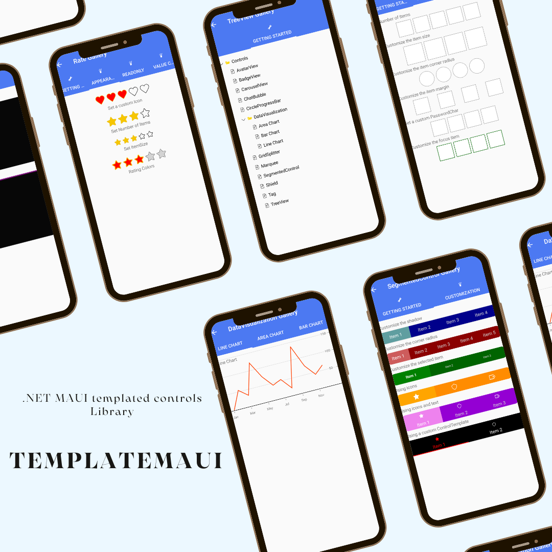
# TemplateMAUI
A set of .NET MAUI templated controls.
Visit [Documentation](https://jsuarezruiz.github.io/TemplateMAUI/)
### How to use it
First, add the TemplateMAUI **NuGet** package to your project. Run the following command in the Package Manager Console.
```
PM> Install-Package TemplateMAUI
```
After adding the NuGet package, initialize the library in the **App** class:
```
TemplateMAUI.Init();
```
### Controls
Currently, the following controls are available:
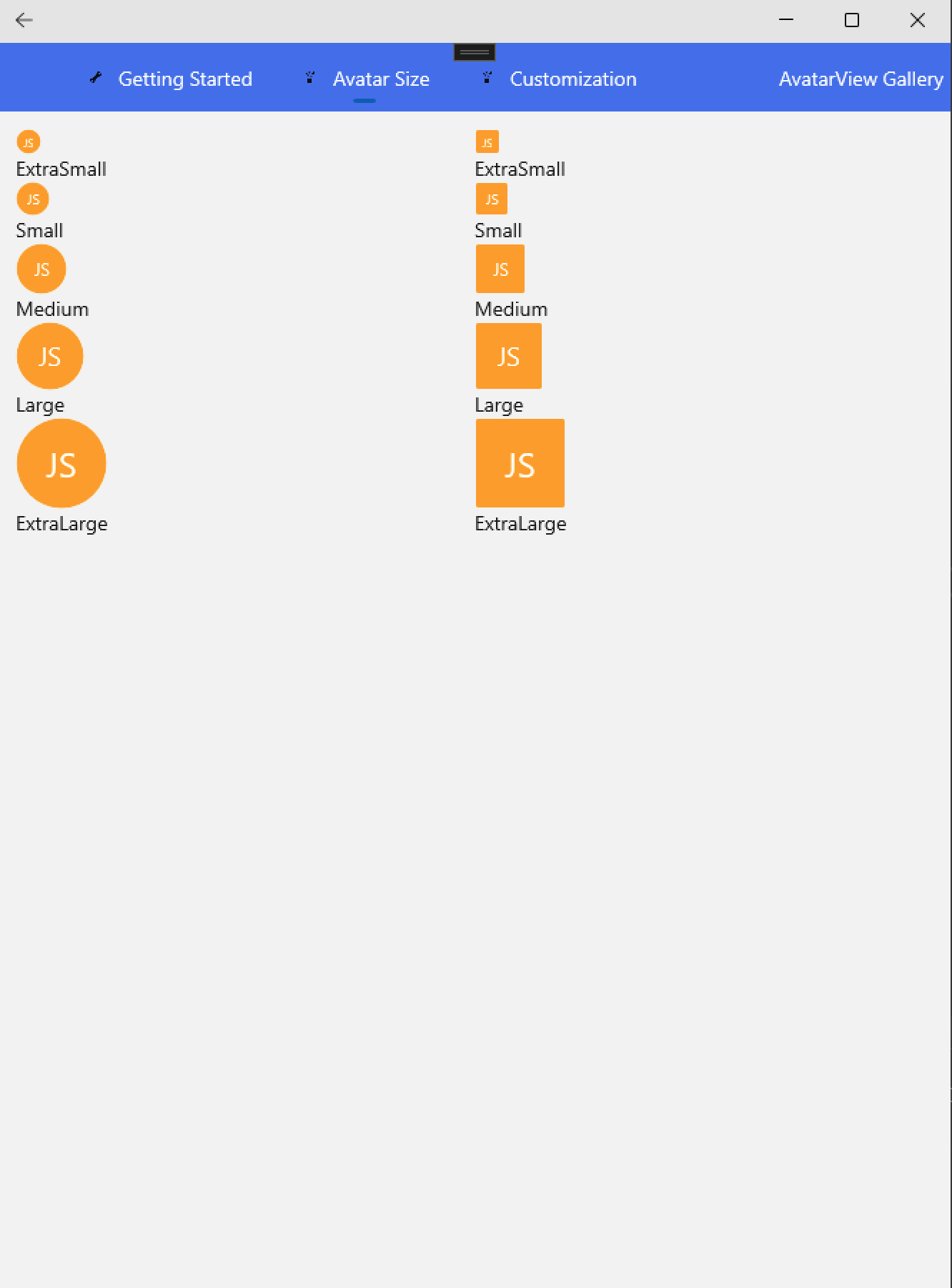
#### AvatarView
Is a graphical representation of the user image view that can be customized by adding icon, text, etc.
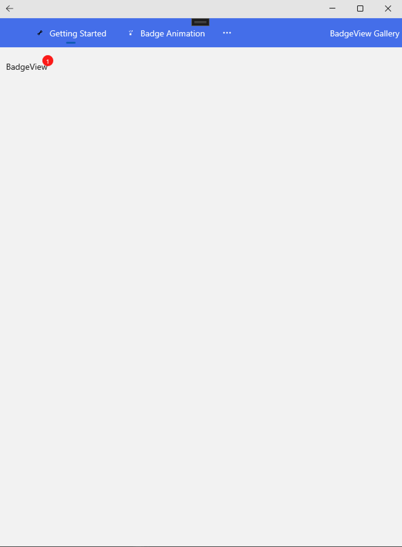
#### BadgeView
Control used to used to notify users notifications, or status of something.
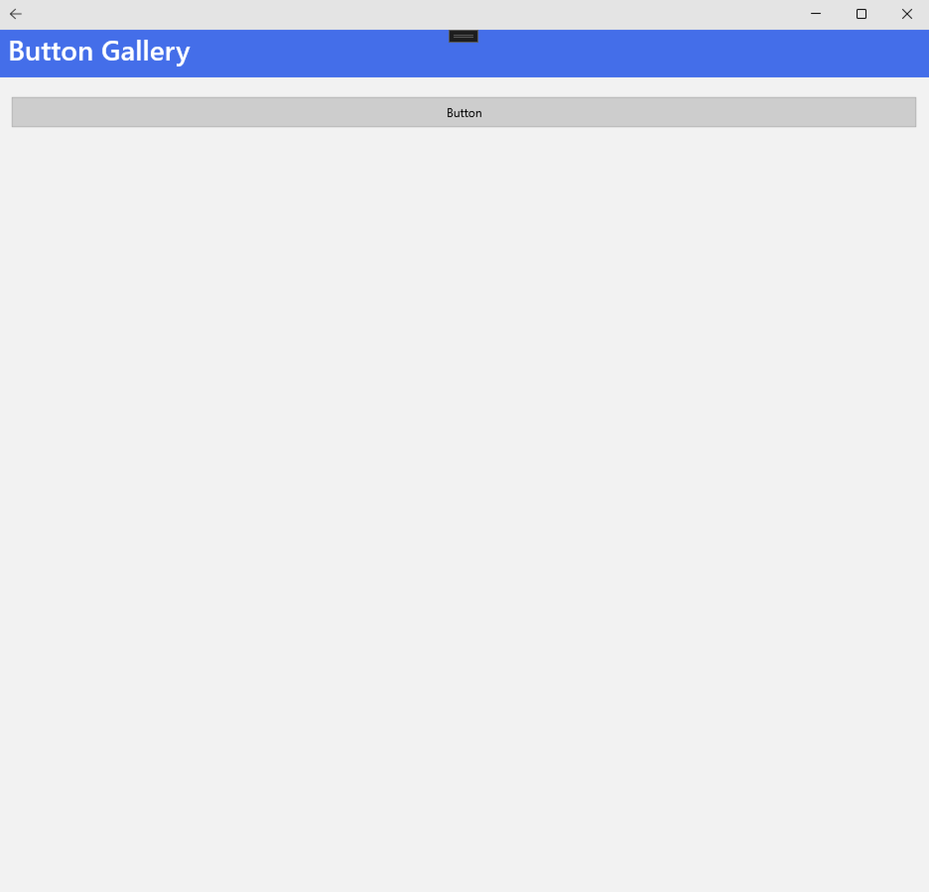
#### Button
Represents a button control with customizable content, appearance, and behavior, making it a versatile component for user interaction in your application.
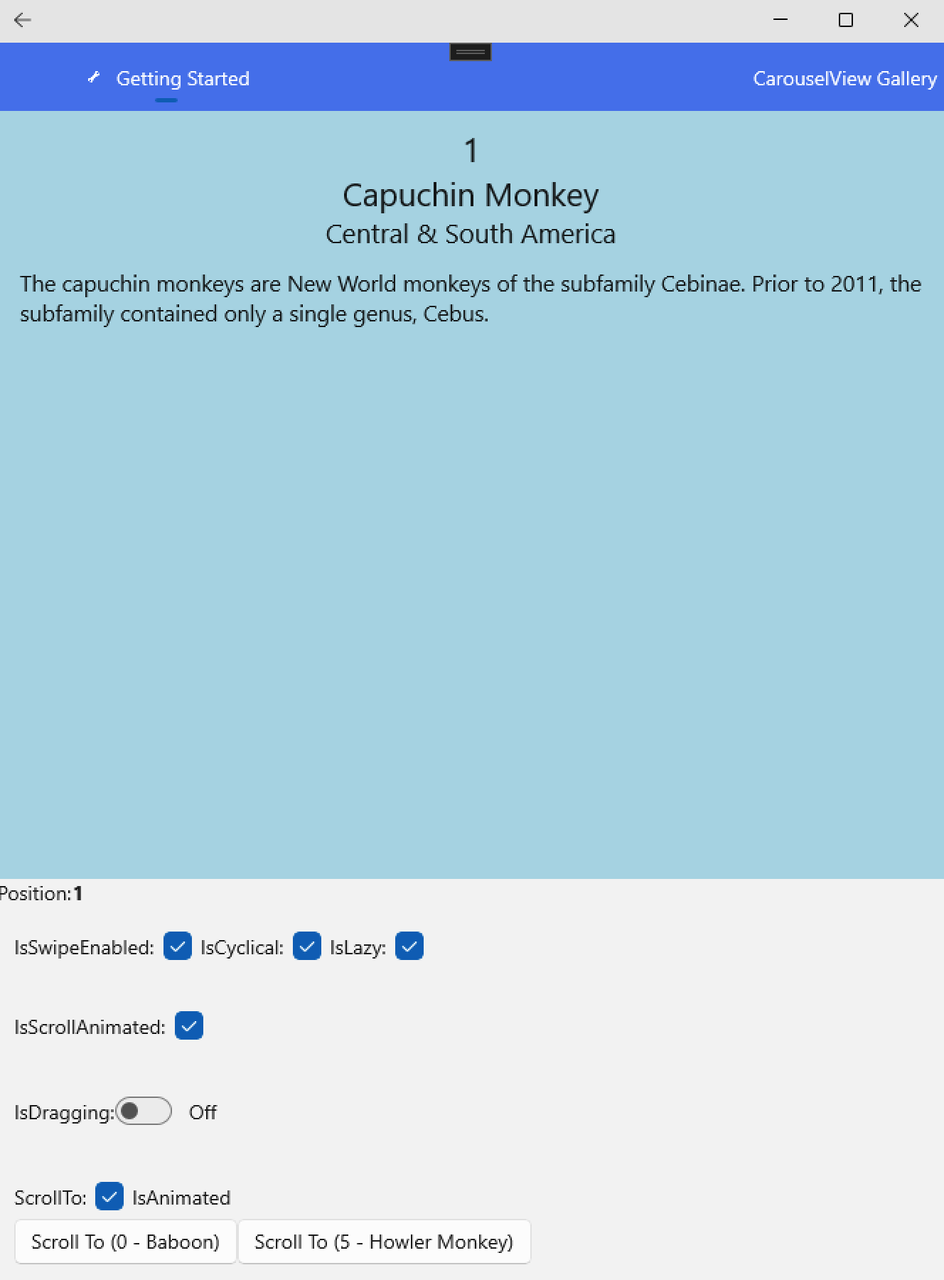
#### CarouselView
Allow to navigate through a collection of views.
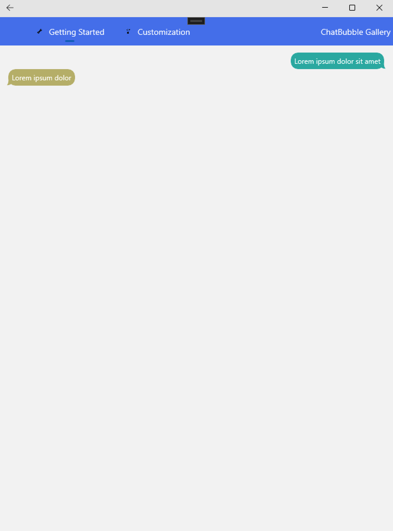
#### ChatBubble
Allow to show a speech bubble message.
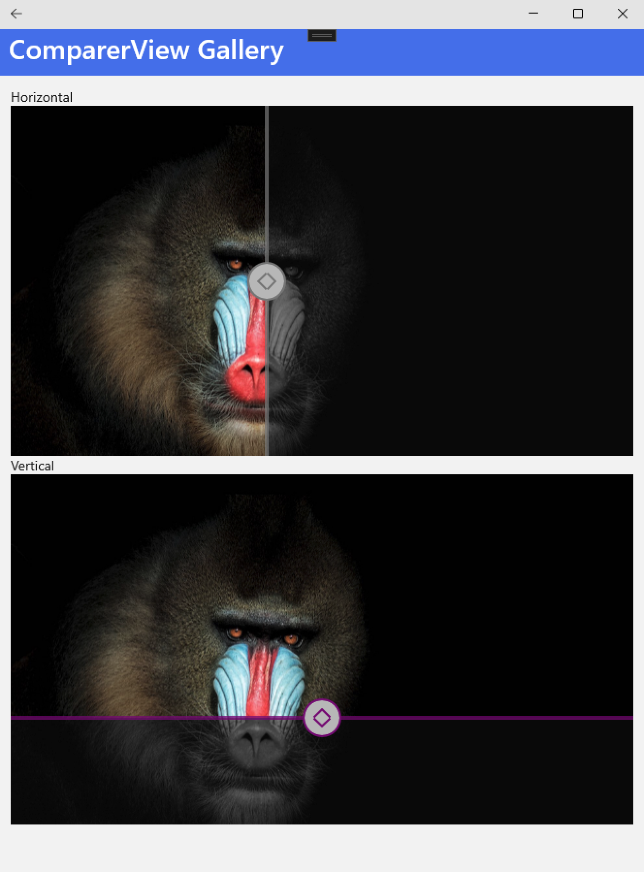
#### ComparerView
Provides an option for displaying a split-screen of two views, which can help you to make comparisons.
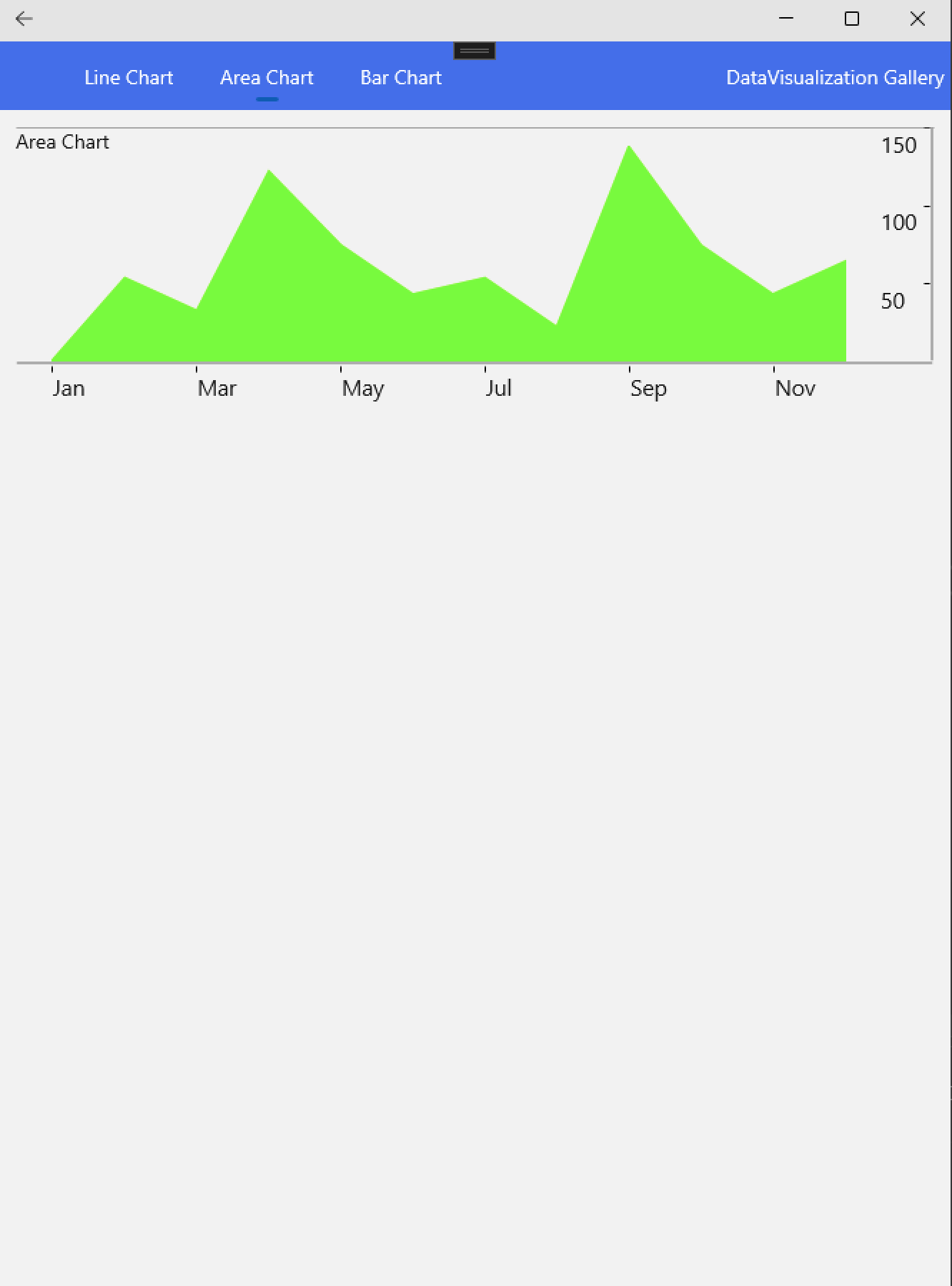
#### DataVisualization
Several series graphs.
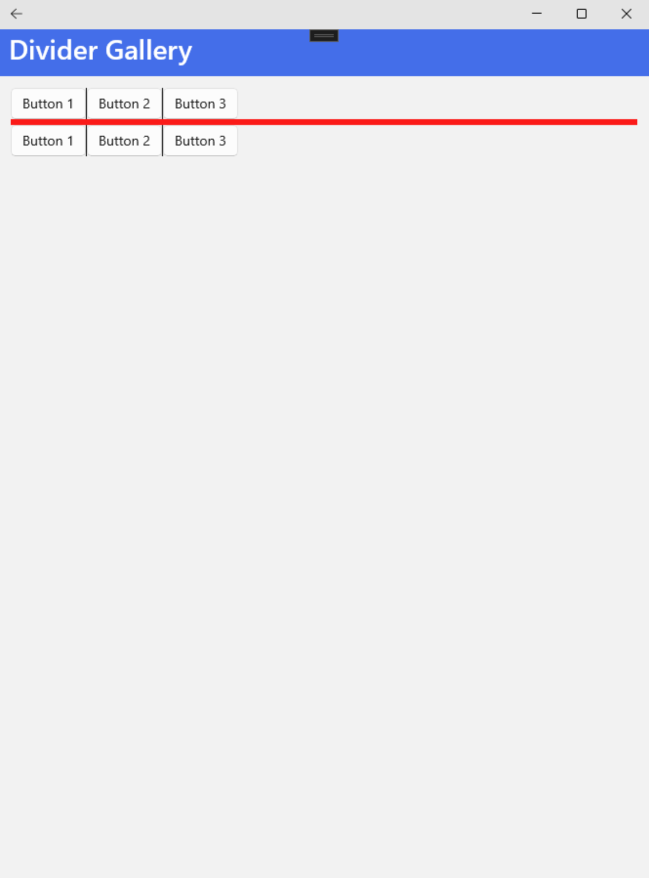
#### Divider
Displays a separator between views.
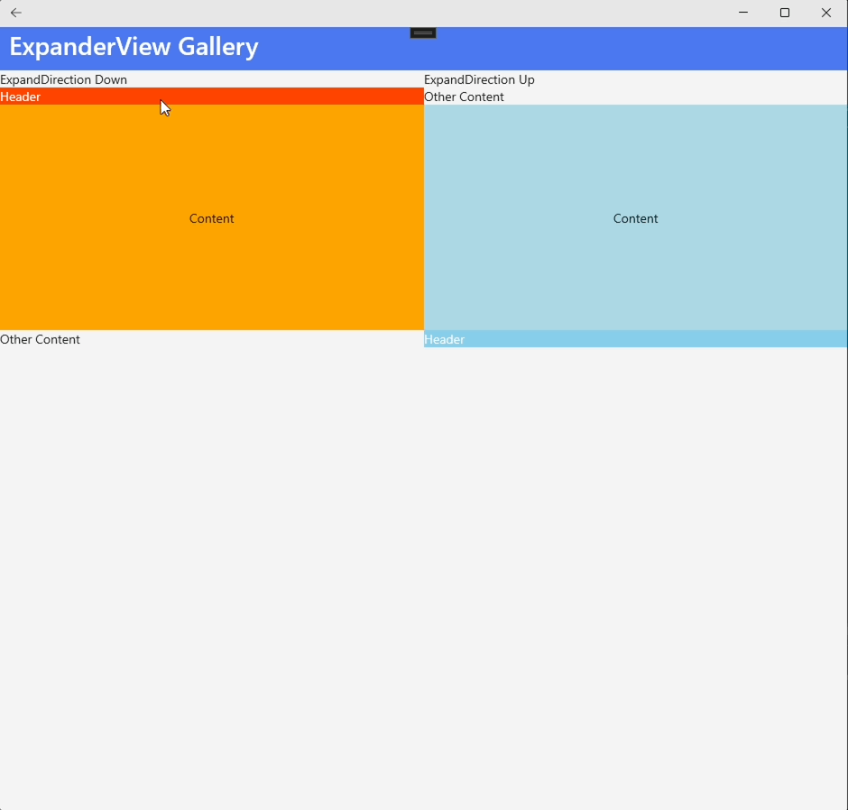
#### ExpanderView
Provide content in an expandable area and includes a header.
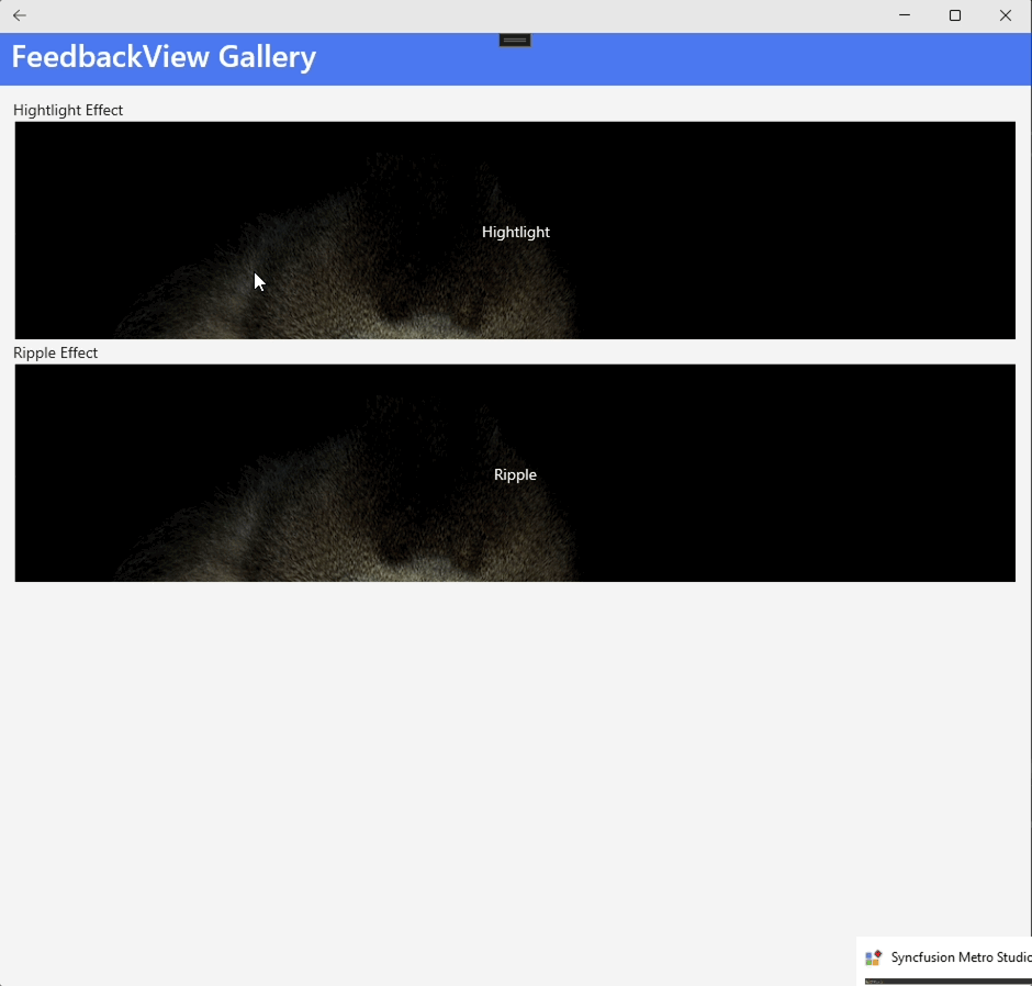
#### FeedbackView
Provide visual feedback to touch interactions.
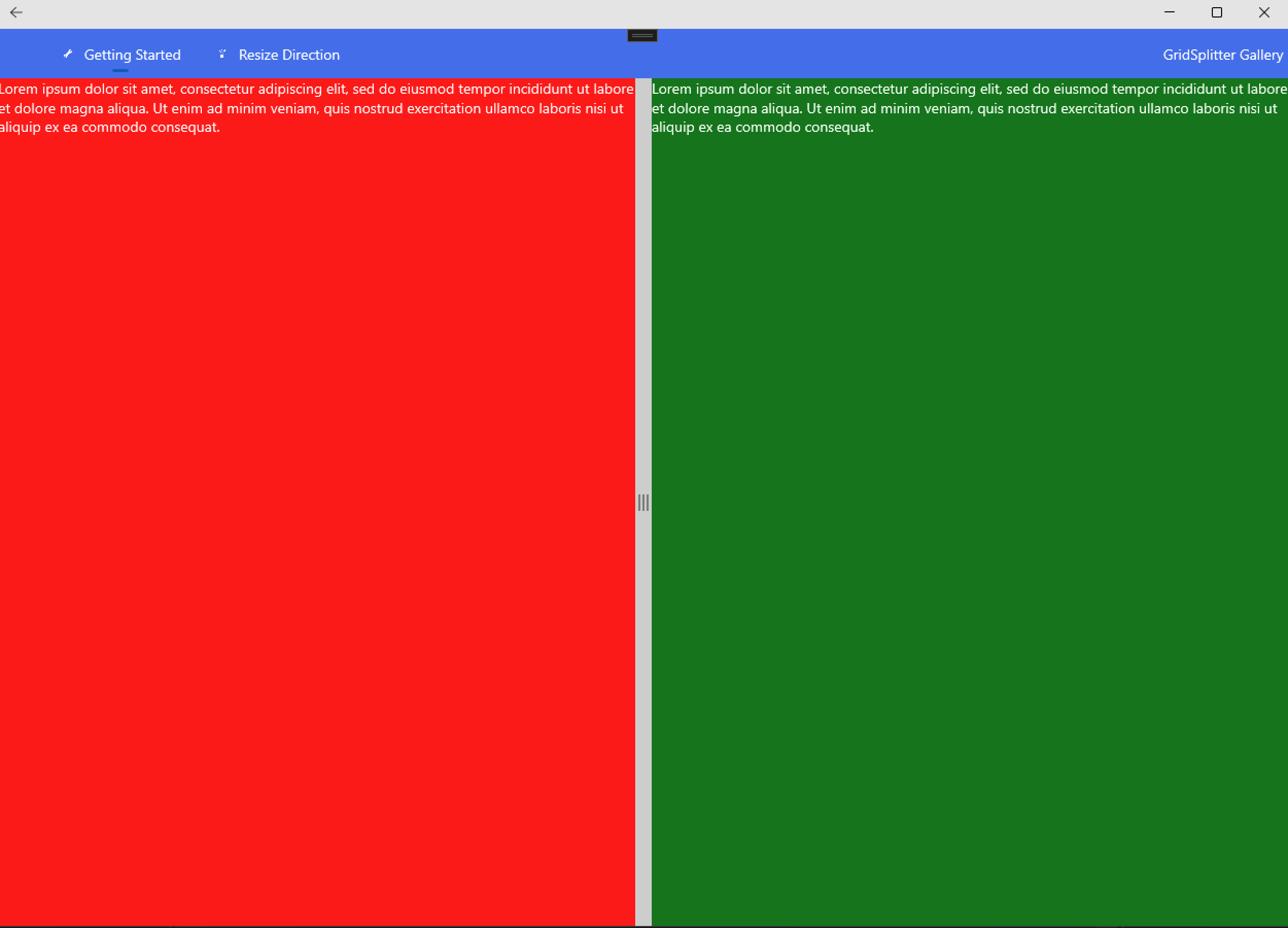
#### GridSplitter
Represents the control that redistributes space between columns or rows of a Grid control.
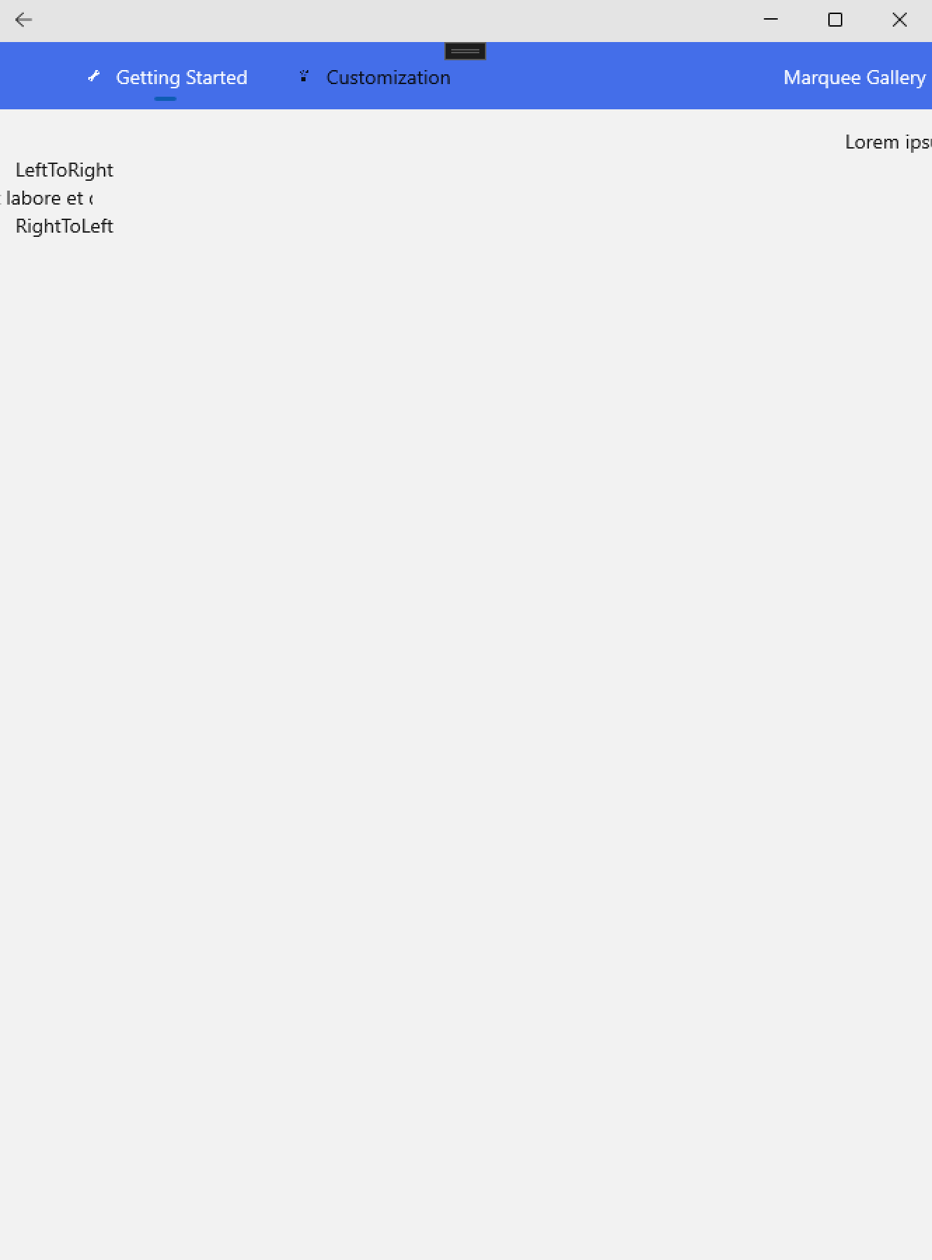
#### Marquee
Use this control to add an attention getting text message that scrolls continuously across the screen.
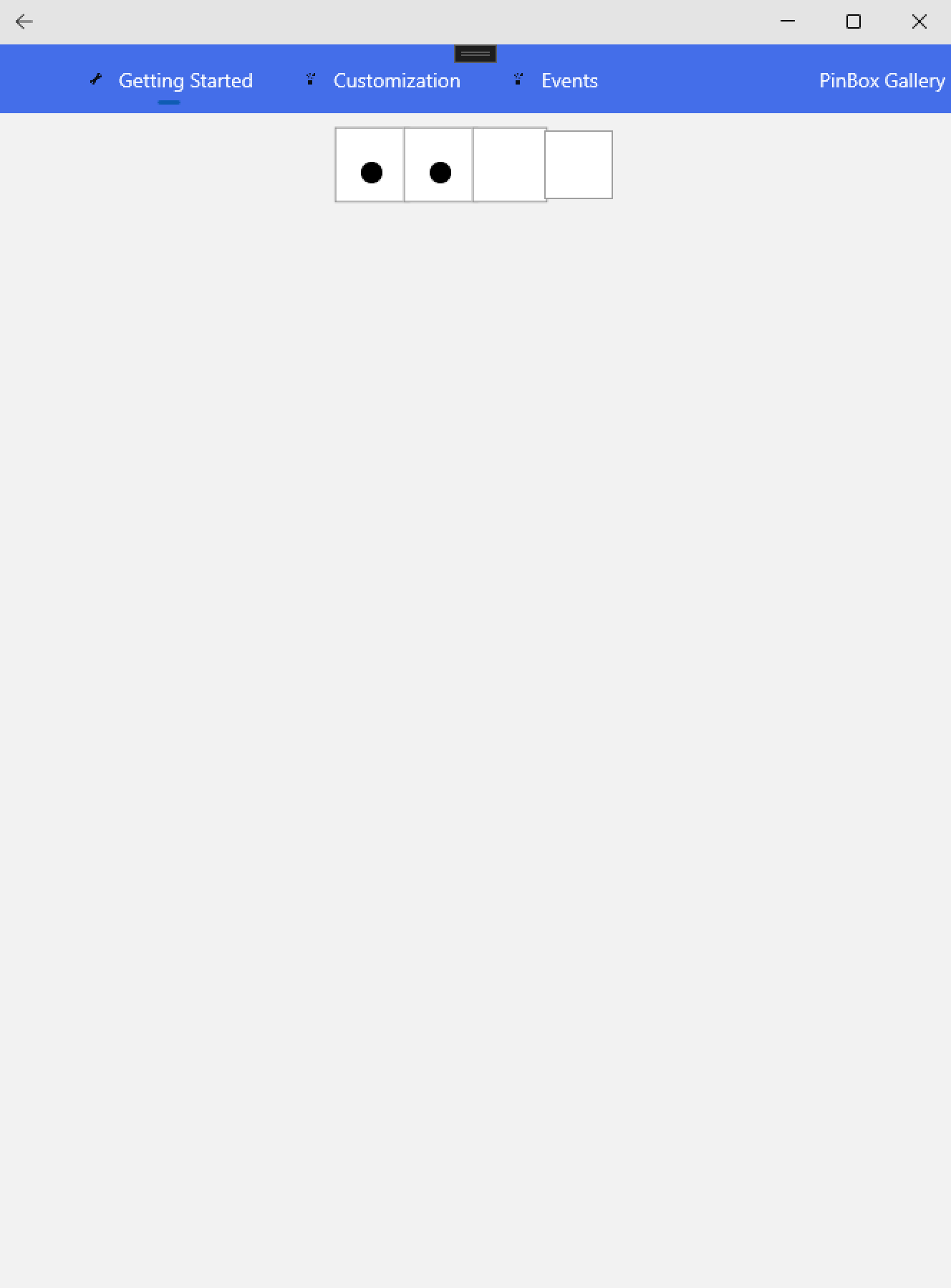
#### PinBox
Allow to introduce a PIN or verification Code.
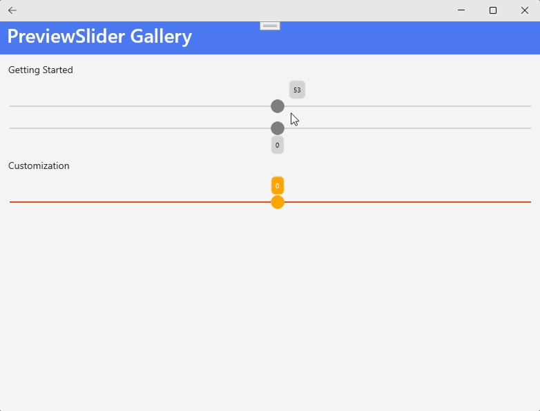
### PreviewSlider
Represents a Slider control that provides a preview of its value.
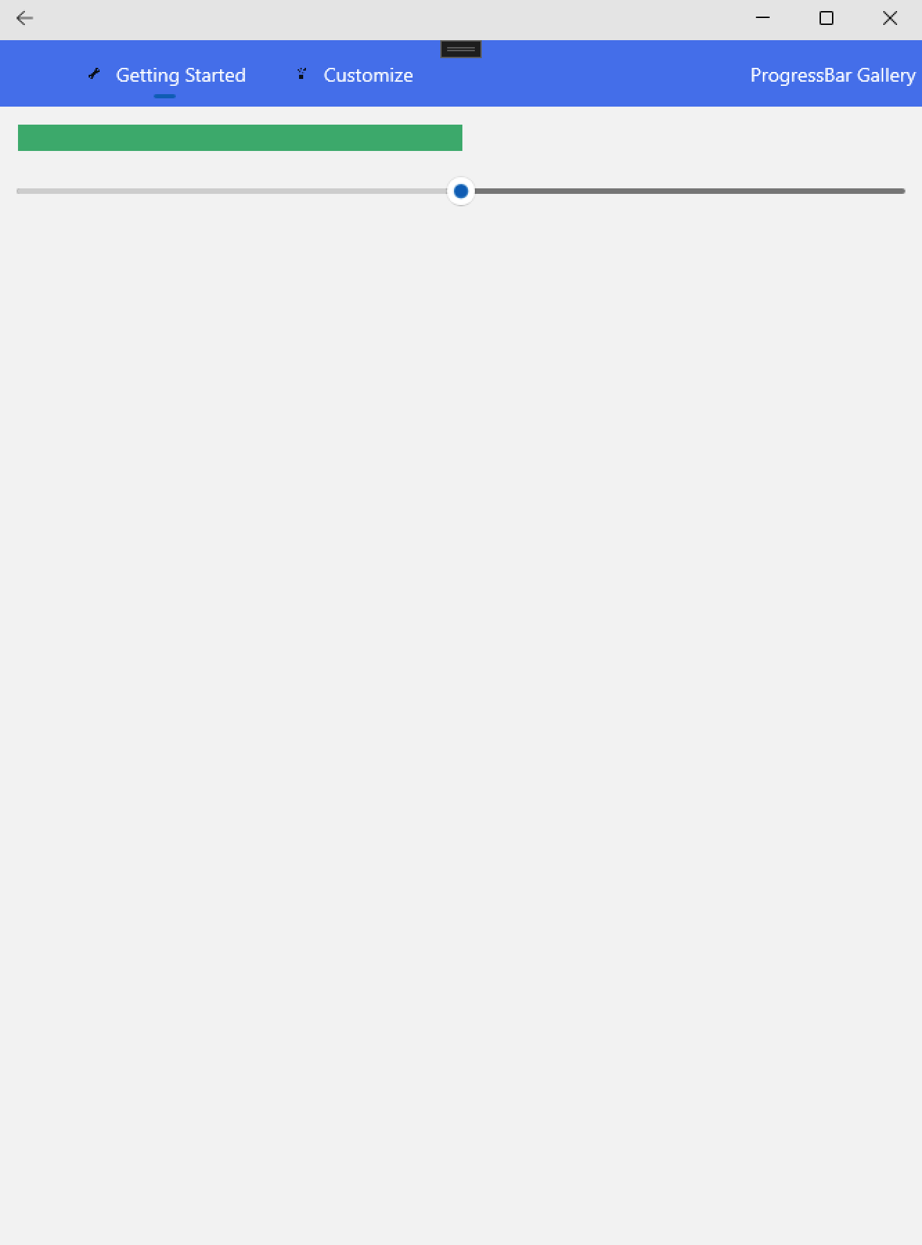
### ProgressBar
Provides a customizable visual to indicate the progress of a task.
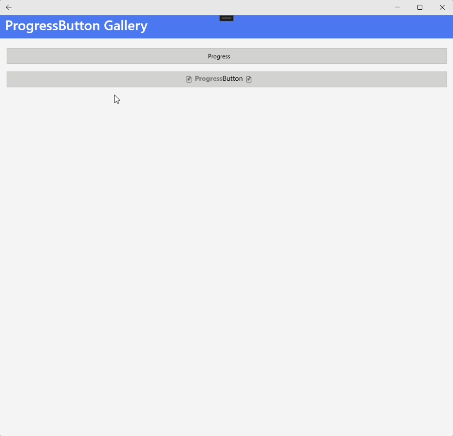
#### ProgressButton
Represent a button with integrated progress indication functionality.
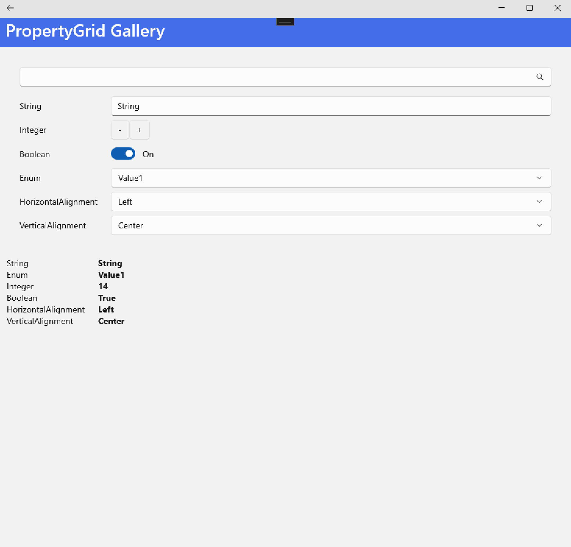
#### PropertyGrid
Allows end-users to edit properties of the objects associated with it.
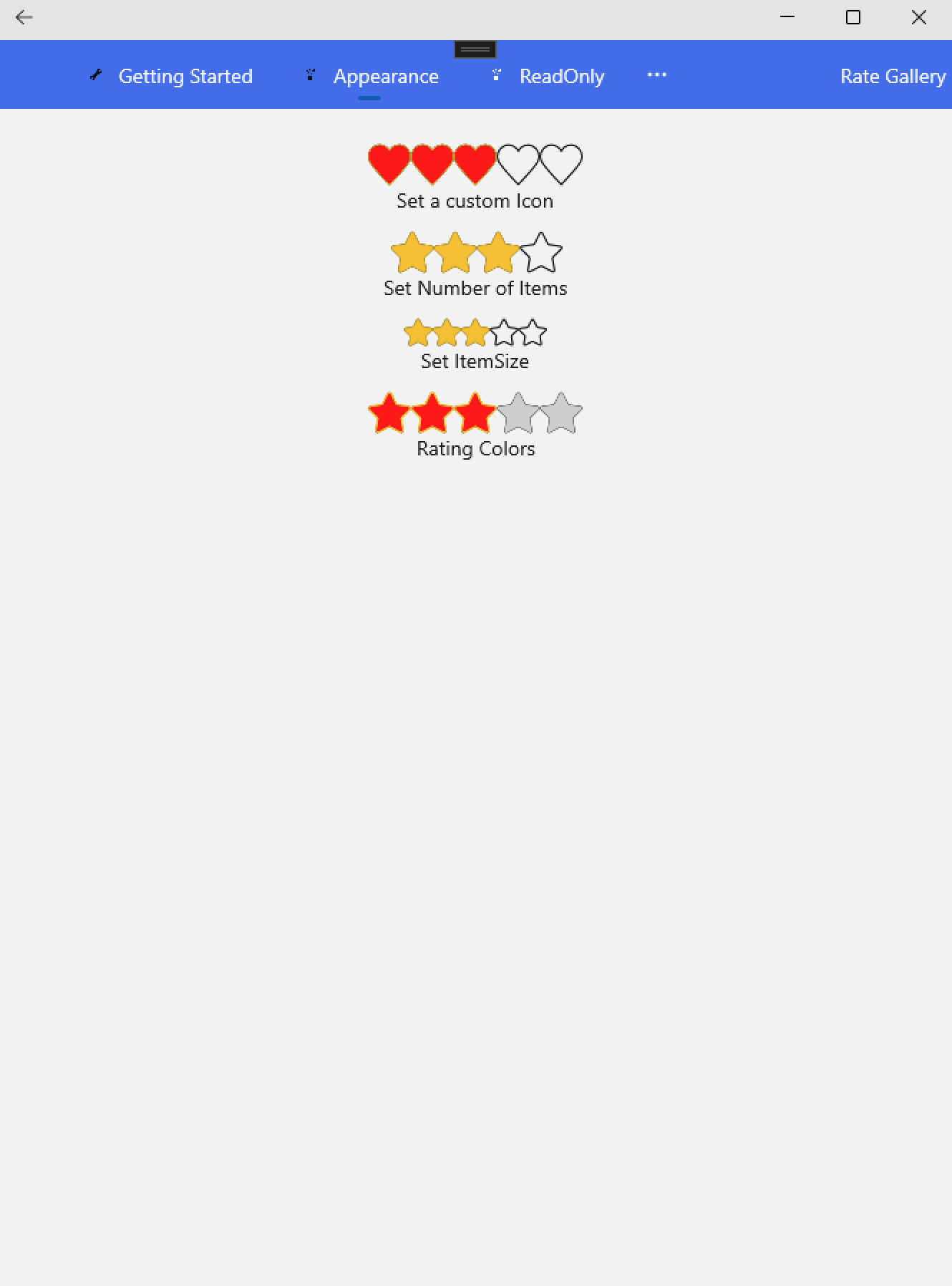
#### Rate
Allows users to select a rating value from a group of visual symbols like stars.
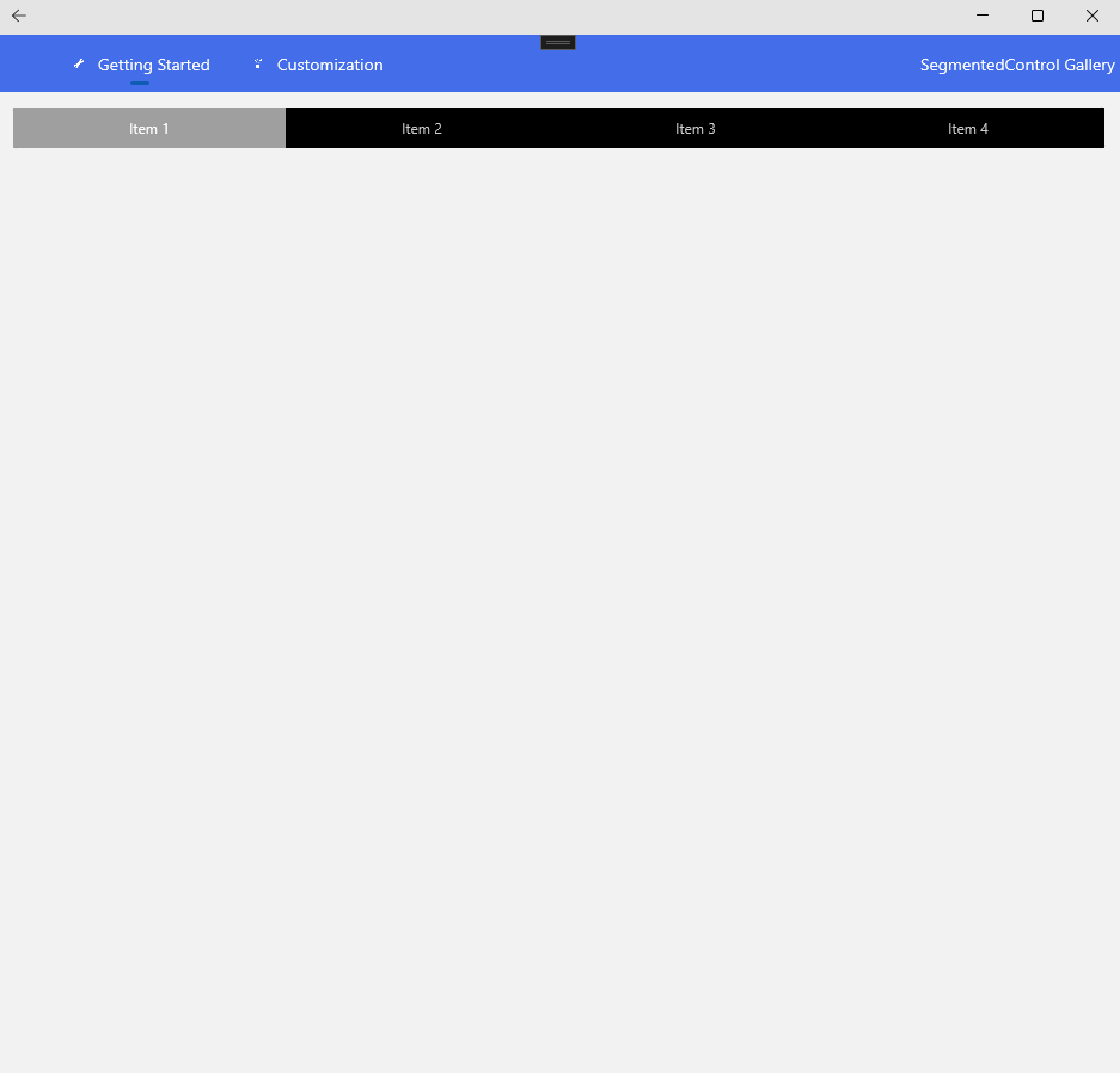
#### SegmentedControl
Is a linear segment made up of multiple segments and allow users to select between multiple options.
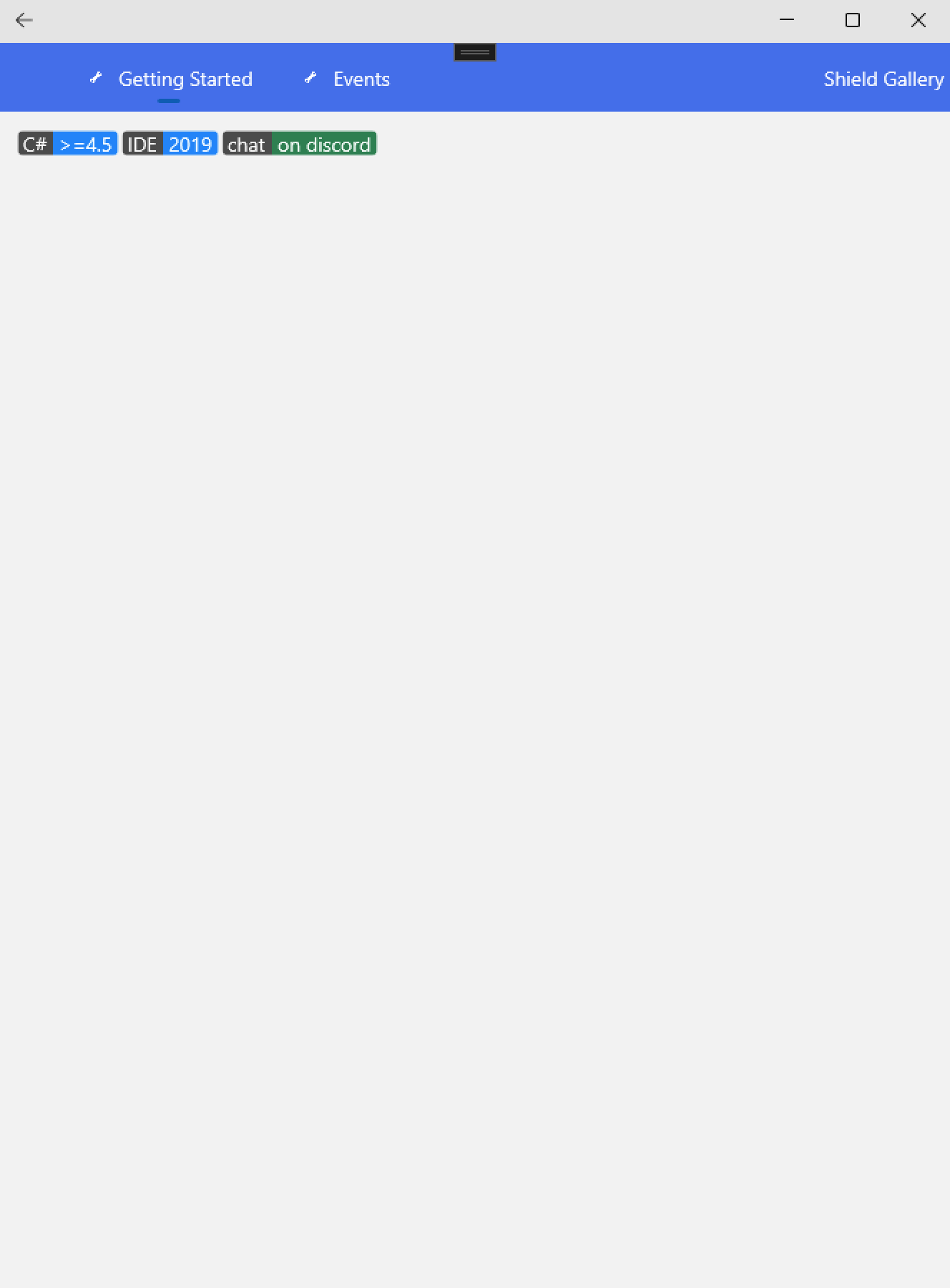
#### Shield
Shield is a type of badge.
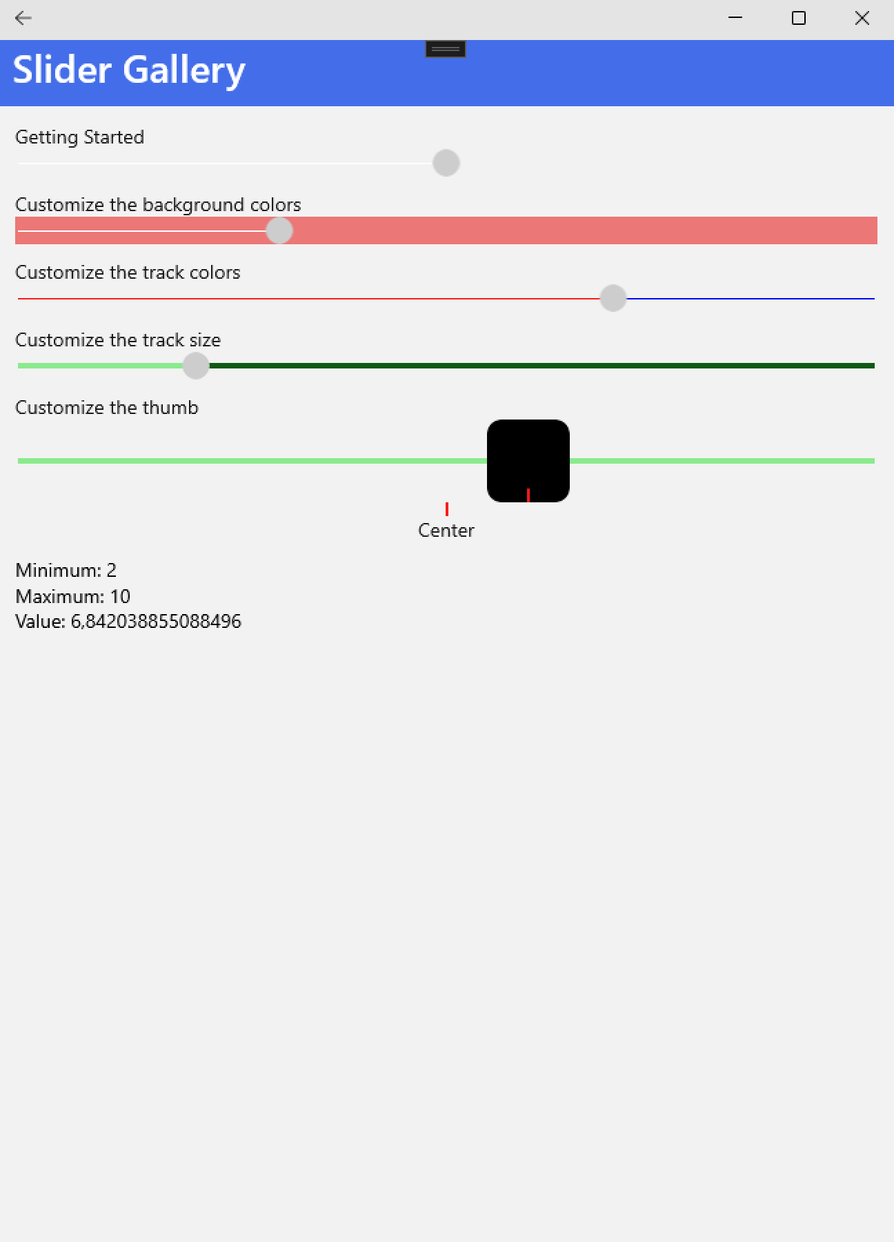
#### Slider
Is a horizontal bar that can be manipulated by the user to select a double value from a continuous range.
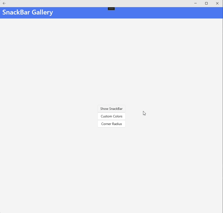
#### SnackBar
Provide brief messages about app processes at the bottom of the screen.
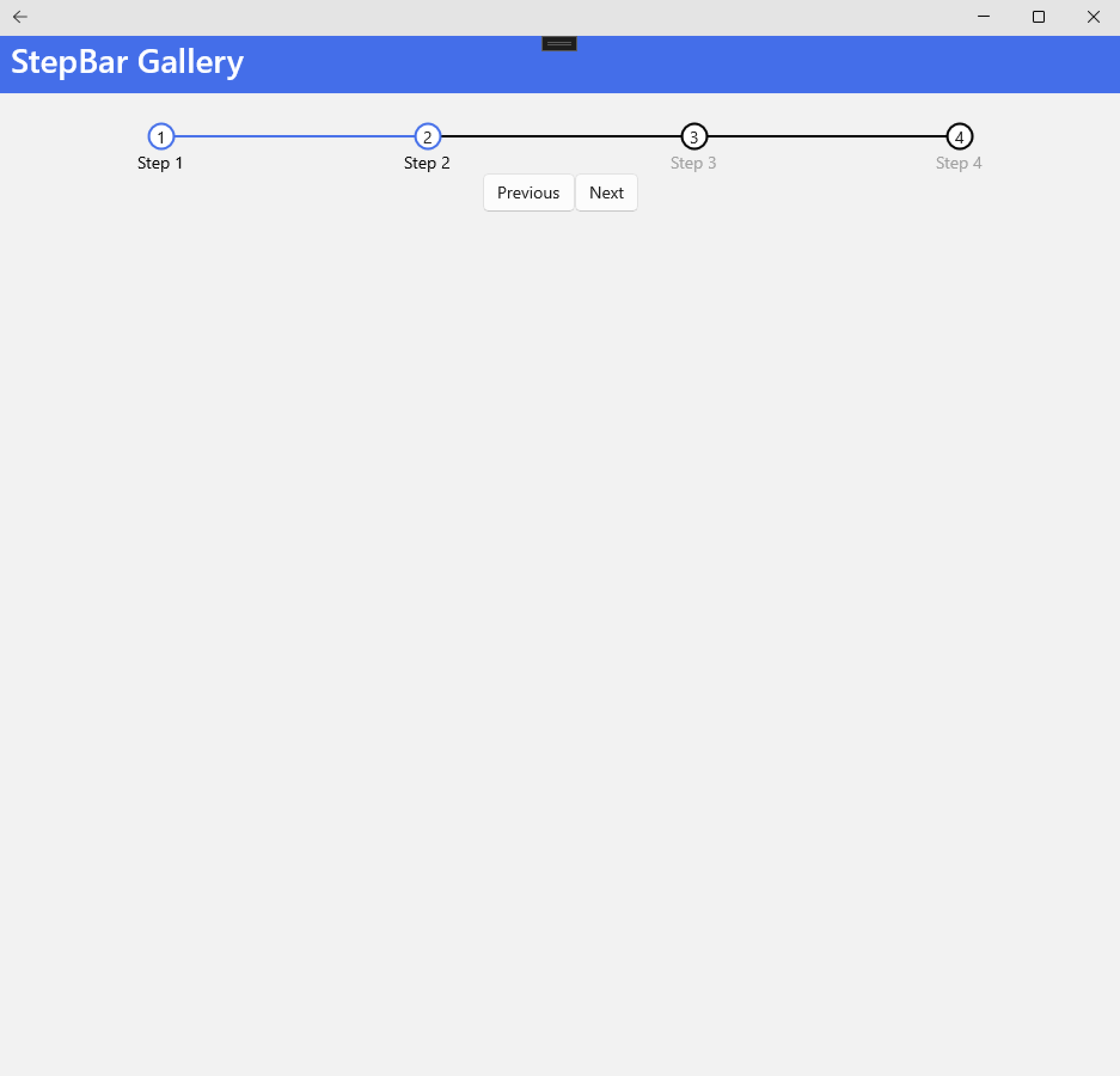
#### StepBar
Allows users to track or keep up with multi-step tasks smoothly.
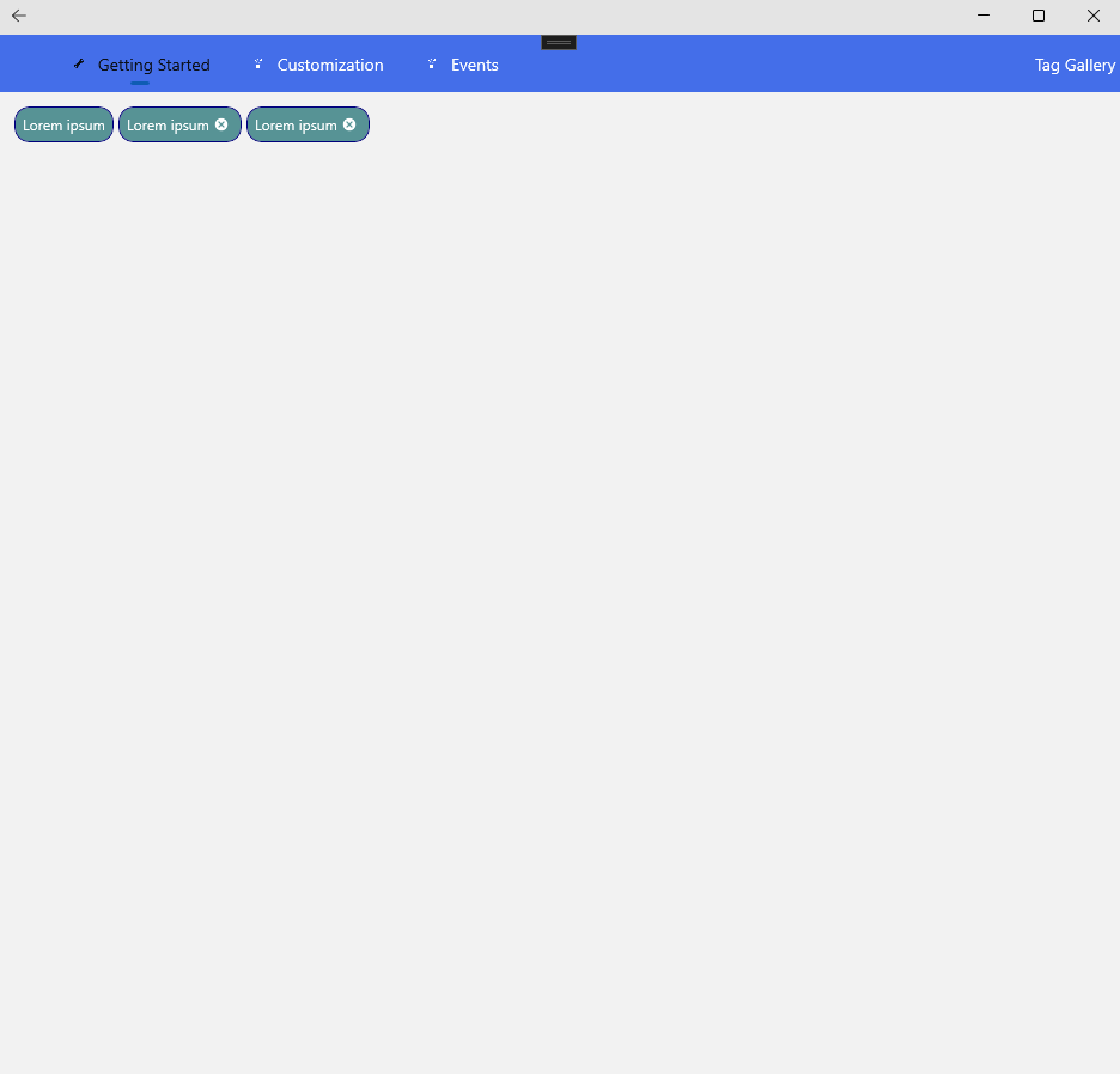
#### Tag
Is a tagging control.
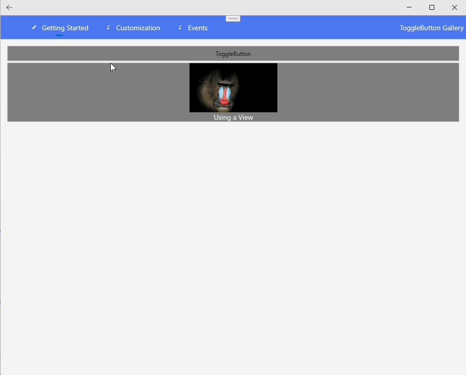
#### ToggleButton
Represents a button that can be toggled between two states: toggled and untoggled.
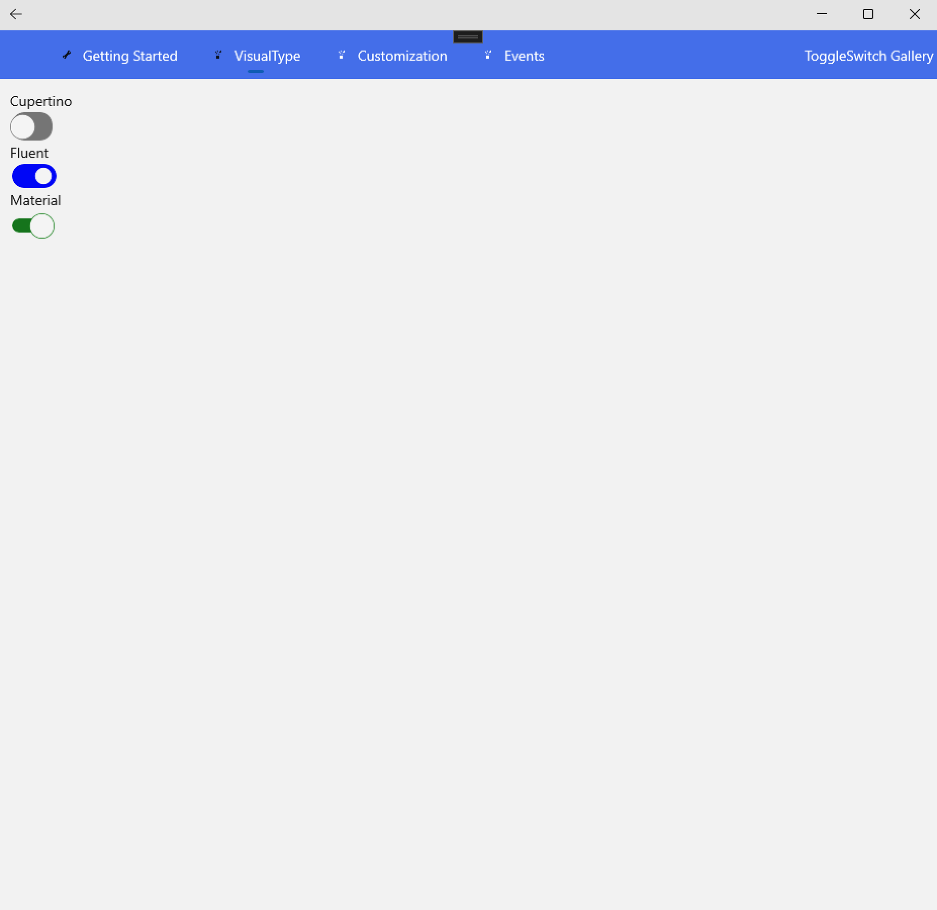
#### ToggleSwitch
A View control that provides a toggled value.
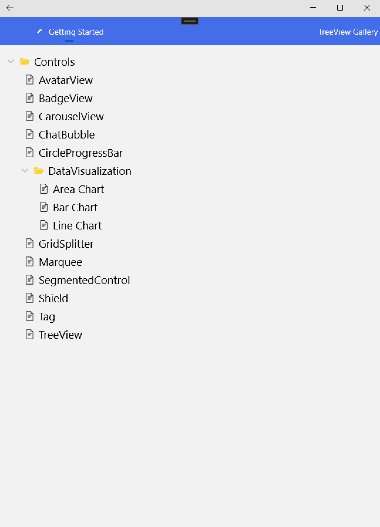
#### TreeView
Enables a hierarchical list with expanding and collapsing nodes that contain nested items.
## Contribution
We welcome contributions from the community! If you have any suggestions, improvements, or new control ideas, feel free to open an issue or submit a pull request.
## Copyright and license
Code released under the [MIT license](https://opensource.org/licenses/MIT).