https://github.com/justalever/tailwindcss-button-components
Tailwind CSS Button Components built with Vite, Vue, and Tailwind JIT
https://github.com/justalever/tailwindcss-button-components
Last synced: about 2 months ago
JSON representation
Tailwind CSS Button Components built with Vite, Vue, and Tailwind JIT
- Host: GitHub
- URL: https://github.com/justalever/tailwindcss-button-components
- Owner: justalever
- Created: 2021-03-31T19:58:02.000Z (about 4 years ago)
- Default Branch: master
- Last Pushed: 2021-04-10T16:43:21.000Z (about 4 years ago)
- Last Synced: 2025-04-15T21:09:05.947Z (about 2 months ago)
- Language: Vue
- Size: 46.9 KB
- Stars: 9
- Watchers: 1
- Forks: 4
- Open Issues: 0
-
Metadata Files:
- Readme: README.md
Awesome Lists containing this project
README
# Tailwind CSS - Button Components
- [Read the blog post](https://web-crunch.com/posts/tailwind-css-button-components) or [watch the tutorial on YouTube](https://youtu.be/UI4v1MuyJio)
- [Consider sponsering me ♥️](https://github.com/sponsors/justalever?o=esb) or [Buying me a coffee](https://www.buymeacoffee.com/webcrunch)
This is a blog post/tutorial for creating button components using Tailwind CSS. As a bonus we'll leverage some modern tools like Vite and Tailwind's new JIT feature which makes local developement with Tailwind CSS blazing fast. _The code in this repo is the "end" result after following the tutorial._
### Getting started
Vite makes scaffolding a new project pretty seamless. For the purposes of this guide I'll leverage a basic Vue.js app by passing the vue template during project creation. You can name your project whatever you wish.
```bash
yarn create @vitejs/app tailwindcss-button-components --template vue
```
This should go fetch basic dependencies and create a new folder with a set of folders and files inside. The general idea is that you'll work inside the `src` folder and everything builds to a `dist` folder which will contain all static assets.
Since we are wanting to leverage Tailwind CSS we need to install it as well. Tailwind depends on `autoprefixer` so here's the one-liner to get things added:
```
yarn add @tailwindcss/jit tailwindcss@latest postcss@latest autoprefixer@latest -D
```
After this installs you might notice the `package.json` file updates with the dependencies we'll need:
```json
{
"name": "tailwindjit-tour",
"version": "0.0.0",
"scripts": {
"dev": "vite",
"build": "vite build",
"serve": "vite preview"
},
"dependencies": {
"vue": "^3.0.5"
},
"devDependencies": {
"@tailwindcss/jit": "^0.1.18",
"@vitejs/plugin-vue": "^1.1.5",
"@vue/compiler-sfc": "^3.0.5",
"autoprefixer": "^10.2.5",
"postcss": "^8.2.9",
"tailwindcss": "^2.0.4",
"vite": "^2.1.3"
}
}
```
### Tailwind CSS Configuration
Tailwind depends on `postcss` which is a package we just installed. PostCSS allows you to pass some configuration to it based on a file called `postcss.config.js`. Create that file and store it at the root of your new project.
Inside of it we'll need the following:
```javascript
// postcss.config.js
module.exports = {
plugins: {
'@tailwindcss/jit': {},
autoprefixer: {},
},
}
```
This code is telling PostCSS to use the `@tailwindcss/jit` package as a source of truth for CSS along side the `autoprefixer` package we installed.
Finally, we need a Tailwind configuration file similar to the `postcss.config.js` file.
Tailwind ships with a command line utility for generating this fairly easily.
```bash
npx tailwind init
# tailwindcss 2.0.4
# ✅ Created Tailwind config file: tailwind.config.js
```
_I'm using Tailwind 2.0.4_
And to round out our Tailwind installation we need a CSS file with the `@tailwind` imports inside. I'll create a file called `tailwind.css` and add those.
```css
/* src/tailwind.css */
@tailwind base;
@tailwind components;
@tailwind utilities;
```
This file then needs to be imported inside the `main.js` file inside our `src` folder.
```javascript
import { createApp } from 'vue'
import App from './App.vue'
import './tailwind.css' // Add this line
createApp(App).mount('#app')
```
If your server isn't running you can fire it back up by running:
```bash
yarn dev
```
### Configuring the project
Since Vite ships with a `HelloWorld.vue` component example I've modified it to relate more to our project.
- `src/components/HelloWorld.vue` becomes `src/components/TailwindButtons.vue`.
The `App.vue` single-file component file contains the following:
```vue
import TailwindButtons from './components/TailwindButtons.vue'
```
Note: A cool feature of Vue 3 here is not having to declare components explicitly. Super neat if you're coming from Vue 2.
The `TailwindButtons.vue` component is where our work will be done. Here's where I ended up:
```vue
import SolidButtons from "../components/SolidButtons.vue"
import OutlinedButtons from "../components/OutlinedButtons.vue"
import IconButtons from "../components/IconButtons.vue"
import GroupedButtons from "../components/GroupedButtons.vue"
import DropdownButtons from "../components/DropdownButtons.vue"
```
Because buttons are fairly repetative UI I chose to extract Tailwind's classes for each variant to my own custom component-based classes. That ends up looking like the following:
```css
/* src/tailwind.css */
@tailwind base;
@tailwind components;
.btn {
@apply px-5 py-3 shadow-sm transition ease-in-out duration-300 rounded leading-snug whitespace-nowrap text-base font-semibold;
}
.btn.btn-sm {
@apply px-4 py-2 text-sm;
}
.btn.btn-lg {
@apply text-lg px-8 py-4;
}
.btn-primary {
@apply text-white bg-blue-500 hover:bg-blue-600;
}
.btn-primary.btn-outline {
@apply text-blue-600 border border-blue-600 bg-transparent hover:bg-blue-600 hover:text-white;
}
.btn-secondary {
@apply text-white bg-indigo-500 hover:bg-indigo-600;
}
.btn-secondary.btn-outline {
@apply text-indigo-600 border border-indigo-600 bg-transparent hover:bg-indigo-600 hover:text-white;
}
.btn-tertiary {
@apply text-white bg-gray-600 hover:bg-gray-700;
}
.btn-tertiary.btn-outline {
@apply text-gray-600 border border-gray-600 bg-transparent hover:bg-gray-600 hover:text-white;
}
@tailwind utilities;
```
Then each component has the following:
```vue
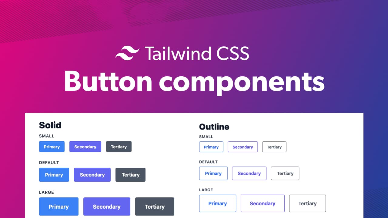
Solid
Small
Primary
Secondary
Tertiary
Default
Primary
Secondary
Tertiary
Large
Primary
Secondary
Tertiary
```
```vue
Outline
Small
Primary
Secondary
Tertiary
Default
Primary
Secondary
Tertiary
Large
Primary
Secondary
Tertiary
```
```vue
Icons
Small
Primary
Secondary
Tertiary
Default
Primary
Secondary
Tertiary
Large
Primary
Secondary
Tertiary
import IconStar from "../components/IconStar.vue"
```
```vue
Grouped
One
Two
Three
```
```vue
Dropdowns
Dropdown
chevron-down
export default {
data() {
return {
active: false
}
}
}
```