https://github.com/kekeh/angular-mydatepicker
Angular datepicker and date range picker :date:
https://github.com/kekeh/angular-mydatepicker
angular angular-cli angular-datepicker angular-mydatepicker date-picker date-range-picker datepicker daterangepicker mydatepicker
Last synced: about 1 year ago
JSON representation
Angular datepicker and date range picker :date:
- Host: GitHub
- URL: https://github.com/kekeh/angular-mydatepicker
- Owner: kekeh
- License: mit
- Created: 2019-05-09T15:04:28.000Z (about 7 years ago)
- Default Branch: master
- Last Pushed: 2024-03-09T16:35:27.000Z (over 2 years ago)
- Last Synced: 2025-03-25T18:54:08.364Z (over 1 year ago)
- Topics: angular, angular-cli, angular-datepicker, angular-mydatepicker, date-picker, date-range-picker, datepicker, daterangepicker, mydatepicker
- Language: TypeScript
- Homepage: https://kekeh.github.io/angular-mydatepicker/
- Size: 6.12 MB
- Stars: 1
- Watchers: 1
- Forks: 14
- Open Issues: 41
-
Metadata Files:
- Readme: README.md
- Changelog: CHANGELOG.md
- License: LICENSE
Awesome Lists containing this project
- awesome-angular-components - kekeh/angular-mydatepicker - Angular datepicker and date range picker 📅 (UI Components / Form)
README

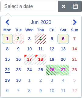
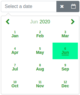
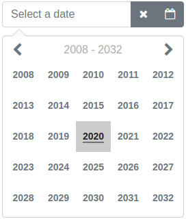
Screenshots using [predefined styles](https://github.com/kekeh/angular-mydatepicker/wiki/color-theme-(grey)) and the [markDates](https://github.com/kekeh/angular-mydatepicker/wiki/usage-of-markDates-option) option. The predefined styles and some of the options can be tested [here](https://kekeh.github.io/angular-mydatepicker).
**Angular datepicker and date range picker**
[](https://travis-ci.org/kekeh/angular-mydatepicker)
[](https://codecov.io/gh/kekeh/angular-mydatepicker)
[](https://www.npmjs.com/package/angular-mydatepicker)
[](https://www.npmjs.com/package/angular-mydatepicker)
[](https://github.com/kekeh/angular-mydatepicker/blob/master/LICENSE)
## Browser support (tested)
| Chrome | Firefox | Edge | IE11 | Safari | iOS Safari |
| :------------- | :------------- | :----| :---------- | :----| :---------- |
| :heavy_check_mark: | :heavy_check_mark: | :heavy_check_mark: | :heavy_check_mark: | :heavy_check_mark: | :heavy_check_mark: |
## Description
Highly configurable Angular datepicker and date range picker.
Basic idea to create this library was to make it as configurable as possible. The library is implemented as a directive. It is done this way, because then there is more choices to configure it.
Online demo is [here](http://kekeh.github.io/angular-mydatepicker)
### Main features
* no dependencies to other libraries
* currently localized to 47 [languages](https://github.com/kekeh/angular-mydatepicker#locale-attribute)
* datepicker
* date range picker
* popup mode
* inline mode
* supports keyboard
* supports RTL
* animation of calendar (open/close)
* awesome configuration possibilities
* easily set styles to the component which are in line with your page theme
* calendar ([example](https://github.com/kekeh/angular-mydatepicker/wiki/color-theme-(blue)))
* input box and input box controls ([bootstrap 4 and font-awesome example](https://github.com/kekeh/angular-mydatepicker/wiki/bootstrap-4-and-font-awesome-example))
* 50 [options](https://github.com/kekeh/angular-mydatepicker#options-attribute)
* change value of any option dynamically
* well tested
* coverage [report](https://codecov.io/gh/kekeh/angular-mydatepicker)
* most of the codes are from the existing libraries which are widely used
### Project
This project was generated with [Angular CLI](https://github.com/angular/angular-cli) version __7.3.8__.
Source code of the component is in the [projects/angular-mydatepicker/src](https://github.com/kekeh/angular-mydatepicker/tree/master/projects/angular-mydatepicker/src) folder.
## Code examples
Code examples are [here](https://github.com/kekeh/angular-mydatepicker/wiki).
## Installation
To install this component to an external project, follow the procedure:
1. __npm install angular-mydatepicker --save__
2. Add __AngularMyDatePickerModule__ import to your __@NgModule__ as follows:
```ts
import { BrowserModule } from '@angular/platform-browser';
import { NgModule } from '@angular/core';
import { FormsModule, ReactiveFormsModule } from '@angular/forms';
import { AngularMyDatePickerModule } from 'angular-mydatepicker';
@NgModule({
declarations: [
AppComponent
],
imports: [
BrowserModule,
ReactiveFormsModule,
FormsModule,
AngularMyDatePickerModule
],
providers: [],
bootstrap: [AppComponent]
})
export class AppModule { }
```
## Usage
Use one of the following two options.
### 1. ngModel binding
In this option the __ngModel__ binding is used.
Examples:
* [bootstrap 4 and font awesome example](https://github.com/kekeh/angular-mydatepicker/wiki/bootstrap-4-and-font-awesome-example)
* [own style in input box (no bootstrap)](https://github.com/kekeh/angular-mydatepicker/wiki/Own-style-in-input-box-(no-bootstrap))
* [example application](https://github.com/kekeh/angular-mydatepicker/tree/master/example/app/date-picker-ngmodel)
There are two ways to initialize date or date range to the model.
Examples:
* [initialize date model (single date mode)](https://github.com/kekeh/angular-mydatepicker/wiki/initialize-date-model-(single-date-mode))
* [initialize date model (date range mode)](https://github.com/kekeh/angular-mydatepicker/wiki/initialize-date-model-(date-range-mode))
### 2. Reactive forms
In this option the value accessor of reactive forms is used.
Examples:
* [reactive forms (bootstrap 4 and font awesome)](https://github.com/kekeh/angular-mydatepicker/wiki/reactive-forms-(bootstrap-4-and-font-awesome))
* [example application](https://github.com/kekeh/angular-mydatepicker/tree/master/example/app/date-picker-reactive-forms)
## Attributes
### options attribute
The [options](https://github.com/kekeh/angular-mydatepicker/wiki/options-attribute) attribute is a type of [IAngularMyDpOptions](https://github.com/kekeh/angular-mydatepicker/blob/master/projects/angular-mydatepicker/src/lib/interfaces/my-options.interface.ts). It has the following optional properties.
| Option | Default | Type | Description |
| :------------- | :------------- | :----| :---------- |
| __dateRange__ | false | boolean | Date picker mode (date picker or date range picker). |
| __inline__ | false | boolean | Normal mode or inline mode. If __inline__ mode is used, set the input box __type__ attribute to __hidden__ and this option to __true__. [Here](https://github.com/kekeh/angular-mydatepicker/blob/master/example/app/date-picker-inline/date-picker-inline.html#L10) is an example.|
| __dayLabels__ | {su: 'Sun', mo: 'Mon', tu: 'Tue', we: 'Wed', th: 'Thu', fr: 'Fri', sa: 'Sat'} | [IMyDayLabels](https://github.com/kekeh/angular-mydatepicker/blob/master/projects/angular-mydatepicker/src/lib/interfaces/my-day-labels.interface.ts) | Day labels visible on the selector. |
| __monthLabels__ | { 1: 'Jan', 2: 'Feb', 3: 'Mar', 4: 'Apr', 5: 'May', 6: 'Jun', 7: 'Jul', 8: 'Aug', 9: 'Sep', 10: 'Oct', 11: 'Nov', 12: 'Dec' } | [IMyMonthLabels](https://github.com/kekeh/angular-mydatepicker/blob/master/projects/angular-mydatepicker/src/lib/interfaces/my-month-labels.interface.ts) | Month labels visible on the selector. |
| __dateFormat__ | yyyy-mm-dd | string | Date format on the selection area and the callback. For example: __d.m.yyyy__, __dd.mm.yyyy__, __yyyy-m-d__, __yyyy-mm-dd__, __d mmm yyyy__, __dd mmm yyyy__, __d## of mmm yyyy__ (d = Day not leading zero, dd = Day with leading zero, d## = Ordinal dates for example 3rd, m = Month not leading zero, mm = Month with leading zero, mmm = Month as a text, yyyy = Year four digit) |
| __defaultView__ | date | [DefaultView](https://github.com/kekeh/angular-mydatepicker/blob/master/projects/angular-mydatepicker/src/lib/enums/default-view.enum.ts) | Calendar opens to this view (date, month or year).|
| __firstDayOfWeek__ | mo | string | First day of week on calendar. One of the following: __mo, tu, we, th, fr, sa, su__ |
| __sunHighlight__ | true | boolean | Sunday red colored on calendar. |
| __satHighlight__ | false | boolean | Saturday red colored on calendar. |
| __highlightDates__ | no default value | Array<[IMyDate](https://github.com/kekeh/angular-mydatepicker/blob/master/projects/angular-mydatepicker/src/lib/interfaces/my-date.interface.ts)> | Dates red colored on calendar. Value of year or month can be zero. If it is zero it affects all years/months. For example: __[{year: 2019, month: 11, day: 14}, {year: 2019, month: 1, day: 15}]__ |
| __markCurrentDay__ | true | boolean | Is current day (today) marked (underline) on calendar. |
| __markCurrentMonth__ | true | boolean | Is current month marked (underline) on calendar. Can be used if __monthSelector = true__. |
| __markCurrentYear__ | true | boolean | Is current year marked (underline) on calendar. Can be used if __yearSelector = true__. |
| __monthSelector__ | true | boolean | If __true__ and if month label is selected opens a selector of months. |
| __yearSelector__ | true | boolean | If __true__ and if year label is selected opens a selector of years. |
| __disableHeaderButtons__ | true | boolean | Prevent to change the calendar view with header buttons if previous or next month are fully disabled by the __disableUntil__ or the __disableSince__ options. |
| __showWeekNumbers__ | false | boolean | Are week numbers visible or not on calendar. Can be used if __firstDayOfWeek = mo__. |
| __selectorHeight__ | 266px | string | Selector height. |
| __selectorWidth__ | 266px | string | Selector width. |
| __disableUntil__ | no default value | [IMyDate](https://github.com/kekeh/angular-mydatepicker/blob/master/projects/angular-mydatepicker/src/lib/interfaces/my-date.interface.ts) | Disable dates backward starting from the given date. For example: __{year: 2019, month: 6, day: 26}__. To reset the existing __disableUntil__ value set: __{year: 0, month: 0, day: 0}__ |
| __disableSince__ | no default value | [IMyDate](https://github.com/kekeh/angular-mydatepicker/blob/master/projects/angular-mydatepicker/src/lib/interfaces/my-date.interface.ts) | Disable dates forward starting from the given date. For example: __{year: 2019, month: 7, day: 22}__. To reset the existing __disableSince__ value set: __{year: 0, month: 0, day: 0}__ |
| __disableDates__ | no default value | Array<[IMyDate](https://github.com/kekeh/angular-mydatepicker/blob/master/projects/angular-mydatepicker/src/lib/interfaces/my-date.interface.ts)>
or
Array<[IMyDisabledDates](https://github.com/kekeh/angular-mydatepicker/blob/master/projects/angular-mydatepicker/src/lib/interfaces/my-disabled-dates.interface.ts)> | Disable dates one by one. Array of disabled dates. For example: __[{year: 2019, month: 11, day: 14}, {year: 2019, month: 1, day: 15}]__. Or it is possible to disable dates by setting own style to __td__ element. For example: __[{dates: [{year: 2020, month: 5, day: 19}, {year: 2020, month: 5, day: 20}], styleClass: 'yoga'}]__. Value of __styleClass__ is name of CSS selector. The definition of the CSS selector have to be added to the __stylesData__ option. For example it is possible add a CSS __background-color__ to definition of this selector.
Value of year or month can be zero. If it is zero it affects all years/months. For example disable first day of every month: __[{year: 0, month: 0, day: 1}]__. To reset existing __disableDates__ value set empty array to it. Here is an [example](https://github.com/kekeh/angular-mydatepicker/wiki/usage-of-disableDates-option). |
| __disableDateRanges__ | no default value | Array<[IMyDateRange](https://github.com/kekeh/angular-mydatepicker/blob/master/projects/angular-mydatepicker/src/lib/interfaces/my-date-range.interface.ts)> | Disable date ranges. For example: __[{begin: {year: 2019, month: 11, day: 14}, end: {year: 2019, month: 11, day: 20}}]__. To reset existing value of __disableDateRanges__ set empty array to it. |
| __disableWeekends__ | false | boolean | Disable weekends. (Saturday and Sunday). |
| __disableWeekdays__ | no default value | Array< string > | Disable weekdays. Array of weekdays to disable. Weekdays are same strings as the __firstDayOfWeek__ option. For example: __['tu', 'we']__ which disables Tuesdays and Wednesdays. |
| __enableDates__ | no default value | Array<[IMyDate](https://github.com/kekeh/angular-mydatepicker/blob/master/projects/angular-mydatepicker/src/lib/interfaces/my-date.interface.ts)> | Enable single dates one by one if the date is disabled. For example if you disable the date range and want to enable some dates in range. Array of enabled days. For example: __[{year: 2019, month: 11, day: 14}, {year: 2019, month: 1, day: 15}]__. Value of year or month can be zero. If it is zero it affects all years/months. For example enable first day of every month: __[{year: 0, month: 0, day: 1}]__. To reset existing __enableDates__ value set empty array to it. |
| __markDates__ | no default value | Array<[IMyMarkedDates](https://github.com/kekeh/angular-mydatepicker/blob/master/projects/angular-mydatepicker/src/lib/interfaces/my-marked-dates.interface.ts)> | Mark dates for different colors or styles. For example: __[{dates: [{year: 2019, month: 11, day: 14}, {year: 2019, month: 12, day: 16}], color: '#004198', styleClass: 'karateDates'}, {dates: [{year: 2018, month: 10, day: 1}, {year: 2018, month: 11, day: 4}], color: 'green', styleClass: 'yogaDates'}]__. The __color__ property is optional. If it is given it adds a triangle to the upper left corner of the date. The __styleClass__ is optional. If it is given it changes the style of the __td__ element of the date. Value of the __styleClass__ is a CSS selector name. The definition of the CSS selector have to be added to the __stylesData__ option. For example it is possible add a CSS __background-color__ to definition of this selector. Both __color__ and __styleClass__ can be used at the same time. Here is an [example](https://github.com/kekeh/angular-mydatepicker/wiki/usage-of-markDates-option).
Value of year or month can be zero. If it is zero it affects all years/months. To reset existing value of __markDates__ set empty array to it. |
| __markWeekends__ | no default value | [IMyMarkedDate](https://github.com/kekeh/angular-mydatepicker/blob/master/projects/angular-mydatepicker/src/lib/interfaces/my-marked-date.interface.ts) | Mark weekends (Saturday and Sunday). For example: __{marked: true, color: 'red'}__. Value of color can be any CSS color code. To reset existing value of __markWeekends__ set: __{marked: false, color: ''}__ |
| __alignSelectorRight__ | false | boolean | Align selector right. |
| __openSelectorTopOfInput__ | false | boolean | Open selector top of input field. |
| __closeSelectorOnDateSelect__ | true | boolean | Is selector closed or not on a date select. |
| __closeSelectorOnDocumentClick__ | true | boolean | Is selector closed or not on a document click. |
| __minYear__ | 1000 | number | Minimum allowed year in calendar. Cannot be less than __1000__. |
| __maxYear__ | 9999 | number | Maximum allowed year in calendar. Cannot be more than __9999__. |
| __showSelectorArrow__ | true | boolean | Is selector (calendar) arrow shown or not. |
| __appendSelectorToBody__ | false | boolean | Is selector (calendar) appended to body element or not. |
| __focusInputOnDateSelect__ | true | boolean | Is the input box focused after a date select. |
| __moveFocusByArrowKeys__ | true | boolean | Is focus moved or not on the calendar by arrow keys. |
| __dateRangeDatesDelimiter__ | " - " | string | The delimiter of dates in a date range. |
| __inputFieldValidation__ | true | boolean | Input field validation enabled or not after __blur__ event of input field. |
| __showMonthNumber__ | true | boolean | Is month number shown or not on the month view. |
| __todayTxt__ | empty string | string | Today footer text. This value comes also from locale [Locales](https://github.com/kekeh/angular-mydatepicker/blob/master/projects/angular-mydatepicker/src/lib/services/angular-mydatepicker.locale.service.ts): If there is locale it is not necessary to add this property. Also the __showFooterToday__ option have to be __true__ in order to use this option. If you want to add only today date to the footer put empty string to the value of this option.|
| __showFooterToday__ | false | boolean | Is today footer shown or not. |
| __calendarAnimation__ | no default value | [IMyCalendarAnimation](https://github.com/kekeh/angular-mydatepicker/blob/master/projects/angular-mydatepicker/src/lib/interfaces/my-calendar-animation.interface.ts) | The type of open (__in__) and close (__out__) animation of calendar. One of the following ([CalAnimation](https://github.com/kekeh/angular-mydatepicker/blob/master/projects/angular-mydatepicker/src/lib/enums/cal-animation.enum.ts)) value: __None__, __Fade__, __ScaleTop__, __ScaleCenter__, __Rotate__, __FlipDiagonal__ or __Own__. Try animations [here](https://kekeh.github.io/angular-mydatepicker/). Examples: [1](https://github.com/kekeh/angular-mydatepicker/wiki/calendar-animation) and [2](https://github.com/kekeh/angular-mydatepicker/wiki/define-own-calendar-animation).|
| __viewChangeAnimation__ | true | boolean | Is view change animation enabled or not. |
| __rtl__ | false | boolean | Is RTL enabled or not. Try RTL [here](https://kekeh.github.io/angular-mydatepicker/). |
| __stylesData__ | no default value | [IMyStyles](https://github.com/kekeh/angular-mydatepicker/blob/master/projects/angular-mydatepicker/src/lib/interfaces/my-styles.interface.ts) | Overridden styles of the datepicker. [Here](https://github.com/kekeh/angular-mydatepicker/wiki/override-styles-multiple-date-pickers-on-same-page) is an example on how to use this option. See also [chapter](https://github.com/kekeh/angular-mydatepicker#override-styles-of-component) below. |
| __divHostElement__ | no default value | [IMyDivHostElement](https://github.com/kekeh/angular-mydatepicker/blob/master/projects/angular-mydatepicker/src/lib/interfaces/my-div-host-element.interface.ts) | Div as a host element. In case of non-editable date field enable this option and put a __angular-mydatepicker__ directive inside a __div__ element. Placeholder text is an additional property of this option. Functionality is limited if this option is enabled. It is also possible to use input box and set it to __disabled__ to archieve non-editable date field. |
| __ariaLabelPrevMonth__ | Previous Month | string | Aria label text of previous month button. |
| __ariaLabelNextMonth__ | Next Month | string | Aria label text of next month button. |
### locale attribute
An __ISO 639-1__ language code can be provided as shorthand for the following options (__dayLabels__, __monthLabels__, __dateFormat__, __firstDayOfWeek__, __sunHighlight__ and __todayTxt__).
Currently supported languages are:
| Language code | Description |
| :------------- | :------------- |
| __en__ | English |
| __fr__ | French |
| __fr-ch__ | French - Switzerland |
| __ja__ | Japanese |
| __fi__ | Finnish |
| __es__ | Spanish |
| __hu__ | Hungarian |
| __sv__ | Swedish |
| __nl__ | Dutch |
| __ru__ | Russian |
| __uk__ | Ukrainian |
| __uz__ | Uzbek |
| __no__ | Norwegian |
| __tr__ | Turkish |
| __pt-br__ | Portuguese - Brazil |
| __de__ | German |
| __de-ch__ | German - Switzerland |
| __it__ | Italian |
| __it-ch__ | Italian - Switzerland |
| __pl__ | Polish |
| __my__ | Burmese |
| __sk__ | Slovak |
| __sl__ | Slovenian |
| __zh-cn__ | Chinese - China |
| __he__ | Hebrew |
| __ro__ | Romanian - Romania |
| __ca__ | Catalan |
| __id__ | Indonesian |
| __en-au__ | English - Australia |
| __en-gb__ | English - British |
| __am-et__ | Amharic |
| __cs__ | Czech |
| __el__ | Greek |
| __kk__ | Kazakh |
| __th__ | Thai |
| __ko-kr__ | Korean |
| __da__ | Danish |
| __lt__ | Lithuanian |
| __vi__ | Vietnamese |
| __bn__ | Bengali |
| __bg__ | Bulgarian |
| __hr__ | Croatian |
| __ar__ | Arabic |
| __is__ | Icelandic |
| __tw__ | Chinese - Taiwan |
| __lv__ | Latvian |
| __et__ | Estonian |
The __locale__ options can be overridden by __options__ attribute.
* a new locale data will be added to [this](https://github.com/kekeh/angular-mydatepicker/blob/master/projects/angular-mydatepicker/src/lib/services/angular-mydatepicker.locale.service.ts)
file. If you want to add a new locale create a pull request.
[Here](https://github.com/kekeh/angular-mydatepicker/wiki/locale-attribute) is an example on how to use the __locale__ attribute.
Try locales [here](https://kekeh.github.io/angular-mydatepicker/).
### defaultMonth attribute
Visible month/year when calendar is opened:
* If date is already selected => calendar opens to the month and the year of the selected date
* In date range mode => calendar opens to the month and the year of the selected begin date
* If an __overrideSelection__ property is set to __true__ in the [IMyDefaultMonth](https://github.com/kekeh/angular-mydatepicker/blob/master/projects/angular-mydatepicker/src/lib/interfaces/my-default-month.interface.ts) the calendar opens to the month and the year specified in the the __defaultMonth__ attribute even the date is selected.
* If the __defaultMonth__ is set => calendar opens to the month and the year specified in the the __defaultMonth__ attribute
* If none of above => calendar opens to the month and the year of current date
Value of the __defaultMonth__ attribute can be:
* [IMyDefaultMonth](https://github.com/kekeh/angular-mydatepicker/blob/master/projects/angular-mydatepicker/src/lib/interfaces/my-default-month.interface.ts) object. The value of __defMonth__ property can be a string which contain year number and month number separated by delimiter. The delimiter can be any special character. For example: __08-2019__ or __08/2019__.
* a string which contain year number and month number separated by delimiter. The delimiter can be any special character. For example: __08-2019__ or __08/2019__.
Example of the __defaultMonth__ attribute is [here](https://github.com/kekeh/angular-mydatepicker/wiki/defaultMonth-attribute).
## Functions
You can can call functions of the directive. Define a local variable to the input field as follows:
```html
```
The __#dp="angular-mydatepicker"__ defines the local variable named __dp__. You can use it to call functions of the directive
for example __(click)="dp.openCalendar()"__.
### openCalendar function
Opens the calendar. Example of the __openCalendar__ function is [here](https://github.com/kekeh/angular-mydatepicker/wiki/call-function-of-the-directive).
### closeCalendar function
Closes the calendar. Example of the __closeCalendar__ function is [here](https://github.com/kekeh/angular-mydatepicker/wiki/call-function-of-the-directive).
### toggleCalendar function
Closes the calendar if it is open and opens the calendar if it is closed. Returns __true__ if the operation was open the calendar, otherwise returns __false__. Example of the __toggleCalendar__ function is [here](https://github.com/kekeh/angular-mydatepicker/wiki/call-function-of-the-directive).
### clearDate function
Clears the date or date range from the input box and model. Example of the __clearDate__ function is [here](https://github.com/kekeh/angular-mydatepicker/wiki/call-function-of-the-directive).
### isDateValid function
Returns __true__ if the date or date range in the input box is valid. Otherwise it returns __false__. This function also calls the __inputFieldChanged__ callback. Example of the __isDateValid__ function is [here](https://github.com/kekeh/angular-mydatepicker/wiki/call-function-of-the-directive).
### headerAction function
Header button (previous, month, year or next) action. Calling this function has same behaviour as clicking of the header button. Function has one parameter [HeaderAction](https://github.com/kekeh/angular-mydatepicker/blob/master/projects/angular-mydatepicker/src/lib/enums/header-action.enum.ts). Example of the __headerAction__ function is [here](https://github.com/kekeh/angular-mydatepicker/wiki/call-function-of-the-directive).
### setHostValue function
Sets host (input box) value.
## Callbacks
### dateChanged callback
* called when a __single date__ or __date range__ is selected, cleared or input field typing is valid
* event parameter:
* __event.isRange__: __true__ if a date range is selected, __false__ if a single date is selected
* __event.singleDate__: event data if __isRange__ is __false__, if __isRange__ is __true__ this property is __null__
* __date__: [IMyDate](https://github.com/kekeh/angular-mydatepicker/blob/master/projects/angular-mydatepicker/src/lib/interfaces/my-date.interface.ts) object for example: { year: 2019, month: 9, day: 7 }
* __jsDate__: Javascript Date object
* __formatted__: Date as a string in the same format as the __dateFormat__ option is. For example '2016-11-22'
* __epoc__: Epoc time stamp. For example: 1479765600
* __event.dateRange__: event data if __isRange__ is __true__, if __isRange__ is __false__ this property is __null__
* __beginDate__: [IMyDate](https://github.com/kekeh/angular-mydatepicker/blob/master/projects/angular-mydatepicker/src/lib/interfaces/my-date.interface.ts) object for example: { year: 2019, month: 11, day: 7 }
* __beginJsDate__: Javascript Date object
* __beginEpoc__: Epoc time stamp for example: 1479765600
* __endDate__: [IMyDate](https://github.com/kekeh/angular-mydatepicker/blob/master/projects/angular-mydatepicker/src/lib/interfaces/my-date.interface.ts) object for example: { year: 2019, month: 11, day: 9 }
* __endJsDate__: Javascript Date object
* __endEpoc__: Epoc time stamp. For example: 1479765600
* __formatted__: Date range as a string. The date is in the same format as the __dateFormat__ option is. For example '2019-11-22 - 2019-11-24'
* Type of event parameter is [IMyDateModel](https://github.com/kekeh/angular-mydatepicker/blob/master/projects/angular-mydatepicker/src/lib/interfaces/my-date-model.interface.ts)
* Example of the __dateChanged__ callback is [here](https://github.com/kekeh/angular-mydatepicker/wiki/dateChanged-callback).
### inputFieldChanged callback
* called when the value change in the input field, date or date range is selected or date is cleared.
* event parameter:
* __event.value__: Value of the input field. For example: '2018-11-22'
* __event.dateFormat__: Date format. For example 'yyyy-mm-dd'
* __event.valid__: Boolean value indicating is the value of input field valid or not. For example: true
* Type of event parameter is [IMyInputFieldChanged](https://github.com/kekeh/angular-mydatepicker/blob/master/projects/angular-mydatepicker/src/lib/interfaces/my-input-field-changed.interface.ts)
* Example of the __inputFieldChanged__ callback is [here](https://github.com/kekeh/angular-mydatepicker/wiki/inputFieldChanged-callback).
### calendarViewChanged callback
* called when the calendar view is changed. The date selection view activated or month/year changed on the date selection view.
* event parameter:
* __event.year__: Year number in calendar. For example: 2018
* __event.month__: Month number in calendar. For example: 11
* __event.first__: First day of selected month and year. Type of [IMyWeekday](https://github.com/kekeh/angular-mydatepicker/blob/master/projects/angular-mydatepicker/src/lib/interfaces/my-weekday.interface.ts). For example: {number: 1, weekday: "tu"}
* __event.last__: Last day of selected month and year. Type of [IMyWeekday](https://github.com/kekeh/angular-mydatepicker/blob/master/projects/angular-mydatepicker/src/lib/interfaces/my-weekday.interface.ts). For example: {number: 30, weekday: "we"}
* event parameter type is [IMyCalendarViewChanged](https://github.com/kekeh/angular-mydatepicker/blob/master/projects/angular-mydatepicker/src/lib/interfaces/my-calendar-view-changed.interface.ts)
* values of the weekday property are same as values of the __firstDayOfWeek__ option
* Example of the __calendarViewChanged__ callback is [here](https://github.com/kekeh/angular-mydatepicker/wiki/calendarViewChanged-callback).
### calendarToggle callback
* called when the calendar is opened or closed
* __event__: number from __1__ to __5__ indicating the reason of the event
* __1__ = calendar opened
* __2__ = calendar closed by date select
* __3__ = calendar closed by calendar button
* __4__ = calendar closed by outside click (document click)
* __5__ = calendar closed by ESC key
* Example of the __calendarToggle__ callback is [here](https://github.com/kekeh/angular-mydatepicker/wiki/calendarToggle-callback).
### rangeDateSelection callback
* called in a date range mode when a date is selected
* event parameter:
* __event.isBegin__: Is begin date. __true__ if begin date, __false__ if end date
* __event.date__: Selected date as an [IMyDate](https://github.com/kekeh/angular-mydatepicker/blob/master/projects/angular-mydatepicker/src/lib/interfaces/my-date.interface.ts) object
* __event.dateFormat__: Date format given in options. For example 'yyyy-mm-dd'
* __event.formatted__: Selected date as a string (format based on __dateFormat__ option). For example '2019-05-10'
* __event.epoc__: Epoc time stamp. For example: 1557435600
* Example of the __rangeDateSelection__ callback is [here](https://github.com/kekeh/angular-mydatepicker/wiki/rangeDateSelection-callback).
### viewActivated callback
* called when the calendar view (date, month or year) change
* __event__: View number as an enum value [ActiveView](https://github.com/kekeh/angular-mydatepicker/blob/master/projects/angular-mydatepicker/src/lib/enums/active-view.enum.ts)
* __1__ = date view
* __2__ = month view
* __3__ = year view
* Example of the __viewActivated__ callback is [here](https://github.com/kekeh/angular-mydatepicker/wiki/viewActivated-callback).
## Override styles of component
It is possible to override styles of the datepicker. Each datepicker can define unique styles in case of multiple datepickers on the same page.
It is possible override any of [these](https://github.com/kekeh/angular-mydatepicker/blob/master/projects/angular-mydatepicker/src/lib/css/angular-mydatepicker.style.css) styles.
Usage examples of the __stylesData__ option:
* [single date picker on page](https://github.com/kekeh/angular-mydatepicker/wiki/override-styles-single-datepicker)
* [multiple datepickers on page](https://github.com/kekeh/angular-mydatepicker/wiki/override-styles-multiple-date-pickers-on-same-page)
* [color theme (grey)](https://github.com/kekeh/angular-mydatepicker/wiki/color-theme-(grey))
* [color theme (blue)](https://github.com/kekeh/angular-mydatepicker/wiki/color-theme-(blue))
* [color theme (green)](https://github.com/kekeh/angular-mydatepicker/wiki/color-theme-(green))
* [color theme (red)](https://github.com/kekeh/angular-mydatepicker/wiki/color-theme-(red))
* [color theme (yellow)](https://github.com/kekeh/angular-mydatepicker/wiki/color-theme-(yellow))
* [color theme (dark)](https://github.com/kekeh/angular-mydatepicker/wiki/color-theme-(dark))
## Development of this component
In order the following commands work you need a __git client__ and __npm__.
* At first fork and clone this repo:
1. __git clone https://github.com/kekeh/angular-mydatepicker.git__
2. __cd angular-mydatepicker__
* Install tools (version >= 7.3.8):
1. __npm install --g @angular/cli__
* Install dependencies:
1. __npm install__
* Run sample application:
1. __ng serve__
2. Navigate to __http://localhost:4200__
* Run tests and lint:
1. Tests: __npm run test-lib__
* the __test-output__ folder is created under the root folder and it contains a coverage report
2. Lint: __npm run lint-lib__
* Build datepicker library:
1. __npm run build-lib__
* the __dist/angular-mydatepicker__ folder is created under the root folder
* Build a local npm installation package:
1. __npm run build-lib__
2. __cd dist/angular-mydatepicker__
3. __npm pack__
* local installation package is created to the __dist/angular-mydatepicker__ folder. For example: __angular-mydatepicker-0.0.1.tgz__
* Install local __npm__ package to your project:
1. __npm install path_to_folder/angular-mydatepicker-0.0.1.tgz__
## Demo
Online demo is [here](http://kekeh.github.io/angular-mydatepicker)
## License
* [MIT](https://github.com/kekeh/angular-mydatepicker/blob/master/LICENSE)
## Author
* kekeh
## Keywords
* datepicker
* date range picker
* Angular