https://github.com/kenmaca/react-native-tear-lines
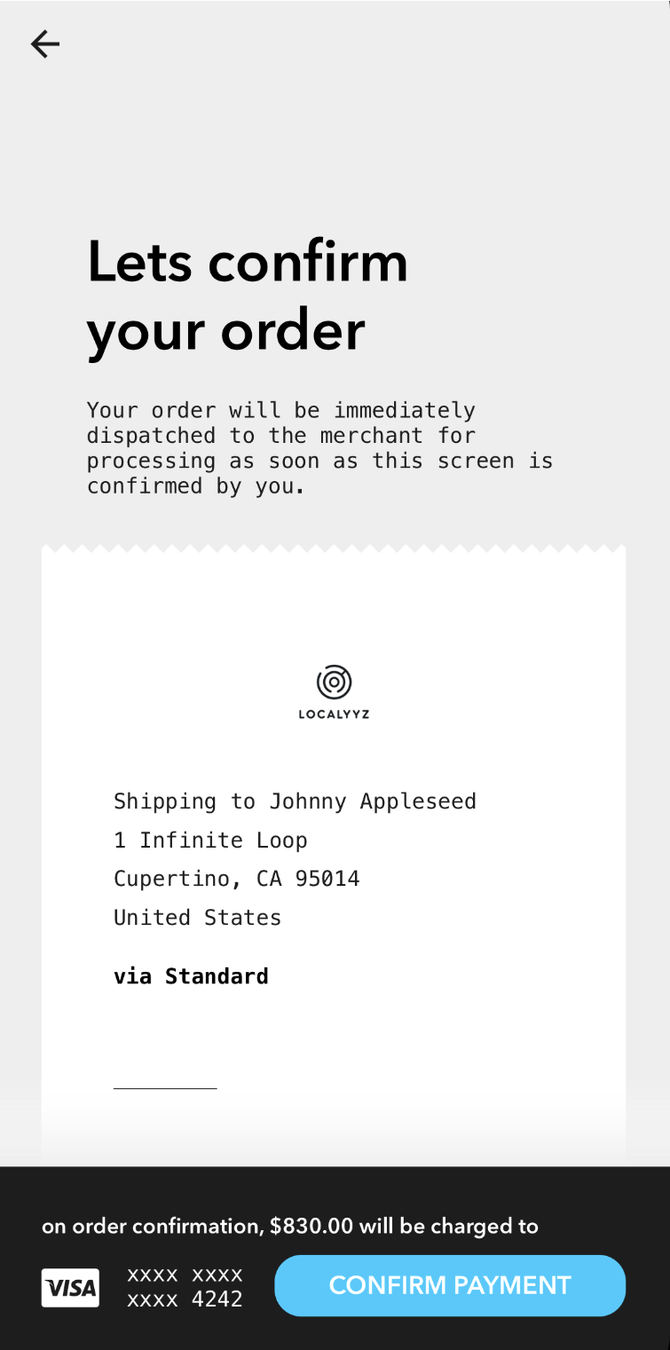
Zig-zag borders to simulate tear lines normally seen on receipts.
https://github.com/kenmaca/react-native-tear-lines
component ios react-native
Last synced: over 1 year ago
JSON representation
Zig-zag borders to simulate tear lines normally seen on receipts.
- Host: GitHub
- URL: https://github.com/kenmaca/react-native-tear-lines
- Owner: kenmaca
- License: mit
- Created: 2018-02-26T08:06:10.000Z (over 8 years ago)
- Default Branch: master
- Last Pushed: 2023-03-03T05:10:54.000Z (over 3 years ago)
- Last Synced: 2024-04-29T09:22:19.592Z (about 2 years ago)
- Topics: component, ios, react-native
- Language: JavaScript
- Size: 156 KB
- Stars: 32
- Watchers: 4
- Forks: 7
- Open Issues: 4
-
Metadata Files:
- Readme: README.md
- License: LICENSE
Awesome Lists containing this project
README
          # react-native-tear-lines

Zig-zag borders to simulate tear lines normally seen on receipts.


## Installation

```

yarn add react-native-tear-lines

```

## Usage

Use `TearLines`'s `onLayout` method in the attached component's `onLayout` prop

to dynamically match its width as demonstrated below:

```js

import { View } from "react-native";

import TearLines from "react-native-tear-lines";


   {

      this.refs.top.onLayout(e);

      this.refs.bottom.onLayout(e);

    }} />


```

## Properties

| Prop | Description | Default | Required |

|---|---|---|---|

|**`isUnder`**|`true` if this `TearLines` is used at the bottom of the attached view rather than the top.|`false`|No|

|**`color`**|Foreground color; should match attached content view's background color.|`#FFFFFF`|No|

|**`backgroundColor`**|Background color, should match container's background color.|`#CCCCCC`|No|

|**`tearSize`**|Specifies how large each tear tile is. Larger values will render less tiles.|`10`|No|

|**`width`**|Width can be provided if you don't want to use the `onLayout` method to dynamically match the attached content view.|*None*|No|

## License

[MIT License](http://opensource.org/licenses/mit-license.html). © Kenneth Ma