https://github.com/keyvaluesoftwaresystems/react-scatter-graph
A fully customizable ready to use scatter graph UI package for React.
https://github.com/keyvaluesoftwaresystems/react-scatter-graph
chart graph react scatter-plot typescript webpack
Last synced: over 1 year ago
JSON representation
A fully customizable ready to use scatter graph UI package for React.
- Host: GitHub
- URL: https://github.com/keyvaluesoftwaresystems/react-scatter-graph
- Owner: KeyValueSoftwareSystems
- License: mit
- Created: 2023-03-24T11:56:25.000Z (over 3 years ago)
- Default Branch: master
- Last Pushed: 2024-02-20T21:57:56.000Z (over 2 years ago)
- Last Synced: 2024-10-03T10:19:10.577Z (almost 2 years ago)
- Topics: chart, graph, react, scatter-plot, typescript, webpack
- Language: TypeScript
- Homepage: https://codesandbox.io/s/stupefied-currying-ornk52
- Size: 6.31 MB
- Stars: 5
- Watchers: 1
- Forks: 0
- Open Issues: 6
-
Metadata Files:
- Readme: README.md
- Contributing: CONTRIBUTING.md
- License: LICENSE
- Code of conduct: CODE_OF_CONDUCT.md
Awesome Lists containing this project
README
# React Scatter Graph


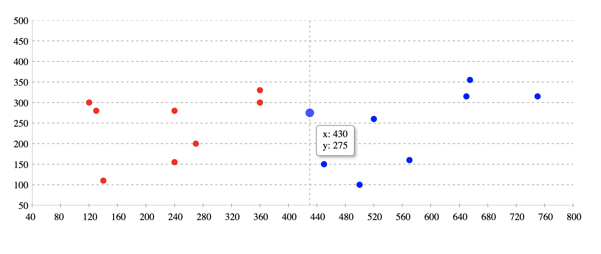
A fully customizable, ready to use scatter graph UI package for React.
Try tweaking React Scatter Graph using this codesandbox link here
## Installation
```bash
npm install @keyvaluesystems/react-scatter-graph
```
You’ll need to install React separately since it isn't included in the package.
Note for **Next.js** users, if you are using Next.js version 13 or later, you will have to use the `use client` feature to ensure proper compatibility.
## Usage
React Scatter Graph can run in a very basic mode like this:
```jsx
import React, { useState } from 'react';
import ReactScatterGraph from '@keyvaluesystems/react-scatter-graph';
function App() {
data = [
{ x: 450, y: 150 },
{ x: 360, y: 330 },
{ x: 650, y: 315 },
{ x: 270, y: 200 }
];
return ;
}
export default App;
```
The `data` array is an array of objects with { x, y } coordinates.
> Note: The graph width is responsive. So it can be adjusted by a parent wrapper. You need to provide the height.
### React Scatter Graph for date inputs:
Scatter graph is a useful tool for plotting date values. In order to do so, timestamps must be provided for the x-axis values.

```jsx
import React, { useState } from 'react';
import ReactScatterGraph from '@keyvaluesystems/react-scatter-graph';
function App() {
data = [
// x given in milliseconds corresponding to the date
{ x: 1672876800000, y: 150 },
{ x: 1673568000000, y: 330 },
{ x: 1674086400000, y: 315 },
{ x: 1673222400000, y: 200 }
];
return ;
}
export default App;
```
## v2.0.0 (Major Version Change)
This release includes a breaking change. Please read this document carefully before upgrading
### Breaking Changes
- The `axisColor` prop has been renamed to `gridLineColor`.
### Migration Steps
- Update Prop: Replace the prop `axisColor` with the name `gridLineColor`.
Before
```jsx
```
After
```jsx
```
## Props
Props that can be passed to the component are listed below:
Prop
Description
Default
data: object[]
An array of x-y coordinates to render.
undefined
graphHeight: number
Height of graph in pixel
undefined
gridLineColor: string
Color for the grid lines on the x and y axes. It helps user to see the exact value of a point on the graph
#9E9E9E
originAxisColor: string
Color for the origin axis
#9E9E9E
renderYLabel?: (arg: number | string): string
Render function for customizing Y axis label
undefined
renderXLabel?: (arg: number | string): string
Render function for customizing X axis label
undefined
scatterPointColor?: (arg: { x: number, y: number }): string
Function for customizing scatter point color. Based on the args, we can customise the color. Return value should be the color hash / string.
undefined
renderValuebox?: (x: number, y: number): ReactElement
Render function for customizing the value box shown on hover.
undefined
styles?: object
Provides you with a bunch of style objects and callback functions to override the default styles.(refer
Style Customizations)
undefined
## Style Customizations
Style customizations can be done by overriding default styles using the `styles` prop.
The below code shows all the overridable styles using `styles` prop.
```jsx
({...styles}),
YLabel?: (yLabel) => ({...styles}),
}}
/>;
```
For a more specific example, please refer the following:
```jsx
({
color: 'blue'
}),
YLabel: () => ({
color: 'green'
})
}}
/>
```
Within the `styles` prop, following keys accept a style object:
- `Root` - overrides the style of outermost container.
Within the `styles` prop, following keys accept a function that returns the desired style for each element:
- `XLabel` - overrides the style of x-axis labels.
- `YLabel` - overrides the style of y-axis labels.