https://github.com/kit/convertkit-react
React-based library to easily plug ConvertKit forms to your React applications
https://github.com/kit/convertkit-react
Last synced: about 1 year ago
JSON representation
React-based library to easily plug ConvertKit forms to your React applications
- Host: GitHub
- URL: https://github.com/kit/convertkit-react
- Owner: Kit
- Created: 2020-06-23T04:36:29.000Z (about 6 years ago)
- Default Branch: main
- Last Pushed: 2023-03-05T02:16:00.000Z (over 3 years ago)
- Last Synced: 2025-05-09T01:18:29.005Z (about 1 year ago)
- Language: JavaScript
- Size: 942 KB
- Stars: 47
- Watchers: 5
- Forks: 5
- Open Issues: 12
-
Metadata Files:
- Readme: README.md
- Changelog: CHANGELOG.md
- Funding: .github/FUNDING.yml
- Roadmap: ROADMAP.md
Awesome Lists containing this project
README
ConvertKit React

Easily plug convertkit forms to your React and Gatsby websites.
Using Vue? Try [ConvertKit-Vue](https://github.com/ConvertKit/convertkit-vue)
Using Svelte? Try [ConvertKit-Svelte](https://github.com/ConvertKit/convertkit-svelte)
## Setup
```sh
yarn add convertkit-react
```
## Demos
View examples on [how to use different templates here](https://codesandbox.io/s/twilight-cookies-ihryz) and [how to style your form with custom styling here](https://codesandbox.io/s/nifty-fog-f8eys)
## Usage
```jsx
import ConvertKitForm from 'convertkit-react'
const MY_FORM_ID = 1234567
function HomePage() {
return (
)
}
```
To get your form id, go to the form you have created on convertkit and choose the HTML embed option.
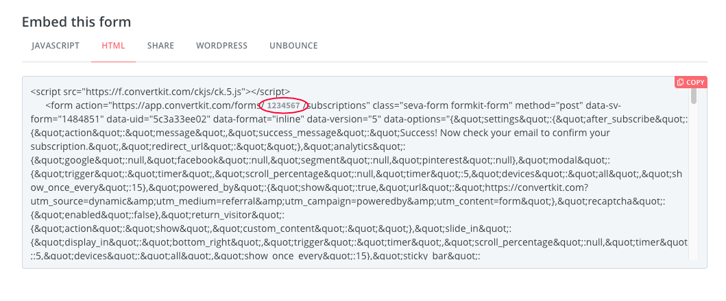
Here you'll pick out your form id from the form action in the embed code:
```html
```
#### Passing custom configuration options
```jsx
function HomePage() {
const config = {
formId: MY_FORM_ID,
template: 'mills',
emailPlaceholder: 'Enter an email address',
submitText: 'Sign up',
}
return (
)
}
```
#### Configuration Options
| **Property** | **Type** | **Default** | **Description** |
| ---------------- | ------------ | -------------------- | -------------------- |
| format | `String` | inline | inline, modal, slidein, sticky |
| template | `String` | minimal | _Templates in the app + minimal_ |
| submitText | `String` | Subscribe | Text shown in submit button |
| headingText | `String` | Varies per template | Text shown in heading |
| disclaimerText | `String` | Varies per template | Text shown in disclaimer area |
| emailPlaceholder | `String` | Your email | Placeholder for email input |
| namePlaceholder | `String` | Your first name | Placeholder for first name input |
| nameLabel | `String` | First name | Custom name label |
| emailLabel | `String` | Email | Custom email label |
| showLabels | `Boolean` | `false` | Shows labels with form inputs or only rely on `aria-label` |
| hideName | `Boolean` | `false` | Hides the name input field |
| newTab | `Boolean` | `false` | Determines if form should be processed in new tab or current |
| stack | `Boolean` | `true` | Determines if inputs are stacked or placed inline |
| hideWarnings | `Boolean` | `false` | Hide warnings that are shown due to misconfiguration |
| backgroundImage | `String` | default on template | Use a different background image for your form |
| backgroundOpacity | `Number` | 0.8 | Opacity here is the inverse of what is on the app which really measures transparency |
| buttonBackground | `String` | Varies per template | A [valid CSS color][1] string |
| buttonColor | `String` | Varies per template | A [valid CSS color][1] string |
##### Templates
The minimal template has no preconfigured styling, leaving you options to style
as desired. To get a preconfigured style, use one of the app templates
(clare, mills, rainier, powell etc) as seen on the app.
##### Content
To change the subheader (sometimes referred to as content) you may just add children
inside the `` component like below:
```jsx
Subscribe to get our latest content by email.
```
## Contributing
To publish a package:
```sh
./publish X.X.X "Message about version"
```
where `X.X.X` is the version number.
[1]: https://developer.mozilla.org/en-US/docs/Web/CSS/color_value