https://github.com/krishcdbry/pretty-progressbar
A generic React component which renders a responsive and slick progress bar. It provides 4 type of progress bars with options to customize them accordingly.
https://github.com/krishcdbry/pretty-progressbar
html5 javascript progress-bar progressbar react reactjs reactjs-components reactjs-es6
Last synced: 6 months ago
JSON representation
A generic React component which renders a responsive and slick progress bar. It provides 4 type of progress bars with options to customize them accordingly.
- Host: GitHub
- URL: https://github.com/krishcdbry/pretty-progressbar
- Owner: krishcdbry
- License: mit
- Created: 2018-02-17T05:02:00.000Z (over 8 years ago)
- Default Branch: master
- Last Pushed: 2019-04-12T02:01:28.000Z (over 7 years ago)
- Last Synced: 2025-10-05T11:31:13.410Z (9 months ago)
- Topics: html5, javascript, progress-bar, progressbar, react, reactjs, reactjs-components, reactjs-es6
- Language: JavaScript
- Homepage: https://krishcdbry.github.io/pretty-progressbar/
- Size: 621 KB
- Stars: 0
- Watchers: 1
- Forks: 0
- Open Issues: 1
-
Metadata Files:
- Readme: README.md
- License: LICENSE
Awesome Lists containing this project
README
# pretty-progressbar [](https://www.npmjs.com/package/pretty-progressbar)
[](https://npmjs.org/package/pretty-progressbar)
A generic React component which renders a responsive and slick progress bars. It provides 4 type of progress bars with options to customize them accordingly.

----------------------------------------------------------------------------------------------------
Getting Started
-----
```javascript
npm i pretty-progressbar --save-dev
```
or
```javascript
npm install pretty-progressbar --save-dev
```
Usage - Example 1
-----
```javascript
import React from 'react';
import { render } from 'react-dom';
import PrettyProgressbar from 'pretty-progressbar';
class App extends React.Component {
render() {
return (
)
}
}
render(
, document.getElementById('root')
)
```
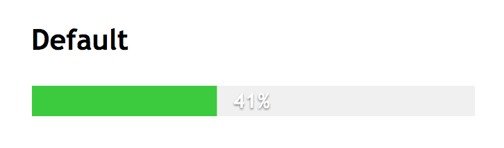
Usage - Example 2 (With Custom Styles)
-----
```javascript
import React from 'react';
import { render } from 'react-dom';
import PrettyProgressbar from 'pretty-progressbar';
class App extends React.Component {
render() {
let progressBarStyle = {
'display' : 'inline-block',
'margin' : '9px'
}
let progressStyle = {
'background' : 'indianred'
}
return (
)
}
}
render(
, document.getElementById('root')
)
```
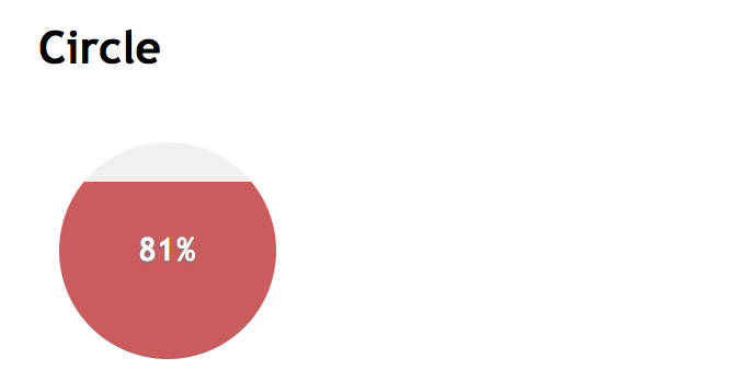
Props
-----
Name | Required | Type | Description |
-------------------|----------|----------|------------------------------------------------------------------------
`percentage` | Yes | number | Progress from 0 to 100. Default 0
`label` | No | boolean | Which shows percentage on the progress bar (true/false) - Default false
`type` | No | string | Which defines type of progress bar (default/circle/cyclinder/square) - Default
`progressbarStyle` | No | object | Style object for the progressbar wrapper (container)
`progressStyle` | No | object | Style object for the progress (content)
## Author
Krishcdbry (krishcdbry@gmail.com)
## Demo
Click here @[https://krishcdbry.github.io/pretty-progressbar/demo/](https://krishcdbry.github.io/pretty-progressbar/demo/)
## Licence
MIT @[krishcdbry](krishcdbry.com)