https://github.com/krottv/compose-sliders
Sliders for compose with custom styles
https://github.com/krottv/compose-sliders
Last synced: 8 months ago
JSON representation
Sliders for compose with custom styles
- Host: GitHub
- URL: https://github.com/krottv/compose-sliders
- Owner: krottv
- Created: 2021-11-18T13:27:20.000Z (over 4 years ago)
- Default Branch: master
- Last Pushed: 2022-10-02T09:23:10.000Z (over 3 years ago)
- Last Synced: 2025-01-18T22:38:07.289Z (over 1 year ago)
- Language: Kotlin
- Size: 167 KB
- Stars: 67
- Watchers: 1
- Forks: 7
- Open Issues: 2
-
Metadata Files:
- Readme: README.md
- Changelog: changelog.md
Awesome Lists containing this project
- jetpack-compose-awesome - compose-sliders - Custom Sliders (previously known as SeekBar) for jetpack compose (Libraries / UI)
README
# Custom compose sliders
This package allows you to build highly customizable sliders and tracks for compose for Android
# Add to your project
[](https://jitpack.io/#krottv/compose-sliders)
Add it in your root build.gradle at the end of repositories:
```
allprojects {
repositories {
maven { url 'https://jitpack.io' }
}
}
```
Add the dependency
```
implementation "com.github.krottv:compose-sliders:$compose_sliders_version"
```
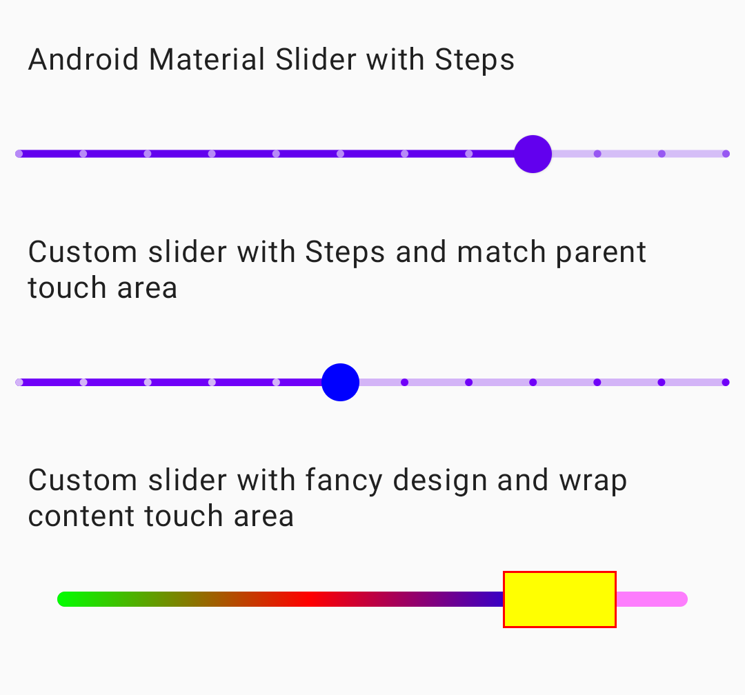
# Simple Usage
```kotlin
var stateSlider2 by remember { mutableStateOf(0.5f) }
SliderValueHorizontal(
stateSlider2, { stateSlider2 = it },
modifier = Modifier
.fillMaxWidth()
.height(80.dp), steps = 10,
thumbHeightMax = true,
track = { modifier: Modifier,
fraction: Float,
interactionSource: MutableInteractionSource,
tickFractions: List,
enabled: Boolean ->
DefaultTrack(
modifier,
fraction,
interactionSource,
tickFractions,
enabled,
height = 4.dp
)
},
thumb = { modifier: Modifier,
offset: Dp,
interactionSource: MutableInteractionSource,
enabled: Boolean,
thumbSize: DpSize ->
DefaultThumb(
modifier, offset, interactionSource, enabled, thumbSize,
color = Color.Blue,
scaleOnPress = 1.3f
)
}
)
```
# Advanced Usage
It allows to use custom composables for track and thumb. For detailed usage see sample/MainActivity
```kotlin
var stateSlider3 by remember { mutableStateOf(0.5f) }
SliderValueHorizontal(
stateSlider3, { stateSlider3 = it },
modifier = Modifier
.fillMaxWidth(),
thumbHeightMax = false,
track = { modifier: Modifier,
progress: Float,
_, _, _ ->
Box(
Modifier.padding(vertical = 30.dp)
.height(8.dp).then(modifier)
) {
val bgTrack = Modifier.background(
Color.Magenta.copy(alpha = 0.5f),
RoundedCornerShape(100)
)
Spacer(bgTrack.fillMaxHeight().then(modifier))
val bgProgress = Modifier.background(
Brush.linearGradient(
listOf(
Color.Green,
Color.Red,
Color.Blue
)
),
RoundedCornerShape(100)
)
Spacer(
bgProgress.fillMaxHeight()
.fillMaxWidth(fraction = progress)
.then(modifier)
)
}
}, thumb = { modifier, _: Dp,
mutableSource,
_, _ ->
var isPressed by remember { mutableStateOf(false) }
mutableSource.ListenOnPressed { isPressed = it }
val color by animateColorAsState(
if (isPressed) Color.Red else Color.Yellow,
TweenSpec(durationMillis = 200)
)
Spacer(
modifier.background(color)
.border(1.dp, Color.Red)
)
},
thumbSizeInDp = DpSize(60.dp, 30.dp)
)
```
# About
The code is mainly based on Slider from compose material package with the abilities of additional customization. This project is inspired by [swiftui-sliders](https://github.com/spacenation/swiftui-sliders). Currently we have only SliderValueHorizontal and in the future it is possible to add SliderValueVertical, SliderRangeHorizontal, SliderRangeVertical if there is a demand for it.
# License
Copyright 2021 compose-sliders Contributors
Licensed under the Apache License, Version 2.0 (the "License");
you may not use this file except in compliance with the License.
You may obtain a copy of the License at
https://www.apache.org/licenses/LICENSE-2.0
Unless required by applicable law or agreed to in writing, software
distributed under the License is distributed on an "AS IS" BASIS,
WITHOUT WARRANTIES OR CONDITIONS OF ANY KIND, either express or implied.
See the License for the specific language governing permissions and
limitations under the License.