https://github.com/ladas-larry/react-native-responsive-image
Responsive image component for React Native
https://github.com/ladas-larry/react-native-responsive-image
Last synced: about 1 year ago
JSON representation
Responsive image component for React Native
- Host: GitHub
- URL: https://github.com/ladas-larry/react-native-responsive-image
- Owner: ladas-larry
- Created: 2015-05-09T13:33:03.000Z (about 11 years ago)
- Default Branch: master
- Last Pushed: 2021-05-26T07:56:22.000Z (about 5 years ago)
- Last Synced: 2024-10-29T13:49:41.529Z (over 1 year ago)
- Language: JavaScript
- Homepage:
- Size: 1.04 MB
- Stars: 401
- Watchers: 14
- Forks: 50
- Open Issues: 0
-
Metadata Files:
- Readme: README.md
Awesome Lists containing this project
- awesome-react-native - react-native-responsive-image ★344 - Most elegant Responsive Image component (Components / UI)
README
# React Native Responsive Image
[](https://david-dm.org/dharmoslap/react-native-responsive-image)
[](https://www.npmjs.com/package/react-native-responsive-image)
[]()
[](https://www.npmjs.com/package/react-native-responsive-image)
## Why?
React Native's Image size is rendered with the same dimensions regardless of device screen size and screen resolution. That's bad. This component scales itself seemlesly on all iOS and Android devices.
## Installation
`npm install react-native-responsive-image --save`
## Usage
`` is expecting `initWidth` and `initHeight` props.
These values are used to set image size on any device that has screen size iPhone Plus, or larger.
Image is then scaled down for any smaller device.
Optional prop `component` is used to pass down either an `Image` or `ImageBackground` imported react-native (defaults to `Image` if not provided)
## Example
```javascript
import React, { Component } from "react";
import { AppRegistry, StyleSheet, View } from "react-native";
import ResponsiveImage from "react-native-responsive-image";
class App extends Component {
render() {
return (
);
}
}
AppRegistry.registerComponent("ResponsiveImageExample", () => App);
```
For `initWidth=138` it looks like this:
| Device | Screen width | Scale | `` width |
| -------------------- | ------------ | ----- | --------------- |
| iPhone SE | 320 | 0.77 | 106 |
| iPhone X | 375 | 0.902 | 117 |
| iPhone8 Plus | 414 | 1 | 138 |
| Nokia 5 | 360 | 0.87 | 120 |
| iPad (or any tablet) | - | 1 | 138 |
## Just one image?
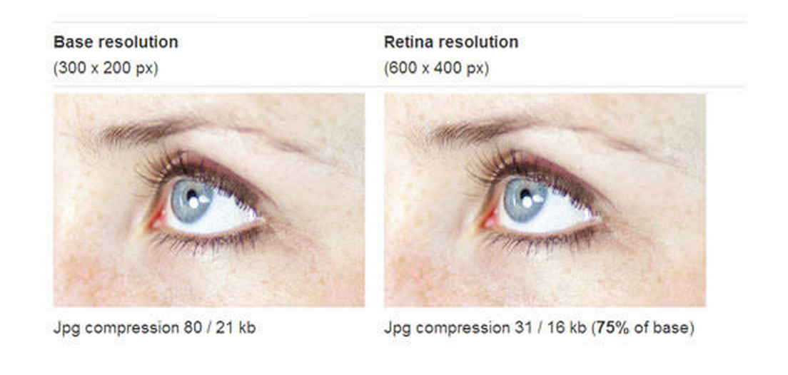
It sounds like you could save some loading by delivering low resolution images to screens with lower resolution. The best way is to serve just one high-resolution (retina) well compressed image. It’s surprising how well they can be compressed, and the result looks the same.
## Example project
### Create project
`expo init ResponsiveImageExample`
- go with 'expo-template-blank'
`cp ./example/App.js ./ResponsiveImageExample/App.js`
`cp -R ./src ./ResponsiveImageExample`
`cd ResponsiveImageExample`
`yarn start`
## Development
1. Modify any files in ./src directory
2. Propagate changes by `cp -R ./src ./ResponsiveImageExample/src`