https://github.com/lidorsystems/integralui-web-angular
IntegralUI Web - Advanced UI Components for Angular 9
https://github.com/lidorsystems/integralui-web-angular
angular angular-cli angular9 components integralui ui
Last synced: about 1 year ago
JSON representation
IntegralUI Web - Advanced UI Components for Angular 9
- Host: GitHub
- URL: https://github.com/lidorsystems/integralui-web-angular
- Owner: lidorsystems
- License: other
- Created: 2016-12-19T14:42:22.000Z (over 9 years ago)
- Default Branch: master
- Last Pushed: 2021-03-18T14:13:57.000Z (over 5 years ago)
- Last Synced: 2025-03-31T01:23:03.587Z (over 1 year ago)
- Topics: angular, angular-cli, angular9, components, integralui, ui
- Language: TypeScript
- Homepage: https://www.lidorsystems.com/products/web/studio/
- Size: 6.17 MB
- Stars: 10
- Watchers: 3
- Forks: 8
- Open Issues: 1
-
Metadata Files:
- Readme: README.md
- Changelog: CHANGE_LOG.md
- License: LICENSE.md
Awesome Lists containing this project
README
# IntegralUI Web for Angular, v20.3
IntegralUI Web is a library built on top of Angular 9 framework. It consists of user interface components, directives and services that can help you create modern web applications.
Note This version is now in MAINTENANCE mode. For newest releases check this repositiry: [IntegralUI Web](https://github.com/lidorsystems/integralui-web).
Here is a brief overview of what is included:
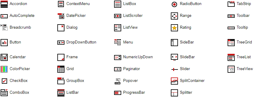
## Components
[Accordion](https://www.lidorsystems.com/support/articles/angular/accordion/accordion-component.aspx) - Displays a list of expandable groups in vertical layout
[AutoComplete](https://www.lidorsystems.com/products/web/studio/samples/angular/#/autocomplete/overview/) - Represents a text box with a dropdown list where you can choose among suggested options
[Breadcrumb](https://www.lidorsystems.com/products/web/studio/samples/angular/#/breadcrumb/overview/) - Used for navigation, where each item can have a link that is automatically separated
[Button](https://www.lidorsystems.com/products/web/studio/samples/angular/#/button/overview/) - Represents a button
[Calendar](https://www.lidorsystems.com/products/web/studio/samples/angular/#/calendar/overview/) - Enables the user to select a date using a visual monthly calendar display
[CheckBox](https://www.lidorsystems.com/products/web/studio/samples/angular/#/checkbox/overview/) - Represents a check box
[ColorPicker](https://www.lidorsystems.com/products/web/studio/samples/angular/#/colorpicker/overview/) - Allows the user to select a color by using a drop-down panel with color palette and slider
[ComboBox](https://www.lidorsystems.com/support/articles/angular/combobox/combobox-component.aspx) - Advanced version of standard ComboBox element
[DatePicker](https://www.lidorsystems.com/products/web/studio/samples/angular/#/datepicker/overview/) - Allows the user to select a date by using a drop-down calendar
[Dialog](https://www.lidorsystems.com/products/web/studio/samples/angular/#/dialog/overview/) - Displays a modal window
[DropDownButton](https://www.lidorsystems.com/products/web/studio/samples/angular/#/dropdownbutton/overview/) - Represents a button with option to show a dropdown list
[Grid](https://www.lidorsystems.com/support/articles/angular/grid/grid-component.aspx) - Displays tabular data sets
[GroupBox](https://www.lidorsystems.com/support/articles/angular/groupbox/groupbox-component.aspx) - An expandable container with header and content
[ListBar](https://www.lidorsystems.com/support/articles/angular/listbar/listbar-component.aspx) - Displays a list of expandable groups with items
[ListBox](https://www.lidorsystems.com/support/articles/angular/listbox/listbox-component.aspx) - Displays a collection of items with content in custom layouts
[ListScroller](https://www.lidorsystems.com/products/web/studio/samples/angular/#/listscroller/overview/) - Displays a scrollable item list in horizontal or vertical layout
[ListView](https://www.lidorsystems.com/support/articles/angular/listview/listview-component.aspx) - Displays a collection of items using several different views
[Menu](https://www.lidorsystems.com/support/articles/angular/menu/menu-component.aspx) - Allows you to create static or dynamic menus
[NumericUpDown](https://www.lidorsystems.com/products/web/studio/samples/angular/#/numeric-updown/overview/) - Displays a numeric value and allows changes within a range of defined minimum and maximum values
[Paginator](https://www.lidorsystems.com/support/articles/angular/paginator/paginator-component.aspx) - Allows you to divide the content in multiple views in single page
[ProgressBar](https://www.lidorsystems.com/products/web/studio/samples/angular/#/progressbar/overview/) - Visualize the progression of an operation
[RadioButton](https://www.lidorsystems.com/products/web/studio/samples/angular/#/radiobutton/overview/) - Represents a radio button
[Rating](https://www.lidorsystems.com/products/web/studio/samples/angular/#/rating/overview/) - Visualizes ratings
[SideBar](https://www.lidorsystems.com/products/web/studio/samples/angular/#/sidebar/overview/) - Allows you to add a custom content panel that appears by sliding from page side over main content
[SlideBar](https://www.lidorsystems.com/support/articles/angular/slidebar/slidebar-component.aspx) - Animates slides composed of custom content
[Slider](https://www.lidorsystems.com/products/web/studio/samples/angular/#/slider/overview/) - Allows changes to a numeric value within a range of defined minimum and maximum values
[SplitContainer](https://www.lidorsystems.com/support/articles/angular/splitcontainer/splitcontainer-component.aspx) - Consists of two resizable panels separated by a splitter with tabs and command buttons
[Splitter](https://www.lidorsystems.com/support/articles/angular/splitter/splitter-component.aspx) - Allows you to resize two block elements during run-time
[TabStrip](https://www.lidorsystems.com/support/articles/angular/tabstrip/tabstrip-component.aspx) - Consists of multiple scrollable panels that share the same space
[Toolbar](https://www.lidorsystems.com/products/web/studio/samples/angular/#/toolbar/overview/) - Displays a collection of different tool items and editors in one line
[TreeGrid](https://www.lidorsystems.com/support/articles/angular/treegrid/treegrid-component.aspx) - Displays hierarchical data structures in multiple columns
[TreeList](https://www.lidorsystems.com/support/articles/angular/treelist/treelist-component.aspx) - Allows you to navigate through tree hierarchy showing only one list at a time
[TreeView](https://www.lidorsystems.com/support/articles/angular/treeview/treeview-component.aspx) - Displays hierarchical data structures
## Directives
[ContextMenu](https://www.lidorsystems.com/support/articles/angular/contextmenu/contextmenu-component.aspx) - Represents a shortcut menu
DropDown - Represents a dropdown window
[Frame](https://www.lidorsystems.com/support/articles/angular/frame/frame-component.aspx) - Places a grip handle that allows you to resize a container during run-time
[Popover](https://www.lidorsystems.com/products/web/studio/samples/angular/#/popover/overview/) - Displays custom HTML content over specified element
[Range](https://www.lidorsystems.com/support/articles/angular/range/range-component.aspx) - Allows you to set limits in which an element can resize during run-time
Resize - Detects changes to the element size and fires notifications when it happens
[Tooltip](https://www.lidorsystems.com/support/articles/angular/tooltip/tooltip-component.aspx) - Adds a tooltip to an element
## Services
Common - Includes a set of common functions usable in most applications
Data - Includes a set of data related functions for different operations like: add/remove, search, etc.
DragDrop - Provides a way to use drag drop operations between custom components or elements.
Filter - Includes a set of related functions for filter operations
All components are inheritable, you can further extend functionalities of specific component by simple create a subclass of component main class. To get access to a specific component, the best way is to import the IntegralUIModule in your application.
## Dependencies
IntegralUI Web requires only the following library:
Angular - v9.0 and above
## DEMO
[Online QuickStart App](https://www.lidorsystems.com/products/web/studio/samples/angular/) - An online demo of each component included
## Installation
Install the repository by running
```bash
npm install https://github.com/lidorsystems/integralui-web-angular.git
```
Open your application module and add a reference to IntegralUI module. Use a relative path to the module location:
```bash
import { IntegralUIModule } from '../../node_modules/@lidorsystems/integralui-web/bin/integralui/integralui.module';
@NgModule({
imports: [ IntegralUIModule ],
declarations: [ AppComponent ],
bootstrap: [ AppComponent ]
})
export class AppModule { }
```
Note In order to use a specific component or directive in your application, follow the [guidelines from corresponding article](https://www.lidorsystems.com/support/help/web/angular/guide/articles.aspx). You can find a separate article available for each component or directive.
### Angular CLI
After installation, in angular.json under styles section add this code line:
```bash
"node_modules/@lidorsystems/integralui-web/bin/integralui/css/integralui.module.css"
```
To apply a theme, also add code line for corresonding theme file:
```bash
"node_modules/@lidorsystems/integralui-web/bin/integralui/themes/integralui.themes.office.css"
```
Note You can choose a theme from available themes located at '~ ... /integralui/themes' folder.
### How to Reduce Bundle Size
If you are using only few components from the InetgralUI Web package, you can reduce the bundle size during compilation by modifying the integralui.module.css file. This file imports CSS files for each component that is part of the package. Inside this file import only CSS for components that you are using.
For example, if you are using only the TreeView component in your app, comment out all other imports for individual components, except for the TreeView component. The result should look like this:
```
/* General settings */
@import 'integralui.css';
@import 'integralui.dragdrop.css';
@import 'integralui.editing.css';
@import 'integralui.filter.css';
@import 'integralui.sorting.css';
/* Component settings */
@import 'integralui.treeview.css';
/*
* Comment out all other CSS files
*
@import 'integralui.accordion.css';
@import 'integralui.autocomplete.css';
@import 'integralui.breadcrumb.css';
. . .
*/
```
You should keep the General Settings section in CSS, it is used by all components.
As a final result, after compilation the build size will be greatly reduced.
### Creating Custom Styles for IntegralUI Components
When you create custom styles or changes to built-in CSS classes of IntegralUI components, placed for example within app.component.css file, make sure ViewEncapsulation is set to None. This allows to override default settings from corresponding component css file. For example:
app.component.ts
```bash
import { Component, ViewEncapsulation } from '@angular/core';
@Component({
selector: 'app-root',
templateUrl: './app.component.html',
styleUrls: ['./app.component.css'],
encapsulation: ViewEncapsulation.None
})
export class AppComponent {
}
```
app.component.css
```bash
.iui-treeview
{
width: 400px;
height: 300px;
}
```
In this example, the TreeView component will have its width and height set from within the app.component.
Note Changes to ViewEncapsulation set to None is avoidable, if you create your own CSS style sheet and include it in angular.json file under styles section. Like it is explained above for general IntegralUI styles.
## QuickStart App
There is a demo application with source code that contains samples for each component included in the [IntegralUI Web](https://www.lidorsystems.com/products/web/studio/) product package. It can help you to get started quickly with learning about the components and write tests immediatelly.
In order to start this application, you only need to install the latest Angular library. Open the nodejs command prompt, go to application directory and type:
```bash
npm install
```
After installation completes, start the application by typing:
```bash
ng serve --open
```
The application will start displaying the main window with links to all components included. Each component window contains a demo and description about the component functionality. You can checkout the sample source code (located under integralui-web/quickstart/src/app/samples subfolder) for more information on the sample and component used.
## Release Notes
This is Trial version of the product. All features are fully functional, except that each component displays a pop-up trial window.
Note A light version of this library is available here [IntegralUI Web Lite](https://github.com/lidorsystems/integralui-web-lite.git). You can use the Lite version for FREE, to develop Internet and Intranet web sites, web applications and other products, with no-charge.
## License Information
You may use this version for the limited purposes of demonstrations, trials or design-time evaluations.
This project has been released under the IntegralUI Web License, and may not be used except in compliance with the License.
A copy of the License should have been installed in the product's root installation directory or it can be found here: [License Agreement](https://www.lidorsystems.com/products/web/iui-web-license-agreement.pdf).
This SOFTWARE is provided "AS IS", WITHOUT WARRANTY OF ANY KIND, either express or implied. See the License for the specific language governing rights and limitations under the License.