https://github.com/lidorsystems/integralui-web-lite
IntegralUI Web Lite - Native Web Components
https://github.com/lidorsystems/integralui-web-lite
angular components javascript react ui vue web web-components
Last synced: 3 months ago
JSON representation
IntegralUI Web Lite - Native Web Components
- Host: GitHub
- URL: https://github.com/lidorsystems/integralui-web-lite
- Owner: lidorsystems
- License: other
- Created: 2020-10-07T06:18:37.000Z (almost 6 years ago)
- Default Branch: main
- Last Pushed: 2020-10-11T10:39:47.000Z (over 5 years ago)
- Last Synced: 2025-03-04T07:40:20.682Z (over 1 year ago)
- Topics: angular, components, javascript, react, ui, vue, web, web-components
- Language: JavaScript
- Homepage: https://www.lidorsystems.com/products/web/studio/
- Size: 439 KB
- Stars: 1
- Watchers: 2
- Forks: 0
- Open Issues: 2
-
Metadata Files:
- Readme: README.md
- Changelog: CHANGE_LOG.md
- License: LICENSE.md
Awesome Lists containing this project
README
# IntegralUI Web Lite, v20.2
IntegralUI Web Lite is an UI library, it consists of native Web Components and services that can help you create modern web applications.
Note This library is a light version of [IntegralUI Web](https://github.com/lidorsystems/integralui-web.git). Some of the component features are excluded from this version.
Here is a brief overview of what is included:
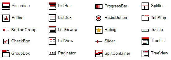
## Components
[Accordion](https://www.lidorsystems.com/products/web/studio/samples/web-components/#/accordion) - Displays a list of expandable groups in vertical layout
[Button](https://www.lidorsystems.com/products/web/studio/samples/web-components/#/button) - Represents a button
[ButtonGroup](https://www.lidorsystems.com/products/web/studio/samples/web-components/#/buttongroup) - Manages actions of multiple buttons arranged in group
[CheckBox](https://www.lidorsystems.com/products/web/studio/samples/web-components/#/checkbox) - Represents a check box
[GroupBox](https://www.lidorsystems.com/products/web/studio/samples/web-components/#/groupbox) - An expandable container with header and content
[ListBar](https://www.lidorsystems.com/products/web/studio/samples/web-components/#/listbar) - Displays a list of expandable groups with items
[ListBox](https://www.lidorsystems.com/products/web/studio/samples/web-components/#/listbox) - Displays a collection of items with content in custom layouts
[ListGroup](https://www.lidorsystems.com/products/web/studio/samples/web-components/#/listgroup) - Represents a collapsible panel with list of items
[ListView](https://www.lidorsystems.com/products/web/studio/samples/web-components/#/listview) - Displays a collection of items using several different views
[Paginator](https://www.lidorsystems.com/products/web/studio/samples/web-components/#/paginator) - Displays a collection of items using several different views
[ProgressBar](https://www.lidorsystems.com/products/web/studio/samples/web-components/#/progressbar) - Visualize the progression of an operation
[RadioButton](https://www.lidorsystems.com/products/web/studio/samples/web-components/#/radiobutton) - Represents a radio button
[Rating](https://www.lidorsystems.com/products/web/studio/samples/web-components/#/rating) - Visualizes ratings
[Slider](https://www.lidorsystems.com/products/web/studio/samples/web-components/#/slider) - Allows changes to a numeric value within a range of defined minimum and maximum values
[SplitContainer](https://www.lidorsystems.com/products/web/studio/samples/web-components/#/splitcontainer) - Consists of two resizable panels separated by a splitter with tabs and command buttons
[Splitter](https://www.lidorsystems.com/products/web/studio/samples/web-components/#/splitter) - Allows you to resize two block elements during run-time
[TabStrip](https://www.lidorsystems.com/products/web/studio/samples/web-components/#/tabstrip) - Consists of multiple scrollable panels that share the same space
[Tooltip](https://www.lidorsystems.com/products/web/studio/samples/web-components/#/tooltip) - Adds a tooltip to an element
[TreeList](https://www.lidorsystems.com/products/web/studio/samples/web-components/#/treelist) - Allows you to navigate through tree hierarchy showing only one list at a time
[TreeView](https://www.lidorsystems.com/products/web/studio/samples/web-components/#/treeview) - Displays hierarchical data structures
## Services
Common - Includes a set of common functions usable in most applications
Data - Includes a set of data related functions for different operations like: add/remove, search, etc.
## Dependencies
IntegralUI Web Lite is built on top of [LitElement](https://github.com/Polymer/lit-element). All necessary files from that library are already included in the /external subfolder of this repository.
## DEMO
[Online QuickStart App](https://www.lidorsystems.com/products/web/studio/samples/web-components/) - An online demo of each component included
## Installation
Install the repository by running
```bash
npm install https://github.com/lidorsystems/integralui-web-lite.git
```
or directly from NPM
```bash
npm i integralui-web-lite
```
Open your application and add a reference to a component you want to use. For example, if you are using the IntegralUI TreeView component:
### Angular
```bash
import 'integralui-web-lite/components/integralui.treeview.js';
```
### React
```bash
import IntegralUITreeViewComponent from 'integralui-web-lite/wrappers/react.integralui.treeview.js';
```
Note Currently [ReactJS doesn't have full support for Web Components](https://custom-elements-everywhere.com/#react). Mainly because of the way data is passed to the component via attributes and their own synthetic event system. For this reason, you can use available wrappers located under /wrappers directory, which are ReactJS components that provide all public API from an IntegralUI component.
### Vanilla JavaScript
```bash
```
## Icons
Because of the web component specification that defines URLs to be always relative to the main document, the path that leads to the icons used by the IntegralUI Web components needs to be set. In addition you may also need to copy/paste the /icons folder in your application folder. Depending on the framework of your choosing this may differ.
### Angular
Follow these steps:
1. Copy/Paste the content of the integralui-web-lite/icons folder under /assets/integralui/icons subfolder in your React application.
2. Set the resourcePath property of IntegralUI Web components to point to the location set in your /assets folder. In this case, for TreeView for example:
```bash
```
### React
Follow these steps:
1. Copy/Paste the content of the integralui-web-lite/icons folder under /public/integralui/icons subfolder in your React application.
2. Set the resourcePath property of IntegralUI Web components to point to the location set in your /public folder. In this case, for TreeView for example:
```bash
```
### Vanilla JavaScript
Set the resourcePath property of IntegralUI Web components to point to /integralui-web-lite/icons folder. In this case, for TreeView for example:
```bash
```
## QuickStart App
There is a demo application with source code that contains samples for each component included in the IntegralUI Web Lite library. It can help you to get started quickly with learning about the components and write tests immediatelly.
From [IntegralUI Web Lite - QuickStart](https://www.lidorsystems.com/products/web/lite/#quickstart) you can download a demo app for Angular, React and Vanilla JavaScript. A detailed information about each of these quick-start demos is available in ReadMe file, located in the root folder of the demo app.
## License Information
You are FREE to use this product to develop Internet and Intranet web sites, web applications and other products, with no-charge.
This project has been released under the IntegralUI Web Lite License, and may not be used except in compliance with the License.
A copy of the License should have been installed in the product's root installation directory or it can be found here: [License Agreement](https://www.lidorsystems.com/products/web/lite/integralui-web-lite-license-agreement.pdf).
This SOFTWARE is provided "AS IS", WITHOUT WARRANTY OF ANY KIND, either express or implied. See the License for the specific language governing rights and limitations under the License.