https://github.com/mahozad/theme-switch
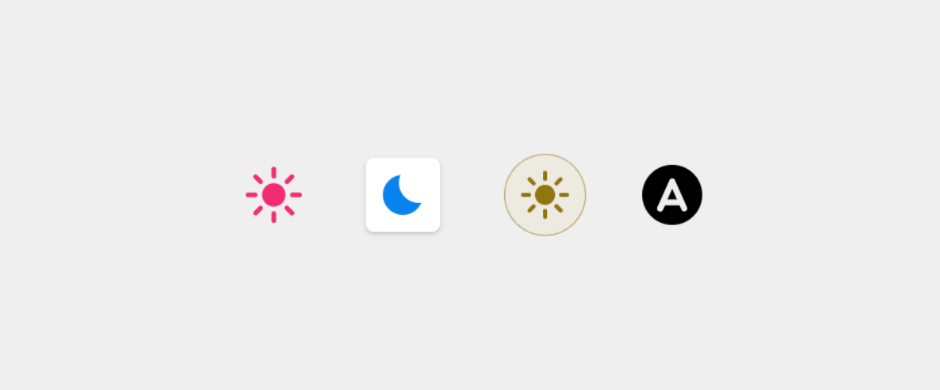
A toggle button to switch between light/dark/system theme on the Web.
https://github.com/mahozad/theme-switch
custom-element dark dark-mode dark-theme theme-switch theme-toggle web-component
Last synced: 12 months ago
JSON representation
A toggle button to switch between light/dark/system theme on the Web.
- Host: GitHub
- URL: https://github.com/mahozad/theme-switch
- Owner: mahozad
- License: apache-2.0
- Created: 2022-02-25T17:02:49.000Z (about 4 years ago)
- Default Branch: main
- Last Pushed: 2024-03-14T07:10:29.000Z (about 2 years ago)
- Last Synced: 2025-03-26T04:41:18.452Z (about 1 year ago)
- Topics: custom-element, dark, dark-mode, dark-theme, theme-switch, theme-toggle, web-component
- Language: JavaScript
- Homepage: https://mahozad.ir/theme-switch/
- Size: 684 KB
- Stars: 18
- Watchers: 1
- Forks: 1
- Open Issues: 0
-
Metadata Files:
- Readme: README.md
- Changelog: CHANGELOG.md
- License: LICENSE
Awesome Lists containing this project
- awesome-web-components - `<theme-switch>` - Animated toggle button to switch between light, dark, and system theme. (Real World / Components)
README
[](https://codecov.io/gh/mahozad/theme-switch)
[](https://unpkg.com/@mahozad/theme-switch)
[](https://www.webcomponents.org/element/@mahozad/theme-switch)

# HTML light/dark/system theme switch button
This is an animated [custom HTML element](https://developer.mozilla.org/en-US/docs/Web/Web_Components/Using_custom_elements)
which toggles between light theme, dark theme, and automatic theme (OS theme).
It adds a custom attribute (`data-theme`) to the `html` element of your page.
You can style your page the way you like based on the value of that attribute.
See the [demo page](https://mahozad.ir/theme-switch/) and scroll below for an [example](#styling-a-page-based-on-the-theme).
## Installing and using the library
- ### Regular HTML pages
```html
```
- ### Node.js and npm
```shell
npm install --save @mahozad/theme-switch
```
```html
```
- ### Angular and more
For Angular framework and more details about the above installation methods see the [wiki](https://github.com/mahozad/theme-switch/wiki).
After installing the library, use the element like this (make sure to include the end tag):
```html
```
## Styling the switch element
A custom element is no different from the built-in elements of HTML.
Use and style it however you want just like you would use and style a regular element:
```css
theme-switch {
width: 64px;
padding: 8px;
background: #888;
/*
* There is a special property called --theme-switch-icon-color
* which you can set, to change the color of the icon (shapes) in the switch.
* You can even make the color change with animation (for example, on mouse hover);
* see https://gist.github.com/mahozad/a8114b6145cac721f7652aa7b0732cf6
*/
--theme-switch-icon-color: #aabbcc;
}
```
## Styling a page based on the theme
In your CSS stylesheet, specify your desired styles for light and dark themes.
One way is to define [custom CSS properties](https://developer.mozilla.org/en-US/docs/Web/CSS/Using_CSS_custom_properties)
for your colors, sizes, etc. and redefine them (if needed) with new values for the other theme:
```css
/* These are applied for the default (light) theme */
/* (or when the toggle is auto, and the OS theme is light) */
html {
--my-page-background-color: #fff;
--my-text-color: red;
}
/* These are applied for the dark theme */
/* (or when the toggle is auto, and the OS theme is dark) */
/* If a property has the same value for light and dark themes, no need to redeclare it here */
html[data-theme="dark"] {
--my-page-background-color: #112233;
}
body /* or any selector you want */ {
background: var(--my-page-background-color);
color: var(--my-text-color);
}
```
## Theme change event
The switch element fires (triggers) a custom event called `themeToggle` every time it is toggled (clicked).
You can listen and react to it if you want:
```javascript
document.addEventListener("themeToggle", event => {
console.log(`Old theme: ${ event.detail.oldState }`);
console.log(`New theme: ${ event.detail.newState }`);
// More operations...
});
```
## Misc
Click here to expand
This widget was inspired by [this YouTube video](https://youtu.be/kZiS1QStIWc)
and [this library](https://github.com/GoogleChromeLabs/dark-mode-toggle).
---
See [this article](https://css-tricks.com/web-components-are-easier-than-you-think/)
which is about creating HTML custom elements.
See the icon for switching themes (located in the top right corner) on
[Google Fonts site](https://fonts.google.com/icons).
Also see [this site](https://rastikerdar.github.io/vazirmatn).
See [this article](https://css-tricks.com/a-complete-guide-to-dark-mode-on-the-web)
for implementing dark/light theme on sites.
See [this post](https://stackoverflow.com/q/56300132/8583692) for how to override
dark/light theme for a site.
See [this comprehensive GitHub repo](https://github.com/mateusortiz/webcomponents-the-right-way) about custom elements.
See [this feature](https://chromestatus.com/feature/5452774595624960).
---
### Similar libraries
- [React Toggle Dark Mode](https://github.com/JoseRFelix/react-toggle-dark-mode)
- [Dark Mode Toggle](https://github.com/H0rn0chse/dark-mode-toggle)
- [\](https://github.com/GoogleChromeLabs/dark-mode-toggle)
- [\](https://github.com/CICCIOSGAMINO/color-scheme-button)
- [\](https://github.com/mothepro/theme-toggle)
- [Binary theme switcher component](https://github.com/diegosanchezp/theme-switcher-component)
---
TODO:
- Try to add the library to [rufus site](https://github.com/pbatard/rufus-web)
- Try to add the library to [jest site](https://github.com/facebook/jest) (probably its `docs/` directory. see [this PR](https://github.com/facebook/jest/pull/11021))
- Try to add the library to [MDN site](https://developer.mozilla.org/en-US/)
- Try to add the library to [docusaurus](https://github.com/facebook/docusaurus)
- Try to add the library to [dokka](https://github.com/Kotlin/dokka)
- Try to add the library to [Spring website](https://spring.io/) and [Spring docs](https://docs.spring.io/spring-framework/docs/current/reference/html/)
- Try to add the library to [mkdocs-material](https://github.com/squidfunk/mkdocs-material)
- Try to add the library to [bootstrap website](https://getbootstrap.com/)
- Try to add the library to [Electron js website](https://www.electronjs.org/)
- Try to add the library to https://playwright.dev/
- Try to add the library to https://tailwindcss.com/
- Try to add the library to and inspire from https://next.vuetifyjs.com/
- Try to add the library to [scoop website](https://scoop.sh/)
- See [chrome auto dark feature for android](https://developer.chrome.com/blog/new-in-chrome-98/#autodark-opt-out)